Matplotlib is the foundational plotting engine of the Python data science stack. Nearly every high-level library, including Pandas and Seaborn, is a wrapper around Matplotlib.
Matplotlib gives us complete, low-level control over figures, axes, styles, and ticks for static and interactive 2D plots. Once we learn its layout system, we can build custom compound plots and adjust every visual element on the canvas.
In this blog, we will learn how to build visualizations using both the functional pyplot interface and the object-oriented API. We will construct line, scatter, bar, histogram, and box plots, and configure subplots and ticks.
Prerequisites: Python 3.x, Matplotlib, NumPy.
Setup
Before plotting, we must set up the environment by importing the required visualization and numerical computing libraries.
Imports and Configuration
Import the necessary visualization and numerical computing modules, and configure Jupyter to display the charts inline:
import matplotlib.pyplot as plt
import numpy as np
from numpy.random import randint
%matplotlib inline
Line Plots
Line plots track values over a continuous axis. NumPy provides the numerical inputs for building the baseline coordinates.
Generating Test Data
Use the linspace() function to return 20 evenly spaced values between 1 and 10:
x = np.linspace(1, 10, 20)
xarray([ 1. , 1.47368421, 1.94736842, 2.42105263, 2.89473684,
3.36842105, 3.84210526, 4.31578947, 4.78947368, 5.26315789,
5.73684211, 6.21052632, 6.68421053, 7.15789474, 7.63157895,
8.10526316, 8.57894737, 9.05263158, 9.52631579, 10. ])Generate 20 random integers between 1 and 50 using randint():
y = randint(1, 50, 20)
yarray([43, 13, 39, 35, 14, 31, 36, 17, 27, 36, 15, 47, 12, 36, 6, 20, 19,
17, 29, 36])Verify the size of the random array:
y.size20Inspect the first ten attributes and functions available within the PyPlot module:
dir(plt)[:10]['Annotation', 'Arrow', 'Artist', 'AutoLocator', 'Axes', 'Button', 'Circle', 'Figure', 'FigureCanvasBase', 'FixedFormatter']Functional PyPlot Line Plots
Plot the unsorted random values along the default index x-axis:
plt.plot(y)The resulting chart connects the random values in their generated sequence:
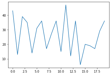
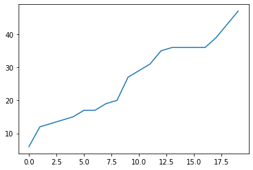
Sort the random integers in ascending order to make the trend line readable:
y = np.sort(y)
print(y)[ 6 12 13 14 15 17 17 19 20 27 29 31 35 36 36 36 36 39 43 47]Plot the sorted values:
plt.plot(y)The sorted line plot displays a steady upward curve:
Labels and Title
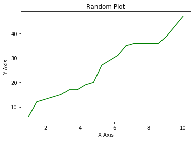
Plot y against x explicitly, set the line color to green, and add labels and a title:
plt.plot(x, y, color = 'g')
plt.xlabel('X Axis')
plt.ylabel('Y Axis')
plt.title('Random Plot')
plt.show()
The labeled chart displays the sorted relationship between x and y:
Common Plot Types
Matplotlib provides several functions for common statistical chart types.
Scatter and Bar Plots
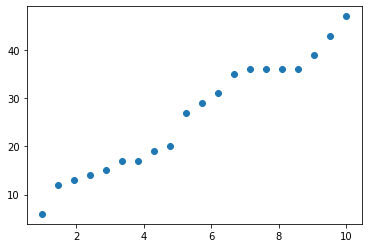
Use the scatter() function to display individual observations as points without connecting lines:
plt.scatter(x, y)The scatter plot shows the data points distributed along the coordinate axes:
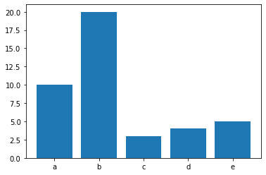
Create discrete categories and plot them as vertical bars using the bar() function:
b = [10, 20, 3, 4, 5]
a = ['a', 'b', 'c', 'd', 'e']
plt.bar(a, b)
The bar plot compares the values across the five categories:
Histograms and Box Plots
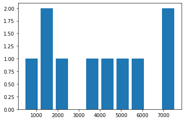
Generate a list of 10 random samples from a range of 1 to 10,000:
from random import sample
data = sample(range(1, 10000), 10)
data[5768, 405, 2213, 7584, 5100, 1136, 7028, 1777, 3683, 4265]Plot the sampled data as a histogram, adjusting the bar widths to 80% of the bin width:
plt.hist(data, rwidth=0.8)The histogram aggregates the observations into frequency bins:
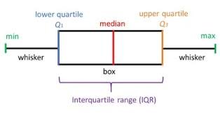
Box plots show the five-number summary of a distribution, mapping the minimum, lower quartile (), median, upper quartile (), and maximum.
The box plot diagram below details how these metrics partition a distribution:
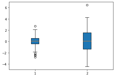
Generate normal distribution samples with different standard deviations and plot them as box plots:
data = [np.random.normal(0, std, 100) for std in range(1,3)]
plt.boxplot(data, vert = True, patch_artist= True)
plt.show()
The box plots compare the spreads and outlier points of the two normal distributions:
Subplots
Subplots let us arrange multiple coordinate charts within a single figure canvas.
Functional Subplots
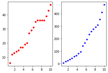
Use plt.subplot(rows, cols, index) to split the canvas and activate different subplots:
plt.subplot(1, 2, 1)
plt.plot(x, y, 'ro', markersize = 5)

plt.subplot(1, 2, 2)
y2 = y*x
plt.plot(x, y2, 'b*')
The layout displays red circles on the left and blue stars on the right:
Object-Oriented Subplots
The object-oriented interface separates the overall Figure canvas from the individual Axes coordinates. Create a single subplot layout:
fig, ax = plt.subplots()
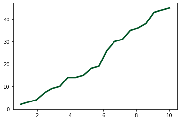
ax.plot(x, y, markersize = 12, linewidth = 3, color = '#005425')
The object-oriented plotting call returns a clean green trend line:
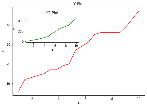
Add custom inset axes by specifying relative coordinates [left, bottom, width, height] within the figure:
fig = plt.figure()
ax1 = fig.add_axes([0, 0, 1, 1])
ax2 = fig.add_axes([0.1, 0.6, 0.4, 0.3])

ax1.plot(x, y, 'r')
ax1.set_xlabel('X')
ax1.set_ylabel('Y')
ax1.set_title('Y Plot')

ax2.plot(x, y2, 'g')
ax2.set_xlabel('X')
ax2.set_ylabel('Y')
ax2.set_title('Y2 Plot')
The main y-axis (red) contains a smaller, green inset plot (ax2) positioned in its upper-left quadrant:
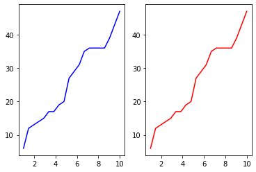
Generate a grid of subplots and access individual cells using index offsets:
fig, ax = plt.subplots(1,2)

ax[0].plot(x, y, 'b')

ax[1].plot(x, y, 'r')
The side-by-side subplots show the blue and red line plots:
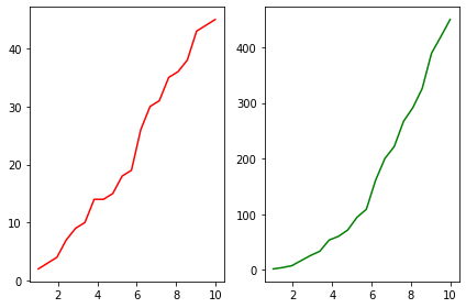
For larger layouts, loop through the axes array and adjust coordinates dynamically:
fig, ax = plt.subplots(1, 2)
col = ['r', 'g']
data = [y, y2]

for i, axes in enumerate(ax):
    axes.plot(x, data[i], col[i])

fig.tight_layout()
Using tight_layout() adjusts the margins between the green and red subplots to prevent overlapping:
Configure custom dimensions, DPI resolution, legends, and save the figure:
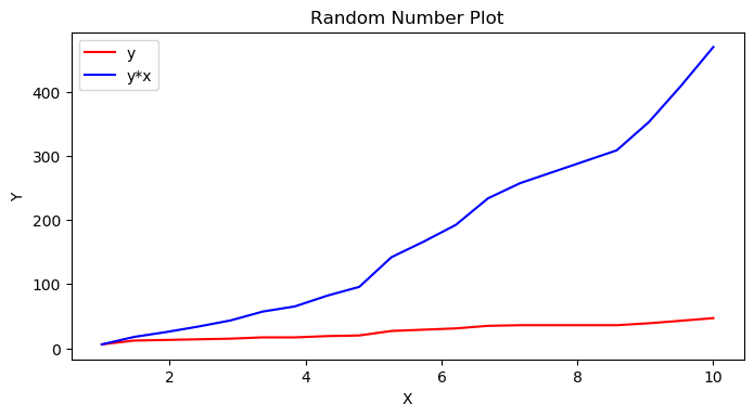
fig, ax = plt.subplots(figsize = (8,4), dpi = 100)

ax.plot(x, y, 'r', label = 'y')
ax.plot(x, y2, 'b', label = 'y*x')
ax.set_xlabel('X')
ax.set_ylabel('Y')
ax.set_title('Random Number Plot')
ax.legend(loc = 0)
fig.savefig('random file.png', dpi = 100)
The resulting chart overlays both trend lines and places the legend at the optimal location:
Axis Controls
We can set custom limits, scale types, and tick values for each axes object.
Axis Limits
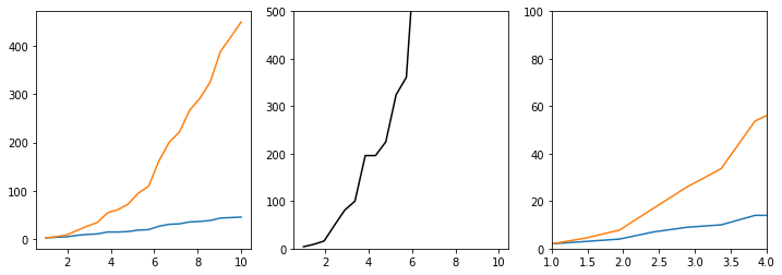
Use set_xlim() and set_ylim() to focus on specific coordinate ranges:
fig, ax = plt.subplots(1, 3, figsize = (12, 4))

ax[0].plot(x, y, x, y2)

ax[1].plot(x, y**2, 'k')
ax[1].set_ylim([0, 500])

ax[2].plot(x, y, x, y2)
ax[2].set_ylim([0, 100])
ax[2].set_xlim([1 ,4])
The subplots show the original range, a vertically capped curve, and a zoomed-in coordinates window:
Axis Scales
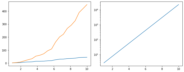
Change scale types (e.g., to a logarithmic scale) using set_yscale():
fig, ax = plt.subplots(1, 2, figsize= (10, 4))
ax[0].plot(x, y, x, y2)

ax[1].plot(x, np.exp(x))
ax[1].set_yscale('log')
fig.tight_layout()
The log-scale subplot linearizes the exponential values along the y-axis:
Custom Ticks and Formatting
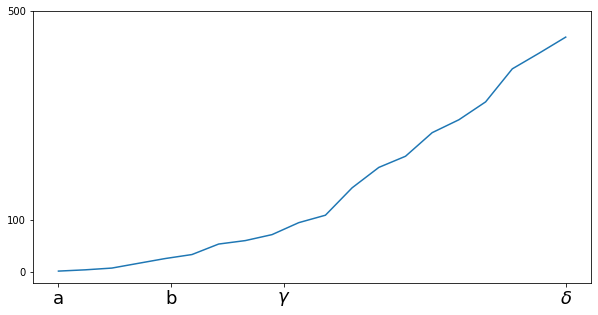
Specify custom tick coordinates and labels, using raw strings for LaTeX mathematical notation:
fig, ax = plt.subplots(figsize = (10,5))
ax.plot(x, y2)
ax.set_xticks([1 , 3, 5, 10])
ax.set_xticklabels([r'a', r'b', r'$\gamma$', r'$\delta$'], fontsize=18)

ax.set_yticks([0, 100, 500])
The custom plot places labels and Greek letters at the tick marks:
Import the ticker module to configure locator and formatter classes:
from matplotlib import tickerApply scientific notation to tick values using a ScalarFormatter:
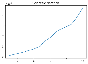
fig, ax = plt.subplots()
ax.plot(x, y2)
ax.set_title('Scientific Notation')

formatter = ticker.ScalarFormatter(useMathText=True)
formatter.set_scientific(True)
formatter.set_powerlimits((-1, 2))
ax.yaxis.set_major_formatter(formatter)
The y-axis formats the tick labels using scientific notation ():
Conclusion
In this blog, we explored Matplotlib's layout and customization pipeline. We built line, scatter, bar, histogram, and box plots, and configured subplots, inset axes, log scales, custom ticks, and scientific formatting.
Key takeaways:
- PyPlot vs. Object-Oriented: The functional
pltinterface is useful for quick plotting, while the object-oriented API (fig, ax) is preferred for complex, multi-panel layouts. - Custom Insets: We can place coordinate axes anywhere on the canvas by specifying relative positioning values.
- Tick Customization: Locators and formatters let us configure Greek mathematical labels and scientific notation.
- Layout Control: Functions like
tight_layout()prevent overlapping text and keep label sizes legible across subplots.
Next steps:
- Read Data Visualization with Pandas to learn how to generate plots directly from DataFrames.
- Read Complete Seaborn Tutorial to master high-level statistical plotting.
- Save custom layouts as reusable functions to streamline the data visualization workflow.