
Data visualization is essential for understanding data distributions, trends, and patterns before starting any modeling task. While dedicated plotting libraries like Seaborn are useful, you often need to generate plots quickly during data manipulation.
Pandas provides built-in plotting capabilities directly on DataFrames and Series, wrapping Matplotlib. This allows you to generate line, bar, histogram, box, scatter, and area plots quickly without writing extensive plotting boilerplate.
In this tutorial, you will build a wide range of plots directly from Pandas DataFrames and Series. You will work with random walks, the Iris dataset, and the Titanic dataset to learn the full suite of Pandas visual tools.
Prerequisites: Python 3.x, Pandas, NumPy, Seaborn, Matplotlib.
Setup
Before plotting, you must set up the environment by importing the required data processing libraries.
Imports and Libraries
Group the necessary libraries into a single import block, which sets up Pandas, NumPy, Seaborn, Matplotlib, and random utility functions:
import numpy as np
import pandas as pd
import seaborn as sns
import matplotlib.pyplot as plt
%matplotlib inline
from numpy.random import randn, randint, uniform, sample
Data Structure Concepts
A Pandas DataFrame is a two-dimensional, size-mutable, potentially heterogeneous tabular data structure with labeled axes (rows and columns). It consists of three principal components: the data, rows, and columns. A Series is a one-dimensional labeled array capable of holding data of any type (integer, string, float, Python objects, etc.). Each column of a DataFrame is a Series.
We will create a DataFrame df containing 1,000 random normal values indexed by a daily datetime range starting on June 7, 2019, and a Series ts structured similarly:
df = pd.DataFrame(randn(1000), index = pd.date_range('2019-06-07', periods = 1000), columns=['value'])
ts = pd.Series(randn(1000), index = pd.date_range('2019-06-07', periods = 1000))
Inspect the first five rows of the generated DataFrame:
df.head()| value | |
|---|---|
| 2019-06-07 | -0.992350 |
| 2019-06-08 | -0.849183 |
| 2019-06-09 | 0.126559 |
| 2019-06-10 | 0.640230 |
| 2019-06-11 | -0.975090 |
Preview the first five values of the generated Series:
ts.head()2019-06-07 0.430385
2019-06-08 1.810955
2019-06-09 3.207345
2019-06-10 -0.366252
2019-06-11 1.406304
Freq: D, dtype: float64Verify the underlying class types of both data structures:
type(df),type(ts)(pandas.core.frame.DataFrame, pandas.core.series.Series)Line Plots
Line plots show trends over a continuous interval or time series. We will apply cumulative sum transformations to simulate a random walk.
Cumulative Transformations
Use the cumsum() function to compute the cumulative sum of the data along the index axis:
df['value'] = df['value'].cumsum()
df.head()| value | |
|---|---|
| 2019-06-07 | -0.992350 |
| 2019-06-08 | -2.833884 |
| 2019-06-09 | -4.548859 |
| 2019-06-10 | -5.623604 |
| 2019-06-11 | -7.673438 |
Apply the same cumulative sum transformation to the Series:
ts = ts.cumsum()
ts.head()2019-06-07 0.430385
2019-06-08 2.671725
2019-06-09 8.120411
2019-06-10 13.202844
2019-06-11 19.691581
Freq: D, dtype: float64Confirm that the structures remain a DataFrame and Series:
type(df), type(ts)(pandas.core.frame.DataFrame, pandas.core.series.Series)Visualizing Line Charts
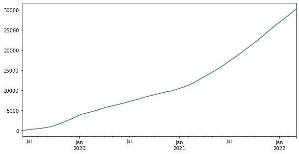
Plot the Series using a custom figure size of 10x5 inches:
ts.plot(figsize=(10,5))The resulting chart tracks the cumulative trajectory of the random walk Series over time:
Now, plot the DataFrame containing the single value column:
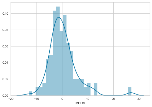
df.plot()The line plot tracks the cumulative values of the DataFrame over the datetime index:
Load the built-in Iris dataset to explore multi-variable line plotting:
iris = sns.load_dataset('iris')
iris.head()
| | sepal_length | sepal_width | petal_length | petal_width | species | |---|---|---|---|---|---|---| | 0 | 5.1 | 3.5 | 1.4 | 0.2 | setosa | | 1 | 4.9 | 3.0 | 1.4 | 0.2 | setosa | | 2 | 4.7 | 3.2 | 1.3 | 0.2 | setosa | | 3 | 4.6 | 3.1 | 1.5 | 0.2 | setosa | | 4 | 5.0 | 3.6 | 1.4 | 0.2 | setosa |
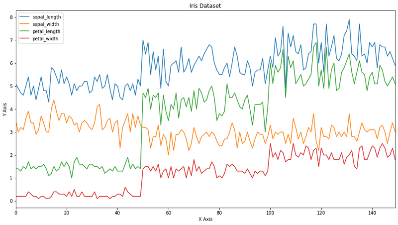
Plot the Iris features with a custom title and axis labels:
ax = iris.plot(figsize=(15,8), title='Iris Dataset')
ax.set_xlabel('X Axis')
ax.set_ylabel('Y Axis')
The multi-line plot shows the measurements for all four Iris features across the samples:
Customize line styles by passing Matplotlib formatting strings (e.g., 'r--' for red dashed lines) and enabling the legend:
ts.plot(style = 'r--', label = 'Series', legend = True)The resulting line plot displays the Series as a red dashed line accompanied by a legend:
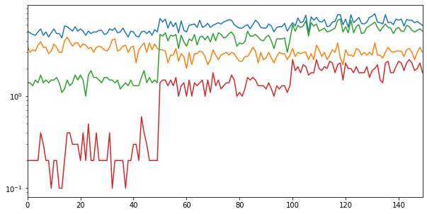
For data covering multiple orders of magnitude, use a logarithmic y-axis scale by setting logy=True:
iris.plot(legend = False, figsize = (10, 5), logy = True)The logarithmic scale compresses the vertical distribution, highlighting relative variations across samples:
Secondary Y-Axes
When plotting columns with different measurement units, plot subset columns on a secondary y-axis to compare trends without squeezing smaller values. Drop sepal and petal widths to build the first DataFrame:
x = iris.drop(['sepal_width', 'petal_width'], axis = 1)
x.head()| sepal_length | petal_length | species | |
|---|---|---|---|
| 0 | 5.1 | 1.4 | setosa |
| 1 | 4.9 | 1.4 | setosa |
| 2 | 4.7 | 1.3 | setosa |
| 3 | 4.6 | 1.5 | setosa |
| 4 | 5.0 | 1.4 | setosa |
Create the second DataFrame by dropping sepal and petal lengths:
y = iris.drop(['sepal_length', 'petal_length'], axis = 1)
y.head()| sepal_width | petal_width | species | |
|---|---|---|---|
| 0 | 3.5 | 0.2 | setosa |
| 1 | 3.0 | 0.2 | setosa |
| 2 | 3.2 | 0.2 | setosa |
| 3 | 3.1 | 0.2 | setosa |
| 4 | 3.6 | 0.2 | setosa |
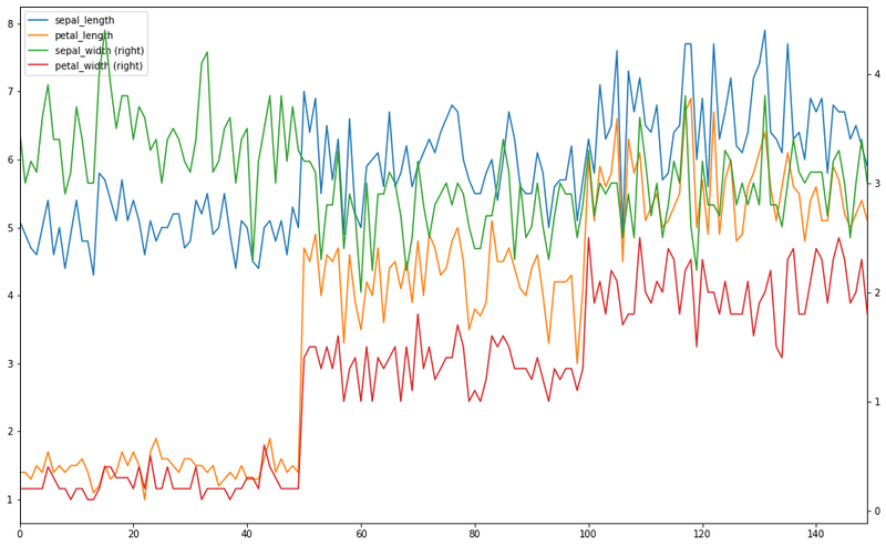
Plot x on the primary y-axis, and overlay y on the secondary y-axis using the same axes object ax:
ax = x.plot()
y.plot(figsize = (16,10), secondary_y = True, ax = ax)
The plot separates lengths on the left y-axis and widths on the right y-axis:
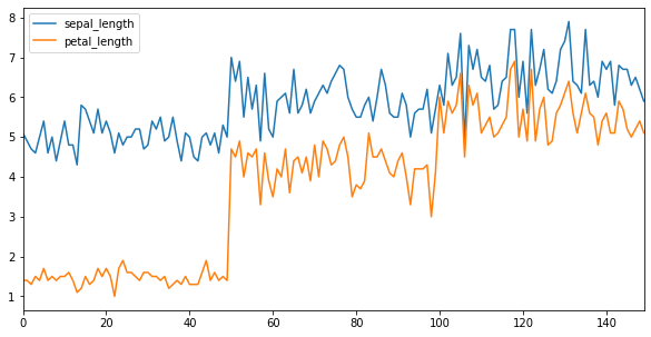
Adjust the tick label resolution by enabling the x_compat compatibility parameter:
x.plot(figsize=(10,5), x_compat = True)The resulting chart adjusts grid alignment settings for compatibility:
Bar Plots
Bar plots display comparisons among discrete categories. Before plotting, drop non-numeric columns like species to isolate the variables:
df = iris.drop(['species'], axis = 1)
df.head()| sepal_length | sepal_width | petal_length | petal_width | |
|---|---|---|---|---|
| 0 | 5.1 | 3.5 | 1.4 | 0.2 |
| 1 | 4.9 | 3.0 | 1.4 | 0.2 |
| 2 | 4.7 | 3.2 | 1.3 | 0.2 |
| 3 | 4.6 | 3.1 | 1.5 | 0.2 |
| 4 | 5.0 | 3.6 | 1.4 | 0.2 |
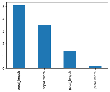
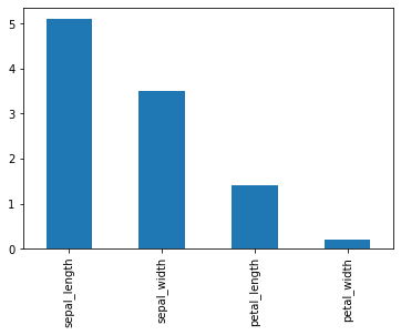
Generate a bar plot for the first observation in the dataset by passing kind='bar':
df.iloc[0].plot(kind='bar')The bar plot compares the four feature measurements for a single Iris flower:
Alternatively, call the .bar() plotting method directly on the slice:
df.iloc[0].plot.bar()The resulting bar chart displays the identical row comparisons:
Load the Titanic dataset to explore discrete categorical distributions:
titanic = sns.load_dataset('titanic')
titanic.head()| survived | pclass | sex | age | sibsp | parch | fare | embarked | class | who | adult_male | deck | embark_town | alive | alone | |
|---|---|---|---|---|---|---|---|---|---|---|---|---|---|---|---|
| 0 | 0 | 3 | male | 22.0 | 1 | 0 | 7.2500 | S | Third | man | True | NaN | Southampton | no | False |
| 1 | 1 | 1 | female | 38.0 | 1 | 0 | 71.2833 | C | First | woman | False | C | Cherbourg | yes | False |
| 2 | 1 | 3 | female | 26.0 | 0 | 0 | 7.9250 | S | Third | woman | False | NaN | Southampton | yes | True |
| 3 | 1 | 1 | female | 35.0 | 1 | 0 | 53.1000 | S | First | woman | False | C | Southampton | yes | False |
| 4 | 0 | 3 | male | 35.0 | 0 | 0 | 8.0500 | S | Third | man | True | NaN | Southampton | no | True |
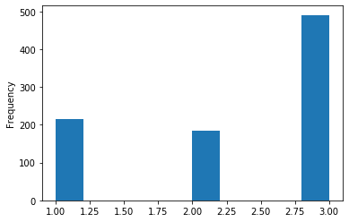
Plot a histogram of passenger ticket classes to check frequencies:
titanic['pclass'].plot(kind = 'hist')The histogram columns show passenger frequencies across the three ticket classes:
Create a small DataFrame with 10 rows and 4 columns to study multi-series bar plots:
df = pd.DataFrame(randn(10, 4), columns=['a', 'b', 'c', 'd'])
df.head()| a | b | c | d | |
|---|---|---|---|---|
| 0 | -0.358585 | -0.530212 | -1.037960 | -0.620583 |
| 1 | 0.063102 | 0.872088 | 0.429474 | 2.020268 |
| 2 | -1.064892 | -0.521098 | -0.238016 | 1.559072 |
| 3 | -0.277393 | -1.246629 | 1.723683 | -0.069810 |
| 4 | -1.123548 | -0.375084 | 0.528301 | 0.739006 |
Plot the column values side-by-side for each index:
df.plot.bar()The bar plot clusters the values of columns a, b, c, and d for each row:
Stacked Bar Plots
To stack the values of the columns vertically for each index, set stacked=True:
df.plot.bar(stacked = True)The stacked bar plot shows the cumulative contribution of each column to the total row value:
Alternatively, draw the stacked plot by passing the kind argument:
df.plot(kind = 'bar', stacked = True)The resulting chart displays the identical stacked columns:
To plot the stacked bars horizontally, use .barh(stacked=True) and remove the border spines with plt.axis('off'):
df.plot.barh(stacked = True)
plt.axis('off')
The horizontal bar plot displays row components stacked along the x-axis with borders hidden:

Histograms
A histogram represents the distribution of numerical data by grouping values into continuous intervals.
Histogram Implementations
Generate a default histogram combining all Iris features:
iris.plot.hist()The histogram overlays the distribution spreads of all numerical Iris features:
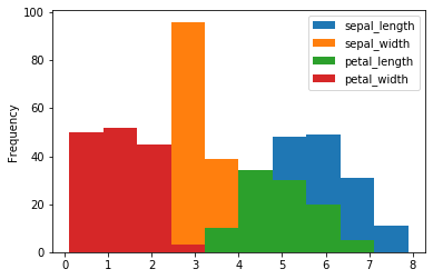
Alternatively, pass kind='hist' to get the same output:
iris.plot(kind = 'hist')The resulting chart displays the identical feature histograms:
![Histogram of Iris feature distributions using kind='hist']](../../images/image-58.png)
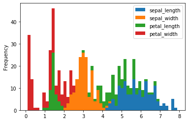
Stack the histograms and increase the bin count to 50 for finer interval resolution:
iris.plot(kind = 'hist', stacked = True, bins = 50)The stacked histogram displays the combined distribution peaks across 50 bins:
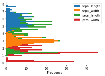
Rotate the histogram layout horizontally by setting the orientation parameter:
iris.plot(kind = 'hist', stacked = True, bins = 50, orientation = 'horizontal')The horizontal stacked histogram plots value counts along the x-axis:
Processing Differences
Use the diff() function to calculate the difference of consecutive values down the index axis:
iris['sepal_width'].diff()[:10]0 NaN
1 -0.5
2 0.2
3 -0.1
4 0.5
5 0.3
6 -0.5
7 0.0
8 -0.5
9 0.2
Name: sepal_width, dtype: float64Plot the distribution of these consecutive differences:
iris['sepal_width'].diff().plot(kind = 'hist', stacked = True, bins = 50)The histogram shows the spread of step differences for the sepal width measurements:
Drop the categorical columns to isolate the numerical features:
df = iris.drop(['species'], axis = 1)
df.diff()[:10]| sepal_length | sepal_width | petal_length | petal_width | |
|---|---|---|---|---|
| 0 | NaN | NaN | NaN | NaN |
| 1 | -0.2 | -0.5 | 0.0 | 0.0 |
| 2 | -0.2 | 0.2 | -0.1 | 0.0 |
| 3 | -0.1 | -0.1 | 0.2 | 0.0 |
| 4 | 0.4 | 0.5 | -0.1 | 0.0 |
| 5 | 0.4 | 0.3 | 0.3 | 0.2 |
| 6 | -0.8 | -0.5 | -0.3 | -0.1 |
| 7 | 0.4 | 0.0 | 0.1 | -0.1 |
| 8 | -0.6 | -0.5 | -0.1 | 0.0 |
| 9 | 0.5 | 0.2 | 0.1 | -0.1 |
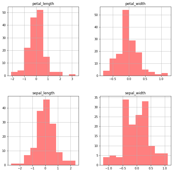
Plot separate histograms for each feature's difference values on a grid layout:
df.diff().hist(color = 'r', alpha = 0.5, figsize=(10,10))The resulting 2x2 grid plots the difference distributions for each numerical column:
Box Plots
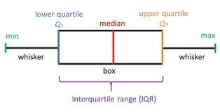
Box plots summarize a distribution using five statistics: the minimum, lower quartile (), median, upper quartile (), and maximum.
The box plot diagram below details how these parameters partition a distribution:
Define a styling dictionary to customize the colors of the boxes and whiskers:
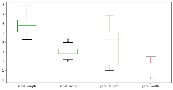
color = {'boxes': 'DarkGreen', 'whiskers': 'r'}
color{'boxes': 'DarkGreen', 'whiskers': 'r'}Generate box plots for the numerical Iris columns using the custom style colors:
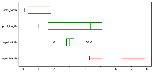
df.plot(kind = 'box', figsize=(10,5), color = color)The box plots compare the medians, interquartile ranges, and outliers across the Iris features:
Rotate the box plots horizontally by setting vert=False:
df.plot(kind = 'box', figsize=(10,5), color = color, vert = False)The horizontal box plots display the same distributions rotated 90 degrees:
Area and Scatter Plots
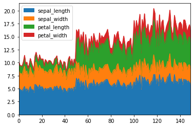
Area plots stack filled line segments, showing cumulative totals over an axis. Generate a stacked area plot using the Iris features:
df.plot(kind = 'area')The area plot stacks the feature values to display cumulative totals:
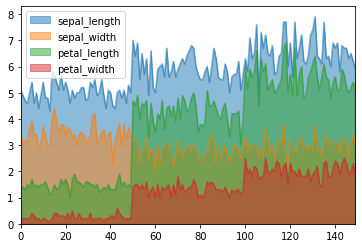
Disable stacking by setting stacked=False to overlay transparent filled line areas:
df.plot.area(stacked = False)The unstacked area plot displays overlapping filled curves representing individual feature dimensions:
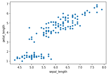
Scatter plots map individual samples as coordinate points. Plot sepal length against petal length:
df.plot.scatter(x = 'sepal_length', y = 'petal_length')The scatter plot shows the positive correlation between Iris sepal length and petal length:
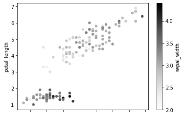
Color-code the points based on sepal width values by passing the column to the c parameter:
df.plot.scatter(x = 'sepal_length', y = 'petal_length', c = 'sepal_width')The points are shaded based on sepal width values using the default colormap:
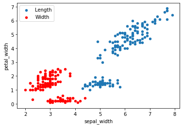
Overlay two scatter series onto the same plot by sharing the axes reference ax:
ax = df.plot.scatter(x = 'sepal_length', y = 'petal_length', label = 'Length');
df.plot.scatter(x = 'sepal_width', y = 'petal_width', label = 'Width', ax = ax, color = 'r')
The plot overlays the sepal length vs. petal length (blue) and sepal width vs. petal width (red) series:
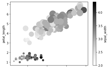
Scale the marker diameters dynamically by passing values from a continuous column (e.g., petal_width) to the s parameter:
df.plot.scatter(x = 'sepal_length', y = 'petal_length', c = 'sepal_width', s = df['petal_width']*200)The plot adjusts marker sizes based on petal width, adding a third variable dimension:
Hex and Pie Plots
Hexbin plots aggregate crowded coordinate points into hexagonal bins. This is useful for large datasets to avoid overplotting.
Hexagonal Binning
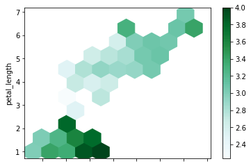
Plot sepal length vs. petal length using hexbins, scaling the bin colors by sepal width:
df.plot.hexbin(x = 'sepal_length', y = 'petal_length', gridsize = 10, C = 'sepal_width')The hexbin plot aggregates the density of data points within hexagonal regions:
Pie Charts
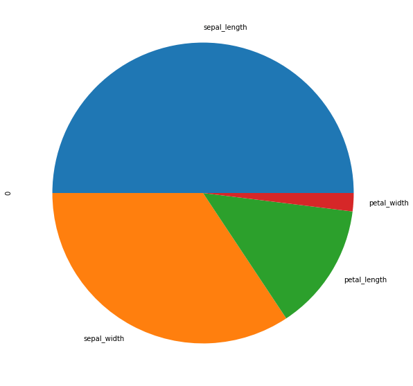
Pie charts display proportional relationships within a single column. Extract the first row of data:
d = df.iloc[0]
dsepal_length 5.1
sepal_width 3.5
petal_length 1.4
petal_width 0.2
Name: 0, dtype: float64Plot the first row's feature values as a pie chart:
d.plot.pie(figsize = (10,10))The pie chart compares the proportions of the features for the single sample:
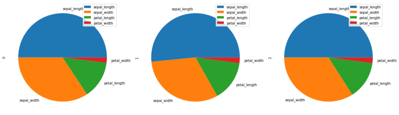
To compare multiple observations, transpose the first three rows of the DataFrame:
d = df.head(3).T
d| 0 | 1 | 2 | |
|---|---|---|---|
| sepal_length | 5.1 | 4.9 | 4.7 |
| sepal_width | 3.5 | 3.0 | 3.2 |
| petal_length | 1.4 | 1.4 | 1.3 |
| petal_width | 0.2 | 0.2 | 0.2 |
Generate separate pie subplots for each sample column:
d.plot.pie(subplots = True, figsize = (20, 20))The grid displays three pie charts comparing feature proportions across the samples:
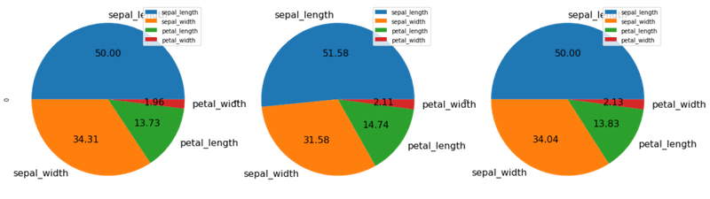
Add percentage annotations and customize label sizes using autopct and fontsize:
d.plot.pie(subplots = True, figsize = (20, 20), fontsize = 16, autopct = '%.2f')The pie charts display percentage values calculated for each wedge:
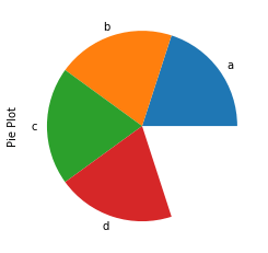
If the sum of values in a Series is less than 1, Pandas plots an incomplete pie chart with an empty wedge representing the remainder:
x=[0.2]*4
print(x)
print(sum(x))[0.2, 0.2, 0.2, 0.2]
0.8Generate the pie chart for this series:
series = pd.Series(x, index = ['a','b','c', 'd'], name = 'Pie Plot')
series.plot.pie()
The pie chart leaves a blank segment representing the 0.2 remainder:
Scatter Matrix
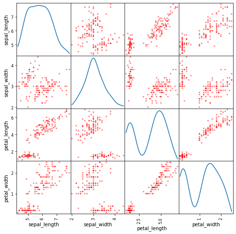
A scatter matrix (pairs plot) displays all pairwise correlations across numerical columns in a single grid layout. Import the utility function:
from pandas.plotting import scatter_matrixPlot the pairwise relationships, using kernel density estimates along the diagonal:
scatter_matrix(df, figsize= (8,8), diagonal='kde', color = 'r')
plt.show()
The scatter matrix displays pairwise scatter plots off the diagonal and univariate KDE plots along the diagonal:
KDE Plots
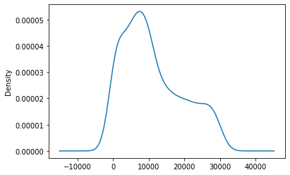
Kernel Density Estimate (KDE) plots visualize the probability density of a continuous variable. Plot the density for the cumulative Series:
ts.plot.kde()The KDE plot displays the smooth probability density curve of the Series values:
Andrews Curves
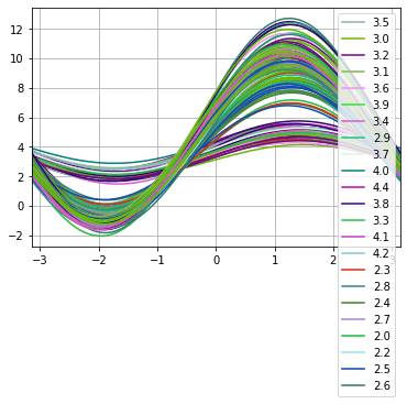
Andrews curves project multivariate data onto a one-dimensional curve using Fourier coefficients:
Where the coefficients correspond to the feature values, and is linearly spaced between and . Each row is plotted as a curve. Import the function:
from pandas.plotting import andrews_curvesPlot the Andrews curves grouped by sepal width:
andrews_curves(df, 'sepal_width')The Andrews curves display the multivariate relationships as overlapping wave patterns:
Subplots
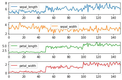
To split DataFrame columns into separate subplots, set subplots=True. Set sharex=False to give each plot its own independent x-axis:
df.plot(subplots = True, sharex = False)
plt.tight_layout()
The grid stacks four line charts showing individual column values over the sample index:
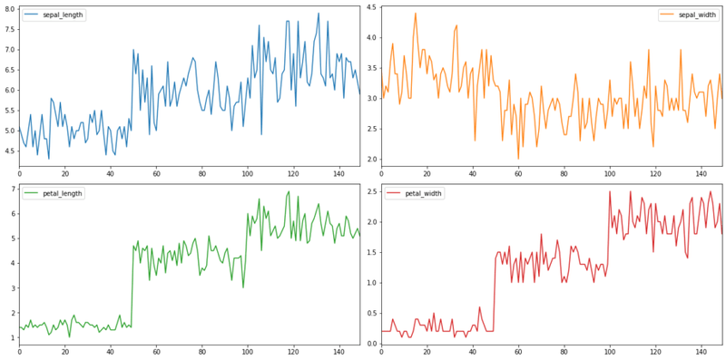
Customize the subplot layout grid by passing a layout tuple (e.g., (2,2) for a 2x2 grid):
df.plot(subplots = True, sharex = False, layout = (2,2), figsize = (16,8))
plt.tight_layout()
The 2x2 grid displays the four feature subplots in a clean rectangular arrangement:
Conclusion
In this tutorial, you explored Pandas' built-in data visualization tools. By working with random walks, the Iris dataset, and the Titanic dataset, you generated line, bar, stacked bar, area, scatter, hexbin, pie, scatter matrix, KDE, Andrews curve, and grid subplot visualizations.
Key takeaways:
- Convenient Wrapper: Pandas plotting wraps Matplotlib, allowing you to create charts directly from DataFrame and Series objects with minimal syntax.
- Plot Customization: You can customize figure sizes, axes titles, legends, log scales, secondary y-axes, and color mapping directly from the
.plot()call. - Grid Layouts: Splitting columns into subplots or using tools like
scatter_matrixprovides a quick overview of multi-variable relationships. - Analytical Selection: Selecting the right plot type (e.g., hexbins for dense scatter plots or boxen/box plots for quantiles) is key to understanding your data distribution before modeling.
Next steps:
- Read Complete Seaborn Tutorial to learn high-level statistical visualization techniques.
- Explore Matplotlib Crash Course to gain low-level layout control and create custom compound figures.
- Apply these visualization techniques to your own dataset to identify patterns and correlations during exploratory data analysis.