Linear Regression with Python | Machine learlearning | KGP Talkie
What is Linear Regression?
You are a real estate agent and you want to predict the house price. It would be great if you can make some kind of automated system which predict price of a house based on various input which is known as feature.
Supervised Machine learning algorithms needs some data to train its model before making a prediction. For that we have a Boston Dataset.
Where can Linear Regression be used?

It is a very powerful technique and can be used to understand the factors that influence profitability. It can be used to forecast sales in the coming months by analyzing the sales data for previous months. It can also be used to gain various insights about customer behaviour.
What is Regression?
Let’s first understand what exactly Regression means it is a statistical method used in finance, investing, and other disciplines that attempts to determine the strength and character of the relationship between one dependent variable (usually denoted by Y) and a series of other variables known as independent variables.Linear Regression is a statistical technique where based on a set of independent variable(s) a dependent variable is predicted.

Regression Examples
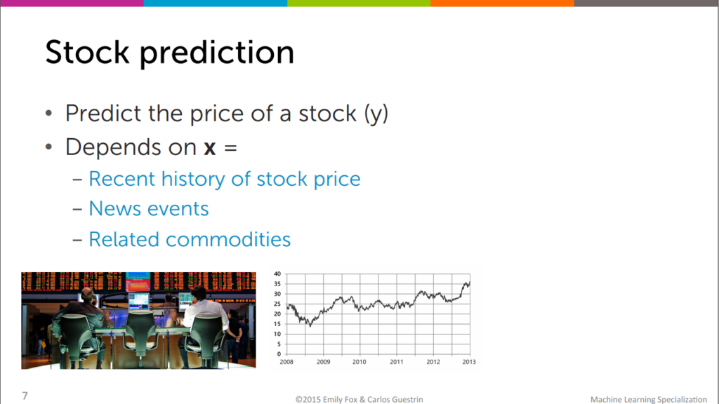
Stock prediction
We can predict the price of stock depends on depedent variable,x. let’s say recent history of stock price,news events.
Tweet popularity
We can also estimate number of people will retweet for your tweet in tewitter based number of followers,popularity of hashtag.

In real estate
As we discussed earlier,We can also predict the house prices and land prices in real estate.

Regression Types
It is of two types: simple linear regression and multiple linear regression.
Simple linear regression: It is characterized by an variable quantity.
Simple Linear Regression
yi=β0+β1Xi+εi
y = dependent variable
β0 = population of intercept
βi = population of co-efficient
x = independent variable
εi = Random error
Multiple Linear Regression
It(as the name suggests) is characterized by multiple independent variables (more than 1). While you discover the simplest fit line, you’ll be able to adjust a polynomial or regression toward the mean. And these are called polynomial or regression toward the mean.

Assessing the performance of the model

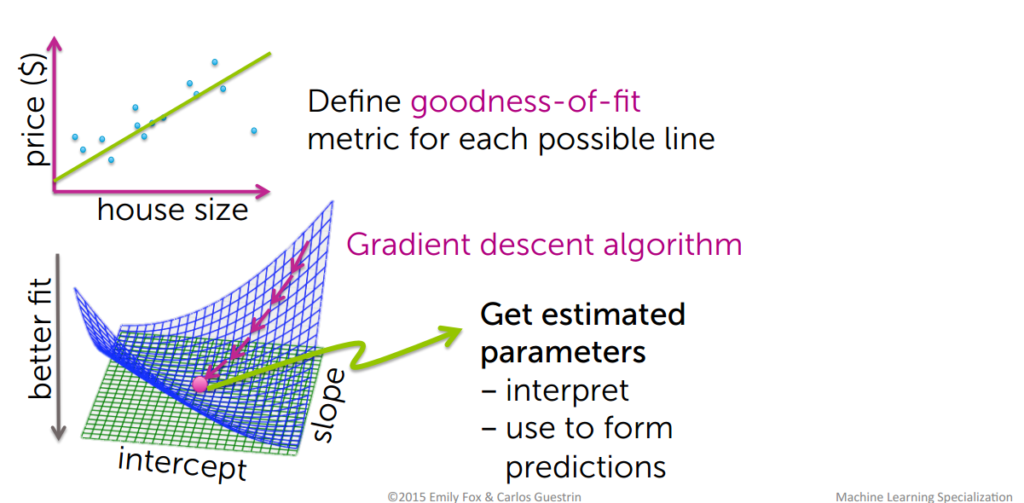
How do we determine the best fit line?
The line for which the the error between the predicted values and the observed values is minimum is called the best fit line or the regression line. These errors are also called as residuals. The residuals can be visualized by the vertical lines from the observed data value to the regression line.
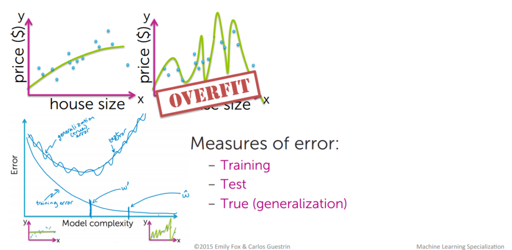
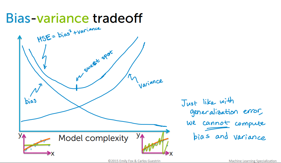
Bias-Variance tradeoff
Bias are the simplifying assumptions made by a model to make the target function easier to learn. Variance is the amount that the estimate of the target function will change if different training data was used. The goal of any supervised machine learning algorithm is to achieve low bias and low variance. In turn the algorithm should achieve good prediction performance.

How to determine error

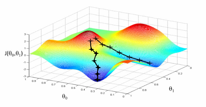
Gradient descent algorithm
Gradient descent is the backbone of an machine learning algorithm.To estimate the predicted value for,Y we will start with random value for, θ
then derive cost using the above equation which stands for Mean Squared Error(MSE).Remember we will try to get the minimum value of cost function that we will get by derivation of cost function .
Gradient Descent Algorithm to reduce the cost function

You might not end up in global minimum
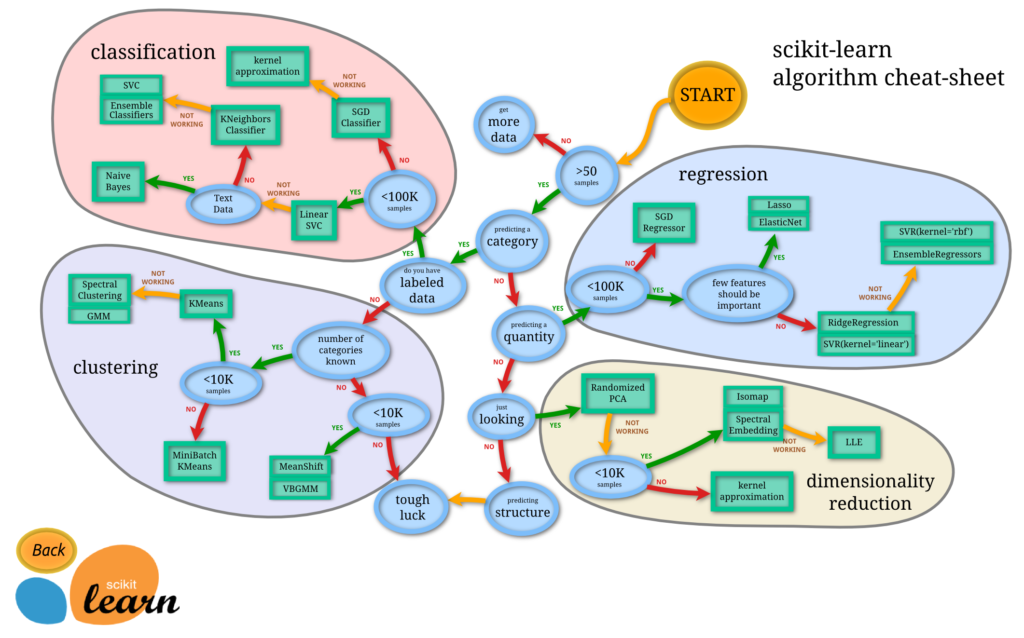
Implimentation with sklearn

scikit-learn
- Machine Learning in Python
- Simple and efficient tools for data mining and data analysis
- Accessible to everybody, and reusable in various contexts
- Built on NumPy, SciPy, and matplotlib
- Open source, commercially usable – BSD license
Learn more here: https://scikit-learn.org/stable/
Image Source: https://cdn-images-1.medium.com/max/2400/1*2NR51X0FDjLB13u4WdYc4g.png
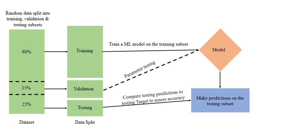
Let’s discuss something about training a ML model, this model generally will try to predict one variable based on all the others. To verify how well this model works, we need a second data set, the test set. We use the model we learned from the training data and see how well it predicts the variable in question for the training set. When given a data set for which you want to use Machine Learning, typically you would divide it randomly into 2 sets. One will be used for training, the other for testing.
Training and testing splitting
Lets get started
import numpy as np
import pandas as pd
import seaborn as sns
import matplotlib.pyplot as plt
from sklearn.datasets import load_boston
from sklearn.model_selection import train_test_split
from sklearn.linear_model import LinearRegression
from sklearn.metrics import mean_absolute_error, mean_squared_error
boston = load_boston()
type(boston)
sklearn.utils.Bunch
boston.keys()
dict_keys(['data', 'target', 'feature_names', 'DESCR', 'filename'])
print(boston.DESCR)
.. _boston_dataset:

Boston house prices dataset
---------------------------

**Data Set Characteristics:**

    :Number of Instances: 506

    :Number of Attributes: 13 numeric/categorical predictive. Median Value (attribute 14) is usually the target.

    :Attribute Information (in order):
        - CRIM     per capita crime rate by town
        - ZN       proportion of residential land zoned for lots over 25,000 sq.ft.
        - INDUS    proportion of non-retail business acres per town
        - CHAS     Charles River dummy variable (= 1 if tract bounds river; 0 otherwise)
        - NOX      nitric oxides concentration (parts per 10 million)
        - RM       average number of rooms per dwelling
        - AGE      proportion of owner-occupied units built prior to 1940
        - DIS      weighted distances to five Boston employment centres
        - RAD      index of accessibility to radial highways
        - TAX      full-value property-tax rate per $10,000
        - PTRATIO  pupil-teacher ratio by town
        - B        1000(Bk - 0.63)^2 where Bk is the proportion of blacks by town
        - LSTAT    % lower status of the population
        - MEDV     Median value of owner-occupied homes in $1000's

    :Missing Attribute Values: None

    :Creator: Harrison, D. and Rubinfeld, D.L.

This is a copy of UCI ML housing dataset.
https://archive.ics.uci.edu/ml/machine-learning-databases/housing/


This dataset was taken from the StatLib library which is maintained at Carnegie Mellon University.

The Boston house-price data of Harrison, D. and Rubinfeld, D.L. 'Hedonic
prices and the demand for clean air', J. Environ. Economics & Management,
vol.5, 81-102, 1978.   Used in Belsley, Kuh & Welsch, 'Regression diagnostics
...', Wiley, 1980.   N.B. Various transformations are used in the table on
pages 244-261 of the latter.

The Boston house-price data has been used in many machine learning papers that address regression
problems.
boston.feature_names
array(['CRIM', 'ZN', 'INDUS', 'CHAS', 'NOX', 'RM', 'AGE', 'DIS', 'RAD',
       'TAX', 'PTRATIO', 'B', 'LSTAT'], dtype='<U7')
boston.target[: 5]
array([24. , 21.6, 34.7, 33.4, 36.2])
data = boston.data
type(data)
numpy.ndarray
data.shape
(506, 13)
DataFrame()
A Data frame is a two-dimensional data structure, i.e., data is aligned in a tabular fashion in rows and columns.
data = pd.DataFrame(data = data, columns= boston.feature_names)
data.head()
| CRIM | ZN | INDUS | CHAS | NOX | RM | AGE | DIS | RAD | TAX | PTRATIO | B | LSTAT | |
|---|---|---|---|---|---|---|---|---|---|---|---|---|---|
| 0 | 0.00632 | 18.0 | 2.31 | 0.0 | 0.538 | 6.575 | 65.2 | 4.0900 | 1.0 | 296.0 | 15.3 | 396.90 | 4.98 |
| 1 | 0.02731 | 0.0 | 7.07 | 0.0 | 0.469 | 6.421 | 78.9 | 4.9671 | 2.0 | 242.0 | 17.8 | 396.90 | 9.14 |
| 2 | 0.02729 | 0.0 | 7.07 | 0.0 | 0.469 | 7.185 | 61.1 | 4.9671 | 2.0 | 242.0 | 17.8 | 392.83 | 4.03 |
| 3 | 0.03237 | 0.0 | 2.18 | 0.0 | 0.458 | 6.998 | 45.8 | 6.0622 | 3.0 | 222.0 | 18.7 | 394.63 | 2.94 |
| 4 | 0.06905 | 0.0 | 2.18 | 0.0 | 0.458 | 7.147 | 54.2 | 6.0622 | 3.0 | 222.0 | 18.7 | 396.90 | 5.33 |
data['Price'] = boston.target
data.head()
| CRIM | ZN | INDUS | CHAS | NOX | RM | AGE | DIS | RAD | TAX | PTRATIO | B | LSTAT | Price | |
|---|---|---|---|---|---|---|---|---|---|---|---|---|---|---|
| 0 | 0.00632 | 18.0 | 2.31 | 0.0 | 0.538 | 6.575 | 65.2 | 4.0900 | 1.0 | 296.0 | 15.3 | 396.90 | 4.98 | 24.0 |
| 1 | 0.02731 | 0.0 | 7.07 | 0.0 | 0.469 | 6.421 | 78.9 | 4.9671 | 2.0 | 242.0 | 17.8 | 396.90 | 9.14 | 21.6 |
| 2 | 0.02729 | 0.0 | 7.07 | 0.0 | 0.469 | 7.185 | 61.1 | 4.9671 | 2.0 | 242.0 | 17.8 | 392.83 | 4.03 | 34.7 |
| 3 | 0.03237 | 0.0 | 2.18 | 0.0 | 0.458 | 6.998 | 45.8 | 6.0622 | 3.0 | 222.0 | 18.7 | 394.63 | 2.94 | 33.4 |
| 4 | 0.06905 | 0.0 | 2.18 | 0.0 | 0.458 | 7.147 | 54.2 | 6.0622 | 3.0 | 222.0 | 18.7 | 396.90 | 5.33 | 36.2 |
Understand your data
data.describe()
| CRIM | ZN | INDUS | CHAS | NOX | RM | AGE | DIS | RAD | TAX | PTRATIO | B | LSTAT | Price | |
|---|---|---|---|---|---|---|---|---|---|---|---|---|---|---|
| count | 506.000000 | 506.000000 | 506.000000 | 506.000000 | 506.000000 | 506.000000 | 506.000000 | 506.000000 | 506.000000 | 506.000000 | 506.000000 | 506.000000 | 506.000000 | 506.000000 |
| mean | 3.613524 | 11.363636 | 11.136779 | 0.069170 | 0.554695 | 6.284634 | 68.574901 | 3.795043 | 9.549407 | 408.237154 | 18.455534 | 356.674032 | 12.653063 | 22.532806 |
| std | 8.601545 | 23.322453 | 6.860353 | 0.253994 | 0.115878 | 0.702617 | 28.148861 | 2.105710 | 8.707259 | 168.537116 | 2.164946 | 91.294864 | 7.141062 | 9.197104 |
| min | 0.006320 | 0.000000 | 0.460000 | 0.000000 | 0.385000 | 3.561000 | 2.900000 | 1.129600 | 1.000000 | 187.000000 | 12.600000 | 0.320000 | 1.730000 | 5.000000 |
| 25% | 0.082045 | 0.000000 | 5.190000 | 0.000000 | 0.449000 | 5.885500 | 45.025000 | 2.100175 | 4.000000 | 279.000000 | 17.400000 | 375.377500 | 6.950000 | 17.025000 |
| 50% | 0.256510 | 0.000000 | 9.690000 | 0.000000 | 0.538000 | 6.208500 | 77.500000 | 3.207450 | 5.000000 | 330.000000 | 19.050000 | 391.440000 | 11.360000 | 21.200000 |
| 75% | 3.677083 | 12.500000 | 18.100000 | 0.000000 | 0.624000 | 6.623500 | 94.075000 | 5.188425 | 24.000000 | 666.000000 | 20.200000 | 396.225000 | 16.955000 | 25.000000 |
| max | 88.976200 | 100.000000 | 27.740000 | 1.000000 | 0.871000 | 8.780000 | 100.000000 | 12.126500 | 24.000000 | 711.000000 | 22.000000 | 396.900000 | 37.970000 | 50.000000 |
data.info()
Pandas dataframe.info() function is used to get a concise summary of the dataframe. It comes really handy when doing exploratory analysis of the data. To get a quick overview of the dataset we use the dataframe.info() function.
data.info()
<class 'pandas.core.frame.DataFrame'>
RangeIndex: 506 entries, 0 to 505
Data columns (total 14 columns):
 #   Column   Non-Null Count  Dtype
---  ------   --------------  -----
 0   CRIM     506 non-null    float64
 1   ZN       506 non-null    float64
 2   INDUS    506 non-null    float64
 3   CHAS     506 non-null    float64
 4   NOX      506 non-null    float64
 5   RM       506 non-null    float64
 6   AGE      506 non-null    float64
 7   DIS      506 non-null    float64
 8   RAD      506 non-null    float64
 9   TAX      506 non-null    float64
 10  PTRATIO  506 non-null    float64
 11  B        506 non-null    float64
 12  LSTAT    506 non-null    float64
 13  Price    506 non-null    float64
dtypes: float64(14)
memory usage: 55.5 KB
data.isnull().sum()
CRIM       0
ZN         0
INDUS      0
CHAS       0
NOX        0
RM         0
AGE        0
DIS        0
RAD        0
TAX        0
PTRATIO    0
B          0
LSTAT      0
Price      0
dtype: int64
Data Visualization
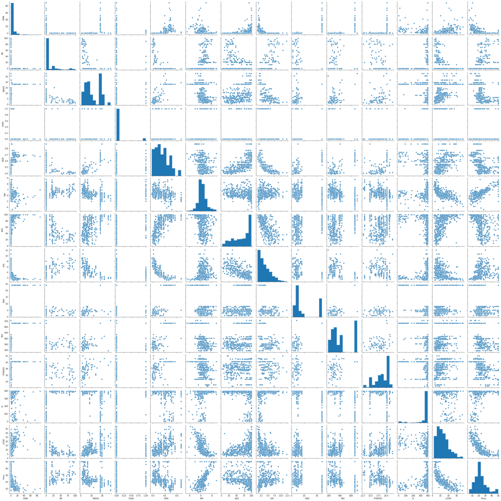
We will start by creating a scatterplot matrix that will allow us to visualize the pair-wise relationships and correlations between the different features.
It is also quite useful to have a quick overview of how the data is distributed and wheter it cointains or not outliers.
sns.pairplot(data)
plt.show()
rows = 2
cols = 7
fig, ax = plt.subplots(nrows= rows, ncols= cols, figsize = (16,4))
col = data.columns
index = 0
for i in range(rows):
    for j in range(cols):
        sns.distplot(data[col[index]], ax = ax[i][j])
        index = index + 1
plt.tight_layout()
plt.show()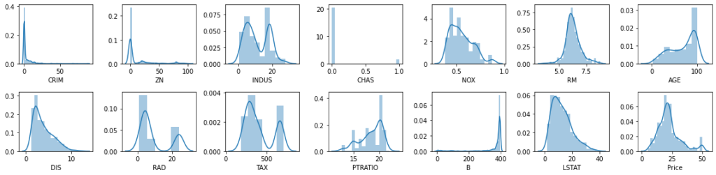
We are going to create now a correlation matrix to quantify and summarize the relationships between the variables.
This correlation matrix is closely related witn covariance matrix, in fact it is a rescaled version of the covariance matrix, computed from standardize features.
It is a square matrix (with the same number of columns and rows) that contains the Person’s r correlation coefficient.
corrmat = data.corr()
corrmat
| CRIM | ZN | INDUS | CHAS | NOX | RM | AGE | DIS | RAD | TAX | PTRATIO | B | LSTAT | Price | |
|---|---|---|---|---|---|---|---|---|---|---|---|---|---|---|
| CRIM | 1.000000 | -0.200469 | 0.406583 | -0.055892 | 0.420972 | -0.219247 | 0.352734 | -0.379670 | 0.625505 | 0.582764 | 0.289946 | -0.385064 | 0.455621 | -0.388305 |
| ZN | -0.200469 | 1.000000 | -0.533828 | -0.042697 | -0.516604 | 0.311991 | -0.569537 | 0.664408 | -0.311948 | -0.314563 | -0.391679 | 0.175520 | -0.412995 | 0.360445 |
| INDUS | 0.406583 | -0.533828 | 1.000000 | 0.062938 | 0.763651 | -0.391676 | 0.644779 | -0.708027 | 0.595129 | 0.720760 | 0.383248 | -0.356977 | 0.603800 | -0.483725 |
| CHAS | -0.055892 | -0.042697 | 0.062938 | 1.000000 | 0.091203 | 0.091251 | 0.086518 | -0.099176 | -0.007368 | -0.035587 | -0.121515 | 0.048788 | -0.053929 | 0.175260 |
| NOX | 0.420972 | -0.516604 | 0.763651 | 0.091203 | 1.000000 | -0.302188 | 0.731470 | -0.769230 | 0.611441 | 0.668023 | 0.188933 | -0.380051 | 0.590879 | -0.427321 |
| RM | -0.219247 | 0.311991 | -0.391676 | 0.091251 | -0.302188 | 1.000000 | -0.240265 | 0.205246 | -0.209847 | -0.292048 | -0.355501 | 0.128069 | -0.613808 | 0.695360 |
| AGE | 0.352734 | -0.569537 | 0.644779 | 0.086518 | 0.731470 | -0.240265 | 1.000000 | -0.747881 | 0.456022 | 0.506456 | 0.261515 | -0.273534 | 0.602339 | -0.376955 |
| DIS | -0.379670 | 0.664408 | -0.708027 | -0.099176 | -0.769230 | 0.205246 | -0.747881 | 1.000000 | -0.494588 | -0.534432 | -0.232471 | 0.291512 | -0.496996 | 0.249929 |
| RAD | 0.625505 | -0.311948 | 0.595129 | -0.007368 | 0.611441 | -0.209847 | 0.456022 | -0.494588 | 1.000000 | 0.910228 | 0.464741 | -0.444413 | 0.488676 | -0.381626 |
| TAX | 0.582764 | -0.314563 | 0.720760 | -0.035587 | 0.668023 | -0.292048 | 0.506456 | -0.534432 | 0.910228 | 1.000000 | 0.460853 | -0.441808 | 0.543993 | -0.468536 |
| PTRATIO | 0.289946 | -0.391679 | 0.383248 | -0.121515 | 0.188933 | -0.355501 | 0.261515 | -0.232471 | 0.464741 | 0.460853 | 1.000000 | -0.177383 | 0.374044 | -0.507787 |
| B | -0.385064 | 0.175520 | -0.356977 | 0.048788 | -0.380051 | 0.128069 | -0.273534 | 0.291512 | -0.444413 | -0.441808 | -0.177383 | 1.000000 | -0.366087 | 0.333461 |
| LSTAT | 0.455621 | -0.412995 | 0.603800 | -0.053929 | 0.590879 | -0.613808 | 0.602339 | -0.496996 | 0.488676 | 0.543993 | 0.374044 | -0.366087 | 1.000000 | -0.737663 |
| Price | -0.388305 | 0.360445 | -0.483725 | 0.175260 | -0.427321 | 0.695360 | -0.376955 | 0.249929 | -0.381626 | -0.468536 | -0.507787 | 0.333461 | -0.737663 | 1.000000 |
Heatmap ( )
A heatmap is a two-dimensional graphical representation of data where the individual values that are contained in a matrix are represented as colors. The seaborn python package allows the creation of annotated heatmaps which can be tweaked using Matplotlib tools as per the creator’s requirement.
Now try look into the following script:
fig, ax = plt.subplots(figsize = (18, 10))
sns.heatmap(corrmat, annot = True, annot_kws={'size': 12})
plt.show()
corrmat.index.values
array(['CRIM', 'ZN', 'INDUS', 'CHAS', 'NOX', 'RM', 'AGE', 'DIS', 'RAD',
       'TAX', 'PTRATIO', 'B', 'LSTAT', 'Price'], dtype=object)
def getCorrelatedFeature(corrdata, threshold):
feature = []
value = []
for i, index in enumerate(corrdata.index):
if abs(corrdata[index])> threshold:
feature.append(index)
value.append(corrdata[index])
df = pd.DataFrame(data = value, index = feature, columns=['Corr Value'])
return dfthreshold = 0.50 corr_value = getCorrelatedFeature(corrmat['Price'], threshold) corr_value
| Corr Value | |
|---|---|
| RM | 0.695360 |
| PTRATIO | -0.507787 |
| LSTAT | -0.737663 |
| Price | 1.000000 |
corr_value.index.values
array(['RM', 'PTRATIO', 'LSTAT', 'Price'], dtype=object)
correlated_data = data[corr_value.index]
correlated_data.head()
| RM | PTRATIO | LSTAT | Price | |
|---|---|---|---|---|
| 0 | 6.575 | 15.3 | 4.98 | 24.0 |
| 1 | 6.421 | 17.8 | 9.14 | 21.6 |
| 2 | 7.185 | 17.8 | 4.03 | 34.7 |
| 3 | 6.998 | 18.7 | 2.94 | 33.4 |
| 4 | 7.147 | 18.7 | 5.33 | 36.2 |
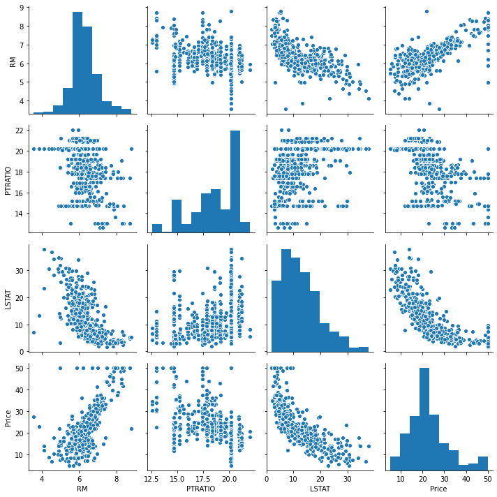
Pairplot and Corrmat of correlated data
A pairplot plot a pairwise relationships in a dataset. Let’s look at the pair plot of correlated data.
sns.pairplot(correlated_data)
plt.tight_layout()
sns.heatmap(correlated_data.corr(), annot=True, annot_kws={'size': 12},linewidth =0)
plt.show()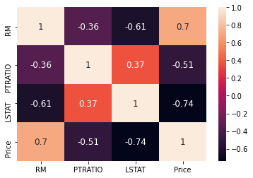
Shuffle and Split Data
we will take the Boston housing dataset and split the data into training and testing subsets. Typically, the data is also shuffled into a random order when creating the training and testing subsets to remove any bias in the ordering of the dataset.
Let’s try to observe the following script:
X = correlated_data.drop(labels=['Price'], axis = 1)
y = correlated_data['Price']
X.head()
| RM | PTRATIO | LSTAT | |
|---|---|---|---|
| 0 | 6.575 | 15.3 | 4.98 |
| 1 | 6.421 | 17.8 | 9.14 |
| 2 | 7.185 | 17.8 | 4.03 |
| 3 | 6.998 | 18.7 | 2.94 |
| 4 | 7.147 | 18.7 | 5.33 |
X_train, X_test, y_train, y_test = train_test_split(X, y, test_size = 0.2, random_state = 0)
X_train.shape, X_test.shape
((404, 3), (102, 3))
Lets train the mode
model = LinearRegression()
model.fit(X_train, y_train)
LinearRegression()
y_predict = model.predict(X_test)
df = pd.DataFrame(data = [y_predict, y_test])
df.T
| 0 | 1 | |
|---|---|---|
| 0 | 27.609031 | 22.6 |
| 1 | 22.099034 | 50.0 |
| 2 | 26.529255 | 23.0 |
| 3 | 12.507986 | 8.3 |
| 4 | 22.254879 | 21.2 |
| … | … | … |
| 97 | 28.271228 | 24.7 |
| 98 | 18.467419 | 14.1 |
| 99 | 18.558070 | 18.7 |
| 100 | 24.681964 | 28.1 |
| 101 | 20.826879 | 19.8 |
102 rows × 2 columns
Defining performance metrics
It is difficult to measure the quality of a given model without quantifying its performance over training and testing. This is typically done using some type of performance metric, whether it is through calculating some type of error, the goodness of fit, or some other useful measurement. For this project, you will be calculating the coefficient of determination, R2, to quantify your model’s performance. The coefficient of determination for a model is a useful statistic in regression analysis, as it often describes how “good” that model is at making predictions.
The values for R2 range from 0 to 1, which captures the percentage of squared correlation between the predicted and actual values of the target variable. A model with an R2 of 0 always fails to predict the target variable, whereas a model with an R2 of 1 perfectly predicts the target variable. Any value between 0 and 1 indicates what percentage of the target variable, using this model, can be explained by the features. A model can be given a negative R2 as well, which indicates that the model is no better than one that naively predicts the mean of the target variable.
For the performance_metric function in the code cell below, you will need to implement the following:
Use r2_score from sklearn.metrics to perform a performance calculation between y_true and y_predict. Assign the performance score to the score variable.
Now we will find $R^2$ which is defined as follows :
$$SS_{t} = {\frac 1n\sum_{i=1}^n(y_i-\hat{y})^2}$$
$$SS_{r} = {\frac 1n\sum_{i=1}^n(y_i-\hat{y}^2}$$
$$R^{2} = 1-\frac{SS}{SS}$$ SSt = total sum of squares
SSr = total sum of squares of residuals
R2 = range from 0 to 1 and also negative if model is completely wrong.

Regression Evaluation Metrics
Here are three common evaluation metrics for regression problems:
Mean Absolute Error (MAE) is the mean of the absolute value of the errors: $$\frac 1n\sum_{i=1}^n|y_i-\hat{y}_i|$$
Mean Squared Error (MSE) is the mean of the squared errors: $${\frac 1n\sum_{i=1}^n(y_i-\hat{y}_i)^2}$$
Root Mean Squared Error (RMSE) is the square root of the mean of the squared errors: $$\sqrt{\frac 1n\sum_{i=1}^n(y_i-\hat{y}_i)^2}$$
Comparing these metrics:
- MAE is the easiest to
understand, because it’s theaverage error. - MSE is more popular than MAE, because MSE
"punishes"larger errors, which tends to be useful in the real world. - RMSE is even more popular than MSE, because RMSE is
interpretable in the "y" units.
All of these are loss functions, because we want to minimize them.
from sklearn.metrics import r2_score
correlated_data.columns
Index(['RM', 'PTRATIO', 'LSTAT', 'Price'], dtype='object')
score = r2_score(y_test, y_predict)
mae = mean_absolute_error(y_test, y_predict)
mse = mean_squared_error(y_test, y_predict)
print('r2_score: ', score)
print('mae: ', mae)
print('mse: ', mse)
r2_score: 0.48816420156925056 mae: 4.404434993909258 mse: 41.67799012221684
Store feature performance
total_features = []
total_features_name = []
selected_correlation_value = []
r2_scores = []
mae_value = []
mse_value = []
def performance_metrics(features, th, y_true, y_pred):
    score = r2_score(y_true, y_pred)
    mae = mean_absolute_error(y_true, y_pred)
    mse = mean_squared_error(y_true, y_pred)
    total_features.append(len(features)-1)
    total_features_name.append(str(features))
    selected_correlation_value.append(th)
    r2_scores.append(score)
    mae_value.append(mae)
    mse_value.append(mse)

    metrics_dataframe = pd.DataFrame(data= [total_features_name, total_features, selected_correlation_value, r2_scores, mae_value, mse_value],
                                    index = ['features name', '#feature', 'corr_value', 'r2_score', 'MAE', 'MSE'])
    return metrics_dataframe.T
performance_metrics(correlated_data.columns.values, threshold, y_test, y_predict)
| features name | #feature | corr_value | r2_score | MAE | MSE | |
|---|---|---|---|---|---|---|
| 0 | [‘RM’ ‘PTRATIO’ ‘LSTAT’ ‘Price’] | 3 | 0.5 | 0.488164 | 4.40443 | 41.678 |
Regression plot of the features correlated with the House Price
Let’s try to plot the features in correlation the house price:
rows = 2
cols = 2
fig, ax = plt.subplots(nrows=rows, ncols=cols, figsize = (16, 4))
ax[0, 0].set_title("House price with respect  to RM")
ax[0, 1].set_title("House price with respect to PTRATIO")
ax[1, 0].set_title("House price with respect to LSTAT")
ax[1, 1].set_title("House price with respect to PRICE")
col = correlated_data.columns
index = 0

for i in range(rows):
    for j in range(cols):
        sns.regplot(x = correlated_data[col[index]], y = correlated_data['Price'], ax = ax[i][j])
        index = index + 1
fig.tight_layout()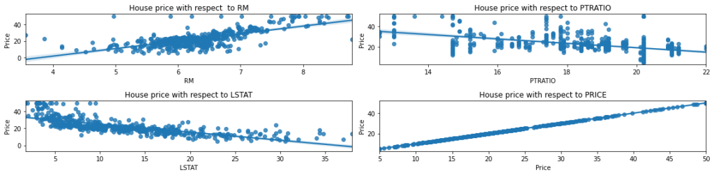
Let’s find out other combination of columns to get better accuracy with >60%
corrmat['Price']
CRIM      -0.388305
ZN         0.360445
INDUS     -0.483725
CHAS       0.175260
NOX       -0.427321
RM         0.695360
AGE       -0.376955
DIS        0.249929
RAD       -0.381626
TAX       -0.468536
PTRATIO   -0.507787
B          0.333461
LSTAT     -0.737663
Price      1.000000
Name: Price, dtype: float64
threshold = 0.60
corr_value = getCorrelatedFeature(corrmat['Price'], threshold)
corr_value
| Corr Value | |
|---|---|
| RM | 0.695360 |
| LSTAT | -0.737663 |
| Price | 1.000000 |
correlated_data = data[corr_value.index]
correlated_data.head()
| RM | LSTAT | Price | |
|---|---|---|---|
| 0 | 6.575 | 4.98 | 24.0 |
| 1 | 6.421 | 9.14 | 21.6 |
| 2 | 7.185 | 4.03 | 34.7 |
| 3 | 6.998 | 2.94 | 33.4 |
| 4 | 7.147 | 5.33 | 36.2 |
Prediction of y from the corr_data. This function return a predicted value for y.
def get_y_predict(corr_data):
    X = corr_data.drop(labels = ['Price'], axis = 1)
    y = corr_data['Price']

    X_train, X_test, y_train, y_test = train_test_split(X, y, test_size = 0.2, random_state = 0)
    model = LinearRegression()
    model.fit(X_train, y_train)
    y_predict = model.predict(X_test)
    return y_predict
y_predict = get_y_predict(correlated_data) performance_metrics(correlated_data.columns.values, threshold, y_test, y_predict)
| features name | #feature | corr_value | r2_score | MAE | MSE | |
|---|---|---|---|---|---|---|
| 0 | [‘RM’ ‘PTRATIO’ ‘LSTAT’ ‘Price’] | 3 | 0.5 | 0.488164 | 4.40443 | 41.678 |
| 1 | [‘RM’ ‘LSTAT’ ‘Price’] | 2 | 0.6 | 0.540908 | 4.14244 | 37.3831 |
Let’s find out other combination of columns to get better accuracy > 70%
corrmat['Price']
CRIM -0.388305 ZN 0.360445 INDUS -0.483725 CHAS 0.175260 NOX -0.427321 RM 0.695360 AGE -0.376955 DIS 0.249929 RAD -0.381626 TAX -0.468536 PTRATIO -0.507787 B 0.333461 LSTAT -0.737663 Price 1.000000 Name: Price, dtype: float64
threshold = 0.70 corr_value = getCorrelatedFeature(corrmat['Price'], threshold) corr_value
| Corr Value | |
|---|---|
| LSTAT | -0.737663 |
| Price | 1.000000 |
correlated_data = data[corr_value.index] correlated_data.head()
| LSTAT | Price | |
|---|---|---|
| 0 | 4.98 | 24.0 |
| 1 | 9.14 | 21.6 |
| 2 | 4.03 | 34.7 |
| 3 | 2.94 | 33.4 |
| 4 | 5.33 | 36.2 |
y_predict = get_y_predict(correlated_data)
performance_metrics(correlated_data.columns.values, threshold, y_test, y_predict)
| features name | #feature | corr_value | r2_score | MAE | MSE | |
|---|---|---|---|---|---|---|
| 0 | [‘RM’ ‘PTRATIO’ ‘LSTAT’ ‘Price’] | 3 | 0.5 | 0.488164 | 4.40443 | 41.678 |
| 1 | [‘RM’ ‘LSTAT’ ‘Price’] | 2 | 0.6 | 0.540908 | 4.14244 | 37.3831 |
| 2 | [‘LSTAT’ ‘Price’] | 1 | 0.7 | 0.430957 | 4.86401 | 46.3363 |
Let’s go ahead and select only RM feature
correlated_data = data[['RM', 'Price']] correlated_data.head()
| RM | Price | |
|---|---|---|
| 0 | 6.575 | 24.0 |
| 1 | 6.421 | 21.6 |
| 2 | 7.185 | 34.7 |
| 3 | 6.998 | 33.4 |
| 4 | 7.147 | 36.2 |
y_predict = get_y_predict(correlated_data) performance_metrics(correlated_data.columns.values, threshold, y_test, y_predict)
| features name | #feature | corr_value | r2_score | MAE | MSE | |
|---|---|---|---|---|---|---|
| 0 | [‘RM’ ‘PTRATIO’ ‘LSTAT’ ‘Price’] | 3 | 0.5 | 0.488164 | 4.40443 | 41.678 |
| 1 | [‘RM’ ‘LSTAT’ ‘Price’] | 2 | 0.6 | 0.540908 | 4.14244 | 37.3831 |
| 2 | [‘LSTAT’ ‘Price’] | 1 | 0.7 | 0.430957 | 4.86401 | 46.3363 |
| 3 | [‘RM’ ‘Price’] | 1 | 0.7 | 0.423944 | 4.32474 | 46.9074 |
Let’s find out other combination of columns to get better accuracy > 40%
threshold = 0.40 corr_value = getCorrelatedFeature(corrmat['Price'], threshold) corr_value
| Corr Value | |
|---|---|
| INDUS | -0.483725 |
| NOX | -0.427321 |
| RM | 0.695360 |
| TAX | -0.468536 |
| PTRATIO | -0.507787 |
| LSTAT | -0.737663 |
| Price | 1.000000 |
correlated_data = data[corr_value.index]
correlated_data.head()
| INDUS | NOX | RM | TAX | PTRATIO | LSTAT | Price | |
|---|---|---|---|---|---|---|---|
| 0 | 2.31 | 0.538 | 6.575 | 296.0 | 15.3 | 4.98 | 24.0 |
| 1 | 7.07 | 0.469 | 6.421 | 242.0 | 17.8 | 9.14 | 21.6 |
| 2 | 7.07 | 0.469 | 7.185 | 242.0 | 17.8 | 4.03 | 34.7 |
| 3 | 2.18 | 0.458 | 6.998 | 222.0 | 18.7 | 2.94 | 33.4 |
| 4 | 2.18 | 0.458 | 7.147 | 222.0 | 18.7 | 5.33 | 36.2 |
y_predict = get_y_predict(correlated_data)
performance_metrics(correlated_data.columns.values, threshold, y_test, y_predict)
| features name | #feature | corr_value | r2_score | MAE | MSE | |
|---|---|---|---|---|---|---|
| 0 | [‘RM’ ‘PTRATIO’ ‘LSTAT’ ‘Price’] | 3 | 0.5 | 0.488164 | 4.40443 | 41.678 |
| 1 | [‘RM’ ‘LSTAT’ ‘Price’] | 2 | 0.6 | 0.540908 | 4.14244 | 37.3831 |
| 2 | [‘LSTAT’ ‘Price’] | 1 | 0.7 | 0.430957 | 4.86401 | 46.3363 |
| 3 | [‘RM’ ‘Price’] | 1 | 0.7 | 0.423944 | 4.32474 | 46.9074 |
| 4 | [‘INDUS’ ‘NOX’ ‘RM’ ‘TAX’ ‘PTRATIO’ ‘LSTAT’ ‘P… | 6 | 0.4 | 0.476203 | 4.3945 | 42.6519 |
Now lets go ahead and understand what is Normalization and Standardization
Standardization
Standardization of data sets is a common requirement for many machine learning estimators implemented in scikit-learn; they might behave badly if the individual features do not more or less look like standard normally distributed data: Gaussian with zero mean and unit variance.
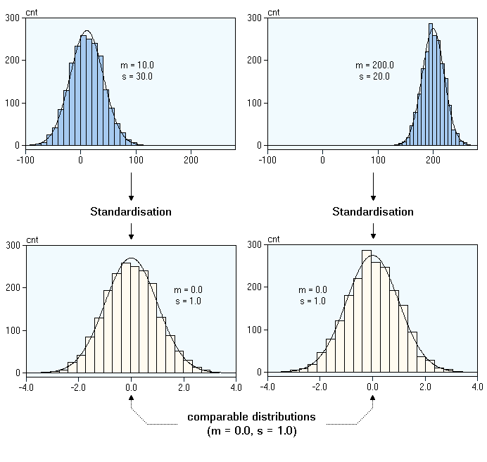
Normalization
Normalization is the process of scaling individual samples to have unit norm. This process can be useful if you plan to use a quadratic form such as the dot-product or any other kernel to quantify the similarity of any pair of samples.
This assumption is the base of the Vector Space Model often used in text classification and clustering contexts.
| Name | Sklearn_class |
|---|---|
| Standard scaler | Standard scaler |
| MinMaxScaler | MinMax Scaler |
| MaxAbs Scaler | MaxAbs Scaler |
| Robust scaler | Robust scaler |
| Quantile Transformer_Normal | Quantile Transformer(output_distribution =’normal’) |
| Quantile Transformer_Uniform | Quantile Transformer(output_distribution = ‘uniform’) |
| PowerTransformer-Yeo-Johnson | PowerTransformer(method = ‘yeo-johnson’) |
| Normalizer | Normalizer |
model = LinearRegression(normalize=True)
model.fit(X_train, y_train)
LinearRegression(normalize=True)
y_predict = model.predict(X_test)
r2_score(y_test, y_predict)
0.48816420156925067
Defining performance metrics
Plotting Learning Curves
Now we will try to plot the Learning curves:
from sklearn.model_selection import learning_curve, ShuffleSplit
def plot_learning_curve(estimator, title, X, y, ylim=None, cv=None, n_jobs=None, train_sizes=np.linspace(.1, 1.0, 10)):

    plt.figure()
    plt.title(title)
    plt.xlabel("Training examples")
    plt.ylabel("Score")

    train_sizes, train_scores, test_scores = learning_curve(
        estimator, X, y, cv=cv, n_jobs=n_jobs, train_sizes=train_sizes)

    train_scores_mean = np.mean(train_scores, axis=1)
    train_scores_std = np.std(train_scores, axis=1)
    test_scores_mean = np.mean(test_scores, axis=1)
    test_scores_std = np.std(test_scores, axis=1)

    plt.grid()

    plt.fill_between(train_sizes, train_scores_mean - train_scores_std,
                     train_scores_mean + train_scores_std, alpha=0.1,
                     color="r")
    plt.fill_between(train_sizes, test_scores_mean - test_scores_std,
                     test_scores_mean + test_scores_std, alpha=0.1, color="g")

    plt.plot(train_sizes, train_scores_mean, 'o-', color="r",
             label="Training score")
    plt.plot(train_sizes, test_scores_mean, 'o-', color="g",
             label="Cross-validation score")

    plt.legend(loc="best")
    return plt

X = correlated_data.drop(labels = ['Price'], axis = 1)
y = correlated_data['Price']

title = "Learning Curves (Linear Regression) " + str(X.columns.values)

cv = ShuffleSplit(n_splits=100, test_size=0.2, random_state=0)

estimator = LinearRegression()
plot_learning_curve(estimator, title, X, y, ylim=(0.7, 1.01), cv=cv, n_jobs=-1)
plt.show()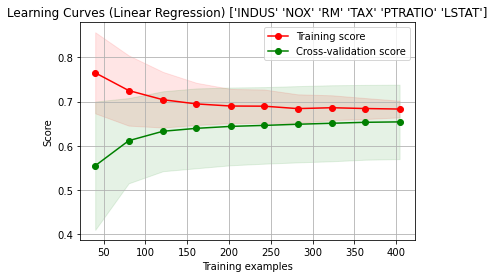

2 Comments