Complete Seaborn Python Tutorial for Data Visualization in Python
Visualizing statistical relationships
Seaborn is a Python data visualization library based on matplotlib. It provides a high-level interface for drawing attractive and informative statistical graphics.
Statistical analysis is a process of understanding how variables in a dataset relate to each other and how those relationships depend on other variables. Visualization can be a core component of this process because, when data are visualized properly, the human visual system can see trends and patterns that indicate a relationship.
1. Numerical Data Ploting
- relplot()
- scatterplot()
- lineplot()
2. Categorical Data Ploting
- catplot()
- boxplot()
- stripplot()
- swarmplot()
- etc…
3. Visualizing Distribution of the Data
- distplot()
- kdeplot()
- jointplot()
- rugplot()
4. Linear Regression and Relationship
- regplot()
- lmplot()
5. Controlling Ploted Figure Aesthetics
- figure styling
- axes styling
- color palettes
- etc..
The necessary python libraries are imported here-
seabornis used to draw various types of graphs.numpyis used to perform basic array operations.pyplotfrommatplotlibis used to visualize the results.pandasis used to read and create the dataset.%matplotlib inlinesets the backend of matplotlib to the ‘inline’ backend: With this backend, the output of plotting commands is displayed inline within frontends like the Jupyter notebook, directly below the code cell that produced it.
import seaborn as sns
import pandas as pd
import numpy as np
import matplotlib.pyplot as plt
%matplotlib inline
We are goint to set the style to darkgrid.The grid helps the plot serve as a lookup table for quantitative information, and the white-on grey helps to keep the grid from competing with lines that represent data.
sns.set(style = 'darkgrid')
Now we are going to load the data using sns.load_dataset. Seaborn has some inbuilt dataset. tips is the one of them. tips.tail() displays the last 5 rows of the dataset
tips = sns.load_dataset('tips')
tips.tail()
| total_bill | tip | sex | smoker | day | time | size | |
|---|---|---|---|---|---|---|---|
| 239 | 29.03 | 5.92 | Male | No | Sat | Dinner | 3 |
| 240 | 27.18 | 2.00 | Female | Yes | Sat | Dinner | 2 |
| 241 | 22.67 | 2.00 | Male | Yes | Sat | Dinner | 2 |
| 242 | 17.82 | 1.75 | Male | No | Sat | Dinner | 2 |
| 243 | 18.78 | 3.00 | Female | No | Thur | Dinner | 2 |
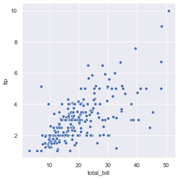
Now we will plot the relational plot using the sns.relplot and visualize the relation between total_bill and tip.
sns.relplot(x = 'total_bill', y = 'tip', data = tips)
As you can see, the above plot is a FacetGrid. It is a class that maps a dataset onto multiple axes arrayed in a grid of rows and columns that correspond to levels of variables in the dataset. Below is a list of things we can apply on FacetGrid.
dir(sns.FacetGrid)
['__class__',
 '__delattr__',
 '__dict__',
 '__dir__',
 '__doc__',
 '__eq__',
 '__format__',
 '__ge__',
 '__getattribute__',
 '__gt__',
 '__hash__',
 '__init__',
 '__init_subclass__',
 '__le__',
 '__lt__',
 '__module__',
 '__ne__',
 '__new__',
 '__reduce__',
 '__reduce_ex__',
 '__repr__',
 '__setattr__',
 '__sizeof__',
 '__str__',
 '__subclasshook__',
 '__weakref__',
 '_bottom_axes',
 '_clean_axis',
 '_facet_color',
 '_facet_plot',
 '_finalize_grid',
 '_get_palette',
 '_inner_axes',
 '_left_axes',
 '_legend_out',
 '_margin_titles',
 '_not_bottom_axes',
 '_not_left_axes',
 '_update_legend_data',
 'add_legend',
 'ax',
 'despine',
 'facet_axis',
 'facet_data',
 'map',
 'map_dataframe',
 'savefig',
 'set',
 'set_axis_labels',
 'set_titles',
 'set_xlabels',
 'set_xticklabels',
 'set_ylabels',
 'set_yticklabels']
value_counts return a Series containing counts of unique values. Here we will get the total number of non-smokers and total number of smokers.
tips['smoker'].value_counts()
No     151
Yes     93
Name: smoker, dtype: int64
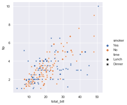
Here we have included smoker and time as well. hue groups variable that will produce elements with different colors. style groups variable that will produce elements with different styles.
sns.relplot(x = 'total_bill', y = 'tip', data = tips, hue = 'smoker', style = 'time')
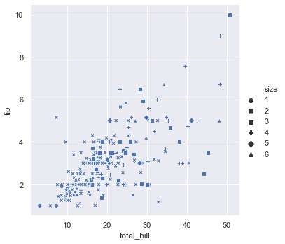
Here we have used style for the size variable.
sns.relplot(x = 'total_bill', y = 'tip', style = 'size', data = tips)
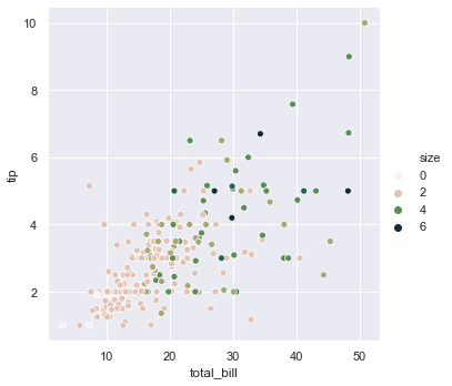
Earlier we have used hue for categorical values i.e. for smoker. Now we will use hue for numerical values i.e. for size. We can change the palette using cubehelix.
sns.relplot(x = 'total_bill', y = 'tip', hue = 'size', data = tips, palette = 'ch:r=-0.8, l= 0.95')
size groups variable that will produce elements with different sizes.
sns.relplot(x = 'total_bill', y = 'tip', data = tips, size = 'size')
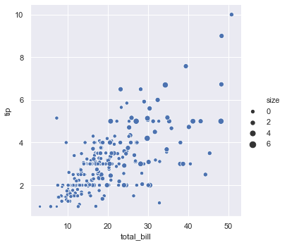
sizes is an object that determines how sizes are chosen when size is used. Here the smallest circle will be of size 15. The largest circle will be of size 200 and all the others will lie in between.
sns.relplot(x = 'total_bill', y = 'tip', data = tips, size = 'size', sizes = (15, 200))

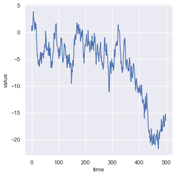
Now we will generate a new dataset to plot a lineplot. np.arange() returns an array with evenly spaced elements. Here it will return values from 0 to 499. randn() returns an array of defined shape, filled with random floating-point samples from the standard normal distribution. Here we will get an array of 500 random values. cumsum() gives the cumulative sum value.
from numpy.random import randn
df = pd.DataFrame(dict(time = np.arange(500), value = randn(500).cumsum()))
df.head()
| time | value | |
|---|---|---|
| 0 | 0 | 0.219531 |
| 1 | 1 | 1.193006 |
| 2 | 2 | 0.312680 |
| 3 | 3 | 0.846526 |
| 4 | 4 | 1.281021 |
By using kind we can change the kind of plot drawn. Bydefault it is set to scatter. Now we will change it to line.
sns.relplot(x = 'time', y = 'value', kind = 'line', data = df, sort = True)
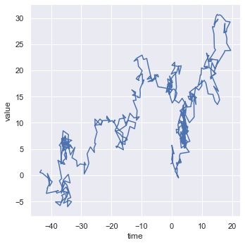
In the above data the values in time are sorted. Lets see what happens if the values are not sorted. For this we will create a new dataset.
df = pd.DataFrame(randn(500, 2).cumsum(axis = 0), columns = ['time', 'value'])
df.head()
| time | value | |
|---|---|---|
| 0 | -0.295978 | 2.185809 |
| 1 | 0.306102 | 2.346635 |
| 2 | 0.358803 | 4.278570 |
| 3 | 0.757172 | 4.095518 |
| 4 | 0.041519 | 5.726971 |
Below we have drawn the plot with unsorted values of time. You can even draw the plot with sorted values of time by setting sort = True which will sort the values of the x axis.
sns.relplot(x = 'time', y = 'value', kind = 'line', data = df, sort = False)
Now we will load the fmri dataset.
fmri = sns.load_dataset('fmri')
fmri.head()
| subject | timepoint | event | region | signal | |
|---|---|---|---|---|---|
| 0 | s13 | 18 | stim | parietal | -0.017552 |
| 1 | s5 | 14 | stim | parietal | -0.080883 |
| 2 | s12 | 18 | stim | parietal | -0.081033 |
| 3 | s11 | 18 | stim | parietal | -0.046134 |
| 4 | s10 | 18 | stim | parietal | -0.037970 |
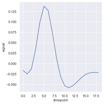
As you can see in the dataset same values of timepoint have different corresponding values of signal. If we draw such a plot we get a confidence interval with 95% confidence. To remove the confidence interval we can set ci = False
sns.relplot(x = 'timepoint', y = 'signal', kind = 'line', data = fmri, ci = False)
We can also have ci = 'sd' to get the standard deviation in the plot.
sns.relplot(x = 'timepoint', y = 'signal', kind = 'line', data = fmri, ci = 'sd')

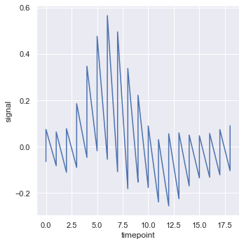
If we want to plot data without any confidence interval we can set estimator = None. This will plot the real dataset.
sns.relplot(x = 'timepoint', y = 'signal', estimator = None, kind = 'line', data = fmri)
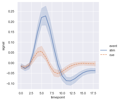
Now we can add a third variable using hue = 'event'.
sns.relplot(x = 'timepoint', y = 'signal', hue = 'event', kind = 'line', data = fmri)

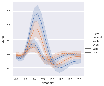
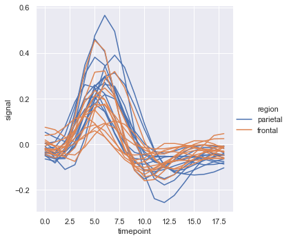
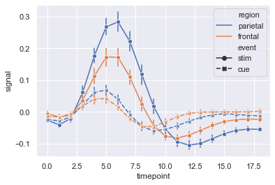
Here we have used 4 variables by setting hue = 'region' and style = 'event'.
sns.relplot(x = 'timepoint', y = 'signal', hue = 'region', style = 'event', kind = 'line', data = fmri)
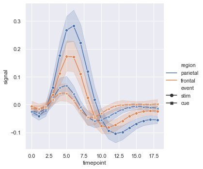
We can improve the plots by placing markers on the data points by including markers = True. We can also remove the dash lines by including dashes = False.
sns.relplot(x = 'timepoint', y = 'signal', hue = 'region', style = 'event', kind = 'line', data = fmri, markers = True, dashes = False)
We can even set hue and style to the same variable to emphasize more and make the plots more informative.
sns.relplot(x = 'timepoint', y = 'signal', hue = 'event', style = 'event', kind = 'line', data = fmri)
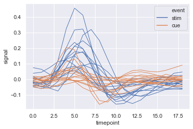
We can set units = subject so that each subject will have a separate line in the plot. While selecting the data we can give a condition using fmri.query(). Here we have given the condition that the value of event should be stim.
sns.relplot(x = 'timepoint', y = 'signal', hue = 'region', units = 'subject', estimator = None, kind = 'line', data = fmri.query("event == 'stim'"))
Now we wil load the dataset dots using a condition.
dots = sns.load_dataset('dots').query("align == 'dots'")
dots.head()
| align | choice | time | coherence | firing_rate | |
|---|---|---|---|---|---|
| 0 | dots | T1 | -80 | 0.0 | 33.189967 |
| 1 | dots | T1 | -80 | 3.2 | 31.691726 |
| 2 | dots | T1 | -80 | 6.4 | 34.279840 |
| 3 | dots | T1 | -80 | 12.8 | 32.631874 |
| 4 | dots | T1 | -80 | 25.6 | 35.060487 |
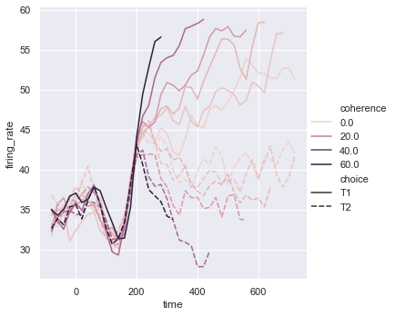
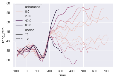
sns.relplot(x = 'time', y = 'firing_rate', data = dots, kind = 'line', hue = 'coherence', style = 'choice')
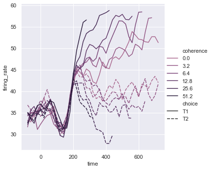
We can set the colour pallete by using sns.cubehelix_pallete. We can set the number of colors in the palette using n_colors. We can specify the intensity of the lightest color in the palette using light.
palette = sns.cubehelix_palette(light = 0.5, n_colors=6)
sns.relplot(x = 'time', y = 'firing_rate', data = dots, kind = 'line', hue = 'coherence', style = 'choice', palette=palette)
We can even change the width of the lines based on some value using size. As we have set size = 'choice' the width of the line will change according to the value of choice. We can even add sizes to set the width.
sns.relplot(x = 'time', y = 'firing_rate', hue = 'coherence', size = 'choice', style = 'choice', kind = 'line', data = dots)

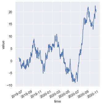
Now we will see how to plot different kinds of non-numerical data such as dates. For that we will generate a new dataset. pd.date_range() returns a fixed frequency DatetimeIndex. periods specifies number of periods to generate.
df = pd.DataFrame(dict(time = pd.date_range('2019-06-02', periods = 500), value = randn(500).cumsum()))
df.head()
| time | value | |
|---|---|---|
| 0 | 2019-06-02 | 0.873964 |
| 1 | 2019-06-03 | 1.163617 |
| 2 | 2019-06-04 | 0.773313 |
| 3 | 2019-06-05 | 0.558634 |
| 4 | 2019-06-06 | -0.426769 |
g is an object which contains the FacetGrid returned by sns.relplot(). fig.autofmt_xdate() formats the dates.
g = sns.relplot(x = 'time', y = 'value', kind = 'line', data = df)
g.fig.autofmt_xdate()
tips.head()
| total_bill | tip | sex | smoker | day | time | size | |
|---|---|---|---|---|---|---|---|
| 0 | 16.99 | 1.01 | Female | No | Sun | Dinner | 2 |
| 1 | 10.34 | 1.66 | Male | No | Sun | Dinner | 3 |
| 2 | 21.01 | 3.50 | Male | No | Sun | Dinner | 3 |
| 3 | 23.68 | 3.31 | Male | No | Sun | Dinner | 2 |
| 4 | 24.59 | 3.61 | Female | No | Sun | Dinner | 4 |
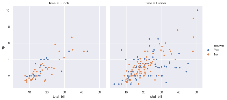
Using FacetGrid we can plot multiple plots simultaneously. Using col we can specify the categorical variables that will determine the faceting of the grid. Here col = 'time' so we are getting two plots for lunch and dinner separately.
sns.relplot(x = 'total_bill', y = 'tip', hue = 'smoker', col = 'time', data = tips)
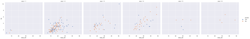
Here col = 'size' so we are getting 6 plots for all the sizes separately
sns.relplot(x = 'total_bill', y = 'tip', hue = 'smoker', col = 'size', data = tips)
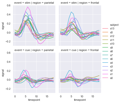
Now we can plot a 2x2 FacetGrid using row and col. By using height we can set the height (in inches) of each facet.
sns.relplot(x = 'timepoint', y = 'signal', hue = 'subject', col = 'region', row = 'event', height=3, kind = 'line', estimator = None, data = fmri)
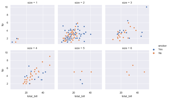
col_wrap wraps the column variable at the given width, so that the column facets span multiple rows.
sns.relplot(x = 'total_bill', y = 'tip', hue = 'smoker', col = 'size', data = tips, col_wrap=3, height=3)
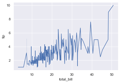
We can also plot line plots using sns.lineplot().
sns.lineplot(x = 'total_bill', y = 'tip', data = tips)
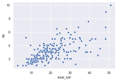
We can plot scatter plots using sns.scatterplot().
sns.scatterplot(x = 'total_bill', y = 'tip', data = tips)
fmri.head()
| subject | timepoint | event | region | signal | |
|---|---|---|---|---|---|
| 0 | s13 | 18 | stim | parietal | -0.017552 |
| 1 | s5 | 14 | stim | parietal | -0.080883 |
| 2 | s12 | 18 | stim | parietal | -0.081033 |
| 3 | s11 | 18 | stim | parietal | -0.046134 |
| 4 | s10 | 18 | stim | parietal | -0.037970 |
Now we will use sns.lineplot. Here we have set ci = 68 and we have shown the error using bars by setting err_style='bars'.The size of confidence intervals to draw around estimated values is 68.
sns.lineplot(x = 'timepoint', y = 'signal', style = 'event', hue = 'region', data = fmri, markers = True, ci = 68, err_style='bars')
Here we have plotted subject separately and we have used a single region i.e. 'frontal'. We can specify the line weight using lw.
sns.lineplot(x = 'timepoint', y = 'signal', hue = 'event', units = 'subject', estimator = None, lw = 1, data = fmri.query("region == 'frontal'"))
dots.head()
| align | choice | time | coherence | firing_rate | |
|---|---|---|---|---|---|
| 0 | dots | T1 | -80 | 0.0 | 33.189967 |
| 1 | dots | T1 | -80 | 3.2 | 31.691726 |
| 2 | dots | T1 | -80 | 6.4 | 34.279840 |
| 3 | dots | T1 | -80 | 12.8 | 32.631874 |
| 4 | dots | T1 | -80 | 25.6 | 35.060487 |
sns.lineplot(x = 'time', y = 'firing_rate', hue = 'coherence', style = 'choice', data = dots)
Now lets work with scatter plots.
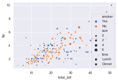
sns.scatterplot(x = 'total_bill', y = 'tip', data = tips, hue = 'smoker', size = 'size', style = 'time')
Now we are going to load the iris dataset.
iris = sns.load_dataset('iris')
iris.head()| sepal_length | sepal_width | petal_length | petal_width | species | |
|---|---|---|---|---|---|
| 0 | 5.1 | 3.5 | 1.4 | 0.2 | setosa |
| 1 | 4.9 | 3.0 | 1.4 | 0.2 | setosa |
| 2 | 4.7 | 3.2 | 1.3 | 0.2 | setosa |
| 3 | 4.6 | 3.1 | 1.5 | 0.2 | setosa |
| 4 | 5.0 | 3.6 | 1.4 | 0.2 | setosa |
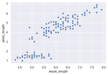
sns.scatterplot(x = 'sepal_length', y = 'petal_length', data = iris)
Instead of passing the data = iris we can even set x and y in the way shown below.
sns.scatterplot(x = iris['sepal_length'], y = iris['petal_length'])

2. Categorical Data Ploting
- catplot()
- boxplot()
- stripplot()
- swarmplot()
- etc…
Now we will see how to plot categorical data.
tips.head()
| total_bill | tip | sex | smoker | day | time | size | |
|---|---|---|---|---|---|---|---|
| 0 | 16.99 | 1.01 | Female | No | Sun | Dinner | 2 |
| 1 | 10.34 | 1.66 | Male | No | Sun | Dinner | 3 |
| 2 | 21.01 | 3.50 | Male | No | Sun | Dinner | 3 |
| 3 | 23.68 | 3.31 | Male | No | Sun | Dinner | 2 |
| 4 | 24.59 | 3.61 | Female | No | Sun | Dinner | 4 |
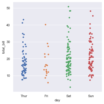
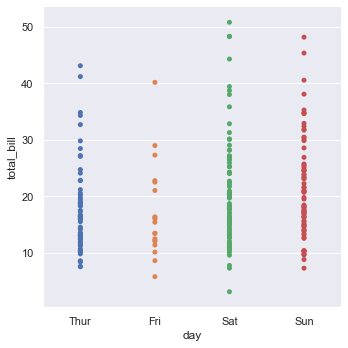
Here day has categorical data and total_bill has numerical data.
sns.catplot(x = 'day', y = 'total_bill', data = tips)
We can even interchange the variables on x and y axis to get a horizontal catplot plot.
sns.catplot(y = 'day', x = 'total_bill', data = tips)

The jitter parameter controls the magnitude of jitter or disables it altogether. Here we have disable the jitter.
sns.catplot(x = 'day', y = 'total_bill', data = tips, jitter = False)
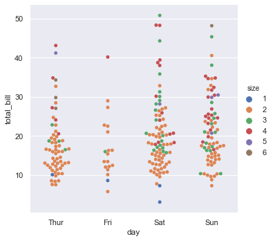
In catplot() we can set the kind parameter to swarm to avoid overlap of points.
sns.catplot(x = 'day', y = 'total_bill', data = tips, kind = 'swarm', hue = 'size')
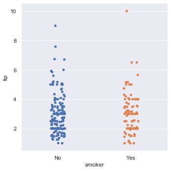
We can set the order in which categorical values should be plotted using order. Bydefault categorical levels are inferred from the data objects.
sns.catplot(x = 'smoker', y = 'tip', data = tips, order= ['No', 'Yes'])
tips.head()
| total_bill | tip | sex | smoker | day | time | size | |
|---|---|---|---|---|---|---|---|
| 0 | 16.99 | 1.01 | Female | No | Sun | Dinner | 2 |
| 1 | 10.34 | 1.66 | Male | No | Sun | Dinner | 3 |
| 2 | 21.01 | 3.50 | Male | No | Sun | Dinner | 3 |
| 3 | 23.68 | 3.31 | Male | No | Sun | Dinner | 2 |
| 4 | 24.59 | 3.61 | Female | No | Sun | Dinner | 4 |
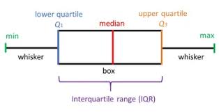
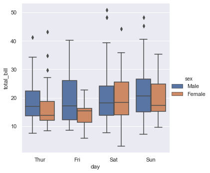
If we want detailed characteristics of data we can use box plot by setting kind = 'box'.
Box plots show the five-number summary of a set of data: including the minimum, first (lower) quartile, median, third (upper) quartile, and maximum.
sns.catplot(x = 'day', y = 'total_bill', kind = 'box', data = tips, hue = 'sex')
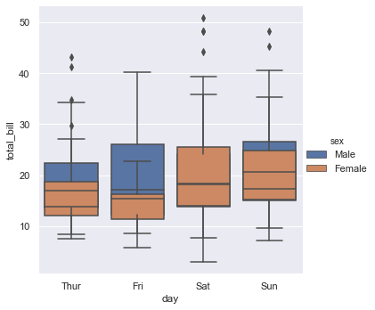
dodge = False merges the box plots of categorical values
sns.catplot(x = 'day', y = 'total_bill', kind = 'box', data = tips, hue = 'sex', dodge = False)
Now we will load the diamonds dataset.
diamonds = sns.load_dataset('diamonds')
diamonds.head()
| carat | cut | color | clarity | depth | table | price | x | y | z | |
|---|---|---|---|---|---|---|---|---|---|---|
| 0 | 0.23 | Ideal | E | SI2 | 61.5 | 55.0 | 326 | 3.95 | 3.98 | 2.43 |
| 1 | 0.21 | Premium | E | SI1 | 59.8 | 61.0 | 326 | 3.89 | 3.84 | 2.31 |
| 2 | 0.23 | Good | E | VS1 | 56.9 | 65.0 | 327 | 4.05 | 4.07 | 2.31 |
| 3 | 0.29 | Premium | I | VS2 | 62.4 | 58.0 | 334 | 4.20 | 4.23 | 2.63 |
| 4 | 0.31 | Good | J | SI2 | 63.3 | 58.0 | 335 | 4.34 | 4.35 | 2.75 |
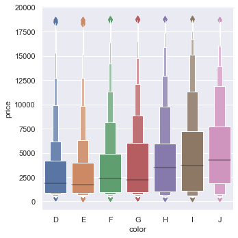
If you want more visualize detailed information you can use boxen plot. It is similar to a box plot in plotting a nonparametric representation of a distribution in which all features correspond to actual observations. By plotting more quantiles, it provides more information about the shape of the distribution, particularly in the tails. While giving the data we are sorting the data according to the colour using diamonds.sort_values('color').
sns.catplot(x = 'color', y = 'price', kind = 'boxen', data = diamonds.sort_values('color'))
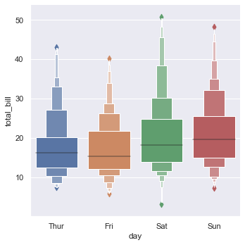
sns.catplot(x = 'day', y = 'total_bill', kind = 'boxen', data = tips, dodge = False)
Violin plot shows the distribution of quantitative data across several levels of one (or more) categorical variables such that those distributions can be compared. Unlike a box plot, in which all of the plot components correspond to actual datapoints, the violin plot features a kernel density estimation of the underlying distribution.
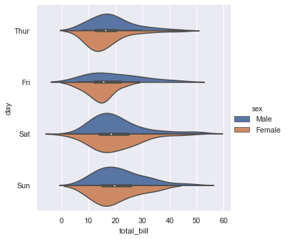
We can draw a violin plot by setting kind = 'violin'. When using hue nesting with a variable that takes two levels, setting split to True will draw half of a violin for each level. This can make it easier to directly compare the distributions.
sns.catplot(x = 'total_bill', y = 'day', hue = 'sex', kind = 'violin', data = tips, split = True,)
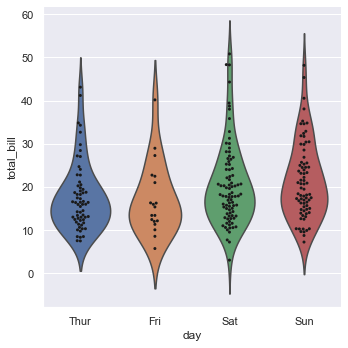
Now we will draw the violin plot and swarm plot together.
inner = None enables representation of the datapoints in the violin interior. The value of parameter ax represents the axes object to draw the plot onto. Here we have set ax of swarmplot to g.ax which represents the violin plot.
g = sns.catplot(x = 'day', y = 'total_bill', kind = 'violin', inner = None, data = tips)
sns.swarmplot(x = 'day', y = 'total_bill', color = 'k', size = 3, data = tips, ax = g.ax)
Now we will load the titanic dataset.
titanic = sns.load_dataset('titanic')
titanic.head()
| survived | pclass | sex | age | sibsp | parch | fare | embarked | class | who | adult_male | deck | embark_town | alive | alone | |
|---|---|---|---|---|---|---|---|---|---|---|---|---|---|---|---|
| 0 | 0 | 3 | male | 22.0 | 1 | 0 | 7.2500 | S | Third | man | True | NaN | Southampton | no | False |
| 1 | 1 | 1 | female | 38.0 | 1 | 0 | 71.2833 | C | First | woman | False | C | Cherbourg | yes | False |
| 2 | 1 | 3 | female | 26.0 | 0 | 0 | 7.9250 | S | Third | woman | False | NaN | Southampton | yes | True |
| 3 | 1 | 1 | female | 35.0 | 1 | 0 | 53.1000 | S | First | woman | False | C | Southampton | yes | False |
| 4 | 0 | 3 | male | 35.0 | 0 | 0 | 8.0500 | S | Third | man | True | NaN | Southampton | no | True |
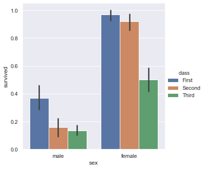
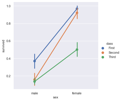
We will now plot a barplot. The black line represents the probability of error.
sns.catplot(x = 'sex', y = 'survived', hue = 'class', kind = 'bar', data = titanic)
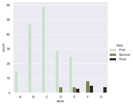
Now we will plot a count plot. We can change the gradient of the colour using palette parameter.
sns.catplot(x = 'deck', kind = 'count', palette = 'ch:0.95', data = titanic, hue = 'class')
A point plot represents an estimate of central tendency for a numeric variable by the position of scatter plot points and provides some indication of the uncertainty around that estimate using error bars.
sns.catplot(x = 'sex', y = 'survived', hue = 'class', kind = 'point', data = titanic)
3. Visualizing Distribution of the Data
- distplot()
- kdeplot()
- jointplot()
- rugplot()
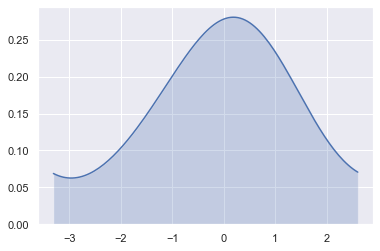
We can plot univariate distribution using sns.distplot(). By default, this will draw a histogram and fit a kernel density estimate (KDE).
rug draws a small vertical tick at each observation. bins is the specification of hist bins.
x = randn(100)
sns.distplot(x, kde = True, hist = False, rug= False, bins= 30)
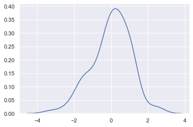
Now lets plot a kdeplot.
shade = True shades in the area under the KDE curve. We can control the bandwidth using bw. The parametercut draws the estimate to cut * bw from the extreme data points i.e. it cuts the plot and zooms it.
sns.kdeplot(x, shade=True, cbar = True, bw = 1, cut = 0)
Now we will see how to plot bivariate distribution.
tips.head()
| total_bill | tip | sex | smoker | day | time | size | |
|---|---|---|---|---|---|---|---|
| 0 | 16.99 | 1.01 | Female | No | Sun | Dinner | 2 |
| 1 | 10.34 | 1.66 | Male | No | Sun | Dinner | 3 |
| 2 | 21.01 | 3.50 | Male | No | Sun | Dinner | 3 |
| 3 | 23.68 | 3.31 | Male | No | Sun | Dinner | 2 |
| 4 | 24.59 | 3.61 | Female | No | Sun | Dinner | 4 |
x = tips['total_bill']
y = tips['tip']
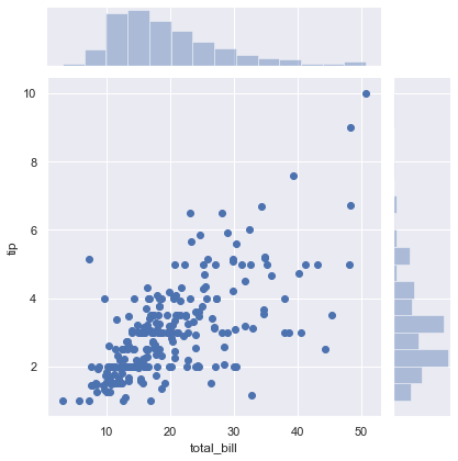
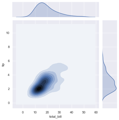
Now we will plot a joint plot. It displays relationship between 2 variables (bivariate) as well as 1D profiles (univariate) in the margins.
sns.jointplot(x = x, y = y)
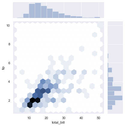
By using kind we can select the kind of plot to draw. Here we have selected kind = 'hex'.
sns.set()
sns.jointplot(x = x, y=y, kind = 'hex')
Here kind = 'kde'.
sns.jointplot(x = x, y = y, kind = 'kde')
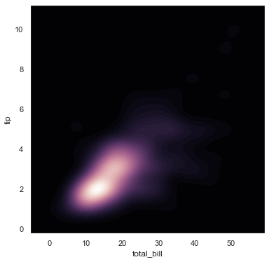
subplots() returns the figure and axes.
sns.cubehelix_palette() produces a colormap with linearly-decreasing (or increasing) brightness. as_cmap = True returns a matplotlib colormap instead of a list of colors. Intensity of the darkest and ligtest colours in the palette can be controlled by dark and light. As reverse = True the palette will go from dark to light.
sns.kdeplot will plot a kde plot. shade = True shades in the area under the KDE curve.
f, ax = plt.subplots(figsize = (6,6))
cmap = sns.cubehelix_palette(as_cmap = True, dark = 0, light = 1, reverse= True)
sns.kdeplot(x, y, cmap = cmap, n_levels=60, shade=True)
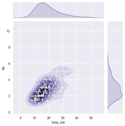
The jointplot() function uses a JointGrid to manage the figure. For more flexibility, you may want to draw your figure by using JointGrid directly. jointplot() returns the JointGrid object after plotting, which you can use to add more layers or to tweak other aspects of the visualization.
sns.plot_joint() draws a bivariate plot of x and y. c and s parameters are for colour and size respectively.
We aew going to join the x axis using collections and control the transparency using set_alpha()
g = sns.jointplot(x, y, kind = 'kde', color = 'm')
g.plot_joint(plt.scatter, c = 'w', s = 30, linewidth = 1, marker = '+')
g.ax_joint.collections[0].set_alpha(0)
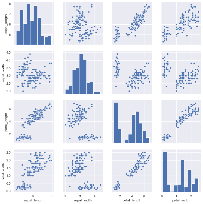
Now we will draw pair plots using sns.pairplot().By default, this function will create a grid of Axes such that each numeric variable in data will by shared in the y-axis across a single row and in the x-axis across a single column. The diagonal Axes are treated differently, drawing a plot to show the univariate distribution of the data for the variable in that column.
sns.pairplot(iris)
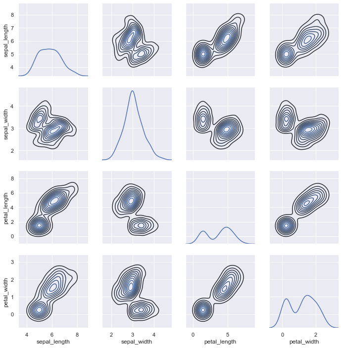
map_diag() draws the diagonal elements are plotted as a kde plot. map_offdiag() draws the non-diagonal elements as a kde plot with number of levels = 10.
g = sns.PairGrid(iris)
g.map_diag(sns.kdeplot)
g.map_offdiag(sns.kdeplot, n_levels = 10)
4. Linear Regression and Relationship
- regplot()
- lmplot()
tips.head()
| total_bill | tip | sex | smoker | day | time | size | |
|---|---|---|---|---|---|---|---|
| 0 | 16.99 | 1.01 | Female | No | Sun | Dinner | 2 |
| 1 | 10.34 | 1.66 | Male | No | Sun | Dinner | 3 |
| 2 | 21.01 | 3.50 | Male | No | Sun | Dinner | 3 |
| 3 | 23.68 | 3.31 | Male | No | Sun | Dinner | 2 |
| 4 | 24.59 | 3.61 | Female | No | Sun | Dinner | 4 |
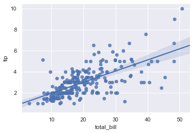
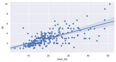
We can draw regression plots with the help of sns.regplot(). The plot drawn below shows the relationship between total_bill and tip.
sns.regplot(x = 'total_bill', y = 'tip', data = tips)
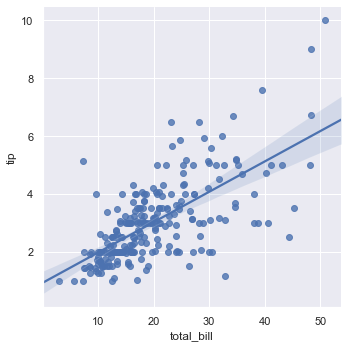
We can draw a linear model plot using sns.lmplot().
sns.lmplot(x = 'total_bill', y= 'tip', data = tips)
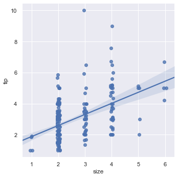
We can draw a plot which shows the linear relationship between size and tips.
sns.lmplot(x = 'size', y = 'tip', data = tips, x_jitter = 0.05)
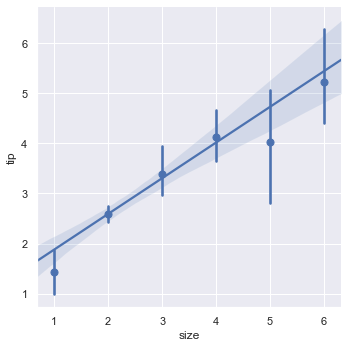
If we set x_estimator = np.mean the dots in the above plot will be replaced by the mean and a confidence line.
sns.lmplot(x = 'size', y = 'tip', data = tips, x_estimator = np.mean)
Now we will see how to draw a plot for the data which is not linearly related. To do this we will load the anscombe dataset.
data = sns.load_dataset('anscombe')
data.head()
| dataset | x | y | |
|---|---|---|---|
| 0 | I | 10.0 | 8.04 |
| 1 | I | 8.0 | 6.95 |
| 2 | I | 13.0 | 7.58 |
| 3 | I | 9.0 | 8.81 |
| 4 | I | 11.0 | 8.33 |
This dataset contains 4 types of data and each type contains 11 values.
data['dataset'].value_counts()
II     11
I      11
III    11
IV     11
Name: dataset, dtype: int64
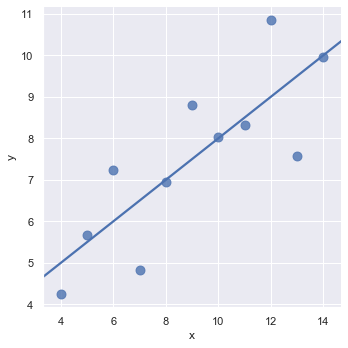
Now we will draw a plot for the data of type I from the dataset. scatter_kws is used to pass additional keyword arguments.
sns.lmplot(x = 'x', y = 'y', data = data.query("dataset == 'I'"), ci = None, scatter_kws={'s': 80})
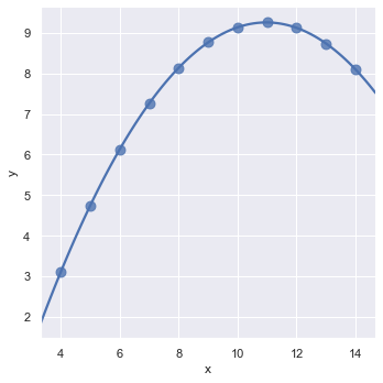
Now we will plot the dataset type II. We can see that it is not linear relation. In order to fit such type of dataset we can use the order parameter. If order is greater than 1, it estimates a polynomial regression.
sns.lmplot(x = 'x', y = 'y', data = data.query("dataset == 'II'"), ci = None, scatter_kws={'s': 80}, order = 2)
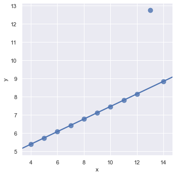
Now we will see how to handle outliers. An outlier is a data point that differs significantly from other observations. We can go and manually remove the outlier from the dataset or we can set robust = True to nullify its effect while drawing the plot.
sns.lmplot(x = 'x', y = 'y', data = data.query("dataset == 'III'"), ci = None, scatter_kws={'s': 80}, robust=True)
We can change the size of figure using subplots() and pass the parameter figsize.
f, ax = plt.subplots(figsize = (8,4))
sns.regplot(x = 'total_bill', y = 'tip', data = tips, ax = ax)
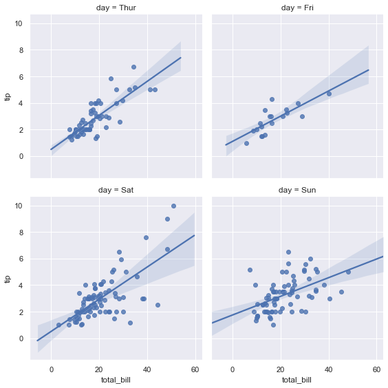
We can even control the height and the position of the plots using height and col_wrap.
sns.lmplot(x = 'total_bill', y = 'tip', data = tips, col = 'day', col_wrap=2, height = 4)
5. Controlling Ploted Figure Aesthetics
- figure styling
- axes styling
- color palettes
- etc..
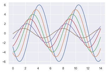
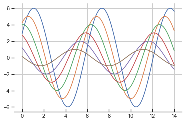
Here is a function to draw a sinplot.
def sinplot(flip = 1):
    x = np.linspace(0, 14, 100)
    for i in range(1,7):
        plt.plot(x, np.sin(x+i*0.5)*(7-i)*flip)
sinplot(-1)
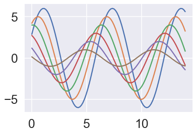
sns.set_style() is used to set the aesthetic style of the plots. ticks will add ticks on the axes. 'axes.grid': True enables the grid in the background of the plot. 'xtick.direcyion': 'in' makes the ticks on the x axis to point inwards. sns.despine() removes the top and right spines from plot. left = True removes the left spine.
sns.set_style('ticks', {'axes.grid': True, 'xtick.direction': 'in'})
sinplot()
sns.despine(left = True, bottom= False)
sns.axes_style() shows all the current elements which are set on the plot. We can change the values of these elements and customize our plots.
sns.axes_style()
{'axes.facecolor': 'white',
 'axes.edgecolor': '.15',
 'axes.grid': True,
 'axes.axisbelow': True,
 'axes.labelcolor': '.15',
 'figure.facecolor': 'white',
 'grid.color': '.8',
 'grid.linestyle': '-',
 'text.color': '.15',
 'xtick.color': '.15',
 'ytick.color': '.15',
 'xtick.direction': 'in',
 'ytick.direction': 'out',
 'lines.solid_capstyle': 'round',
 'patch.edgecolor': 'w',
 'image.cmap': 'rocket',
 'font.family': ['sans-serif'],
 'font.sans-serif': ['Arial',
  'DejaVu Sans',
  'Liberation Sans',
  'Bitstream Vera Sans',
  'sans-serif'],
 'patch.force_edgecolor': True,
 'xtick.bottom': True,
 'xtick.top': False,
 'ytick.left': True,
 'ytick.right': False,
 'axes.spines.left': True,
 'axes.spines.bottom': True,
 'axes.spines.right': True,
 'axes.spines.top': True}
sns.set_context() sets the plotting context parameters. This affects things like the size of the labels, lines, and other elements of the plot, but not the overall style. The base context is “notebook”, and the other contexts are “paper”, “talk”, and “poster”, which are version of the notebook parameters scaled by .8, 1.3, and 1.6, respectively. We can even use font_scale which is a separate scaling factor to independently scale the size of the font elements.
sns.set_style('darkgrid')
sns.set_context('talk', font_scale=1.5)
sinplot()
Now we will see some colour palettes which seaborn uses. sns.color_palette() returns a list of the current colors defining a color palette.
current_palettes = sns.color_palette()
sns.palplot(current_palettes)

We can use the the hls color space, which is a simple transformation of RGB values to create colour palettes.
sns.palplot(sns.color_palette('hls', 8))

Conclusion
- With the help of data visualization, we can see how the data looks like and what kind of correlation is held by the attributes of data.
- This is the first and foremost step where they will get a high level statistical overview on how the data is and some of its attributes like the underlying distribution, presence of outliers, and several more useful features.
- From perspective of building models, by visualizing the data we can find the hidden patterns, explore if there are any clusters within data and we can find if they are linearly separable/too much overlapped etc.
- From this initial analysis we can easily rule out the models that won’t be suitable for such a data and we will implement only the models that are suitable, without wasting our valuable time and the computational resources.
0 Comments