Data Visualization with Pandas
Data visualization is the discipline of trying to understand data by placing it in a visual context so that patterns, trends and correlations that might not otherwise be detected can be exposed.
pandas is a fast, powerful, flexible and easy to use open source data analysis and manipulation tool, in Python programming language. It is a high-level data manipulation tool developed by Wes McKinney. It is built on the Numpy package and its key data structure is called the DataFrame. DataFrames allow you to store and manipulate tabular data in rows of observations and columns of variables. Pandas is mainly used for data analysis. Pandas allows importing data from various file formats such as comma-separated values, JSON, SQL, Microsoft Excel. Pandas allows various data manipulation operations such as merging, reshaping, selecting, as well as data cleaning, and data wrangling features. Doing visualizations with pandas comes in handy when you want to view how your data looks like quickly.
import numpy as np
import pandas as pd
import seaborn as sns
import matplotlib.pyplot as plt
%matplotlib inline
from numpy.random import randn, randint, uniform, sample
Pandas DataFrame is two-dimensional size-mutable, potentially heterogeneous tabular data structure with labeled axes (rows and columns). A Data frame is a two-dimensional data structure, i.e., data is aligned in a tabular fashion in rows and columns. Pandas DataFrame consists of three principal components, the data, rows, and columns. Series is a one-dimensional labeled array capable of holding data of any type (integer, string, float, python objects, etc.). Each column of the dataframe is a Series.
Below we are creatind a dataframe df which consists of 1000 random numbers generated by rand(). index specifies the index to use for resulting frame. date_range() returns a fixed frequency DatetimeIndex which start date ‘2019-06-07’. periods is used to specify the number of periods to generate. Through columns we can specify the column labels to use for resulting frame. Similarly, we are creating a Series ts.
df = pd.DataFrame(randn(1000), index = pd.date_range('2019-06-07', periods = 1000), columns=['value'])
ts = pd.Series(randn(1000), index = pd.date_range('2019-06-07', periods = 1000))
df.head()
| value | |
|---|---|
| 2019-06-07 | -0.992350 |
| 2019-06-08 | -0.849183 |
| 2019-06-09 | 0.126559 |
| 2019-06-10 | 0.640230 |
| 2019-06-11 | -0.975090 |
ts.head()
2019-06-07    0.430385
2019-06-08    1.810955
2019-06-09    3.207345
2019-06-10   -0.366252
2019-06-11    1.406304
Freq: D, dtype: float64
type(df),type(ts)
(pandas.core.frame.DataFrame, pandas.core.series.Series)
Line plot
The cumsum() function is used to get cumulative sum over a DataFrame or Series axis. It returns a DataFrame or Series of the same size containing the cumulative sum.
df['value'] = df['value'].cumsum()
df.head()
| value | |
|---|---|
| 2019-06-07 | -0.992350 |
| 2019-06-08 | -2.833884 |
| 2019-06-09 | -4.548859 |
| 2019-06-10 | -5.623604 |
| 2019-06-11 | -7.673438 |
ts = ts.cumsum()
ts.head()
2019-06-07     0.430385
2019-06-08     2.671725
2019-06-09     8.120411
2019-06-10    13.202844
2019-06-11    19.691581
Freq: D, dtype: float64
type(df), type(ts)
(pandas.core.frame.DataFrame, pandas.core.series.Series)
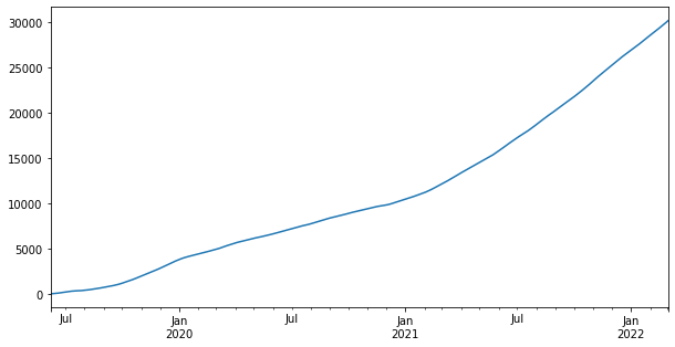
Now we will visualize ts. plot() is a function which makes plots of DataFrame using matplotlib / pylab. We can specify the figure size using figsize. We need to pass a tuple (width, height) in inches.
ts.plot(figsize=(10,5))
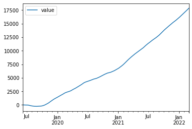
Now we will plot the dataframe df.
df.plot()
load_dataset() loads an example dataset from the online repository (requires internet). Here we have loaded the iris dataset from seaborn.
iris = sns.load_dataset('iris')
iris.head()
| sepal_length | sepal_width | petal_length | petal_width | species | |
|---|---|---|---|---|---|
| 0 | 5.1 | 3.5 | 1.4 | 0.2 | setosa |
| 1 | 4.9 | 3.0 | 1.4 | 0.2 | setosa |
| 2 | 4.7 | 3.2 | 1.3 | 0.2 | setosa |
| 3 | 4.6 | 3.1 | 1.5 | 0.2 | setosa |
| 4 | 5.0 | 3.6 | 1.4 | 0.2 | setosa |
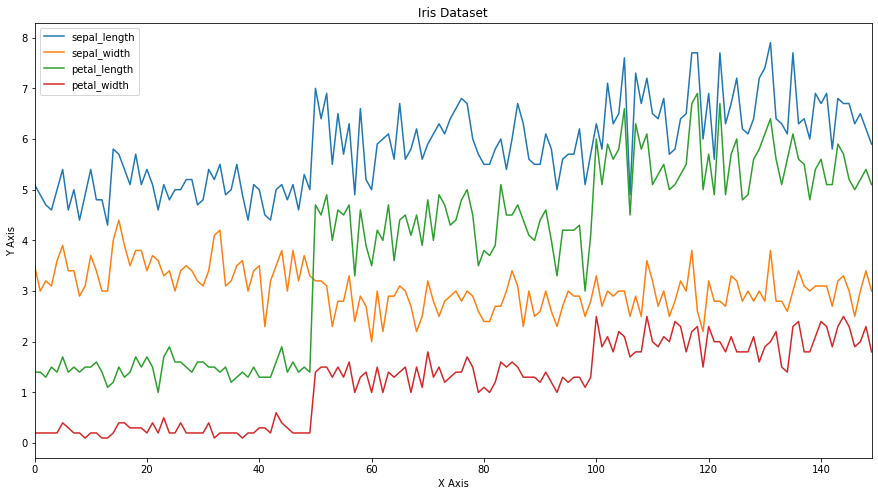
Now we will plot the iris dataframe. Using title we can add a Title for the plot. We have even set the axes labels.
ax = iris.plot(figsize=(15,8), title='Iris Dataset')
ax.set_xlabel('X Axis')
ax.set_ylabel('Y Axis')
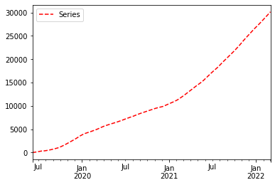
Now we will plot the series again but this time we will add the style parameter. -- means dashed line style and r means red colour. Hence r-- means red dashed line. legend = True places legend on axis subplots using the name specified using label.
ts.plot(style = 'r--', label = 'Series', legend = True)
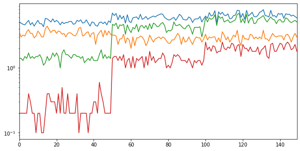
logy = True uses log scaling on y axis.
iris.plot(legend = False, figsize = (10, 5), logy = True)
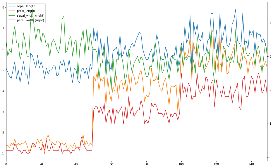
Now we will see how to plot data on the secondary axis. For that we will create 2 dataframes x and y as shown below. We will plot sepal_width and petal_width on the primary axis and sepal_length and petal_length on the secondary axis.
x = iris.drop(['sepal_width', 'petal_width'], axis = 1)
x.head()
| sepal_length | petal_length | species | |
|---|---|---|---|
| 0 | 5.1 | 1.4 | setosa |
| 1 | 4.9 | 1.4 | setosa |
| 2 | 4.7 | 1.3 | setosa |
| 3 | 4.6 | 1.5 | setosa |
| 4 | 5.0 | 1.4 | setosa |
y = iris.drop(['sepal_length', 'petal_length'], axis = 1)
y.head()
| sepal_width | petal_width | species | |
|---|---|---|---|
| 0 | 3.5 | 0.2 | setosa |
| 1 | 3.0 | 0.2 | setosa |
| 2 | 3.2 | 0.2 | setosa |
| 3 | 3.1 | 0.2 | setosa |
| 4 | 3.6 | 0.2 | setosa |
If secondary_y = True then data is plot on a secondary y-axis. Now we will plot x on the primary axis and y on the secondary axis of the same plot.
ax = x.plot()
y.plot(figsize = (16,10), secondary_y = True, ax = ax)
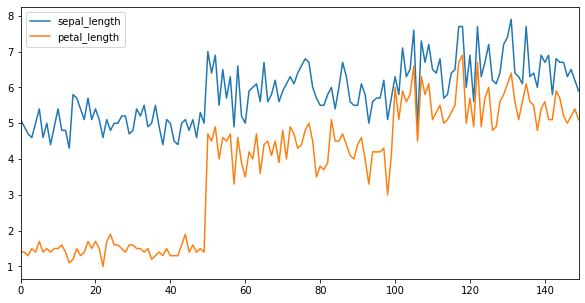
We can adjust the tick resolution using x_compat.
x.plot(figsize=(10,5), x_compat = True)
Bar Plot
Now we will see how to draw bar plots. The species column in iris contains non-numeric values. Hence we will drop it and save the resultant dataframe in df.
df = iris.drop(['species'], axis = 1)
df.head()
| sepal_length | sepal_width | petal_length | petal_width | |
|---|---|---|---|---|
| 0 | 5.1 | 3.5 | 1.4 | 0.2 |
| 1 | 4.9 | 3.0 | 1.4 | 0.2 |
| 2 | 4.7 | 3.2 | 1.3 | 0.2 |
| 3 | 4.6 | 3.1 | 1.5 | 0.2 |
| 4 | 5.0 | 3.6 | 1.4 | 0.2 |
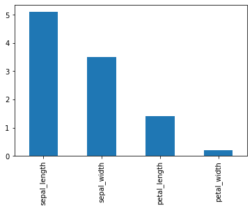
Now we will draw a bar plot for the first row of df.
df.iloc[0].plot(kind='bar')

You can even draw the same plot using the line of code given below.
df.iloc[0].plot.bar()
Now we will load the titanic dataset from seaborn.
titanic = sns.load_dataset('titanic')
titanic.head()
| survived | pclass | sex | age | sibsp | parch | fare | embarked | class | who | adult_male | deck | embark_town | alive | alone | |
|---|---|---|---|---|---|---|---|---|---|---|---|---|---|---|---|
| 0 | 0 | 3 | male | 22.0 | 1 | 0 | 7.2500 | S | Third | man | True | NaN | Southampton | no | False |
| 1 | 1 | 1 | female | 38.0 | 1 | 0 | 71.2833 | C | First | woman | False | C | Cherbourg | yes | False |
| 2 | 1 | 3 | female | 26.0 | 0 | 0 | 7.9250 | S | Third | woman | False | NaN | Southampton | yes | True |
| 3 | 1 | 1 | female | 35.0 | 1 | 0 | 53.1000 | S | First | woman | False | C | Southampton | yes | False |
| 4 | 0 | 3 | male | 35.0 | 0 | 0 | 8.0500 | S | Third | man | True | NaN | Southampton | no | True |
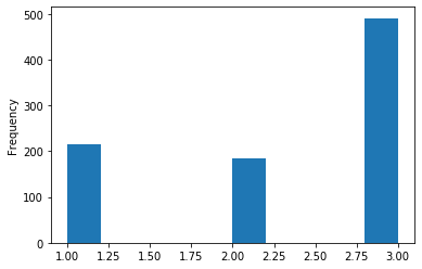
To see the distribution of a single column we can plot a histogram. Here we have drawn a histogram for pclass. The 3 bars represent the 3 different values in pclass.
titanic['pclass'].plot(kind = 'hist')
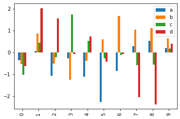
Now we will create a dataframe df which will have 10 rows and 4 columns. It will containd= random values which will be generated by randn(). The column names will be a, b, c and d respectively.
df = pd.DataFrame(randn(10, 4), columns=['a', 'b', 'c', 'd'])
df.head()
| a | b | c | d | |
|---|---|---|---|---|
| 0 | -0.358585 | -0.530212 | -1.037960 | -0.620583 |
| 1 | 0.063102 | 0.872088 | 0.429474 | 2.020268 |
| 2 | -1.064892 | -0.521098 | -0.238016 | 1.559072 |
| 3 | -0.277393 | -1.246629 | 1.723683 | -0.069810 |
| 4 | -1.123548 | -0.375084 | 0.528301 | 0.739006 |
df.plot.bar()
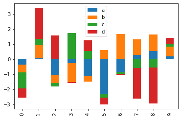
Stacked Plot
Now we will plot a stacked plot for df. stacked = True lots stacked bar charts for the DataFrame.
df.plot.bar(stacked = True)

We can even draw the same plot which the line of code givwn below.
df.plot(kind = 'bar', stacked = True)
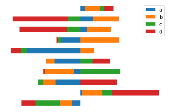
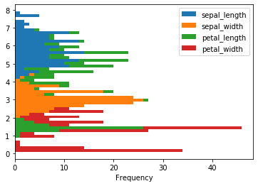
Till now we have drawn vertical bar plots. Now we will see how to plot horizontal bar plots. A horizontal bar plot is a plot that presents quantitative data with rectangular bars with lengths proportional to the values that they represent. For this we will use the barh() function. plt.axis('off') turns off axis lines and labels.
df.plot.barh(stacked = True)
plt.axis('off')
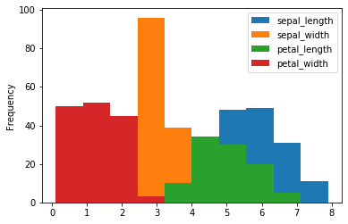
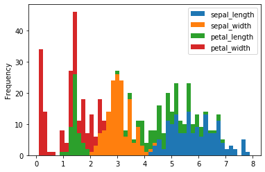
Histogram
A histogram is a representation of the distribution of data.
We can draw a histogram using the hist() function.
iris.plot.hist()
Alternatively, you can even plot it in this way.
iris.plot(kind = 'hist')

A histogram displays numerical data by grouping data into “bins” of equal width. Each bin is plotted as a bar whose height corresponds to how many data points are in that bin. Bins are also sometimes called “intervals”, “classes”, or “buckets”. We can use bins to specify the number of bins.
iris.plot(kind = 'hist', stacked = True, bins = 50)
We can draw a horizontal histogram by passing orientation = 'horizontal'.
iris.plot(kind = 'hist', stacked = True, bins = 50, orientation = 'horizontal')
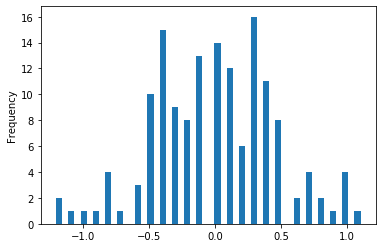
The diff() function calculates the difference of a DataFrame element compared with another element in the DataFrame.
iris['sepal_width'].diff()[:10]
0    NaN
1   -0.5
2    0.2
3   -0.1
4    0.5
5    0.3
6   -0.5
7    0.0
8   -0.5
9    0.2
Name: sepal_width, dtype: float64
We can plot the histogram of the difference.
iris['sepal_width'].diff().plot(kind = 'hist', stacked = True, bins = 50)
We will drop the species column as it is non-numeric and take difference of all the other columns.
df = iris.drop(['species'], axis = 1)
df.diff()[:10]
| sepal_length | sepal_width | petal_length | petal_width | |
|---|---|---|---|---|
| 0 | NaN | NaN | NaN | NaN |
| 1 | -0.2 | -0.5 | 0.0 | 0.0 |
| 2 | -0.2 | 0.2 | -0.1 | 0.0 |
| 3 | -0.1 | -0.1 | 0.2 | 0.0 |
| 4 | 0.4 | 0.5 | -0.1 | 0.0 |
| 5 | 0.4 | 0.3 | 0.3 | 0.2 |
| 6 | -0.8 | -0.5 | -0.3 | -0.1 |
| 7 | 0.4 | 0.0 | 0.1 | -0.1 |
| 8 | -0.6 | -0.5 | -0.1 | 0.0 |
| 9 | 0.5 | 0.2 | 0.1 | -0.1 |
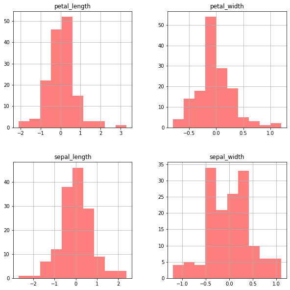
Now if we plot the histogram we will get 4 separate subplots for each column in df.
df.diff().hist(color = 'r', alpha = 0.5, figsize=(10,10))
Box Plot
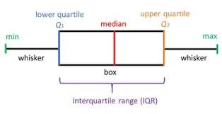
Box plots show the five-number summary of a set of data: including the minimum, first (lower) quartile, median, third (upper) quartile, and maximum. Box plots divide the data into sections that each contain approximately 25% of the data in that set. The first quartile is the 25th percentile. Second quartile is 50th percentile and third quartile is 75th percentile.
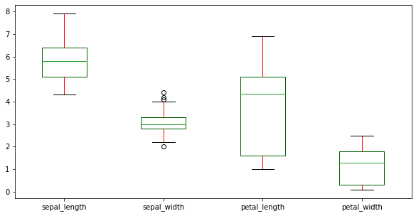
color = {'boxes': 'DarkGreen', 'whiskers': 'r'}
color
{'boxes': 'DarkGreen', 'whiskers': 'r'}Now we will plot a box plot for df. We have set the colour of the boxes to DarkGreen and colour of the whiskers to r i.e. red.
df.plot(kind = 'box', figsize=(10,5), color = color)
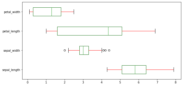
We can plot a horizontal box plot by passing vert = False.
df.plot(kind = 'box', figsize=(10,5), color = color, vert = False)
Area and Scatter Plot
An area plot displays quantitative data visually. We can pass kind='area' to draw a area plot.
df.plot(kind = 'area')
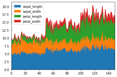
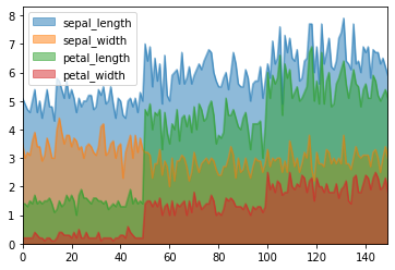
Area plots are stacked by default. To draw unstacked area plots we have to set the parameter stacked to False.
df.plot.area(stacked = False)
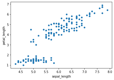
Now we will draw scatter plots In scatter plots the coordinates of each point are defined by two dataframe columns and filled circles are used to represent each point. This kind of plot is useful to see complex correlations between two variables.
df.plot.scatter(x = 'sepal_length', y = 'petal_length')
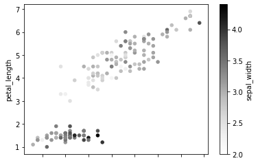
c is a parameter which decides the color of each point. Here we have passed the column name sepal_width whose values will be used to color the marker points according to a colormap.
df.plot.scatter(x = 'sepal_length', y = 'petal_length', c = 'sepal_width')
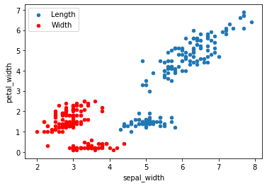
We can group 2 scatter plots in the same figure as shown below. Here we have drawn a plot for sepal_length vs petal_length and sepal_width vs petal_width in the same axes.
ax = df.plot.scatter(x = 'sepal_length', y = 'petal_length', label = 'Length');
df.plot.scatter(x = 'sepal_width', y = 'petal_width', label = 'Width', ax = ax, color = 'r')
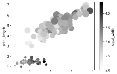
s is used to control the size of each point. Here the size will value according to the values in petal_width.
df.plot.scatter(x = 'sepal_length', y = 'petal_length', c = 'sepal_width', s = df['petal_width']*200)
Hex and Pie Plot
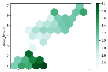
A Hexbin plot is useful to represent the relationship of 2 numerical variables when you have a lot of data point. Instead of overlapping, the plotting window is split in several hexbins, and the number of points per hexbin is counted. The color denotes this number of points.
Now we will draw a hexbin plot. gridsize is used to specify the number of hexagons in the x-direction. The corresponding number of hexagons in the y-direction is chosen in a way that the hexagons are approximately regular. Alternatively, gridsize can be a tuple with two elements specifying the number of hexagons in the x-direction and the y-direction. C specifies values at given coordinates.
df.plot.hexbin(x = 'sepal_length', y = 'petal_length', gridsize = 10, C = 'sepal_width')
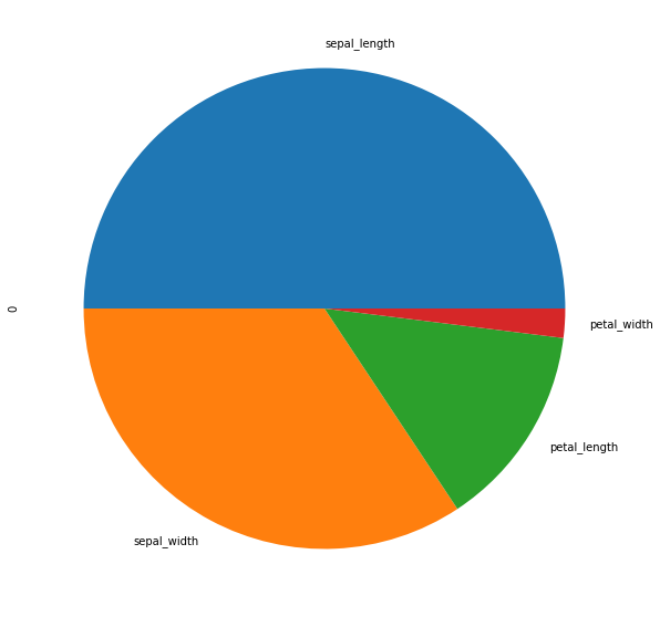
Now we will move on to pie plots. A pie plot is a proportional representation of the numerical data in a column. To start with we will only consider the first row.
d = df.iloc[0]
d
sepal_length    5.1
sepal_width     3.5
petal_length    1.4
petal_width     0.2
Name: 0, dtype: float64
d.plot.pie(figsize = (10,10))
Now we will see how to plot a separate pie plot for each column. For that we will take the transpose of the first 3 rows of df.
d = df.head(3).T
d
| 0 | 1 | 2 | |
|---|---|---|---|
| sepal_length | 5.1 | 4.9 | 4.7 |
| sepal_width | 3.5 | 3.0 | 3.2 |
| petal_length | 1.4 | 1.4 | 1.3 |
| petal_width | 0.2 | 0.2 | 0.2 |
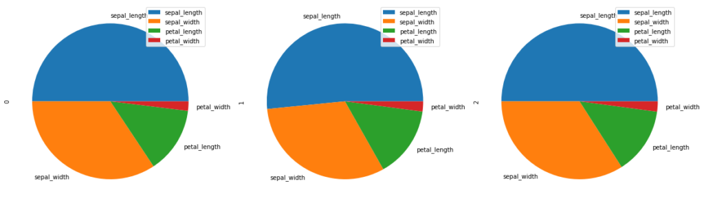
subplots = True plots separate pie plots for each numerical column independently.
d.plot.pie(subplots = True, figsize = (20, 20))
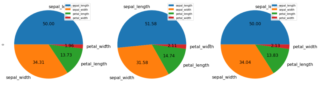
You can even change the font size. autopct enables you to display the percent value using Python string formatting.
d.plot.pie(subplots = True, figsize = (20, 20), fontsize = 16, autopct = '%.2f')
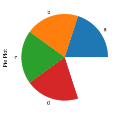
Consider we want to make a pie chart of array x. The fractional area of each wedge is given by x/sum(x). If sum(x) < 1, then the values of x give the fractional area directly and the array will not be normalized. The resulting pie will have an empty wedge of size 1 – sum(x).
x=[0.2]*4
print(x)
print(sum(x))
[0.2, 0.2, 0.2, 0.2]
0.8
Hence we can see that we have got an incomplete pie plot as sum(x) is 0.8 which is less than 1.
series = pd.Series(x, index = ['a','b','c', 'd'], name = 'Pie Plot')
series.plot.pie()
Scatter Matrix
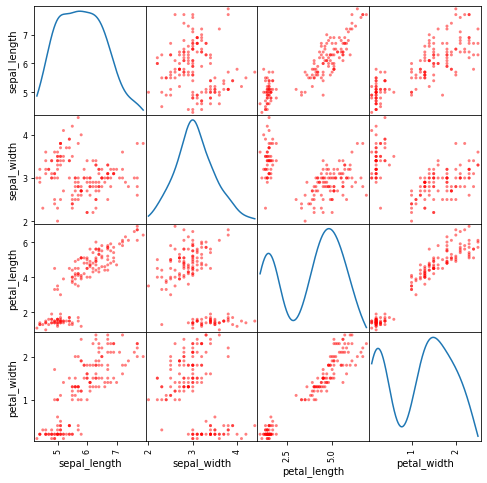
A scatter matrix (pairs plot) compactly plots all the numeric variables we have in a dataset against each other one. First we will import scatter_matrix.
from pandas.plotting import scatter_matrix
Now we will plot a scatter matrix for df with the diagonal plots as Kernel Density Estimation (KDE) plots.
scatter_matrix(df, figsize= (8,8), diagonal='kde', color = 'r')
plt.show()
KDE Plots
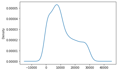
Now we will plot a KDE plot. KDE Plot described as Kernel Density Estimate is used for visualizing the Probability Density of a continuous variable. It depicts the probability density at different values in a continuous variable.
ts.plot.kde()
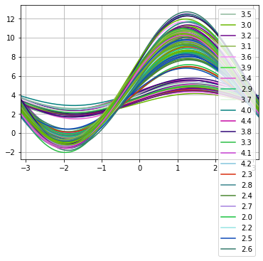
Andrew curves
Andrews curves have the functional form:
f(t) = x_1/sqrt(2) + x_2 sin(t) + x_3 cos(t) + x_4 sin(2t) + x_5 cos(2t) + …
Where x coefficients correspond to the values of each dimension and t is linearly spaced between -pi and +pi. Each row of frame then corresponds to a single curve.
We will import andrews_curves.
from pandas.plotting import andrews_curves
Now we will plot andrews curves for sepal_width.
andrews_curves(df, 'sepal_width')
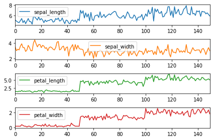
Subplots
Lastly, we will see how to divide dataset into multiple separate plots. This can be done by passing subplots = True. sharex = False gives a separate x axis to all the plots.
df.plot(subplots = True, sharex = False)
plt.tight_layout()
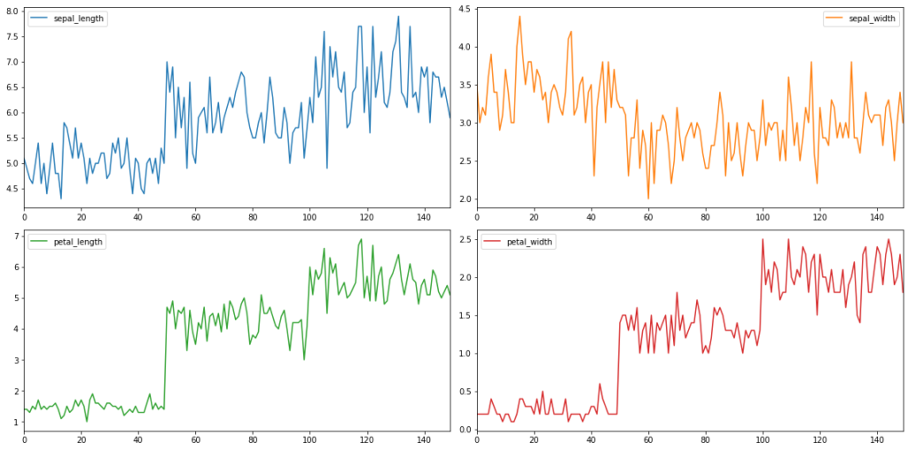
We can even change the layout of the subplots by using the parameter layout.
df.plot(subplots = True, sharex = False, layout = (2,2), figsize = (16,8))
plt.tight_layout()
Data visualization provides us with a quick, clear understanding of the information. Due to graphical representations, we can visualize large volumes of data in an understandable and coherent way, which in turn helps us comprehend the information and draw conclusions and insights. Relevant data visualization is essential for pinpointing the right direction to take for selecting and tuning a machine learning model. It both shortens the machine learning process and provides more accuracy for its outcome.
0 Comments