Feature Engineering Tutorial Series 4: Linear Model Assumptions
Linear models make the following assumptions over the independent variables X, used to predict Y:
- There is a linear relationship between X and the outcome Y
- The independent variables X are normally distributed
- There is no or little co-linearity among the independent variables
- Homoscedasticity (homogeneity of variance)
Examples of linear models are:
- Linear and Logistic Regression
- Linear Discriminant Analysis (LDA)
- Principal Component Regressors
Definitions:
Linear relationship describes a relationship between the independent variables X and the target Y that is given by: Y ≈ β0 + β1X1 + β2X2 + … + βnXn.
Normality means that every variable X follows a Gaussian distribution.
Multi-colinearity refers to the correlation of one independent variable with another. Variables should not be correlated.
Homoscedasticity, also known as homogeneity of variance, describes a situation in which the error term (that is, the “noise” or random disturbance in the relationship between the independent variables X and the dependent variable Y is the same across all the independent variables.
Failure to meet one or more of the model assumptions may end up in a poor model performance. If the assumptions are not met, we can try a different machine learning model or transform the input variables so that they fulfill the assumptions.
How can we evaluate if the assumptions are met by the variables?
- Linear regression can be assessed by scatter-plots and residuals plots
- Normal distribution can be assessed by Q-Q plots
- Multi-colinearity can be assessed by correlation matrices
- Homoscedasticity can be assessed by residuals plots
What can we do if the assumptions are not met?
Sometimes variable transformation can help the variables meet the model assumptions. We normally do 1 of 2 things:
- Mathematical transformation of the variables
- Discretisation
In this blog
We will learn the following things:
- Scatter plots and residual plots to visualise linear relationships
- Q-Q plots for normality
- Correlation matrices to determine co-linearity
- Residual plots for homoscedasticity
We will compare the expected plots (how the plots should look like if the assumptions are met) obtained from simulated data, with the plots obtained from a toy dataset from Scikit-Learn.
Let’s Start!
We will start by importing all the libraries we need throughout this blog.
import pandas as pd
import numpy as np

# for plotting and visualization
import matplotlib.pyplot as plt
import seaborn as sns

# for the Q-Q plots
import scipy.stats as stats

# the dataset for the demo
from sklearn.datasets import load_boston

# for linear regression
from sklearn.linear_model import LinearRegression

# to split and standarize the dataset
from sklearn.model_selection import train_test_split
from sklearn.preprocessing import StandardScaler

# to evaluate the regression model
from sklearn.metrics import mean_squared_error
We will load the Boston House price dataset from sklearn. load_boston() loads and returns the boston house-prices dataset. We will create a pandas dataframe containing the independent variables and the target.
boston_dataset = load_boston()

# create a dataframe with the independent variables
boston = pd.DataFrame(boston_dataset.data,
                      columns=boston_dataset.feature_names)

# add the target
boston['MEDV'] = boston_dataset.target

boston.head()
| CRIM | ZN | INDUS | CHAS | NOX | RM | AGE | DIS | RAD | TAX | PTRATIO | B | LSTAT | MEDV | |
|---|---|---|---|---|---|---|---|---|---|---|---|---|---|---|
| 0 | 0.00632 | 18.0 | 2.31 | 0.0 | 0.538 | 6.575 | 65.2 | 4.0900 | 1.0 | 296.0 | 15.3 | 396.90 | 4.98 | 24.0 |
| 1 | 0.02731 | 0.0 | 7.07 | 0.0 | 0.469 | 6.421 | 78.9 | 4.9671 | 2.0 | 242.0 | 17.8 | 396.90 | 9.14 | 21.6 |
| 2 | 0.02729 | 0.0 | 7.07 | 0.0 | 0.469 | 7.185 | 61.1 | 4.9671 | 2.0 | 242.0 | 17.8 | 392.83 | 4.03 | 34.7 |
| 3 | 0.03237 | 0.0 | 2.18 | 0.0 | 0.458 | 6.998 | 45.8 | 6.0622 | 3.0 | 222.0 | 18.7 | 394.63 | 2.94 | 33.4 |
| 4 | 0.06905 | 0.0 | 2.18 | 0.0 | 0.458 | 7.147 | 54.2 | 6.0622 | 3.0 | 222.0 | 18.7 | 396.90 | 5.33 | 36.2 |
feature_names returns the names of features i.e. a list of the independent variables.
features = boston_dataset.feature_names
features
array(['CRIM', 'ZN', 'INDUS', 'CHAS', 'NOX', 'RM', 'AGE', 'DIS', 'RAD',
       'TAX', 'PTRATIO', 'B', 'LSTAT'], dtype='<U7')
Now we will see the detailed description of the dataset. DESCR gives the full description of the dataset. Get familiar with the variables before continuing with the notebook. Our aim is to predict the median value of the houses i.e. the MEDV column of the dataset.
print(boston_dataset.DESCR)
.. _boston_dataset:

Boston house prices dataset
---------------------------

**Data Set Characteristics:**

    :Number of Instances: 506

    :Number of Attributes: 13 numeric/categorical predictive. Median Value (attribute 14) is usually the target.

    :Attribute Information (in order):
        - CRIM     per capita crime rate by town
        - ZN       proportion of residential land zoned for lots over 25,000 sq.ft.
        - INDUS    proportion of non-retail business acres per town
        - CHAS     Charles River dummy variable (= 1 if tract bounds river; 0 otherwise)
        - NOX      nitric oxides concentration (parts per 10 million)
        - RM       average number of rooms per dwelling
        - AGE      proportion of owner-occupied units built prior to 1940
        - DIS      weighted distances to five Boston employment centres
        - RAD      index of accessibility to radial highways
        - TAX      full-value property-tax rate per $10,000
        - PTRATIO  pupil-teacher ratio by town
        - B        1000(Bk - 0.63)^2 where Bk is the proportion of blacks by town
        - LSTAT    % lower status of the population
        - MEDV     Median value of owner-occupied homes in $1000's

    :Missing Attribute Values: None

    :Creator: Harrison, D. and Rubinfeld, D.L.

This is a copy of UCI ML housing dataset.
https://archive.ics.uci.edu/ml/machine-learning-databases/housing/


This dataset was taken from the StatLib library which is maintained at Carnegie Mellon University.

The Boston house-price data of Harrison, D. and Rubinfeld, D.L. 'Hedonic
prices and the demand for clean air', J. Environ. Economics & Management,
vol.5, 81-102, 1978.   Used in Belsley, Kuh & Welsch, 'Regression diagnostics
...', Wiley, 1980.   N.B. Various transformations are used in the table on
pages 244-261 of the latter.

The Boston house-price data has been used in many machine learning papers that address regression
problems.

.. topic:: References

   - Belsley, Kuh & Welsch, 'Regression diagnostics: Identifying Influential Data and Sources of Collinearity', Wiley, 1980. 244-261.
   - Quinlan,R. (1993). Combining Instance-Based and Model-Based Learning. In Proceedings on the Tenth International Conference of Machine Learning, 236-243, University of Massachusetts, Amherst. Morgan Kaufmann.
Simulation data for the examples
Now we will create a dataframe with variable x that follows a normal distribution and shows a linear relationship with y. This will provide the expected plots i.e. how the plots should look like if the assumptions are met.
np.random.seed(29) # for reproducibility

n = 200
x = np.random.randn(n)
y = x * 10 + np.random.randn(n) * 2

toy_df = pd.DataFrame([x, y]).T
toy_df.columns = ['x', 'y']
toy_df.head()
| x | y | |
|---|---|---|
| 0 | -0.417482 | -1.271561 |
| 1 | 0.706032 | 7.990600 |
| 2 | 1.915985 | 19.848687 |
| 3 | -2.141755 | -21.928903 |
| 4 | 0.719057 | 5.579070 |
Linear Assumption
We evaluate linear assumption with scatter plots and residual plots. Scatter plots are used to plot the change in the dependent variable y with the independent variable x.
Scatter plots
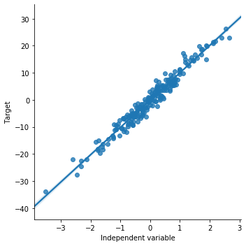
Now we will see how the scatter plot looks like for the simulated data. This is how the plot should look like when there is a linear relationship. sns.lmplot() method is used to draw a scatter plot onto a FacetGrid.
# order 1 indicates that we want seaborn to estimate a linear model (the line in the plot below) between x and y
sns.lmplot(x="x", y="y", data=toy_df, order=1)

plt.ylabel('Target')
plt.xlabel('Independent variable')
Now we will draw a scatter plot for the boston house price dataset. We will plot LSAST (% lower status of the population) vs MEDV (Median value of owner-occupied homes in $1000’s)
sns.lmplot(x="LSTAT", y="MEDV", data=boston, order=1)
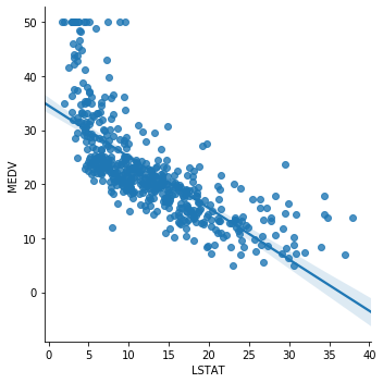
The relationship between LSTAT and MEDV is linear, apart from a few values around the minimal values of LSTAT i.e. towards the top left hand side of the plot.
Now we plot RM (average number of rooms per dwelling) vs MEDV.
sns.lmplot(x="RM", y="MEDV", data=boston, order=1)
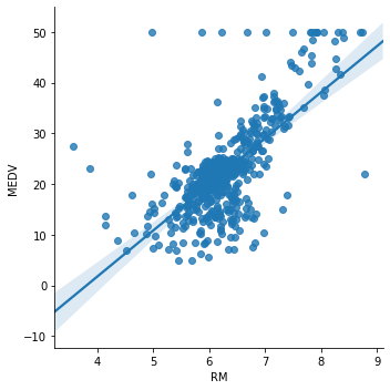
Here it is not so clear whether the relationship is linear. It does seem so around the center of the plot, but there are a lot of dots that do not adjust to the line.
Now we plot CRIM (per capita crime rate by town) vs MEDV.
sns.lmplot(x="CRIM", y="MEDV", data=boston, order=1)
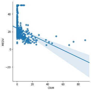
The relationship between CRIM and MEDV is clearly not linear. A transformation of CRIM may helps improve the linear relationship. We will apply log transformation to CRIM and draw the plot again.
boston['log_crim'] = np.log(boston['CRIM'])

# plot the transformed CRIM variable vs MEDV
sns.lmplot(x="log_crim", y="MEDV", data=boston, order=1)
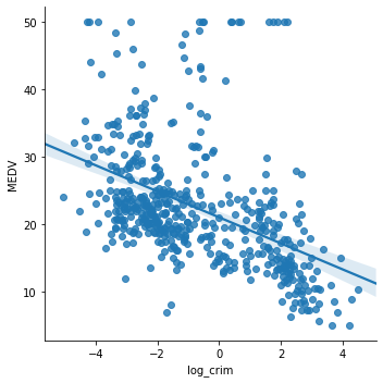
The transformation certainly improved the linear fit between CRIM and MEDV.
# let's drop the added log transformed variable we don't need it for the rest of the demo

boston.drop(labels='log_crim', inplace=True, axis=1)
Assessing linear relationship by examining the residuals (errors)
Another thing that we can do to determine whether there is a linear relationship between the variable and the target is to evaluate the distribution of the errors, or the residuals. The residuals refer to the difference between the predictions and the real value of the target. It is performed as follows:
1) Make a linear regression model using the desired variables (X)
2) Obtain the predictions
3) Determine the error (True house price – predicted house price)
4) Observe the distribution of the error.
If the house price, in this case MEDV, is linearly explained by the variables we are evaluating, then the error should be random noise, and should typically follow a normal distribution centered at 0. We expect to see the error terms for each observation lying around 0.
We will do this first, for the simulated data, to become familiar with how the plots should look like. Then we will do the same for LSTAT and then, we will transform LSTAT to see how transformation affects the residuals and the linear fit.
# SIMULATED DATA

# step 1: make a linear model
# call the linear model from sklearn
linreg = LinearRegression()

# fit the model
linreg.fit(toy_df['x'].to_frame(), toy_df['y'])

# step 2: obtain the predictions
# make the predictions
pred = linreg.predict(toy_df['x'].to_frame())

# step 3: calculate the residuals
error = toy_df['y'] - pred

# plot predicted vs real
plt.scatter(x=pred, y=toy_df['y'])
plt.xlabel('Predictions')
plt.ylabel('Real value')
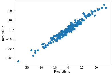
The model makes good predictions. The predictions are quite aligned with the real value of the target.
Now we will visualize the distribution of errors. If the relationship is linear, the noise should be random, centered around zero, and should follow a normal distribution. We plot the error terms vs the independent variable x. Error values should be around 0 and homogeneously distributed.
# step 4: observe the distribution of the errors

plt.scatter(y=error, x=toy_df['x'])
plt.ylabel('Residuals')
plt.xlabel('Independent variable x')
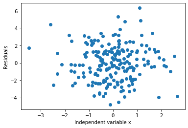
As expected, the errors are distributed around 0.
Now we will plot a histogram of the residuals (errors). They should follow a gaussian distribution centered around 0.
sns.distplot(error, bins=30)
plt.xlabel('Residuals')
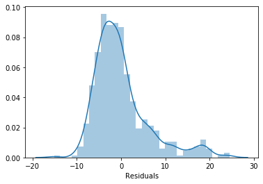
The errors adopt a Gaussian distribution and it is centered around 0. So it meets the assumptions, as expected.
Let’s do the same for LSTAT.
# step 1: call the linear model from sklearn
linreg = LinearRegression()

# fit the model
linreg.fit(boston['LSTAT'].to_frame(), boston['MEDV'])

# step 2: make the predictions
pred = linreg.predict(boston['LSTAT'].to_frame())

# step 3: calculate the residuals
error = boston['MEDV'] - pred

# plot predicted vs real
plt.scatter(x=pred, y=boston['MEDV'])
plt.xlabel('Predictions')
plt.ylabel('MEDV')
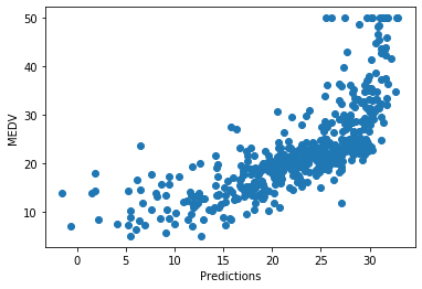
There is a relatively good fit for most of the predictions, but the model does not predict very well towards the highest house prices. For high house prices, the model under-estimates the price.
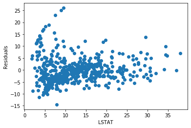
# step 4: observe the distribution of the errors

plt.scatter(y=error, x=boston['LSTAT'])
plt.ylabel('Residuals')
plt.xlabel('LSTAT')
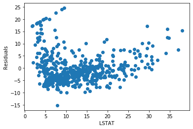
The residuals are not really centered around zero. And the errors are not homogeneously distributed across the values of LSTAT. Low and high values of LSTAT show higher errors.
The relationship could be improved.
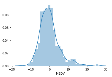
# histogram of the residuals
# should follow a gaussian distribution

sns.distplot(error, bins=30)
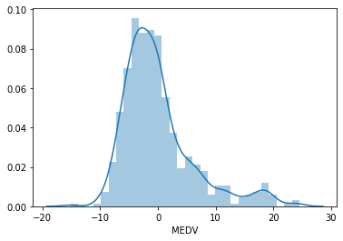
The residuals are not centered around zero, and the distribution is not totally Gaussian. There is a peak at around 20. Can we improve the fit by transforming LSTAT? To find out let’s repeat the exercise by fitting the model to log transformed LSTAT.
# step 1: call the linear model from sklearn
linreg = LinearRegression()

# fit the model
linreg.fit(np.log(boston['LSTAT']).to_frame(), boston['MEDV'])

# staep 2: make the predictions
pred = linreg.predict(np.log(boston['LSTAT']).to_frame())

# step 3: calculate the residuals
error = boston['MEDV'] - pred

# plot predicted vs real
plt.scatter(x=pred, y=boston['MEDV'])
plt.xlabel('Predictions')
plt.ylabel('MEDV')
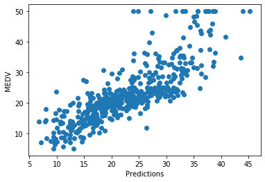
The predictions seem a bit better compared to the non-transformed variable.
# step 4: observe the distribution of the errors

plt.scatter(y=error, x=boston['LSTAT'])
plt.ylabel('Residuals')
plt.xlabel('LSTAT')
The residuals are more centered around zero and more homogeneously distributed across the values of x.
# histogram of the residuals
# should follow a gaussian distribution

sns.distplot(error, bins=30)
The histogram looks more Gaussian, and the peak towards 20 has now disappeared. We can see how a variable transformation improved the fit and helped meet the linear model assumption of linearity.
Go ahead and try this in the variables RM and CRIM.
Multicolinearity
To determine co-linearity, we evaluate the correlation of all the independent variables in the dataframe. We will calculate the correlations using pandas corr() and round off the values to 2 decimals. We will plot the correlation matrix using heatmaps(). A heatmap is a graphical representation of data in which data values are represented as colors. They are typically used to visualize correlation matrices.
correlation_matrix = boston[features].corr().round(2)
figure = plt.figure(figsize=(12, 12))
# annot = True to print the correlation values inside the squares
sns.heatmap(data=correlation_matrix, annot=True)

On the x and y axis of the heatmap we have the variables of the boston house dataframe. Within each square, the correlation value between those 2 variables is indicated. For example, for LSTAT vs CRIM at the bottom left of the heatmap, we see a correlation of 0.46. These 2 variables are not highly correlated.
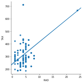
Instead, for the variables RAD and TAX, the correlation is 0.91. These variables are highly correlated. The same is true for the variables NOX and DIS, which show a correlation value of -0.71.
Let’s see how they look in a scatter plot. We will plot the correlation between RAD (index of accessibility to radial highways) and TAX (full-value property-tax rate per $10,000).
sns.lmplot(x="RAD", y="TAX", data=boston, order=1)
Simillary for NOX (itric oxides concentration (parts per 10 million)) and DIS (weighted distances to five Boston employment centres).
sns.lmplot(x="NOX", y="DIS", data=boston, order=1)
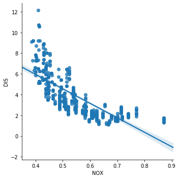
The correlation, or co-linearity between NOX and DIS, is quite obvious in the above scatter plot. So these variables are violating the assumption of no multi co-linearity.
We would remove 1 of the 2 from the dataset before training the linear model.
Normality
We evaluate normality using histograms and Q-Q plots. Let’s begin with histograms. If the variable is normally distributed, we should observe the typical Gaussian bell shape.
Histograms
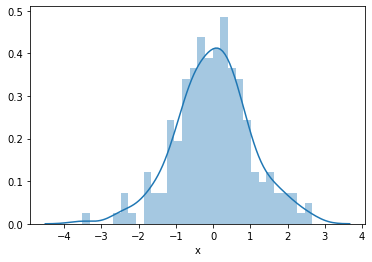
First we will plot the histogram of the simulated independent variable x which we know follows a Gaussian distribution.
sns.distplot(toy_df['x'], bins=30)
Now we will plot the histogram of the variable RM (average number of rooms per dwelling).
sns.distplot(boston['RM'], bins=30)
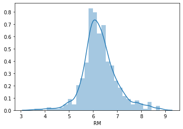
This variable seems to follow a Normal distribution hence it meets the assumption.
We will plot a histogram for the variable LSTAT (% lower status of the population).
sns.distplot(boston['LSTAT'], bins=30)
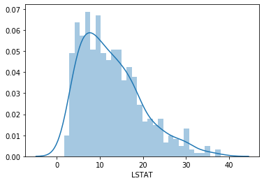
LSTAT is skewed. Let’s see if a transformation fixes this.
# histogram of the log-transformed LSTAT for comparison
sns.distplot(np.log(boston['LSTAT']), bins=30)

The distribution is less skewed, but not totally normal either. We could go ahead and try other transformations.
Q-Q plots
In a Q-Q plot, the quantiles of the variable are plotted on the vertical axis (y), and the quantiles of a specified probability distribution (Gaussian distribution) are indicated on the horizontal axis (x). The plot consists of a series of points that show the relationship between the quantiles of the real data and the quantiles of the specified probability distribution. If the values of a variable perfectly match the specified probability distribution (i.e. the normal distribution), the points on the graph will form a 45 degree line.
Let’s plot the Q-Q plot for the simualted data. The dots should adjust to the 45 degree line
stats.probplot(toy_df['x'], dist="norm", plot=plt)
plt.show()
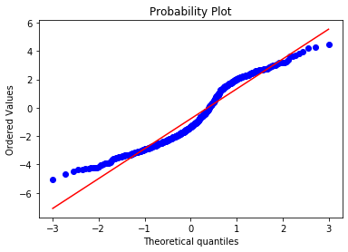
And they do. This is how a normal distribution looks like in a Q-Q plot. Let’s do the same for RM.
stats.probplot(boston['RM'], dist="norm", plot=plt)
plt.show()
Most of the points adjust to the 45 degree line. However, the values at both ends of the distribution deviate from the line. This indicates that the distribution of RM is not perfectly Gaussian.
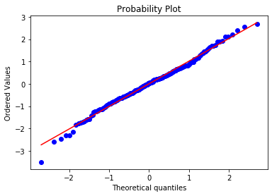
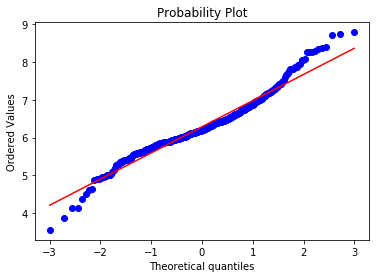
Let’s plot for LSTAT.
stats.probplot(boston['LSTAT'], dist="norm", plot=plt)
plt.show()
Many of the observations lie on the 45 degree red line following the expected quantiles of the theoretical Gaussian distribution, particularly towards the center of the plot. Some observations at the lower and upper end of the value range depart from the red line, which indicates that the variable LSTAT is not normally distributed, as we rightly see in the histogram.
Let’s see if a transformation improves the normality.
# and now for the log transformed LSTAT
stats.probplot(np.log(boston['LSTAT']), dist="norm", plot=plt)
plt.show()

We can see that after the transformation, the quantiles are more aligned over the 45 degree line with the theoretical quantiles of the Gaussian distribution.
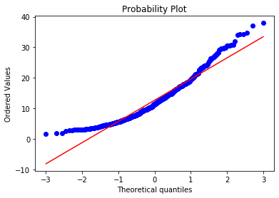
Just for comparison, let’s go ahead and plot CRIM.
stats.probplot(boston['CRIM'], dist="norm", plot=plt)
plt.show()

Now let’s see if a transformation improves the plot.
stats.probplot(np.log(boston['CRIM']), dist="norm", plot=plt)
plt.show()
In this case, the transformation improved the fit, but the transformed distribution is not Gaussian. You could try with a different transformation.
Homocedasticity
Homoscedasticity, also known as homogeneity of variance, describes a situation in which the error term (that is, the “noise” or random disturbance in the relationship between the independent variables X and the dependent variable Y is the same across all the independent variables.
The way to identify if the variables are homoscedastic, is to make a linear model with all the independent variables involved, calculate the residuals, and plot the residuals vs each one of the independent variables. If the distribution of the residuals is homogeneous across the variable values, then the variables are homoscedastic.
There are other tests for homoscedasticity:
- Residual plot
- Levene’s test
- Barlett’s test
- Goldfeld-Quandt Test
For this demo we will focus on residual plot analysis.
To train and evaluate the model we will split the data into training and testing set with the help of train_test_split(). We will use the variables RM, LSTAT and CRIM as the feature space and MEDV as the target. The test_size = 0.3 will keep 30% data for testing and 70% data will be used for training the model. random_state controls the shuffling applied to the data before applying the split.
X_train, X_test, y_train, y_test = train_test_split(
    boston[['RM', 'LSTAT', 'CRIM']],
    boston['MEDV'],
    test_size=0.3,
    random_state=0)

X_train.shape, X_test.shape, y_train.shape, y_test.shape
((354, 3), (152, 3), (354,), (152,))
Now we will scale the features. StandardScaler() standardizes the features by removing the mean and scaling to unit variance
The standard score of a sample x is calculated as:
z = (x – u) / s
where u is the mean of the training samples and s is the standard deviation of the training samples.
scaler = StandardScaler()
scaler.fit(X_train)
StandardScaler(copy=True, with_mean=True, with_std=True)
Now we will build the model and make predictions.
# call the model
linreg = LinearRegression()

# train the model
linreg.fit(scaler.transform(X_train), y_train)

# make predictions on the train set and calculate the mean squared error
print('Train set')
pred = linreg.predict(scaler.transform(X_train))
print('Linear Regression mse: {}'.format(mean_squared_error(y_train, pred)))

# make predictions on the test set and calculate the mean squared error
print('Test set')
pred = linreg.predict(scaler.transform(X_test))
print('Linear Regression mse: {}'.format(mean_squared_error(y_test, pred)))
print()
Train set
Linear Regression mse: 28.603232128198893
Test set
Linear Regression mse: 33.20006295308442
Next we will calculate the residuals and plot the residuals vs LSTAT which is one of the independent variables.
# calculate the residuals
error = y_test - pred

# plot the residuals vs LSTAT
plt.scatter(x=X_test['LSTAT'], y=error)
plt.xlabel('LSTAT')
plt.ylabel('Residuals')
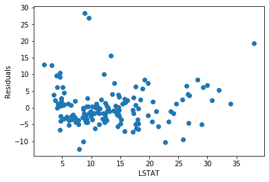
The residuals seem fairly homogeneously distributed across the values of LSTAT.
Let’s plot the residuals vs RM.
plt.scatter(x=X_test['RM'], y=error)
plt.xlabel('RM')
plt.ylabel('Residuals')
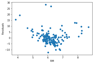
For this variable, the residuals do not seem to be homogeneously distributed across the values of RM. In fact, low and high values of RM show higher error terms.
Now we will plot residuals vs CRIM.
plt.scatter(x=X_test['CRIM'], y=error)
plt.xlabel('CRIM')
plt.ylabel('Residuals')
Text(0, 0.5, 'Residuals')
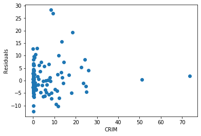
The residuals for this particular variable are very skewed.
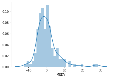
We will plot a histogram for error. The distribution of the residuals is fairly normal, but not quite, with more high values than expected towards the right end of the distribution.
sns.distplot(error, bins=30)
We will use the yellobricks library. It is a library for visualisation of machine learning model outcomes.
To install the library you can run the following command-
pip install yellowbrick
yellowbricks allows you to visualise the residuals of the models after fitting a linear regression.
from yellowbrick.regressor import ResidualsPlot

linreg = LinearRegression()
linreg.fit(scaler.transform(X_train), y_train)
visualizer = ResidualsPlot(linreg)

visualizer.fit(scaler.transform(X_train), y_train)  # Fit the training data to the model
visualizer.score(scaler.transform(X_test), y_test)  # Evaluate the model on the test data
visualizer.poof()
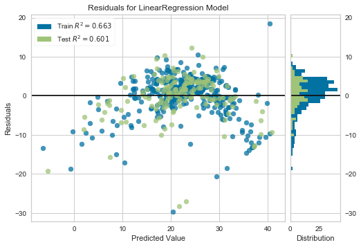
We see from the plot that the residuals are not homogeneously distributed across the predicted value and are not centered around zero either.
Let’s see if transformation of the variables CRIM and LSTAT helps improve the fit and the homoscedasticity.
# log transform the variables
boston['LSTAT'] = np.log(boston['LSTAT'])
boston['CRIM'] = np.log(boston['CRIM'])
boston['RM'] = np.log(boston['RM'])

# let's separate into training and testing set
X_train, X_test, y_train, y_test = train_test_split(
    boston[['RM', 'LSTAT', 'CRIM']],
    boston['MEDV'],
    test_size=0.3,
    random_state=0)

X_train.shape, X_test.shape, y_train.shape, y_test.shape
((354, 3), (152, 3), (354,), (152,))
# let's scale the features
scaler = StandardScaler()
scaler.fit(X_train)
StandardScaler(copy=True, with_mean=True, with_std=True)
# building the model

# call the model
linreg = LinearRegression()

# fit the model
linreg.fit(scaler.transform(X_train), y_train)

# make predictions and calculate the mean squared error over the train set
print('Train set')
pred = linreg.predict(scaler.transform(X_train))
print('Linear Regression mse: {}'.format(mean_squared_error(y_train, pred)))

# make predictions and calculate the mean squared error over the test set
print('Test set')
pred = linreg.predict(scaler.transform(X_test))
print('Linear Regression mse: {}'.format(mean_squared_error(y_test, pred)))
print()
Train set
Linear Regression mse: 24.36853232810096
Test set
Linear Regression mse: 29.516553315892253
If you compare these squared errors with the ones obtained using the non-transformed data, you can see that transformation improved the fit, as the mean squared errors for both train and test sets are smaller after using transformed data.
# calculate the residuals
error = y_test - pred

# residuals plot vs LSTAT
plt.scatter(x=X_test['LSTAT'], y=error)
plt.xlabel('LSTAT')
plt.ylabel('Residuals')
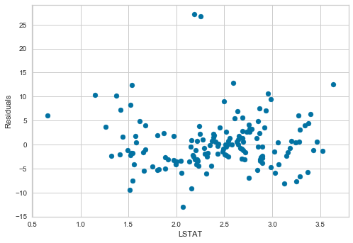
Values seem homogeneously distributed across values of LSTAT and centered around zero.
# residuals plot vs RM
plt.scatter(x=X_test['RM'], y=error)
plt.xlabel('RM')
plt.ylabel('Residuals')
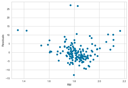
The transformation improved the spread of the residuals across the values of RM.
# residuals plot vs CRIM
plt.scatter(x=X_test['CRIM'], y=error)
plt.xlabel('CRIM')
plt.ylabel('Residuals')

The transformation helped distribute the residuals across the values of CRIM.
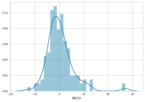
Now we will plot a histogram for error.
sns.distplot(error, bins=30)

The distribution of the residuals is more Gaussian looking now. There is still a few higher than expected residuals towards the right of the distribution, but leaving those apart, the distribution seems less skewed than with the non-transformed data.
Now let’s plot the residuals using yellowbricks.
linreg = LinearRegression()
linreg.fit(scaler.transform(X_train), y_train)
visualizer = ResidualsPlot(linreg)

visualizer.fit(scaler.transform(X_train), y_train)  # Fit the training data to the model
visualizer.score(scaler.transform(X_test), y_test)  # Evaluate the model on the test data
visualizer.poof()
The errors are more homogeneously distributed and centered around 0.
The errors are more homogeneously distributed and centered around 0.
Look at the R square values in the yellowbricks residual plots. Compare the values for the models utilising the transformed and non-transformed data. We can see how transforming the data, improved the fit (Test R square of 0.65 for transformed data vs 0.6 for non-transformed data).
1 Comment