
Data visualization is the cornerstone of exploratory data analysis. A raw table of numbers is difficult to digest, but a single, well-crafted chart can instantly reveal hidden trends, patterns, and outliers in your data.
Seaborn is a powerful Python data visualization library built on top of Matplotlib. It provides a high-level, declarative interface for drawing attractive, informative statistical graphics, automating complex tasks like mapping variables to visual properties, calculating confidence intervals, and managing multi-panel layouts.
In this tutorial you will build a wide range of plots using Seaborn's relational, categorical, distribution, and regression modules. Using real-world datasets like tips, fmri, iris, and titanic, you will learn how to create visualizations that are both beautiful and publication-ready.
Prerequisites: Python 3.x, Seaborn, Pandas, NumPy, Matplotlib.
Setup
Before generating any plots, you must set up your environment by importing the required libraries and configuring global styles.
Imports and Global Style
Group the necessary libraries into a single import block. We import Seaborn, Pandas, NumPy, and PyPlot, and configure Jupyter to display the charts inline:
import seaborn as sns
import pandas as pd
import numpy as np
import matplotlib.pyplot as plt
%matplotlib inline
Configure Seaborn's default visual style to add a background grid that aids readability without competing with the data points:
sns.set(style='darkgrid')Loading Sample Data
Seaborn includes several built-in datasets for testing. Load the tips dataset, which records customer billing details, and inspect the final five entries:
tips = sns.load_dataset('tips')
tips.tail()| total_bill | tip | sex | smoker | day | time | size | |
|---|---|---|---|---|---|---|---|
| 239 | 29.03 | 5.92 | Male | No | Sat | Dinner | 3 |
| 240 | 27.18 | 2.00 | Female | Yes | Sat | Dinner | 2 |
| 241 | 22.67 | 2.00 | Male | Yes | Sat | Dinner | 2 |
| 242 | 17.82 | 1.75 | Male | No | Sat | Dinner | 2 |
| 243 | 18.78 | 3.00 | Female | No | Thur | Dinner | 3 |
Relational Plots
Relational plots are used to visualize how variables in a dataset associate with each other. Seaborn provides the flexible relplot function to examine relationships using scatter and line representations.
relplot Basics
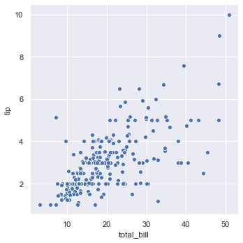
The figure-level function sns.relplot() defaults to drawing a scatter plot, which helps map the relationship between two continuous variables:
sns.relplot(x='total_bill', y='tip', data=tips)The basic scatter plot shows the relationship between total bill amount and tip amount:
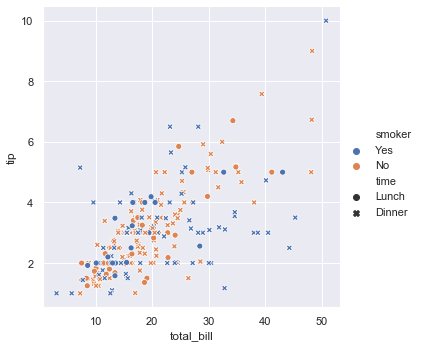
Add categorical dimensions to the scatter plot by mapping them to marker colors (hue) and marker shapes (style):
sns.relplot(x='total_bill', y='tip', data=tips, hue='smoker', style='time')Mapping variables to color hue and marker style separates smoking status and dining time across the observations:
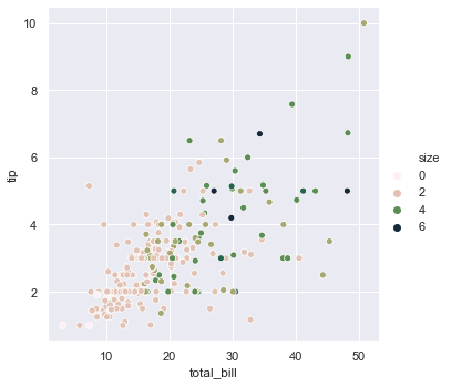
For numeric variables, map the values to a sequential color scale using a custom cubehelix color palette:
sns.relplot(x='total_bill', y='tip', hue='size', data=tips, palette='ch:r=-0.8, l=0.95')Using a continuous color gradient represents the party size, styled with a custom cubehelix palette:
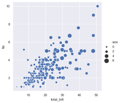
Vary point sizing alongside color to highlight differences in group size:
sns.relplot(x='total_bill', y='tip', data=tips, size='size', sizes=(15, 200))Scaling the scatter point diameters based on party size adds another layer of quantitative variation:
lineplot and Confidence Intervals
For sequential data like time-series, set kind='line'. Set sort=True to order values along the x-axis:
from numpy.random import randn

df = pd.DataFrame(dict(time=np.arange(500), value=randn(500).cumsum()))
sns.relplot(x='time', y='value', kind='line', data=df, sort=True)
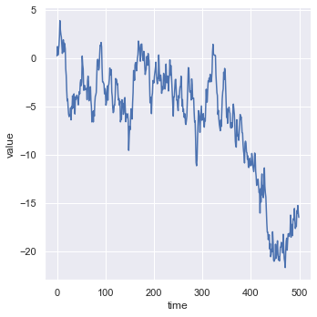
The resulting line plot shows the chronological progression of a random walk with values sorted along the x-axis:
If the dataset represents spatial coordinates or path tracking where chronological order is not sorted along the x-axis, set sort=False:
df = pd.DataFrame(randn(500, 2).cumsum(axis=0), columns=['time', 'value'])
sns.relplot(x='time', y='value', kind='line', data=df, sort=False)
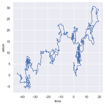
Setting sort to false preserves the unsorted sequence, creating a spatial path plot of coordinate movement:
When plotting datasets with multiple measurements per x-value, Seaborn aggregates observations and shows a 95% confidence interval. You can disable this shaded area by setting ci=False:
fmri = sns.load_dataset('fmri')
sns.relplot(x='timepoint', y='signal', kind='line', data=fmri, ci=False)
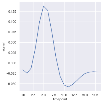
The line plot displays the average neural signal across timepoints without any shaded confidence intervals:
Change the shaded representation to display one standard deviation of spread around the mean by setting ci='sd':
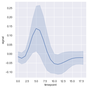
sns.relplot(x='timepoint', y='signal', kind='line', data=fmri, ci='sd')Updating the confidence interval to sd overlays a shaded region indicating one standard deviation of spread around the mean:
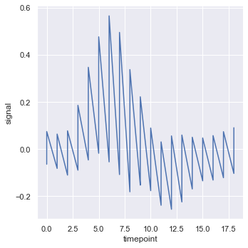
To plot every individual measurement thread without any aggregation, set estimator=None:
sns.relplot(x='timepoint', y='signal', estimator=None, kind='line', data=fmri)Disabling aggregation draws the raw, un-averaged signal trace for every subject, showing the full density of the observations:
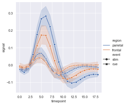
Distinguish line categories using a combination of colors and markers, while disabling dashed line patterns with dashes=False:
sns.relplot(x='timepoint', y='signal', hue='region', style='event',
            kind='line', data=fmri, markers=True, dashes=False)
The resulting chart uses color and marker styles to compare regional and event responses while keeping the line styles solid:
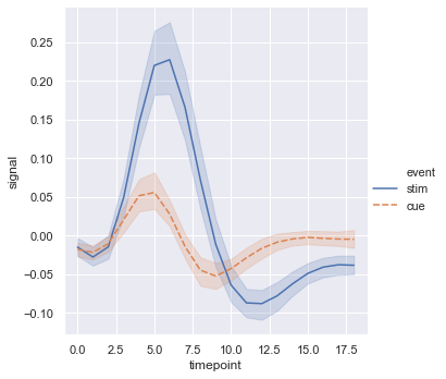
Map color hue and marker style to the same variable to make group differences highly readable:
sns.relplot(x='timepoint', y='signal', hue='event', style='event',
            kind='line', data=fmri)
The plot combines line style and color for the event category to make the comparison highly visible:
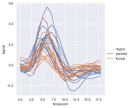
Use the units parameter to isolate separate trajectories for each participant without aggregating their values:
sns.relplot(x='timepoint', y='signal', hue='region', units='subject',
            estimator=None, kind='line',
            data=fmri.query("event == 'stim'"))
The plot shows individual subject trajectories for the stim event, grouped by brain region:
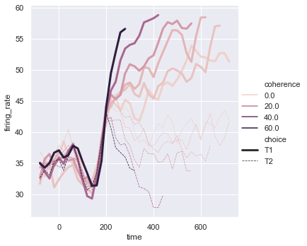
Map line widths using a custom sequential palette to trace differences across multiple groups:
dots = sns.load_dataset('dots').query("align == 'dots'")
palette = sns.cubehelix_palette(light=0.5, n_colors=6)
sns.relplot(x='time', y='firing_rate', data=dots, kind='line',
            hue='coherence', size='choice', style='choice', palette=palette)
The line plot displays firing rates over time, with colors indicating coherence and line thickness representing choices:
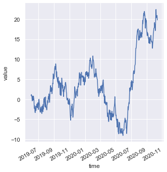
When working with datetime values on the x-axis, rotate tick labels automatically using the helper function autofmt_xdate():
df = pd.DataFrame(dict(
    time=pd.date_range('2019-06-02', periods=500),
    value=randn(500).cumsum()
))
g = sns.relplot(x='time', y='value', kind='line', data=df)
g.fig.autofmt_xdate()
The rotated labels prevent overlap along the date axis, keeping the time-series labels legible:
Multi-Panel FacetGrids
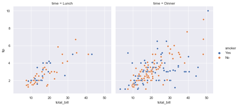
Pass col to split the visualization across multiple side-by-side plots based on categorical levels:
sns.relplot(x='total_bill', y='tip', hue='smoker', col='time', data=tips)Splitting the data on meal times generates side-by-side scatter plots in a FacetGrid layout:
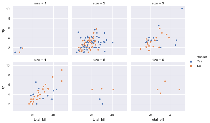
Set col_wrap to wrap columns onto new rows when dealing with categories containing many levels:
sns.relplot(x='total_bill', y='tip', hue='smoker', col='size',
            data=tips, col_wrap=3, height=3)
Wrapping the columns at three arranges the six party size subsets across a clean two-row layout:
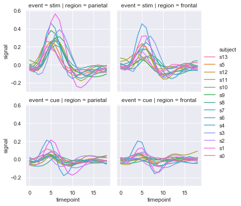
Combine row and col to layout a complete two-dimensional panel grid of trajectories:
sns.relplot(x='timepoint', y='signal', hue='subject', col='region',
            row='event', height=3, kind='line', estimator=None, data=fmri)
The resulting 2x2 grid separates regional and event trajectories, keeping individual subject lines distinct:
Axes-Level Alternatives
Use sns.lineplot() and sns.scatterplot() directly when embedding figures within complex, customized Matplotlib layouts:
sns.lineplot(x='total_bill', y='tip', data=tips)sns.scatterplot(x='total_bill', y='tip', data=tips)Categorical Plots
Categorical plots allow you to visualize variables grouped by distinct categories. You can show point frequencies, distributions, or aggregated estimates across different categorical levels.
catplot and Strip Plots
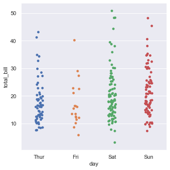
The default kind='strip' setting in sns.catplot() plots observations as individual points scattered along the categorical axis:
sns.catplot(x='day', y='total_bill', data=tips)The default strip plot shows individual bill amounts distributed across the days of the week:
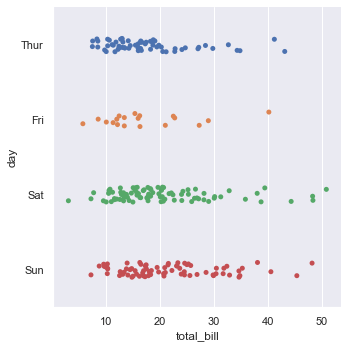
Swap the x and y assignments to rotate the category axis horizontally:
sns.catplot(y='day', x='total_bill', data=tips)Swapping x and y axes rotates the strip plot, presenting the distributions horizontally:
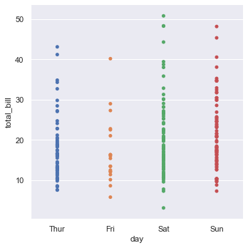
Disable random horizontal scattering by setting jitter=False to align points in straight columns:
sns.catplot(x='day', y='total_bill', data=tips, jitter=False)Disabling jitter stacks the points vertically in a single line for each weekday category:
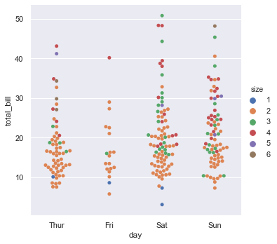
Use kind='swarm' to arrange points edge-to-edge without overlapping, showing the precise density shape:
sns.catplot(x='day', y='total_bill', data=tips, kind='swarm', hue='size')The swarm plot arranges points horizontally to avoid overlapping, colored by party size:
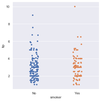
Control the exact display order of categorical groups using the order parameter:
sns.catplot(x='smoker', y='tip', data=tips, order=['No', 'Yes'])The ordered strip plot groups tip amounts by smoker status, displaying non-smokers before smokers:
Box and Boxen Plots
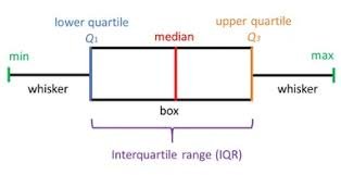
Box plots summarize a distribution using five key statistics: the minimum, lower quartile (), median, upper quartile (), and maximum.
The box plot diagram below details how the five-number summary divides a dataset's distribution:
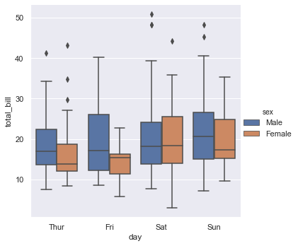
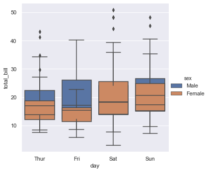
Generate a box plot of total bills split across weekdays, grouping categories by sex:
sns.catplot(x='day', y='total_bill', kind='box', data=tips, hue='sex')Splitting the boxes by gender compares the median and spread of total bills for male and female diners:
Overlay box plots directly on top of each other within each weekday category by setting dodge=False:
sns.catplot(x='day', y='total_bill', kind='box', data=tips, hue='sex', dodge=False)Setting dodge to false overlays the male and female box plots within the same category column:
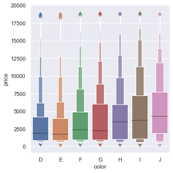
On large datasets, use the boxen plot to show more granular quantile steps down the distribution tails:
diamonds = sns.load_dataset('diamonds')
sns.catplot(x='color', y='price', kind='boxen', data=diamonds.sort_values('color'))
The boxen plot shows multiple quantiles of price distributions across diamond colors, highlighting tail characteristics:
Violin Plots
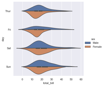
Violin plots combine box plot summaries with smooth kernel density estimations. Set split=True to compare two nested categories as mirror halves of the same violin shape:
sns.catplot(x='total_bill', y='day', hue='sex', kind='violin',
            data=tips, split=True)
Splitting the violins draws the male and female density distributions as mirror halves, saving space and improving comparison:
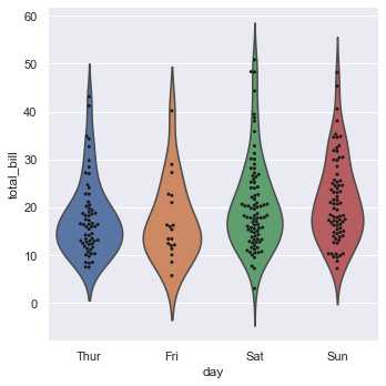
Combine smooth density lines with exact coordinate points by overlaying a swarm plot onto a violin plot:
g = sns.catplot(x='day', y='total_bill', kind='violin', inner=None, data=tips)
sns.swarmplot(x='day', y='total_bill', color='k', size=3, data=tips, ax=g.ax)
Overlaying a swarm plot onto a violin plot shows the individual data points on top of the smooth density estimate:
Bar and Point Plots
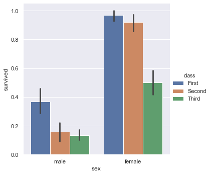
Bar plots display statistical estimates (usually the mean) as rectangular heights. Load the titanic dataset to visualize survival rates:
titanic = sns.load_dataset('titanic')
sns.catplot(x='sex', y='survived', hue='class', kind='bar', data=titanic)
The bar plot displays survival rates, with error bars representing the confidence interval of the estimated mean:
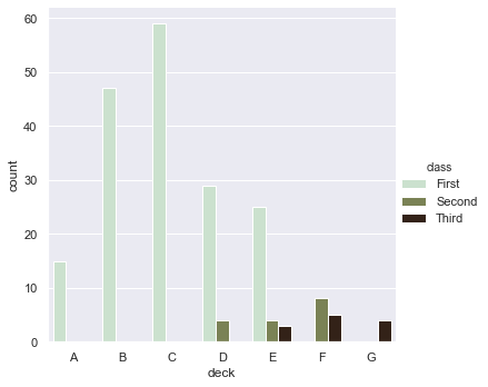
Use a count plot to display the raw frequencies of observations across categorical bins:
sns.catplot(x='deck', kind='count', palette='ch:0.95', data=titanic, hue='class')The count plot shows passenger frequencies across different ship decks, colored by passenger ticket class:
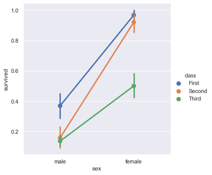
A point plot isolates the estimated mean and confidence interval, connecting them with lines to emphasize trends across categories:
sns.catplot(x='sex', y='survived', hue='class', kind='point', data=titanic)The point plot links estimated survival means across categories, making class differences easy to track:
Distribution Plots
Distribution plots describe how observations of numerical variables are spread out. You can examine single variables or study bivariate and multivariate relationships simultaneously.
Univariate Distributions
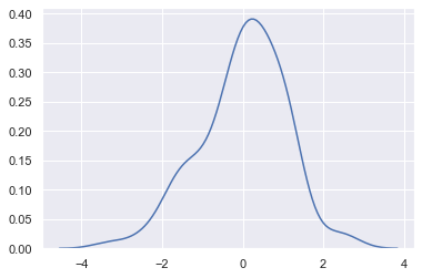
Plot a single variable distribution using a histogram overlaid with a smooth kernel density estimate line:
x = randn(100)
sns.distplot(x, kde=True, hist=False, rug=False, bins=30)
The distribution plot displays a smooth kernel density estimate curve representing the random distribution:
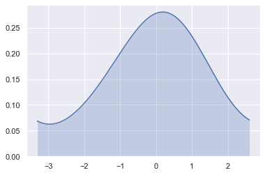
Plot a standalone KDE curve, filling the region underneath and truncating the estimate at the observed data limits by setting cut=0:
sns.kdeplot(x, shade=True, cbar=True, bw=1, cut=0)The shaded KDE plot cuts off density estimations at the extreme edges of the observed sample range:
Bivariate Distributions
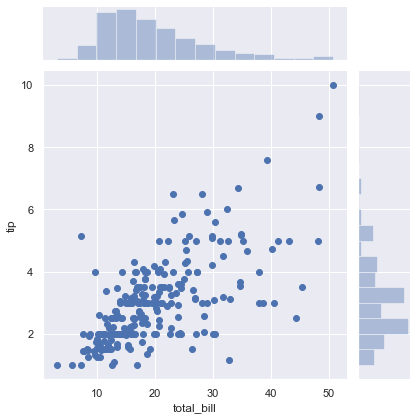
Use sns.jointplot() to display the joint relationship between two variables alongside their individual marginal distributions:
x = tips['total_bill']
y = tips['tip']
sns.jointplot(x=x, y=y)
The joint plot combines the bivariate scatter plot with individual marginal histograms for both variables:
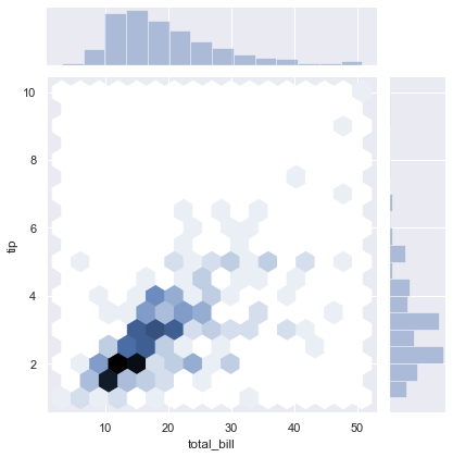
Replace the scatter points with hexagonal bins to better represent data density in crowded plots:
sns.set()
sns.jointplot(x=x, y=y, kind='hex')
The hexbin joint plot aggregates points into hexagonal bins to display local density in crowded regions:
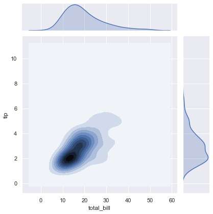
Use 2D contour lines to display a continuous density estimate of the joint relationship:
sns.jointplot(x=x, y=y, kind='kde')The contour joint plot replaces individual points with a smooth 2D density contour map:
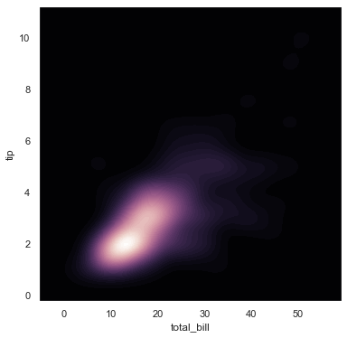
Map variables to color density levels directly using a reverse cubehelix colormap:
f, ax = plt.subplots(figsize=(6, 6))
cmap = sns.cubehelix_palette(as_cmap=True, dark=0, light=1, reverse=True)
sns.kdeplot(x, y, cmap=cmap, n_levels=60, shade=True)
The custom KDE plot uses a reverse cubehelix colormap to display density contours on a dark background:
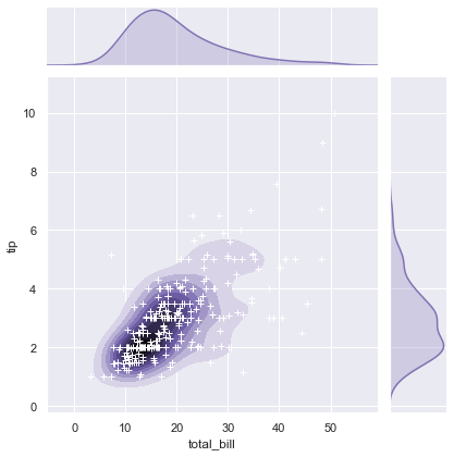
Combine contour density fields with custom marker points on a JointGrid canvas:
g = sns.jointplot(x, y, kind='kde', color='m')
g.plot_joint(plt.scatter, c='w', s=30, linewidth=1, marker='+')
g.ax_joint.collections[0].set_alpha(0)
The custom JointGrid combines a shaded density contour map with overlaid scatter markers:
Pair Plots with PairGrid
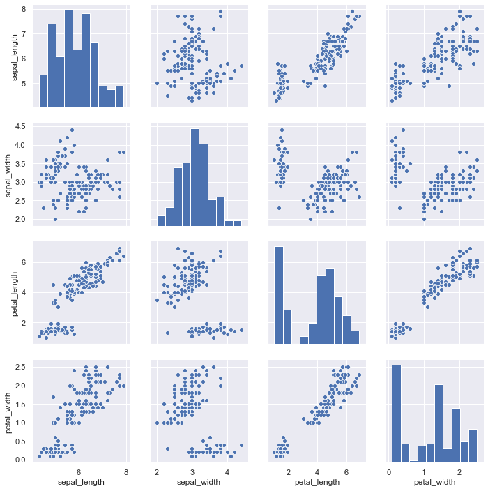
Generate a matrix of pairwise relationships across all numerical variables in a dataset:
iris = sns.load_dataset('iris')
sns.pairplot(iris)
The pair plot visualizes all pairwise variable combinations across the Iris features, highlighting class separations:
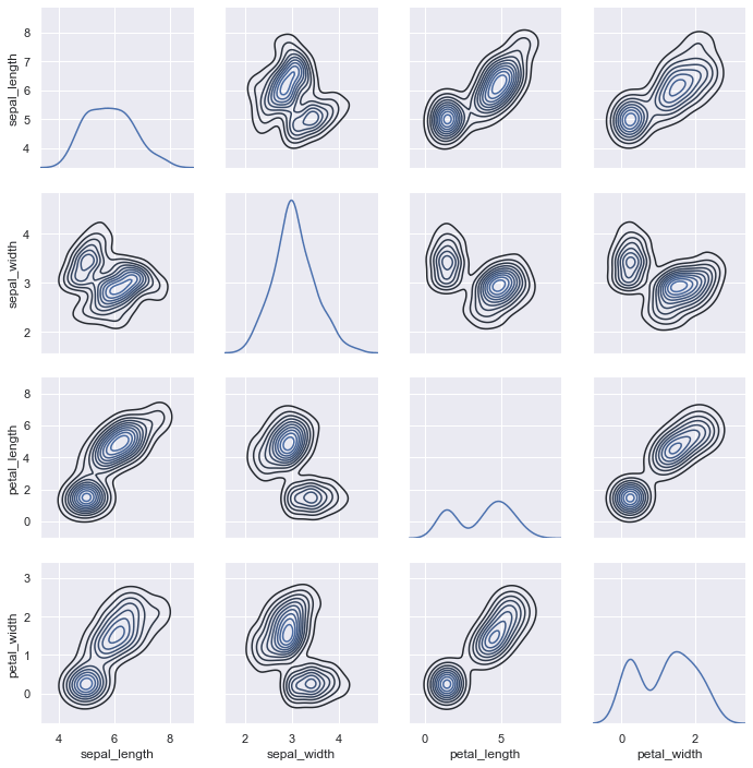
Use a PairGrid to customize different plot types on the diagonal and off-diagonal cells:
g = sns.PairGrid(iris)
g.map_diag(sns.kdeplot)
g.map_offdiag(sns.kdeplot, n_levels=10)
The custom PairGrid maps univariate density plots on the diagonal and contour density maps off the diagonal:
Regression Plots
Regression plots add analytical value to your visualizations by overlaying linear or non-linear models onto your data. They help visually identify correlations and trends.
regplot and lmplot Basics
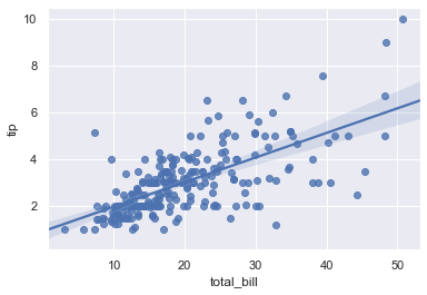
Fit a simple linear regression trend line to your scatter coordinates:
sns.regplot(x='total_bill', y='tip', data=tips)The regression plot displays a linear trend line fitted to the scatter points, shaded with a 95% confidence interval:
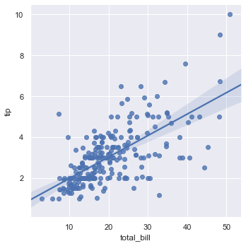
Generate the regression plot inside a square FacetGrid panel using the figure-level lmplot() function:
sns.lmplot(x='total_bill', y='tip', data=tips)The lmplot function wraps regplot in a figure-level grid structure, producing a similar regression fit on a square canvas:
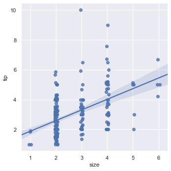
When working with discrete groups, add horizontal jitter to spread points out along the categorical columns:
sns.lmplot(x='size', y='tip', data=tips, x_jitter=0.05)Adding horizontal jitter to the discrete sizes makes the scatter point density visible along the trend line:
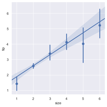
Collapse discrete data groups into a single mean value point accompanied by its confidence interval line:
sns.lmplot(x='size', y='tip', data=tips, x_estimator=np.mean)Collapsing points to their conditional means displays clear vertical error bands at each size category:
Non-Linear and Robust Regression
Load the Anscombe dataset containing four distinct groupings to compare different regression situations:
data = sns.load_dataset('anscombe')
data['dataset'].value_counts()II 11
I 11
III 11
IV 11
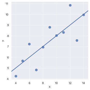
Name: dataset, dtype: int64Subset I contains a standard linear relationship where a simple trend line fits the points well:
sns.lmplot(x='x', y='y', data=data.query("dataset == 'I'"),
           ci=None, scatter_kws={'s': 80})
For subset I, a simple linear regression line fits the data points perfectly:
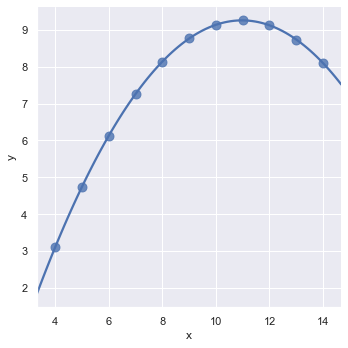
For subset II showing a curved relationship, use a second-order polynomial regression line by setting order=2:
sns.lmplot(x='x', y='y', data=data.query("dataset == 'II'"),
           ci=None, scatter_kws={'s': 80}, order=2)
Fitting a second-order polynomial regression line captures the parabolic structure of subset II:
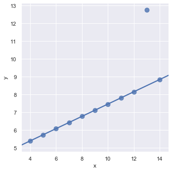
For data containing outliers that skew the linear fit, enable robust estimation to down-weight outlier points:
sns.lmplot(x='x', y='y', data=data.query("dataset == 'III'"),
           ci=None, scatter_kws={'s': 80}, robust=True)
Using a robust regression estimator ignores the vertical outlier point to fit the main trend line correctly:
Multi-Panel Regression Grids
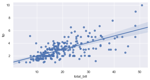
Set custom dimensions on your figure canvas by passing a target Matplotlib axis object:
f, ax = plt.subplots(figsize=(8, 4))
sns.regplot(x='total_bill', y='tip', data=tips, ax=ax)
Passing the custom ax reference renders the regression plot on a wider, rectangular layout:
Split the linear fits into multiple weekday columns using a wrapped panel layout:
sns.lmplot(x='total_bill', y='tip', data=tips, col='day', col_wrap=2, height=4)The regression grid displays independent linear trends for each weekday, wrapped across two columns:
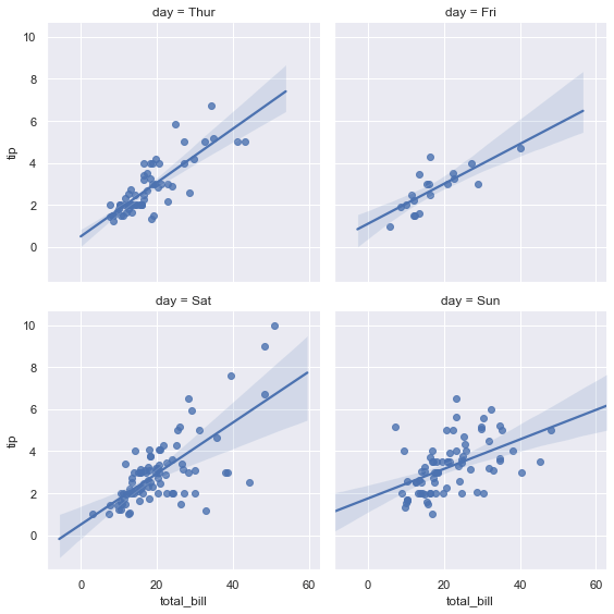
Figure Aesthetics
Seaborn allows you to customize the visual presentation of your charts easily. You can control grid styling, label font sizes, and color palettes to match publication or presentation requirements.
Styles and Spines
Define a helper function to output multiple offset sine waves:
def sinplot(flip=1):
    x = np.linspace(0, 14, 100)
    for i in range(1, 7):
        plt.plot(x, np.sin(x + i * 0.5) * (7 - i) * flip)
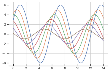
Configure style ticks and remove the top and right spines to clean up the chart border:
sns.set_style('ticks', {'axes.grid': True, 'xtick.direction': 'in'})
sinplot()
sns.despine(left=True, bottom=False)
The resulting sine plot displays grid lines and ticks, with the top and right spines removed:
Print the current active style configuration dictionary to inspect and customize specific layout parameters:
sns.axes_style(){'axes.facecolor': 'white', 'axes.edgecolor': '.15', 'axes.grid': True, 'axes.axisbelow': True, 'axes.labelcolor': '.15', 'figure.facecolor': 'white', 'grid.color': '.8', 'grid.linestyle': '-', 'text.color': '.15', 'xtick.color': '.15', 'ytick.color': '.15', 'xtick.direction': 'in', 'ytick.direction': 'out', 'lines.solid_capstyle': 'round', 'patch.edgecolor': 'w', 'image.cmap': 'rocket', 'font.family': ['sans-serif'], 'font.sans-serif': ['Arial', 'DejaVu Sans', 'Liberation Sans', 'Bitstream Vera Sans', 'sans-serif'], 'patch.force_edgecolor': True, 'xtick.bottom': True, 'xtick.top': False, 'ytick.left': True, 'ytick.right': False, 'axes.spines.left': True, 'axes.spines.bottom': True, 'axes.spines.right': True, 'axes.spines.top': True}Context Scaling
Scale label dimensions for different publication formats (such as papers or posters) using context scaling configurations:
| Context | Scale |
|---|---|
'paper' |
0.8× |
'notebook' |
1× (default) |
'talk' |
1.3× |
'poster' |
1.6× |
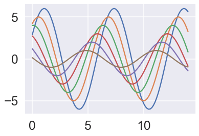
Scale the active context for slide presentations by setting 'talk' with an independent font multiplier:
sns.set_style('darkgrid')
sns.set_context('talk', font_scale=1.5)
sinplot()
The talk context scales up lines, tick labels, and axes labels for high-visibility presentation display:
Color Palettes
Inspect the active default color palette:
current_palettes = sns.color_palette()
sns.palplot(current_palettes)
The swatches show the colors contained in Seaborn's active default palette:

Switch to the HLS color space to generate evenly spaced hues across the color spectrum:
sns.palplot(sns.color_palette('hls', 8))The swatches show eight colors evenly spaced across the HLS hue spectrum:

Conclusion
In this tutorial you explored the full Seaborn visualization pipeline. By analyzing real-world datasets like tips, fmri, iris, and titanic, you created structured, informative graphics covering relational mapping, categorical groupings, distribution distributions, and regression lines.
Key takeaways:
- Declarative Power: Seaborn handles structural mappings (colors, sizes, styles, panel grids) automatically, letting you focus on data relationships rather than boilerplate layout commands.
- Figure vs. Axes Level APIs: Figure-level functions (
relplot,catplot,lmplot) return aFacetGridfor clean panel wrapping, while axes-level plots (scatterplot,boxplot,regplot) integrate directly into custom Matplotlib axis arrangements. - Visual Integrity: Opening and validating plot outputs ensures your visual configurations line up with the underlying dataset, preventing misrepresentations during exploration.
- Aesthetic Customization: Configuring styles, scaling layouts, and selecting color spaces prepares your figures for different media targets, from reports to slide decks.
Next steps:
- Read Data Visualization with Pandas to learn how to generate quick plots directly from your DataFrames.
- Learn Complete Seaborn Python Tutorial for Data Visualization details to master advanced plot styling.
- Explore Matplotlib Crash Course to gain low-level layout control and create custom compound figures.