
K-Means clustering is one of the most widely used unsupervised machine learning algorithms. Unlike supervised methods, it finds structure in data without any labels — making it ideal for customer segmentation, anomaly detection, and exploratory analysis.
The algorithm groups data into clusters by iteratively assigning each point to its nearest centroid and then recomputing each centroid as the mean of its assigned points. The word "means" in K-Means refers to this averaging step.
In this tutorial you will apply K-Means to a synthetic two-dimensional dataset and then to the Iris dataset. You will choose the right value of using the elbow method and visualize the resulting cluster assignments.
Prerequisites: Python 3.x, scikit-learn, Pandas, NumPy, Matplotlib, Seaborn.
Types of Clustering
Machine learning is broadly divided into supervised learning (labelled data), unsupervised learning (no labels), and semi-supervised learning (a mix of both). Clustering falls entirely in the unsupervised category.
Within clustering there are two assignment styles:
- Hard clustering — each data point belongs to exactly one cluster.
- Soft clustering — each data point has a probability of belonging to every cluster.
Types of Clustering Algorithms
There are four major families of clustering algorithms, each with a different mathematical idea of what makes a good cluster.
Connectivity-Based Clustering
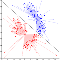
Connectivity-based (hierarchical) clustering groups points that are spatially close to one another. The main assumption is that nearby points are more similar than distant ones. These methods are sensitive to outliers, which can appear as spurious clusters or cause real clusters to merge incorrectly.
The diagram below shows how a connectivity-based algorithm separates two groups by drawing a decision boundary between them:
Centroid-Based Clustering
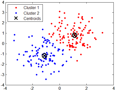
In centroid-based clustering, each cluster is represented by a central point called a centroid. The centroid is the mean position of all points in the cluster and does not need to be an actual data point. K-Means is the canonical centroid-based algorithm.
The diagram below shows two clusters, each with a centroid marker at its center of mass:
Distribution-Based Clustering
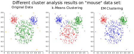
Distribution-based methods model each cluster as a statistical distribution — most commonly a Gaussian. The Gaussian Mixture Model (GMM) fitted with the Expectation-Maximization algorithm is the best-known example. These models have strong theoretical foundations but can overfit when the number of clusters is too high.
The comparison below shows Original Data, K-Means, and EM clustering applied to the same "mouse" shaped dataset, illustrating how EM can follow curved boundaries:
Density-Based Clustering
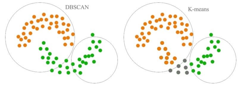
Density-based methods — such as DBSCAN — define clusters as dense regions of points separated by sparse regions. They can discover arbitrarily shaped clusters and naturally label sparse points as noise, unlike K-Means which always forces every point into a cluster.
The diagram below contrasts DBSCAN and K-Means on the same non-convex dataset, showing that DBSCAN correctly separates the irregular shapes while K-Means misassigns the overlapping region:
Dataset and Problem Understanding
Start by importing the libraries you will need throughout this tutorial:
import pandas as pd
import numpy as np
import seaborn as sns
import matplotlib.pyplot as plt
%matplotlib inline
Load the synthetic dataset using pd.read_csv. The dataset has two numeric features, x and y, and a ground-truth cluster column you will use only for comparison:
data = pd.read_csv('data.csv', index_col = 0)
data.head()| x | y | cluster | |
|---|---|---|---|
| 0 | -8.482852 | -5.603349 | 2 |
| 1 | -7.751632 | -8.405334 | 2 |
| 2 | -10.967098 | -9.032782 | 2 |
| 3 | -11.999447 | -7.606734 | 2 |
| 4 | -1.736810 | 10.478015 | 1 |
Check the distribution of the ground-truth cluster labels with value_counts():
data['cluster'].value_counts()1 67
0 67
2 66
Name: cluster, dtype: int64The dataset contains three roughly balanced groups: 67 points in clusters 0 and 1 each, and 66 in cluster 2.
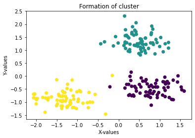
Plot a scatter chart to see the natural groupings in the data. The %matplotlib inline magic you set earlier tells Jupyter to render the chart inside the notebook:
plt.scatter(data['x'], data['y'], c = data['cluster'], cmap = 'viridis')
plt.xlabel('X-values')
plt.ylabel('Y-values')
plt.title('Formation of cluster')
plt.show()
The scatter plot below shows three clearly separated blobs colored by their ground-truth label:
Training K-Means on the Dataset
The K-Means algorithm is a simple, efficient method capable of clustering data in just a few iterations. It is an unsupervised technique — it discovers structure without using the cluster label column.
Import KMeans and StandardScaler from scikit-learn:
from sklearn.cluster import KMeans
from sklearn.preprocessing import StandardScaler
Separate the features from the label:
X = data[['x', 'y']]
y = data['cluster']
Standardize X before training. When features have different units or variances, K-Means — which relies on Euclidean distance — will be dominated by the larger-scale feature. StandardScaler transforms each feature to have mean 0 and standard deviation 1:
scaler = StandardScaler()
X = scaler.fit_transform(X)
X[: 5]array([[-1.01200363, -0.60606415],
[-0.86550679, -1.04265203],
[-1.5097118 , -1.14041707],
[-1.71653856, -0.91821912],
[ 0.33953731, 1.89963378]])Write the standardized values back into the DataFrame so subsequent plots use the scaled coordinates:
data[['x', 'y']] = XFitting with k = 2
Start with k=2 to see how K-Means behaves when given fewer clusters than the true number. You will correct this after applying the elbow method:
k=2
kmeans = KMeans(n_clusters=k, random_state=42)
kmeans.fit(X)KMeans(n_clusters=2, random_state=42)Retrieve the two centroid coordinates the algorithm converged on:
center = kmeans.cluster_centers_
centerarray([[-1.30618271, -0.87560626],
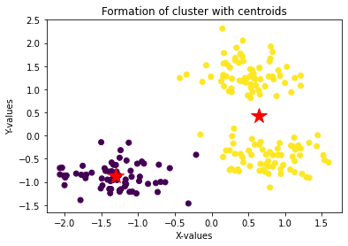
[ 0.64334372, 0.43126875]])Plot the cluster assignments alongside the centroids, represented as red stars:
plt.scatter(data['x'], data['y'], c = kmeans.labels_, cmap = 'viridis')
plt.xlabel('X-values')
plt.ylabel('Y-values')
plt.title('Formation of cluster with centroids')
for i, point in enumerate(center):
    plt.plot(center[i][0], center[i][1], '*r--', linewidth=2, markersize=18)
With only two clusters, the model merges what are actually three blobs. The two red star centroids are visible, but you can already see that the upper-right region contains points that should belong to a third group:
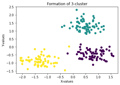
Plot the ground-truth labels to confirm that three clusters exist in the data:
plt.scatter(data['x'], data['y'], c = data['cluster'], cmap = 'viridis')
plt.xlabel('X-values')
plt.ylabel('Y-values')
plt.title('Formation of 3-cluster')
plt.show()
The true three-cluster structure is now visible, confirming that k=2 was too low:
Choosing the Right Value of K
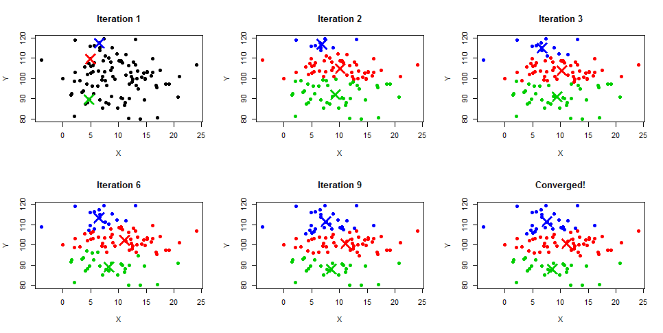
The K-Means convergence process follows four steps.
Assuming inputs :
- Step 1 — Pick random points as initial cluster centers (centroids).
- Step 2 — Assign each to the nearest centroid by Euclidean distance.
- Step 3 — Recompute each centroid as the mean of all points assigned to it.
- Step 4 — Repeat Steps 2 and 3 until no assignment changes.
The diagram below illustrates this convergence sequence from random initialization (Iteration 1) through successive refinements until the clusters stabilize:
When you already know the right number of clusters, use that value directly. When you do not, use the Elbow Method.
The Elbow Method
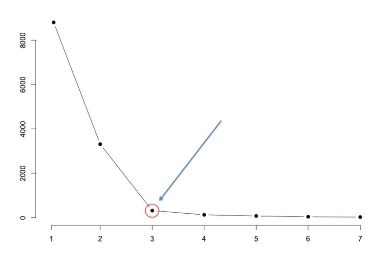
The elbow method plots SSE (Sum of Squared Errors, also called inertia) against different values of and looks for the point where the curve bends sharply — the "elbow." Beyond that point, adding more clusters yields diminishing returns.
Where:
- — number of clusters
- — the set of points assigned to cluster
- — a data point in cluster
- — the centroid (mean) of cluster
- — squared Euclidean distance
The diagram below shows an example elbow curve annotated with an arrow pointing to the optimal :
Computing SSE for the Synthetic Dataset
Fit K-Means for every from 1 to 9 and record kmeans.inertia_ — scikit-learn's name for SSE — at each step:
SSE = []
index = range(1,10)
for i in index:
    kmeans = KMeans(n_clusters=i, random_state=42)
    kmeans.fit(X)
    SSE.append(kmeans.inertia_)
print(kmeans.inertia_)400.0000000000001
156.41078579574975
44.057048453292815
36.726387118666075
31.01642761531463
25.39959047192452
22.547184727743304
19.92343817847746
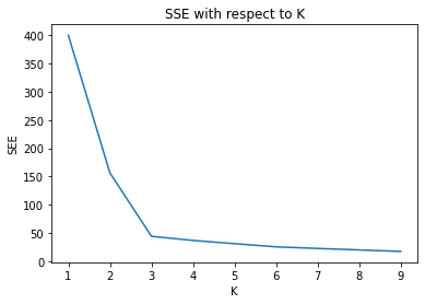
17.295836404824982The inertia drops sharply from to , then the rate of decrease slows considerably. Plot the curve to see the elbow clearly:
plt.plot(index, SSE)
plt.xlabel('K')
plt.ylabel('SEE')
plt.title('SSE with respect to K')
plt.show()
The elbow in the SSE curve below falls at , confirming the three natural groups visible in the scatter plot:
Fitting with k = 3
Now re-train with the correct number of clusters and plot the result with three centroid markers:
k=3
kmeans = KMeans(n_clusters=k, random_state=42)
kmeans.fit(X)
KMeans(n_clusters=3, random_state=42)
center = kmeans.cluster_centers_
plt.xlabel('X-values')
plt.ylabel('Y-values')
plt.title('Formation of clusters with 3-centroids')

plt.scatter(data['x'], data['y'], c = kmeans.labels_, cmap = 'viridis')
for i, point in enumerate(center):
plt.plot(center[i][0], center[i][1], '*r--', linewidth=2, markersize=18)
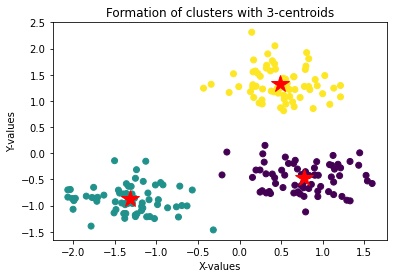
With k=3, each blob is assigned its own cluster and the three red star centroids sit at the geometric center of each group:
Applying K-Means to the Iris Dataset
To see how K-Means performs on a real-world dataset, apply the same workflow to the Iris dataset, which contains four measurements of 150 iris flowers across three species.
Import datasets from scikit-learn and load the Iris data:
from sklearn import datasetsLoad and scale the features:
iris = datasets.load_iris()
X = iris.data
scaler = StandardScaler()
X = scaler.fit_transform(X)
iris.target_namesarray(['setosa', 'versicolor', 'virginica'], dtype='<U10')The Iris dataset contains three species, so you expect the elbow method to suggest . Compute SSE for from 1 to 9:
SSE = []
index = range(1,10)
for i in index:
    kmeans = KMeans(n_clusters=i, random_state=42)
    kmeans.fit(X)
    SSE.append(kmeans.inertia_)
print(kmeans.inertia_)600.0
222.36170496502302
139.82049635974974
114.41256181896094
90.92751382392049
80.0224959955744
71.81624598106144
62.28749580350205
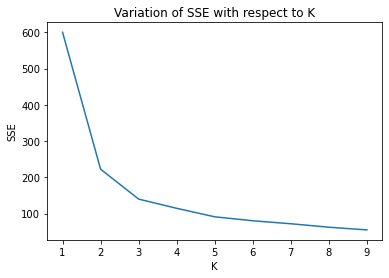
54.8110520315013Plot SSE versus to locate the elbow:
plt.plot(index, SSE)
plt.xlabel('K')
plt.ylabel('SSE')
plt.title('Variation of SSE with respect to K')
plt.show()
The elbow curve for the Iris dataset bends most noticeably around , which aligns exactly with the three true species in the data:
Conclusion
In this tutorial you applied K-Means clustering to a synthetic three-blob dataset and to the Iris dataset. You used the elbow method — plotting SSE (inertia) against values of from 1 to 9 — to identify the optimal cluster count of 3 in both cases. After scaling the features with StandardScaler, the trained model clearly separated all three groups, with centroid markers confirming each cluster's geometric center.
Key takeaways:
- K-Means is an unsupervised algorithm that iterates between assigning points to their nearest centroid and recomputing centroids as cluster means until convergence.
- Always standardize features before running K-Means — the algorithm uses Euclidean distance, so unscaled features with large variance will dominate assignments.
- The elbow method finds the right by plotting SSE against cluster count and selecting the value where marginal gains begin to flatten.
- Inertia (
kmeans.inertia_) is scikit-learn's name for SSE — the lower it is, the tighter the clusters, but excessively low inertia with high signals overfitting. - K-Means assumes convex, roughly equal-sized clusters; for irregular shapes consider density-based methods like DBSCAN.
Next steps:
- Explore K-Nearest Neighbors to see how distance-based reasoning applies to a supervised classification problem.
- Read Ensemble Learning for a broader view of combining multiple models to improve prediction quality.
- Experiment with different values of
initinKMeans('k-means++'vs'random') to see how centroid initialization affects convergence speed and final cluster quality.