
Logistic regression is one of the most widely used algorithms for binary classification. Unlike linear regression, which predicts a continuous output, logistic regression predicts the probability that an input belongs to one of two classes. That probability is then compared against a decision threshold to produce a class label — making it a fast, interpretable baseline for any classification task.
In this tutorial you will predict whether a passenger survived the Titanic disaster. You will preprocess the raw dataset, encode categorical variables, apply Recursive Feature Elimination to pick the five most informative features, and evaluate the final model with accuracy, log loss, and the Receiver Operating Characteristic (ROC) curve.
Prerequisites: Python 3.x, NumPy, Pandas, Matplotlib, Seaborn, scikit-learn.
What is Logistic Regression?
Logistic regression is a supervised classification algorithm that estimates the probability of a binary outcome. Given a set of input features , the model outputs a value between 0 and 1 representing the probability that the target variable . A decision threshold — typically 0.5 — is then applied to convert that probability into a class label.
The diagram below contrasts linear regression and logistic regression: linear regression can produce predictions outside the [0, 1] range, while logistic regression constrains its output to lie strictly between 0 and 1.
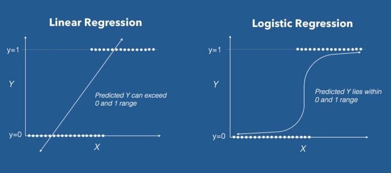
Logistic regression is used everywhere you need a probabilistic yes/no answer: spam vs. not spam, fraudulent vs. legitimate transaction, malignant vs. benign tumour. The key insight is that it replaces the linear output with a nonlinear sigmoid function that squashes any real value into the (0, 1) interval.
Types of Logistic Regression
Logistic regression has three variants based on the number of target classes:
- Binomial — the target has exactly two classes (e.g. "survived" vs. "not survived", "pass" vs. "fail").
- Multinomial — the target has three or more unordered classes (e.g. "disease A" vs. "disease B" vs. "disease C").
- Ordinal — the target has three or more ordered classes (e.g. "poor", "good", "very good").
This tutorial focuses on the binomial case, where the target variable takes the values 0 or 1.
The Sigmoid Function
The sigmoid function maps any real-valued number to a value in the open interval (0, 1). For an input , it is defined as:
Where:
- — the linear combination
- — Euler's number (~2.718)
- — the predicted probability that
The plot below shows the S-shaped curve of the sigmoid function. Notice how the output approaches 0 for very negative inputs and approaches 1 for very positive inputs.
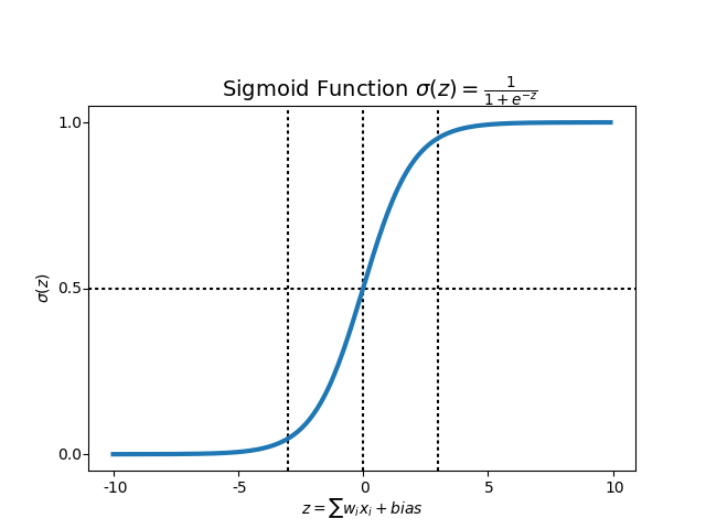
Near either extreme of the curve, changes in produce very little change in — this is the well-known vanishing gradient problem. Gradients become very small, which can slow or stall learning. In practice, this is manageable for logistic regression, and sigmoid remains the standard activation for binary output layers.
The Decision Boundary
Once the sigmoid function produces a probability, you apply a decision threshold to assign a class label. With the default threshold of 0.5, any input whose predicted probability exceeds 0.5 is classified as class 1; otherwise it is classified as class 0. The decision boundary is the hyperplane in feature space where the model's output equals exactly 0.5.
The scatter plot below illustrates a decision boundary separating two classes in a two-dimensional feature space.
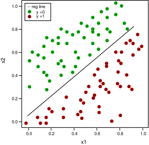
Choosing the right threshold depends on your problem: a fraud-detection model might lower the threshold to catch more true positives at the cost of more false positives.
The Cost Function
In linear regression, the mean squared error cost function produces a convex surface, which is easy to optimise. If you apply MSE directly to logistic regression, the result is non-convex — full of local minima that make gradient descent unreliable. Instead, logistic regression uses log loss (also called binary cross-entropy):
Where:
- — number of training examples
- — true label for example (0 or 1)
- — predicted probability for example
- — model parameters (weights)
When the true label is 1, only the first term contributes; when the true label is 0, only the second term contributes. This formulation produces a convex surface that gradient descent can minimise reliably.
Loading the Titanic Dataset
The Titanic dataset describes 891 passengers from the 1912 disaster. Your task is to predict the survived column (1 = survived, 0 = did not survive). Start by importing all required libraries and loading the dataset from seaborn's built-in collection.
import numpy as np
import pandas as pd
import seaborn as sns
import matplotlib.pyplot as plt
from sklearn.linear_model import LogisticRegression
from sklearn.model_selection import train_test_split, cross_val_score
from sklearn.feature_selection import RFE
from sklearn.metrics import (
    accuracy_score, classification_report, precision_score, recall_score,
    confusion_matrix, precision_recall_curve, roc_auc_score, roc_curve, auc, log_loss
)
%matplotlib inline
Load the dataset and inspect the first ten rows:
titanic = sns.load_dataset('titanic')
titanic.head(10)| survived | pclass | sex | age | sibsp | parch | fare | embarked | class | who | adult_male | deck | embark_town | alive | alone | |
|---|---|---|---|---|---|---|---|---|---|---|---|---|---|---|---|
| 0 | 0 | 3 | male | 22.0 | 1 | 0 | 7.2500 | S | Third | man | True | NaN | Southampton | no | False |
| 1 | 1 | 1 | female | 38.0 | 1 | 0 | 71.2833 | C | First | woman | False | C | Cherbourg | yes | False |
| 2 | 1 | 3 | female | 26.0 | 0 | 0 | 7.9250 | S | Third | woman | False | NaN | Southampton | yes | True |
| 3 | 1 | 1 | female | 35.0 | 1 | 0 | 53.1000 | S | First | woman | False | C | Southampton | yes | False |
| 4 | 0 | 3 | male | 35.0 | 0 | 0 | 8.0500 | S | Third | man | True | NaN | Southampton | no | True |
| 5 | 0 | 3 | male | NaN | 0 | 0 | 8.4583 | Q | Third | man | True | NaN | Queenstown | no | True |
| 6 | 0 | 1 | male | 54.0 | 0 | 0 | 51.8625 | S | First | man | True | E | Southampton | no | True |
| 7 | 0 | 3 | male | 2.0 | 3 | 1 | 21.0750 | S | Third | child | False | NaN | Southampton | no | False |
| 8 | 1 | 3 | female | 27.0 | 0 | 2 | 11.1333 | S | Third | woman | False | NaN | Southampton | yes | False |
| 9 | 1 | 2 | female | 14.0 | 1 | 0 | 30.0708 | C | Second | child | False | NaN | Cherbourg | yes | False |
Check the summary statistics for all numeric columns:
titanic.describe()| survived | pclass | age | sibsp | parch | fare | |
|---|---|---|---|---|---|---|
| count | 891.000000 | 891.000000 | 714.000000 | 891.000000 | 891.000000 | 891.000000 |
| mean | 0.383838 | 2.308642 | 29.699118 | 0.523008 | 0.381594 | 32.204208 |
| std | 0.486592 | 0.836071 | 14.526497 | 1.102743 | 0.806057 | 49.693429 |
| min | 0.000000 | 1.000000 | 0.420000 | 0.000000 | 0.000000 | 0.000000 |
| 25% | 0.000000 | 2.000000 | 20.125000 | 0.000000 | 0.000000 | 7.910400 |
| 50% | 0.000000 | 3.000000 | 28.000000 | 0.000000 | 0.000000 | 14.454200 |
| 75% | 1.000000 | 3.000000 | 38.000000 | 1.000000 | 0.000000 | 31.000000 |
| max | 1.000000 | 3.000000 | 80.000000 | 8.000000 | 6.000000 | 512.329200 |
Exploratory Data Analysis
Before training any model, you need to understand the data: which columns have missing values, how the age distribution looks, and how survival rates vary by passenger characteristics.
Checking for Missing Values
Identify how many null values exist in each column:
titanic.isnull().sum()survived 0
pclass 0
sex 0
age 177
sibsp 0
parch 0
fare 0
embarked 2
class 0
who 0
adult_male 0
deck 688
embark_town 2
alive 0
alone 0
dtype: int64Three columns have missing values: age (177 rows), embarked (2 rows), and deck (688 rows — nearly 80 % of passengers). The heatmap below makes this pattern immediately visible.
sns.heatmap(titanic.isnull(), cbar = False, cmap = 'viridis')
plt.title('Number of people in the ship with respect their features ')
plt.show()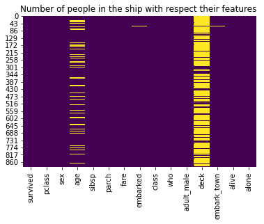
Calculate the exact percentage of missing age values:
titanic['age'].isnull().sum()/titanic.shape[0]*10019.865319865319865About 20 % of passengers have no recorded age, so you will fill these gaps using class-based mean imputation rather than dropping the rows.
Age Distribution
Plot the density-normalised histogram of passenger ages to understand the overall distribution before imputation.
ax = titanic['age'].hist(bins = 30, density = True, stacked = True, color = 'teal', alpha = 0.7, figsize = (16, 5))
titanic['age'].plot(kind = 'density', color = 'teal')
ax.set_xlabel('Age')
plt.title('Percentage of the people with respect to their age ')
plt.show()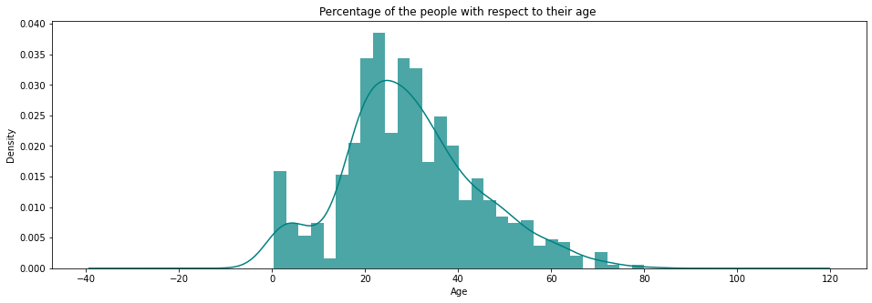
The distribution is right-skewed, with most passengers in their twenties and thirties. Now break that down by sex and survival outcome.
Survival by Age and Sex
The two side-by-side histograms below show how survival rates differ between female and male passengers across different age groups.
survived = 'survived'
not_survived = 'not survived'

fig, axes = plt.subplots(nrows = 1, ncols = 2, figsize = (20, 4))
women = titanic[titanic['sex'] == 'female']
men = titanic[titanic['sex'] == 'male']

ax = sns.distplot(women[women[survived]==1].age.dropna(), bins = 18, label = survived, ax = axes[0], kde = False)
ax = sns.distplot(women[women[survived]==0].age.dropna(), bins = 40, label = not_survived, ax = axes[0], kde = False)
ax.legend()
ax.set_title('Number of female passenger whether survived or not with respect to their age ')
ax = sns.distplot(men[men[survived]==1].age.dropna(), bins = 18, label = survived, ax = axes[1], kde = False)
ax = sns.distplot(men[men[survived]==0].age.dropna(), bins = 40, label = not_survived, ax = axes[1], kde = False)
ax.legend()
ax.set_title('Number of male passenger whether survived or not with respect to their age')
plt.ylabel('No. of people')
plt.show()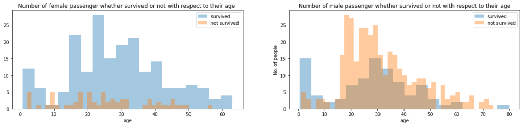
Female passengers survived at much higher rates across all age groups, while male survival was relatively low regardless of age. This confirms that sex will be an important feature in the model.
Check the sex counts in the dataset:
titanic['sex'].value_counts()male 577
female 314
Name: sex, dtype: int64Age and Fare by Passenger Class
Inspect how age and fare vary across the three passenger classes using box plots. First, look at age distribution by class:
sns.catplot(x = 'pclass', y = 'age', data = titanic, kind = 'box')
plt.title('Age of the people who are in pclass')
plt.show()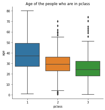
First-class passengers tend to be older on average than second- or third-class passengers. Now check fare distribution by class:
sns.catplot(x = 'pclass', y = 'fare', data = titanic, kind = 'box')
plt.title('Fare for the different classes of the pclass')
plt.show()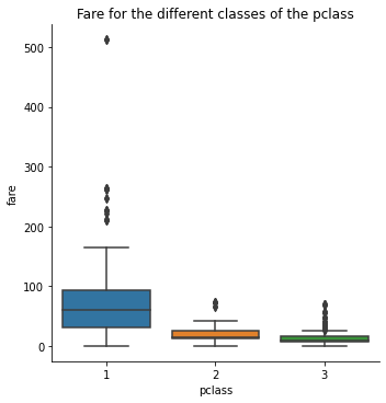
First-class fares are substantially higher and more variable. You will use this relationship to compute class-based mean ages for imputation.
Compute the mean age for each passenger class:
titanic[titanic['pclass'] == 1]['age'].mean()38.233440860215055titanic[titanic['pclass'] == 2]['age'].mean()29.87763005780347titanic[titanic['pclass'] == 3]['age'].mean()25.14061971830986Data Preprocessing
With a clear picture of the missing values and distributions, you can now clean the dataset. The steps are: impute missing ages, fill the two missing embark values, drop columns with too many missing values, and encode categorical variables as integers.
Imputing Missing Ages
Imputation replaces missing values with a computed substitute. Rather than using the global mean age, you use the mean age for each passenger class — a more accurate estimate given the age differences you saw above.
Define an imputation function that checks the passenger's class and returns the appropriate mean age:
def impute_age(cols):
    age = cols[0]
    pclass = cols[1]

    if pd.isnull(age):
        if pclass == 1:
            return titanic[titanic['pclass'] == 1]['age'].mean()
        elif pclass == 2:
            return titanic[titanic['pclass'] == 2]['age'].mean()
        elif pclass == 3:
            return titanic[titanic['pclass'] == 3]['age'].mean()

    else:
        return age
Apply the function to fill all missing ages:
titanic['age'] = titanic[['age', 'pclass']].apply(impute_age, axis = 1)Re-plot the missing-value heatmap to confirm that the age column is now fully populated:
sns.heatmap(titanic.isnull(), cbar = False, cmap = 'viridis')
plt.title('Number of people with respect to their features')
plt.show()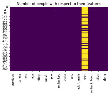
The age column is clean. The deck column still has nearly all values missing, so you will drop it entirely later.
Analysing Embark Port
Before dropping columns, investigate the embarkation data to understand survival patterns by port. A FacetGrid creates a grid of subplots conditioned on a categorical variable — here, embarkation port.
f = sns.FacetGrid(titanic, row = 'embarked', height = 2.5, aspect= 3)
f.map(sns.pointplot, 'pclass', 'survived', 'sex', order = None, hue_order = None)
f.add_legend()
plt.show()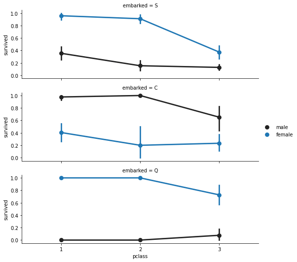
Female passengers consistently show higher survival rates than males across all ports and classes. Check how many rows have missing embark values:
titanic['embarked'].isnull().sum()2titanic['embark_town'].value_counts()Southampton 644
Cherbourg 168
Queenstown 77
Name: embark_town, dtype: int64Southampton ('S') is by far the most common embark port, so fill the two missing values with 'S':
common_value = 'S'
titanic['embarked'].fillna(common_value, inplace = True) titanic['embarked'].isnull().sum()0Confirm the heatmap now shows embarked fully filled:
sns.heatmap(titanic.isnull(), cbar = False, cmap = 'viridis')
plt.title('Number of people with respect to their features')
plt.show()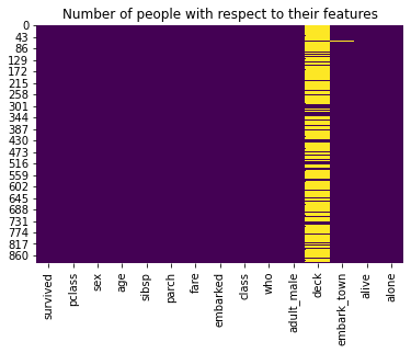
Dropping Redundant Columns
Remove deck, embark_town, and alive — deck has too many missing values to be useful, embark_town is a duplicate of embarked, and alive is a direct text encoding of the target variable survived. Use drop() to remove them:
titanic.drop(labels=['deck', 'embark_town', 'alive'], inplace = True, axis = 1)Re-check the heatmap to confirm all remaining columns are fully populated:
sns.heatmap(titanic.isnull(), cbar = False, cmap = 'viridis')
plt.title('Number of people with respect to their features')
plt.show()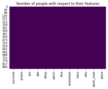
Every remaining column is now complete. Check the full info() summary to verify column types:
titanic.info()RangeIndex: 891 entries, 0 to 890
Data columns (total 12 columns):
# Column Non-Null Count Dtype
--- ------ -------------- -----
0 survived 891 non-null int64
1 pclass 891 non-null int64
2 sex 891 non-null object
3 age 891 non-null float64
4 sibsp 891 non-null int64
5 parch 891 non-null int64
6 fare 891 non-null float64
7 embarked 891 non-null object
8 class 891 non-null category
9 who 891 non-null object
10 adult_male 891 non-null bool
11 alone 891 non-null bool
dtypes: bool(2), category(1), float64(2), int64(4), object(3)
memory usage: 65.5+ KBInspect the first few rows before encoding:
titanic.head()| survived | pclass | sex | age | sibsp | parch | fare | embarked | class | who | adult_male | alone | |
|---|---|---|---|---|---|---|---|---|---|---|---|---|
| 0 | 0 | 3 | male | 22.0 | 1 | 0 | 7.2500 | S | Third | man | True | False |
| 1 | 1 | 1 | female | 38.0 | 1 | 0 | 71.2833 | C | First | woman | False | False |
| 2 | 1 | 3 | female | 26.0 | 0 | 0 | 7.9250 | S | Third | woman | False | True |
| 3 | 1 | 1 | female | 35.0 | 1 | 0 | 53.1000 | S | First | woman | False | False |
| 4 | 0 | 3 | male | 35.0 | 0 | 0 | 8.0500 | S | Third | man | True | True |
Cast fare, age, and pclass to integer to reduce memory usage:
titanic['fare'] = titanic['fare'].astype('int')
titanic['age'] = titanic['age'].astype('int')
titanic['pclass'] = titanic['pclass'].astype('int')
titanic.info()RangeIndex: 891 entries, 0 to 890
Data columns (total 12 columns):
# Column Non-Null Count Dtype
--- ------ -------------- -----
0 survived 891 non-null int64
1 pclass 891 non-null int32
2 sex 891 non-null object
3 age 891 non-null int32
4 sibsp 891 non-null int64
5 parch 891 non-null int64
6 fare 891 non-null int32
7 embarked 891 non-null object
8 class 891 non-null category
9 who 891 non-null object
10 adult_male 891 non-null bool
11 alone 891 non-null bool
dtypes: bool(2), category(1), int32(3), int64(3), object(3)
memory usage: 55.0+ KBConverting Categorical Data to Numbers
Scikit-learn requires all features to be numeric. Map each categorical column to integer codes using dictionaries, then inspect the result.
genders = {'male': 0, 'female': 1}
titanic['sex'] = titanic['sex'].map(genders)
who = {'man': 0, 'women': 1, 'child': 2}
titanic['who'] = titanic['who'].map(who)
adult_male = {True: 1, False: 0}
titanic['adult_male'] = titanic['adult_male'].map(adult_male)
alone = {True: 1, False: 0}
titanic['alone'] = titanic['alone'].map(alone)            ports = {'S': 0, 'C': 1, 'Q': 2}
titanic['embarked'] = titanic['embarked'].map(ports) titanic.head()| survived | pclass | sex | age | sibsp | parch | fare | embarked | class | who | adult_male | alone | |
|---|---|---|---|---|---|---|---|---|---|---|---|---|
| 0 | 0 | 3 | 0 | 22 | 1 | 0 | 7 | 0 | Third | 0.0 | 1 | 0 |
| 1 | 1 | 1 | 1 | 38 | 1 | 0 | 71 | 1 | First | NaN | 0 | 0 |
| 2 | 1 | 3 | 1 | 26 | 0 | 0 | 7 | 0 | Third | NaN | 0 | 1 |
| 3 | 1 | 1 | 1 | 35 | 1 | 0 | 53 | 0 | First | NaN | 0 | 0 |
| 4 | 0 | 3 | 0 | 35 | 0 | 0 | 8 | 0 | Third | 0.0 | 1 | 1 |
Drop the remaining object-type columns class and who (redundant with pclass and adult_male):
titanic.drop(labels = ['class', 'who'], axis = 1, inplace= True)
titanic.head()| survived | pclass | sex | age | sibsp | parch | fare | embarked | adult_male | alone | |
|---|---|---|---|---|---|---|---|---|---|---|
| 0 | 0 | 3 | 0 | 22 | 1 | 0 | 7 | 0 | 1 | 0 |
| 1 | 1 | 1 | 1 | 38 | 1 | 0 | 71 | 1 | 0 | 0 |
| 2 | 1 | 3 | 1 | 26 | 0 | 0 | 7 | 0 | 0 | 1 |
| 3 | 1 | 1 | 1 | 35 | 1 | 0 | 53 | 0 | 0 | 0 |
| 4 | 0 | 3 | 0 | 35 | 0 | 0 | 8 | 0 | 1 | 1 |
You now have a clean, fully numeric 10-column dataset ready for modelling.
Training a Baseline Logistic Regression Model
Split the data and fit a first logistic regression model using all nine features. This gives you a baseline accuracy to compare against after feature selection.
X = titanic.drop('survived', axis = 1)
y = titanic['survived']
X_train, X_test, y_train, y_test = train_test_split(X, y, test_size = 0.33, random_state = 42)                           model = LogisticRegression(solver= 'lbfgs', max_iter = 400)
model.fit(X_train, y_train)
y_predict = model.predict(X_test)
model.score(X_test, y_test)0.8271186440677966The baseline model achieves 82.7 % accuracy. Next you will use feature selection to see whether a smaller, better-chosen feature set improves that score.
Recursive Feature Elimination
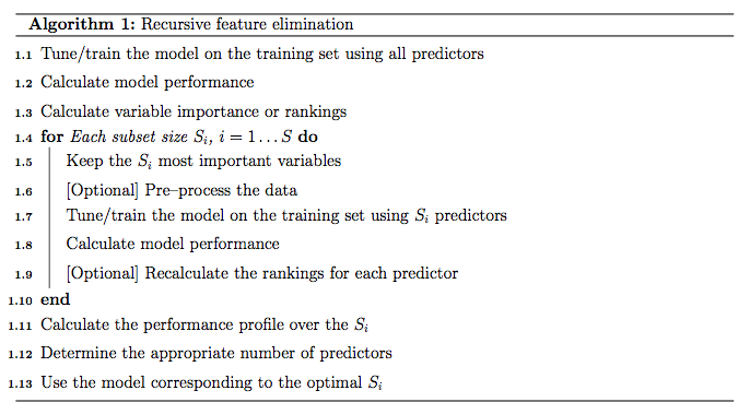
Recursive Feature Elimination (RFE) is a feature selection technique that works by repeatedly fitting a model, ranking features by their importance, and pruning the least important one at each step. It continues until the target number of features is reached.
The algorithm below illustrates the RFE procedure at each iteration:
Fit an RFE wrapper around a LogisticRegression estimator, targeting the top 5 features:
model = LogisticRegression(solver='lbfgs', max_iter=500)
rfe = RFE(model, 5, verbose=1)
rfe = rfe.fit(X, y)
rfe.support_E:\callme_conda\lib\site-packages\sklearn\utils\validation.py:68: FutureWarning: Pass n_features_to_select=5 as keyword args. From version 0.25 passing these as positional arguments will result in an error
warnings.warn("Pass {} as keyword args. From version 0.25 "Fitting estimator with 9 features.
Fitting estimator with 8 features.
Fitting estimator with 7 features.
Fitting estimator with 6 features.
array([ True, False, False, True, True, False, False, True, True])The boolean array marks which of the nine columns were selected. Inspect the full dataset and the feature matrix to identify which column positions are True:
titanic.head(3)| survived | pclass | sex | age | sibsp | parch | fare | embarked | adult_male | alone | |
|---|---|---|---|---|---|---|---|---|---|---|
| 0 | 0 | 3 | 0 | 22 | 1 | 0 | 7 | 0 | 1 | 0 |
| 1 | 1 | 1 | 1 | 38 | 1 | 0 | 71 | 1 | 0 | 0 |
| 2 | 1 | 3 | 1 | 26 | 0 | 0 | 7 | 0 | 0 | 1 |
X.head()| pclass | sex | age | sibsp | parch | fare | embarked | adult_male | alone | |
|---|---|---|---|---|---|---|---|---|---|
| 0 | 3 | 0 | 22 | 1 | 0 | 7 | 0 | 1 | 0 |
| 1 | 1 | 1 | 38 | 1 | 0 | 71 | 1 | 0 | 0 |
| 2 | 3 | 1 | 26 | 0 | 0 | 7 | 0 | 0 | 1 |
| 3 | 1 | 1 | 35 | 1 | 0 | 53 | 0 | 0 | 0 |
| 4 | 3 | 0 | 35 | 0 | 0 | 8 | 0 | 1 | 1 |
Filter the feature matrix down to only the RFE-selected columns:
XX = X[X.columns[rfe.support_]]XX.head()| pclass | sibsp | parch | adult_male | alone | |
|---|---|---|---|---|---|
| 0 | 3 | 1 | 0 | 1 | 0 |
| 1 | 1 | 1 | 0 | 0 | 0 |
| 2 | 3 | 0 | 0 | 0 | 1 |
| 3 | 1 | 1 | 0 | 0 | 0 |
| 4 | 3 | 0 | 0 | 1 | 1 |
RFE selected pclass, sibsp, parch, adult_male, and alone as the five most predictive features. Re-split using these columns only, then re-train:
X_train, X_test, y_train, y_test = train_test_split(XX, y, test_size = 0.2, random_state = 8, stratify = y)model = LogisticRegression(solver= 'lbfgs', max_iter = 500)
model.fit(X_train, y_train)
y_predict = model.predict(X_test)
model.score(X_test, y_test)0.8547486033519553The model with just five features achieves 85.5 % accuracy — an improvement over the 82.7 % baseline with all nine features. Feature selection reduced dimensionality without sacrificing performance.
Evaluating Classification Metrics
Beyond raw accuracy, good classification evaluation requires precision, recall, log loss, and the ROC-AUC score. The diagram below defines the key metrics in terms of the confusion matrix quadrants.
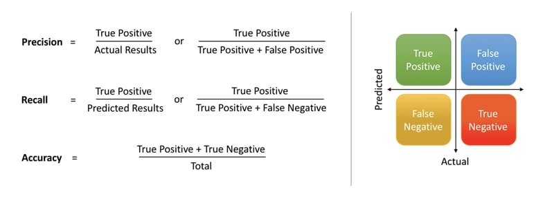
- Accuracy — the fraction of all predictions that are correct:
- Precision — of all positive predictions, the fraction that are truly positive:
- Recall (sensitivity) — of all actual positives, the fraction correctly identified:
Re-fit the model and generate probability scores for the test set:
model = LogisticRegression(solver= 'lbfgs', max_iter = 500)
model.fit(X_train, y_train)
y_predict = model.predict(X_test)
Predicting Probabilities
The predict_proba() method returns a two-column array: the first column holds and the second holds . Index [:, 1] to extract the positive-class probabilities:
y_predict_prob = model.predict_proba(X_test)[:, 1]
y_predict_prob[: 5]array([0.55566832, 0.87213996, 0.09376084, 0.09376084, 0.37996908])These probabilities feed directly into the ROC curve calculation.
Computing the ROC Curve
The Receiver Operating Characteristic (ROC) curve plots the True Positive Rate (recall) against the False Positive Rate at every possible decision threshold. roc_curve() returns the false positive rates, true positive rates, and the corresponding threshold values, sorted from low to high:
[fpr, tpr, thr] = roc_curve(y_test, y_predict_prob)
[fpr, tpr, thr][: 2][array([0. , 0. , 0. , 0. , 0.00909091, 0.00909091, 0.00909091, 0.00909091, 0.00909091, 0.00909091, 0.03636364, 0.03636364, 0.03636364, 0.06363636, 0.09090909, 0.12727273, 0.12727273, 0.13636364, 0.21818182, 0.23636364, 0.24545455, 0.27272727, 0.29090909, 0.43636364, 0.45454545, 0.47272727, 0.52727273, 0.92727273, 1. ]), array([0. , 0.07246377, 0.20289855, 0.24637681, 0.33333333, 0.39130435, 0.44927536, 0.55072464, 0.60869565, 0.63768116, 0.63768116, 0.65217391, 0.69565217, 0.7826087 , 0.7826087, 0.7826087 , 0.79710145, 0.79710145, 0.86956522, 0.88405797, 0.88405797, 0.88405797, 0.88405797, 0.89855072, 0.91304348, 0.91304348, 0.92753623, 1. , 1. ])]Accuracy, Log Loss, and AUC
Compute the three summary metrics for the model:
accuracy_score()— fraction of correct predictionslog_loss()— negative log-likelihood; lower is betterauc()— area under the ROC curve using the trapezoidal rule; 1.0 is a perfect classifier
print('Accuracy: ', accuracy_score(y_test, y_predict))
print('log loss: ', log_loss(y_test, y_predict_prob))
print('auc: ', auc(fpr, tpr))Accuracy: 0.8547486033519553
log loss: 0.36597373727139876
auc: 0.9007246376811595An AUC of 0.90 is strong — it means your model correctly ranks a randomly chosen survivor above a randomly chosen non-survivor 90 % of the time.
Plotting the ROC Curve
Find the index where the true positive rate first exceeds 0.95, then draw reference lines at that operating point:
idx = np.min(np.where(tpr>0.95))Plot the full ROC curve with the operating point highlighted:
plt.figure()
plt.plot(fpr, tpr, color = 'coral', label = "ROC curve area: " + str(auc(fpr, tpr)))
plt.plot([0, 1], [0, 1], 'k--')
plt.plot([0, fpr[idx]], [tpr[idx], tpr[idx]], 'k--', color = 'blue')
plt.plot([fpr[idx],fpr[idx]], [0,tpr[idx]], 'k--', color='blue')
plt.xlim([0.0, 1.0])
plt.ylim([0.0, 1.05])
plt.xlabel('False Positive Rate (1 - specificity)', fontsize=14)
plt.ylabel('True Positive Rate (recall)', fontsize=14)
plt.title('Receiver operating characteristic (ROC) curve')
plt.legend(loc="lower right")
plt.show()
print("Using a threshold of %.3f " % thr[idx] + "guarantees a sensitivity of %.3f " % tpr[idx] +
      "and a specificity of %.3f" % (1-fpr[idx]) +
      ", i.e. a false positive rate of %.2f%%." % (np.array(fpr[idx])*100))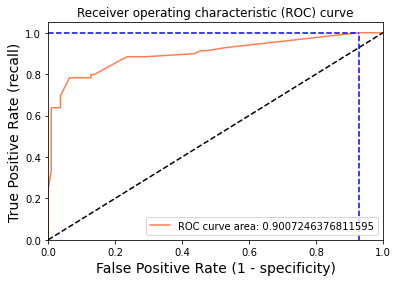
Using a threshold of 0.094 guarantees a sensitivity of 1.000 and a specificity of 0.073, i.e. a false positive rate of 92.73%.At a threshold of 0.094 the model catches every survivor (recall = 1.0), but at the cost of a very high false positive rate — 92.7 % of non-survivors are also flagged as survivors. This illustrates the classic precision–recall trade-off: lowering the threshold increases recall but decreases specificity. For most applications you would choose a threshold that balances the two.
Conclusion
In this tutorial you built a logistic regression classifier to predict Titanic survival. You started from a raw dataset with missing values and mixed data types, cleaned and imputed the data, applied Recursive Feature Elimination to select the five most informative features, and evaluated the final model with accuracy, log loss, and the ROC-AUC curve. The final model reached 85.5 % accuracy and an AUC of 0.90 — a strong result for a linear, interpretable algorithm.
Key takeaways:
- Logistic regression squashes a linear score through the sigmoid function to produce a probability bounded between 0 and 1.
- The decision threshold is a hyperparameter: lowering it increases recall at the cost of more false positives.
- Log loss is a more informative training objective than accuracy because it penalises confident wrong predictions.
- Recursive Feature Elimination can improve generalisation by removing noisy or redundant features.
- An AUC of 0.90 means the model ranks positive examples above negative examples 90 % of the time, regardless of threshold choice.
Next steps:
- Explore Support Vector Machines to see how a margin-based classifier handles the same binary classification problem.
- Read Random Forest Classifier and Regressor to understand how an ensemble of decision trees can outperform a single linear model.
- Try adjusting the
Cregularisation parameter inLogisticRegressionto control the bias–variance trade-off and observe how accuracy and AUC change on the held-out test set.