
When you work with categorical features in real-world datasets, you will almost always encounter rare labels — category values that appear in only a small fraction of your rows. A label that shows up in fewer than 5 % of all records gives your model very little data to learn from. That limited exposure creates problems: the model may overfit to the noise around that label, or it may never see the label at all in one of the train/test splits.
In this tutorial you will work with three categorical columns from the Ames housing dataset — Neighborhood, Exterior1st, and Exterior2nd — and the numeric target SalePrice. You will measure category frequencies, visualise their relationship with the target, group rare categories into a unified bucket, and observe how rare labels split unevenly between training and test sets.
Prerequisites: Python 3.x, pandas, NumPy, Matplotlib, scikit-learn.
Setting Up: Imports and Data
Import the libraries you need for this tutorial. pandas handles tabular data, NumPy supports array operations, Matplotlib draws the charts, and train_test_split from scikit-learn divides the dataset into training and test portions.
import pandas as pd
import numpy as np
import matplotlib.pyplot as plt
from sklearn.model_selection import train_test_split
Load only the four columns needed for this demo.
The variable definitions are:
Neighborhood— the physical location within Ames city limitsExterior1st— the primary exterior covering materialExterior2nd— the secondary exterior covering material (when more than one material is used)SalePrice— the final sale price of the house (the prediction target)
use_cols = ['Neighborhood', 'Exterior1st', 'Exterior2nd', 'SalePrice']

data = pd.read_csv('https://raw.githubusercontent.com/laxmimerit/All-CSV-ML-Data-Files-Download/master/houseprice.csv',usecols=use_cols)
data.head()| Neighborhood | Exterior1st | Exterior2nd | SalePrice | |
|---|---|---|---|---|
| 0 | CollgCr | VinylSd | VinylSd | 208500 |
| 1 | Veenker | MetalSd | MetalSd | 181500 |
| 2 | CollgCr | VinylSd | VinylSd | 223500 |
| 3 | Crawfor | Wd Sdng | Wd Shng | 140000 |
| 4 | NoRidge | VinylSd | VinylSd | 250000 |
Identifying Rare Labels
Counting Unique Categories
Before you can identify rare labels, you need to know how many unique categories each variable contains — a property called cardinality. High cardinality means more distinct values; many of them may be rare.
Count the distinct categories in each variable using nunique():
# these are the loaded categorical variables
cat_cols = ['Neighborhood', 'Exterior1st', 'Exterior2nd']

for col in cat_cols:
    print('variable: ', col, ' number of labels: ', data[col].nunique())

print('total houses: ', len(data))variable: Neighborhood number of labels: 25
variable: Exterior1st number of labels: 15
variable: Exterior2nd number of labels: 16
total houses: 1460Neighborhood has 25 distinct values across 1 460 houses, meaning many individual categories will represent only a tiny fraction of the data.
Visualising Category Frequency
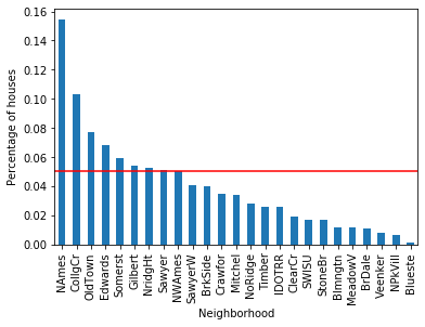
To flag which categories are rare, plot the percentage of houses that belong to each category and draw a horizontal threshold line at 5 %. Any bar below that line is a rare label.
total_houses = len(data)

# for each categorical variable
for col in cat_cols:

    # count the number of houses per categoryand divide by total houses
    # aka percentage of houses per category

    temp_df = pd.Series(data[col].value_counts() / total_houses)

    # make plot with the above percentages
    fig = temp_df.sort_values(ascending=False).plot.bar()
    fig.set_xlabel(col)

    # add a line at 5 % to flag the threshold for rare categories
    fig.axhline(y=0.05, color='red')
    fig.set_ylabel('Percentage of houses')
    plt.show()
The bar chart below shows category frequencies for Neighborhood. The red horizontal line marks the 5 % threshold — bars below it are rare labels:
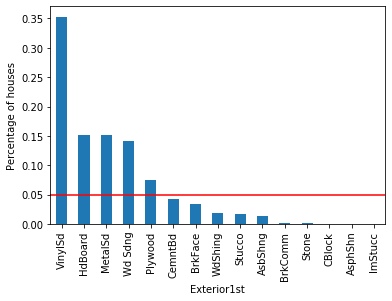
The same frequency chart for Exterior1st shows that only VinylSd, HdBoard, MetalSd, and Wd Sdng appear in more than 5 % of houses:
For Exterior2nd, even more categories fall below the 5 % threshold:
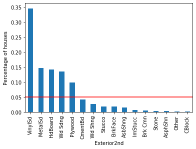
Across all three variables, a handful of dominant categories account for the majority of observations while many categories sit well below 5 %. These infrequent categories are the rare labels that can cause overfitting.
Why Rare Labels Matter: Relationship with the Target
Knowing a category is rare is one thing; understanding its relationship with the target variable SalePrice is another. You need to know whether the rare label carries a genuine signal or just noise.
Helper Functions
The function below computes two things for every category in a given column: the percentage of houses that belong to it, and the mean SalePrice for those houses.
def calculate_mean_target_per_category(df, var):

    # total number of houses
    total_houses = len(df)

    # percentage of houses per category
    temp_df = pd.Series(df[var].value_counts() / total_houses).reset_index()
    temp_df.columns = [var, 'perc_houses']

    # add the mean SalePrice
    temp_df = temp_df.merge(df.groupby([var])['SalePrice'].mean().reset_index(),
                            on=var,
                            how='left')

    return temp_df
The second function draws a dual-axis chart: grey bars show the percentage of houses per category (left axis), while a green line shows the mean SalePrice per category (right axis):
def plot_categories(df, var):

    fig, ax = plt.subplots(figsize=(8, 4))
    plt.xticks(df.index, df[var], rotation=90)

    ax2 = ax.twinx()
    ax.bar(df.index, df["perc_houses"], color='lightgrey')
    ax2.plot(df.index, df["SalePrice"], color='green', label='Seconds')
    ax.axhline(y=0.05, color='red')
    ax.set_ylabel('percentage of houses per category')
    ax.set_xlabel(var)
    ax2.set_ylabel('Average Sale Price per category')
    plt.show()
Neighborhood vs. SalePrice
Apply the helper functions to the Neighborhood column first:
temp_df = calculate_mean_target_per_category(data, 'Neighborhood')
temp_df| Neighborhood | perc_houses | SalePrice | |
|---|---|---|---|
| 0 | NAmes | 0.154110 | 145847.080000 |
| 1 | CollgCr | 0.102740 | 197965.773333 |
| 2 | OldTown | 0.077397 | 128225.300885 |
| 3 | Edwards | 0.068493 | 128219.700000 |
| 4 | Somerst | 0.058904 | 225379.837209 |
| 5 | Gilbert | 0.054110 | 192854.506329 |
| 6 | NridgHt | 0.052740 | 316270.623377 |
| 7 | Sawyer | 0.050685 | 136793.135135 |
| 8 | NWAmes | 0.050000 | 189050.068493 |
| 9 | SawyerW | 0.040411 | 186555.796610 |
| 10 | BrkSide | 0.039726 | 124834.051724 |
| 11 | Crawfor | 0.034932 | 210624.725490 |
| 12 | Mitchel | 0.033562 | 156270.122449 |
| 13 | NoRidge | 0.028082 | 335295.317073 |
| 14 | Timber | 0.026027 | 242247.447368 |
| 15 | IDOTRR | 0.025342 | 100123.783784 |
| 16 | ClearCr | 0.019178 | 212565.428571 |
| 17 | SWISU | 0.017123 | 142591.360000 |
| 18 | StoneBr | 0.017123 | 310499.000000 |
| 19 | Blmngtn | 0.011644 | 194870.882353 |
| 20 | MeadowV | 0.011644 | 98576.470588 |
| 21 | BrDale | 0.010959 | 104493.750000 |
| 22 | Veenker | 0.007534 | 238772.727273 |
| 23 | NPkVill | 0.006164 | 142694.444444 |
| 24 | Blueste | 0.001370 | 137500.000000 |
About 15 % of houses are in NAmes with a mean SalePrice of 310 000 but appears in fewer than 2 % of records — a strong-looking signal supported by very few observations.
Now plot the full picture for Neighborhood:
plot_categories(temp_df, 'Neighborhood')The dual-axis chart below shows bars for category frequency (grey, left axis) and a green line for mean SalePrice (right axis). The red line is the 5 % threshold:
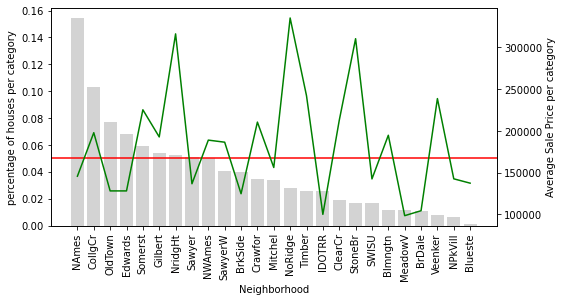
NridgHt houses sell at a high average price, while Sawyer houses tend to be cheaper. StoneBr shows an average SalePrice above $300 000, yet fewer than 2 % of the dataset's houses are located there. Because you have only a handful of StoneBr observations to learn from, the model may over- or under-estimate the neighbourhood's true effect on price.
Now plot the remaining two categorical variables using the same helper functions:
for col in cat_cols:

    # we plotted this variable already
    if col !='Neighborhood':

        # using the functions we created
        temp_df = calculate_mean_target_per_category(data, col)
        plot_categories(temp_df, col)
The chart for Exterior1st shows a wide swing in mean SalePrice across rare categories (those to the right of the red line), suggesting noisy estimates rather than reliable signals:
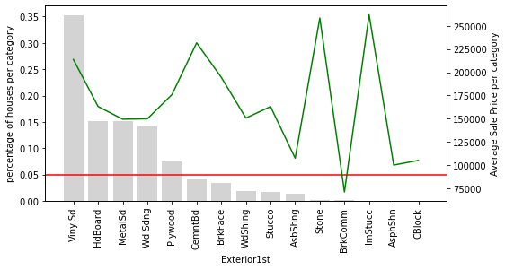
The chart for Exterior2nd makes the problem even clearer — nearly all of its categories fall below the 5 % threshold, and the green price line oscillates sharply among them:
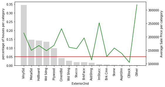
For Exterior2nd, most categories appear in fewer than 5 % of houses, and the mean SalePrice swings up and down erratically across those rare categories. This volatility is a sign of noisy estimates: because so few observations back each label, you cannot confidently say whether a high or low mean price reflects a true pattern or just random variation. These rare labels might carry genuine predictive power, or they might simply be introducing noise — and with only a handful of samples you cannot tell which.
Note: Adding standard deviation bars or an interquartile range to this chart would show exactly how variable
SalePriceis within each category, giving you an even clearer picture of estimation uncertainty.
Grouping Rare Labels
The Grouping Strategy
One standard approach to handling rare labels is to merge all infrequent categories into a single umbrella category, typically labelled 'rare' or 'Other'. This consolidation lets the model learn the collective influence of infrequent categories on the target, rather than trying to learn an unreliable estimate from each tiny group individually.
The function below replaces every category that appears in fewer than 5 % of rows with the string 'rare':
def group_rare_labels(df, var):

    total_houses = len(df)

    # first we will calculate the % of houses for each category
    temp_df = pd.Series(df[var].value_counts() / total_houses)

    # then we will create a dictionary to replace the rare labels with the string 'rare' if they are present in less than 5% of houses

    grouping_dict = {
        k: ('rare' if k not in temp_df[temp_df >= 0.05].index else k)
        for k in temp_df.index
    }

    # now we will replace the rare categories
    tmp = df[var].map(grouping_dict)

    return tmp
Applying the Grouping to Neighborhood
Apply group_rare_labels to Neighborhood and inspect the result:
data['Neighborhood_grouped'] = group_rare_labels(data, 'Neighborhood')

data[['Neighborhood', 'Neighborhood_grouped']].head(10)| Neighborhood | Neighborhood_grouped | |
|---|---|---|
| 0 | CollgCr | CollgCr |
| 1 | Veenker | rare |
| 2 | CollgCr | CollgCr |
| 3 | Crawfor | rare |
| 4 | NoRidge | rare |
| 5 | Mitchel | rare |
| 6 | Somerst | Somerst |
| 7 | NWAmes | NWAmes |
| 8 | OldTown | OldTown |
| 9 | BrkSide | rare |
Neighbourhoods like Veenker, Crawfor, and NoRidge — which individually appeared in fewer than 5 % of rows — are now mapped to 'rare'.
Plot the grouped variable to see how the 'rare' bucket compares with the remaining common categories:
temp_df = calculate_mean_target_per_category(data, 'Neighborhood_grouped')
plot_categories(temp_df, 'Neighborhood_grouped')
The chart below shows the consolidated Neighborhood_grouped variable. The 'rare' bar on the left now represents all infrequent neighbourhoods as a single group, and its associated mean SalePrice reflects their combined average effect:
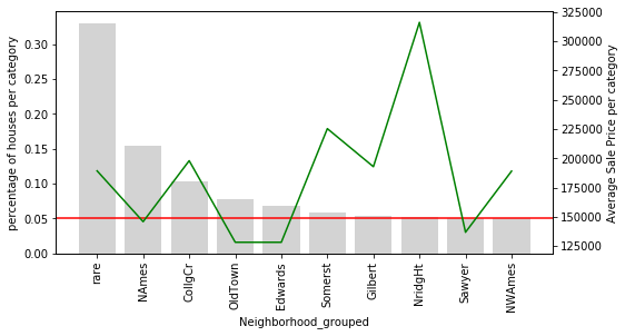
The 'rare' category now captures the overall influence of all infrequent neighbourhoods on SalePrice. Compare this with the original ungrouped chart:
# let's plot the original Neighborhood for comparison
temp_df = calculate_mean_target_per_category(data, 'Neighborhood')
plot_categories(temp_df, 'Neighborhood')
The original Neighborhood chart for comparison — notice how many bars fall below the red 5 % line, each with its own noisy price estimate:
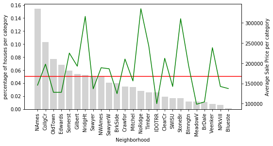
Only 9 neighbourhoods are common enough to stand on their own. All the others are now folded into 'rare', which provides a single, more stable estimate of their combined influence.
Applying the Grouping to the Remaining Variables
Apply the same grouping to Exterior1st and Exterior2nd and visualise the result:
for col in cat_cols[1:]:

    # re using the functions I created
    data[col+'_grouped'] = group_rare_labels(data, col)
    temp_df = calculate_mean_target_per_category(data, col+'_grouped')
    plot_categories(temp_df, col+'_grouped')
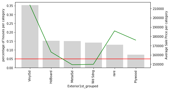
For Exterior1st_grouped, all rare exterior types are consolidated into 'rare', and the remaining common categories show a more stable price relationship:
For Exterior2nd_grouped, the same consolidation applies — the erratic price swings from the ungrouped version are replaced by a cleaner, more interpretable chart:
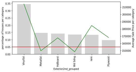
Notice an interesting pattern: in both Exterior1st_grouped and Exterior2nd_grouped, houses with rare exterior types tend to have a higher average SalePrice than houses with common exterior types (except for VinylSd). The rare categories seem to share something in common — perhaps they signal premium or non-standard materials. Grouping them together lets the model learn this shared signal from a larger combined pool of observations.
Note: Ideally you would also plot the standard deviation or interquartile range of
SalePricewithin each group to quantify how much the price varies inside that bucket.
Rare Labels and Train/Test Splits
Why the Split Creates a Problem
When you split a dataset into training and test sets, rare labels often end up in only one of the two splits. A label that lands only in the training set wastes model capacity — the model learns a special case it will never encounter at inference time. A label that lands only in the test set is even worse: the model has never seen it before and cannot make a meaningful prediction.
Split the data into 70 % training and 30 % test, keeping only the three categorical columns as features and SalePrice as the target:
X_train, X_test, y_train, y_test = train_test_split(data[cat_cols],
                                                    data['SalePrice'],
                                                    test_size=0.3,
                                                    random_state=2910)

X_train.shape, X_test.shape((1022, 3), (438, 3))The training set contains 1 022 rows and the test set contains 438 rows.
Categories Present Only in Training
Find the Exterior1st categories that appear in the training set but not in the test set:
unique_to_train_set = [
    x for x in X_train['Exterior1st'].unique() if x not in X_test['Exterior1st'].unique()
]

print(unique_to_train_set)['Stone', 'BrkComm', 'ImStucc', 'CBlock']There are 4 categories present in the training set and are not present in the test set.
Categories Present Only in Testing
Now find the labels that appear in the test set but are missing from training:
unique_to_test_set = [
    x for x in X_test['Exterior1st'].unique() if x not in X_train['Exterior1st'].unique()
]

print(unique_to_test_set)['AsphShn']In this case, there is 1 rare value present in the test set only. The model trained on X_train has never seen 'AsphShn' and will not know how to encode or score it correctly at inference time. This is a direct consequence of having rare labels: with so few observations, a single random split is enough to remove a category from one side entirely.
Conclusion
In this tutorial you explored rare labels in the Ames housing dataset. You measured category frequencies for Neighborhood, Exterior1st, and Exterior2nd, visualised each category's relationship with SalePrice, grouped all categories below the 5 % frequency threshold into a unified 'rare' bucket, and confirmed that rare labels split unevenly between training and test sets.
Key takeaways:
- A rare label is a category that appears in fewer than 5 % of rows; the threshold is a rule of thumb and can be adjusted for your dataset.
- Rare labels produce unreliable mean-target estimates because so few observations back them up — the model learns from noise rather than signal.
- Grouping rare categories into
'rare'lets the model learn their collective influence on the target from a larger, more stable pool of observations. - Without grouping, rare labels often land entirely in one split, causing the model to either overfit (train-only label) or fail at inference (test-only label).
- Always compute rare-label thresholds on the training set only to avoid data leakage; never use test-set frequencies to decide which labels to group.
Next steps:
- Continue the series with Linear Model Assumptions to learn how categorical encoding choices affect the assumptions underlying linear models.
- Read Outlier Detection and Treatment to apply similar frequency-based thinking to numeric variables with extreme values.
- Explore Variable Magnitude and Scaling to understand why the scale of your numeric features can matter as much as the encoding of your categorical ones.