
An outlier is a data point that sits far away from the rest of the observations in a dataset. It is suspicious because it may have been generated by a different process — for example, a measurement error, a data entry mistake, or a genuinely rare event.
Not all outliers are bad. In fraud detection, an unusual transaction is exactly what you are looking for. But in many regression and classification problems, outliers caused by noise or errors will distort your model. This tutorial shows you how to find them systematically.
In this tutorial you will work with two real datasets: the Boston Housing dataset (loaded from Scikit-learn) and the Titanic passenger dataset (loaded from a public CSV). You will build two reusable detection functions — one for normally distributed variables and one for skewed variables — and apply them to five features.
Prerequisites: Python 3.x, Pandas, NumPy, Matplotlib, Seaborn, SciPy, Scikit-learn.
Why Outliers Matter for Machine Learning
Not every model reacts to outliers in the same way, so the first question to ask is: does my model care?
Models sensitive to outliers:
- Linear Regression and Logistic Regression — extreme values pull the regression line or decision boundary toward them, distorting every prediction.
- AdaBoost — assigns higher weights to misclassified samples; outliers repeatedly receive high weights, forcing the ensemble to over-focus on noise.
- Neural Networks — can be misled when outliers dominate gradient updates during training.
Models robust to outliers:
- Decision Trees and Random Forests — these models split data using thresholds, so an extreme value only affects the single node where it lands; it does not shift the entire model.
If you are building a linear model or a distance-based model (such as K-Nearest Neighbours or K-Means clustering), outlier treatment is not optional — it is a prerequisite.
Outlier Detection Theory
The right detection method depends on the shape of your variable's distribution. Before picking a method, you need to know whether the variable is approximately normal or skewed.
Normally Distributed Variables — Z-Score Rule
For a variable that follows a Gaussian (normal) distribution — bell-shaped and symmetric — data points beyond three standard deviations from the mean are flagged as outliers:
Where:
- — the mean (average) of the feature
- — the standard deviation of the feature; measures how spread out the values are
- — three standard deviations in either direction; roughly 99.7 % of all data in a normal distribution falls within this range, so anything outside is considered extreme
Skewed Variables — IQR Proximity Rule
Many real-world variables are not bell-shaped — they have a long tail to one side. For these skewed distributions, standard deviations are unreliable because they are sensitive to extreme values themselves. Instead, you use the Interquartile Range (IQR):
Where:
- — the 25th percentile; 25 % of values fall below this point
- — the 75th percentile; 75 % of values fall below this point
- — the range of the middle 50 % of the data; robust to extreme values
Using the IQR, you calculate upper and lower boundaries. There are two common multipliers:
Standard outlier boundaries (catches moderate outliers):
Extreme outlier boundaries (catches only the most extreme values):
Where:
- — the 25th percentile of the feature
- — the 75th percentile of the feature
- — the interquartile range ()
- or — the distance multiplier; 1.5 is the standard threshold used by boxplots, 3 targets only the most extreme observations
Understanding the Boxplot
Before writing any code, it helps to understand what a boxplot shows. The diagram below labels every component — the box spans the IQR, the line inside the box is the median, and the whiskers extend to the standard 1.5 × IQR boundaries. Any point beyond a whisker is an outlier:
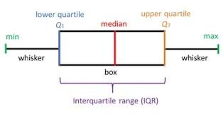
Any value sitting outside the whiskers is considered an outlier.
Setting Up the Environment
Start by importing every library you will need for this tutorial.
# to read the dataset into a dataframe and perform operations on it
import pandas as pd

# to perform basic array operations
import numpy as np

# for plotting and visualization
import matplotlib.pyplot as plt
import seaborn as sns

# for Q-Q plots
import scipy.stats as stats

# boston house dataset for the demo
from sklearn.datasets import load_boston
Load the Boston Housing dataset and inspect its variable descriptions — this tells you exactly what each column measures:
from sklearn.datasets import load_boston
print(load_boston().DESCR).. _boston_dataset:
Boston house prices dataset
---------------------------
**Data Set Characteristics:**
:Number of Instances: 506
:Number of Attributes: 13 numeric/categorical predictive. Median Value (attribute 14) is usually the target.
:Attribute Information (in order):
- CRIM per capita crime rate by town
- ZN proportion of residential land zoned for lots over 25,000 sq.ft.
- INDUS proportion of non-retail business acres per town
- CHAS Charles River dummy variable (= 1 if tract bounds river; 0 otherwise)
- NOX nitric oxides concentration (parts per 10 million)
- RM average number of rooms per dwelling
- AGE proportion of owner-occupied units built prior to 1940
- DIS weighted distances to five Boston employment centres
- RAD index of accessibility to radial highways
- TAX full-value property-tax rate per $10,000
- PTRATIO pupil-teacher ratio by town
- B 1000(Bk - 0.63)^2 where Bk is the proportion of blacks by town
- LSTAT % lower status of the population
- MEDV Median value of owner-occupied homes in $1000's
:Missing Attribute Values: None
:Creator: Harrison, D. and Rubinfeld, D.L.
This is a copy of UCI ML housing dataset.
https://archive.ics.uci.edu/ml/machine-learning-databases/housing/
This dataset was taken from the StatLib library which is maintained at Carnegie Mellon University.
The Boston house-price data of Harrison, D. and Rubinfeld, D.L. 'Hedonic
prices and the demand for clean air', J. Environ. Economics & Management,
vol.5, 81-102, 1980. Used in Belsley, Kuh & Welsch, 'Regression diagnostics
...', Wiley, 1980. N.B. Various transformations are used in the table on
pages 244-261 of the latter.
The Boston house-price data has been used in many machine learning papers that address regression
problems.
.. topic:: References
- Belsley, Kuh & Welsch, 'Regression diagnostics: Identifying Influential Data and Sources of Collinearity', Wiley, 1980. 244-261.
- Quinlan,R. (1993). Combining Instance-Based and Model-Based Learning. In Proceedings on the Tenth International Conference of Machine Learning, 236-243, University of Massachusetts, Amherst. Morgan Kaufmann.For this tutorial you only need three columns — RM (average rooms per dwelling), LSTAT (% lower-status population), and CRIM (per-capita crime rate). Select them and preview the first five rows:
boston_dataset = load_boston()
boston = pd.DataFrame(boston_dataset.data,
                      columns=boston_dataset.feature_names)[[
                          'RM', 'LSTAT', 'CRIM'
                      ]]

boston.head()| RM | LSTAT | CRIM | |
|---|---|---|---|
| 0 | 6.575 | 4.98 | 0.00632 |
| 1 | 6.421 | 9.14 | 0.02731 |
| 2 | 7.185 | 4.03 | 0.02729 |
| 3 | 6.998 | 2.94 | 0.03237 |
| 4 | 7.147 | 5.33 | 0.06905 |
Load the Titanic dataset and keep only the Age and Fare columns. Drop any rows that have missing values in those columns so they do not interfere with the boundary calculations:
titanic = pd.read_csv('https://raw.githubusercontent.com/laxmimerit/All-CSV-ML-Data-Files-Download/master/titanic.csv',
                      usecols=['Age', 'Fare'])

titanic.dropna(subset=['Age', 'Fare'], inplace=True)
titanic.head()| Age | Fare | |
|---|---|---|
| 0 | 22.0 | 7.2500 |
| 1 | 38.0 | 71.2833 |
| 2 | 26.0 | 7.9250 |
| 3 | 35.0 | 53.1000 |
| 4 | 35.0 | 8.0500 |
Identifying Variable Distributions
Before applying any detection method, you need to know the shape of your variable's distribution. You will use three complementary plots: a histogram (shows the overall shape), a Q-Q plot (compares the data to a theoretical normal distribution — if the points lie on the diagonal line, the variable is approximately normal), and a boxplot (shows the IQR, whiskers, and any outliers directly).
The helper function below draws all three plots side by side for any variable in a given DataFrame:
def diagnostic_plots(df, variable):
    # function takes a dataframe (df) and
    # the variable of interest as arguments

    # define figure size
    plt.figure(figsize=(16, 4))

    # histogram
    plt.subplot(1, 3, 1)
    sns.distplot(df[variable], bins=30)
    plt.title('Histogram')

    # Q-Q plot
    plt.subplot(1, 3, 2)
    stats.probplot(df[variable], dist="norm", plot=plt)
    plt.ylabel('RM quantiles')

    # boxplot
    plt.subplot(1, 3, 3)
    sns.boxplot(y=df[variable])
    plt.title('Boxplot')

    plt.show()
Normally Distributed Variables
Plot the diagnostic charts for RM — the average number of rooms per dwelling:
diagnostic_plots(boston, 'RM')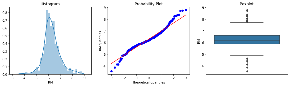
The histogram and Q-Q plot confirm that RM approximates a Gaussian distribution well — the points in the Q-Q plot track the diagonal line closely. The boxplot reveals a small number of dots beyond both whiskers, suggesting outliers at both tails.
Now inspect Age from the Titanic dataset — the age of each passenger:
diagnostic_plots(titanic, 'Age')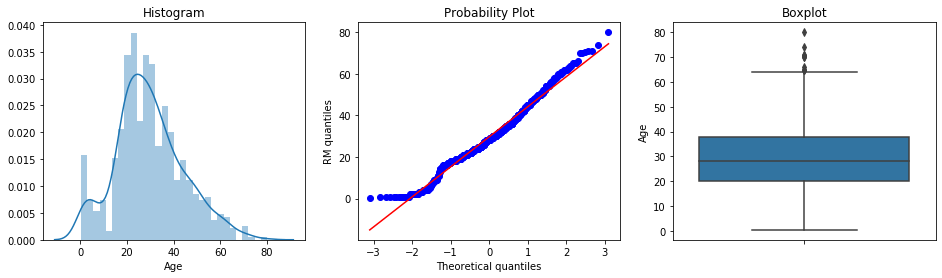
The Age variable approximates a Gaussian distribution fairly well. There is a slight deviation from normality at the lower end of the Q-Q plot, caused by the concentration of younger passengers. The boxplot indicates a small number of outliers above the upper whisker — very old passengers.
Skewed Variables
Plot the diagnostic charts for LSTAT — the percentage of lower-status population per town:
diagnostic_plots(boston, 'LSTAT')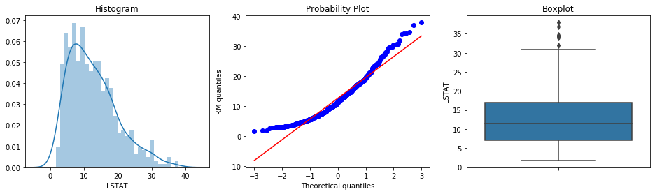
LSTAT is clearly not normally distributed — the histogram has a long tail to the right and the Q-Q plot deviates from the diagonal. The boxplot confirms outliers only at the right tail. For this variable you will use the IQR method.
Examine CRIM — the per-capita crime rate by town:
diagnostic_plots(boston, 'CRIM')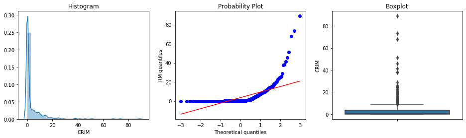
CRIM is heavily right-skewed. Almost all towns have very low crime rates, but a subset have extremely high ones. The boxplot shows a large cluster of outlier points far above the upper whisker.
Finally, look at Fare from the Titanic dataset — the ticket price paid by each passenger:
diagnostic_plots(titanic, 'Fare')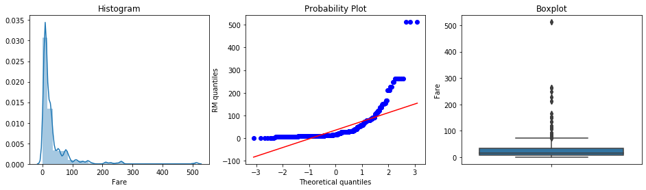
Fare is also extremely right-skewed, with most passengers paying low fares and a handful paying very high amounts. The IQR method is the correct choice here.
Outlier Detection for Normally Distributed Variables
The function below calculates the upper and lower boundaries using the Z-score rule — mean plus or minus three standard deviations:
def find_normal_boundaries(df, variable):

    # calculate the boundaries outside which lie the outliers for a Gaussian distribution

    upper_boundary = df[variable].mean() + 3 * df[variable].std()
    lower_boundary = df[variable].mean() - 3 * df[variable].std()

    return upper_boundary, lower_boundary
Apply it to RM to get the numerical boundaries:
upper_boundary, lower_boundary = find_normal_boundaries(boston, 'RM')
upper_boundary, lower_boundary(8.392485817597757, 4.176782957105816)Values above ~8.4 rooms or below ~4.2 rooms per dwelling are rare enough to be considered outliers. Now count how many houses fall outside these boundaries:
print('Total number of houses: {}'.format(len(boston)))

print('Houses with more than 8.4 rooms (right end outliers): {}'.format(
    len(boston[boston['RM'] > upper_boundary])))

print('Houses with less than 4.2 rooms (left end outliers: {}'.format(
    len(boston[boston['RM'] < lower_boundary])))

print('% right end outliers: {}'.format(
    len(boston[boston['RM'] > upper_boundary]) / len(boston)))

print('% left end outliers: {}'.format(
len(boston[boston['RM'] < lower_boundary]) / len(boston)))Total number of houses: 506
Houses with more than 8.4 rooms (right end outliers): 4
Houses with less than 4.2 rooms (left end outliers: 4
% right end outliers: 0.007905138339920948
% left end outliers: 0.007905138339920948Only 4 houses sit at each tail — about 0.8 % each, or 1.6 % combined. This is exactly what you expect: the Z-score rule is designed to flag only the rarest values.
Now calculate boundaries for Age in the Titanic dataset:
# calculate boundaries for Age in the titanic

upper_boundary, lower_boundary = find_normal_boundaries(titanic, 'Age')
upper_boundary, lower_boundary(73.27860964406095, -13.88037434994331)The upper boundary of 73 years is meaningful. The lower boundary is negative, which is impossible for age — so you only apply the upper boundary. Count the passengers above 73:
# lets look at the number and percentage of outliers

print('Total passengers: {}'.format(len(titanic)))

print('Passengers older than 73: {}'.format(
    len(titanic[titanic['Age'] > upper_boundary])))
print()
print('% of passengers older than 73: {}'.format(
len(titanic[titanic['Age'] > upper_boundary]) / len(titanic)))Total passengers: 714
Passengers older than 73: 2
% of passengers older than 73: 0.0028011204481792717Only 2 passengers were older than 73 — a tiny fraction of the 714 passengers, confirming they are genuine outliers by the Z-score definition.
Outlier Detection for Skewed Variables
For skewed features, you use the IQR proximity rule. The function below accepts a distance argument so you can switch between 1.5 × IQR (standard outliers) and 3 × IQR (extreme outliers):
def find_skewed_boundaries(df, variable, distance):

    IQR = df[variable].quantile(0.75) - df[variable].quantile(0.25)

    lower_boundary = df[variable].quantile(0.25) - (IQR * distance)
    upper_boundary = df[variable].quantile(0.75) + (IQR * distance)

    return upper_boundary, lower_boundary
Apply the standard 1.5 × IQR rule to LSTAT:
upper_boundary, lower_boundary = find_skewed_boundaries(boston, 'LSTAT', 1.5)
upper_boundary, lower_boundary(31.962500000000006, -8.057500000000005)The upper boundary is ~32. The lower boundary is negative, which LSTAT (a percentage) cannot reach, so only the upper boundary is meaningful. Count the houses with unusually high values:
print('Total houses: {}'.format(len(boston)))

print('Houses with LSTAT bigger than 32: {}'.format(
    len(boston[boston['LSTAT'] > upper_boundary])))
print()
print('% of houses with LSTAT bigger than 32: {}'.format(
len(boston[boston['LSTAT'] > upper_boundary])/len(boston)))Total houses: 506
Houses with LSTAT bigger than 32: 7
% of houses with LSTAT bigger than 32: 0.01383399209486166Seven houses (1.4 %) have an unusually high lower-status population percentage — consistent with the right-tail outliers visible in the boxplot earlier.
Now use the stricter 3 × IQR rule on CRIM to find only the most extreme crime-rate values:
upper_boundary, lower_boundary = find_skewed_boundaries(boston, 'CRIM', 3)
upper_boundary, lower_boundary(14.462195000000001, -10.7030675)Count the houses above this extreme boundary:
print('Total houses: {}'.format(len(boston)))

print('Houses with CRIM bigger than 14: {}'.format(
    len(boston[boston['CRIM'] > upper_boundary])))
print()
print('% of houses with CRIM bigger than 14s: {}'.format(
len(boston[boston['CRIM'] > upper_boundary]) / len(boston)))Total houses: 506
Houses with CRIM bigger than 14: 30
% of houses with CRIM bigger than 14s: 0.05928853754940711Even with the stricter 3 × IQR threshold, about 6 % of the dataset exceeds the boundary. This reflects the heavily skewed nature of CRIM — a small number of high-crime towns sit very far from the rest.
Finally, identify extreme Fare values in the Titanic dataset using IQR × 3:
upper_boundary, lower_boundary = find_skewed_boundaries(titanic, 'Fare', 3)
upper_boundary, lower_boundary(109.35, -67.925)Count the passengers who paid fares above this boundary:
print('Total passengers: {}'.format(len(titanic)))

print('Passengers who paid more than 117: {}'.format(
    len(titanic[titanic['Fare'] > upper_boundary])))
print()
print('% of passengers who paid more than 117: {}'.format(
len(titanic[titanic['Fare'] > upper_boundary])/len(titanic)))Total passengers: 714
Passengers who paid more than 117: 44
% of passengers who paid more than 117: 0.06162464985994398About 6 % of passengers paid fares above the extreme boundary. As with the other right-skewed variables, the lower boundary is negative and is ignored. These 44 passengers likely held first-class cabins and represent a genuinely different segment of the passenger population.
Conclusion
In this tutorial you built a systematic outlier detection workflow applied to five features across two real-world datasets. For RM and Age — variables that are approximately normally distributed — you used the Z-score rule and found very few outliers (under 2 %). For LSTAT, CRIM, and Fare — right-skewed variables — you used the IQR proximity rule and found between 1 % and 6 % of observations lying beyond the extreme boundaries.
Key takeaways:
- Always inspect the variable's distribution first — histogram and Q-Q plot together tell you whether to use the Z-score rule or the IQR rule.
- The Z-score rule () is appropriate only for approximately normal variables; applying it to skewed data gives misleading boundaries.
- The IQR rule is robust to extreme values because it uses percentiles rather than the mean and standard deviation.
- A negative lower boundary is physically impossible for variables like age, percentage, or price — use only the upper boundary in those cases.
- The percentage of outliers found should be small (under 5 %); if it is large, revisit the multiplier or the distribution assumption.
Next steps:
- After removing or capping outliers, scaling your features is the logical next step — read Variable Magnitude to see how standardization and min-max scaling work.
- If you have not yet addressed linear model assumptions such as normality of residuals and homoscedasticity, read Linear Model Assumptions.
- For handling rare category labels in categorical features — another common preprocessing challenge — see Rare Labels.
- To see how tree-based models that are naturally robust to outliers work, explore Decision Tree in Python.