
When you train a linear regression or logistic regression model, the mathematics behind it rests on a set of assumptions about your input features. If those assumptions are violated, the model can produce inaccurate predictions, unstable coefficients, or misleading confidence intervals — even if the code runs without errors.
This tutorial walks you through each assumption, shows you how to detect violations visually and numerically, and demonstrates how log transformations can bring your features back into compliance. You will work with the Boston housing dataset from scikit-learn alongside a small simulated dataset that shows you exactly what "correct" plots look like.
Prerequisites: Python 3.x, Pandas, NumPy, Matplotlib, Seaborn, SciPy, scikit-learn, Yellowbrick.
What Linear Models Assume
A linear model assumes that the target can be expressed as a weighted sum of the input features:
Where:
- — the target variable you are trying to predict
- — the independent input features
- — the intercept (the predicted value when all features are zero)
- — the regression coefficients (how much each feature moves the prediction)
For this equation to produce reliable results, four conditions must hold:
| Assumption | What it means | How to check | Fix if violated |
|---|---|---|---|
| Linearity | Each feature has a straight-line relationship with | Scatter plots, residual plots | Log, power, or exponential transformation; discretization |
| Normality | Each feature follows a Gaussian (bell-curve) distribution | Histograms, Q-Q plots | Log, Box-Cox, or Yeo-Johnson transformation |
| No multicollinearity | Input features are not strongly correlated with each other | Correlation matrix, Variance Inflation Factor | Drop one of the correlated features; apply PCA |
| Homoscedasticity | The model's prediction errors have roughly the same spread across all feature values | Residual plots | Log, Box-Cox, or Yeo-Johnson transformation |
When one or more of these conditions fail, you have two options: apply a mathematical transformation to the offending feature, or switch to a model that does not share these assumptions (such as a tree-based method).
Setting Up the Environment
Start by importing every library you will need for this tutorial in one block:
import pandas as pd
import numpy as np

# for plotting and visualization
import matplotlib.pyplot as plt
import seaborn as sns

# for the Q-Q plots
import scipy.stats as stats

# the dataset for the demo
from sklearn.datasets import load_boston

# for linear regression
from sklearn.linear_model import LinearRegression

# to split and standarize the dataset
from sklearn.model_selection import train_test_split
from sklearn.preprocessing import StandardScaler

# to evaluate the regression model
from sklearn.metrics import mean_squared_error
Load the Boston housing dataset and build a Pandas DataFrame that holds both the features and the target column MEDV (median house value in $1000s):
boston_dataset = load_boston()

# create a dataframe with the independent variables
boston = pd.DataFrame(boston_dataset.data,
                      columns=boston_dataset.feature_names)

# add the target
boston['MEDV'] = boston_dataset.target

boston.head()| CRIM | ZN | INDUS | CHAS | NOX | RM | AGE | DIS | RAD | TAX | PTRATIO | B | LSTAT | MEDV | |
|---|---|---|---|---|---|---|---|---|---|---|---|---|---|---|
| 0 | 0.00632 | 18.0 | 2.31 | 0.0 | 0.538 | 6.575 | 65.2 | 4.0900 | 1.0 | 296.0 | 15.3 | 396.90 | 4.98 | 24.0 |
| 1 | 0.02731 | 0.0 | 7.07 | 0.0 | 0.469 | 6.421 | 78.9 | 4.9671 | 2.0 | 242.0 | 17.8 | 396.90 | 9.14 | 21.6 |
| 2 | 0.02729 | 0.0 | 7.07 | 0.0 | 0.469 | 7.185 | 61.1 | 4.9671 | 2.0 | 242.0 | 17.8 | 392.83 | 4.03 | 34.7 |
| 3 | 0.03237 | 0.0 | 2.18 | 0.0 | 0.458 | 6.998 | 45.8 | 6.0622 | 3.0 | 222.0 | 18.7 | 394.63 | 2.94 | 33.4 |
| 4 | 0.06905 | 0.0 | 2.18 | 0.0 | 0.458 | 7.147 | 54.2 | 6.0622 | 3.0 | 222.0 | 18.7 | 396.90 | 5.33 | 36.2 |
Retrieve the list of feature names — these 13 columns are the independent variables you will analyze throughout this tutorial:
features = boston_dataset.feature_names
featuresarray(['CRIM', 'ZN', 'INDUS', 'CHAS', 'NOX', 'RM', 'AGE', 'DIS', 'RAD',
'TAX', 'PTRATIO', 'B', 'LSTAT'], dtype='<U7')Print the full dataset description to familiarize yourself with what each column represents before continuing. Your goal is to predict MEDV — the median value of owner-occupied homes:
print(boston_dataset.DESCR).. _boston_dataset:
Boston house prices dataset
---------------------------
**Data Set Characteristics:**
:Number of Instances: 506
:Number of Attributes: 13 numeric/categorical predictive. Median Value (attribute 14) is usually the target.
:Attribute Information (in order):
- CRIM per capita crime rate by town
- ZN proportion of residential land zoned for lots over 25,000 sq.ft.
- INDUS proportion of non-retail business acres per town
- CHAS Charles River dummy variable (= 1 if tract bounds river; 0 otherwise)
- NOX nitric oxides concentration (parts per 10 million)
- RM average number of rooms per dwelling
- AGE proportion of owner-occupied units built prior to 1940
- DIS weighted distances to five Boston employment centres
- RAD index of accessibility to radial highways
- TAX full-value property-tax rate per $10,000
- PTRATIO pupil-teacher ratio by town
- B 1000(Bk - 0.63)^2 where Bk is the proportion of blacks by town
- LSTAT % lower status of the population
- MEDV Median value of owner-occupied homes in $1000's
:Missing Attribute Values: None
:Creator: Harrison, D. and Rubinfeld, D.L.
This is a copy of UCI ML housing dataset.
https://archive.ics.uci.edu/ml/machine-learning-databases/housing/
This dataset was taken from the StatLib library which is maintained at Carnegie Mellon University.
The Boston house-price data of Harrison, D. and Rubinfeld, D.L. 'Hedonic
prices and the demand for clean air', J. Environ. Economics & Management,
vol.5, 81-102, 1978. Used in Belsley, Kuh & Welsch, 'Regression diagnostics
...', Wiley, 1980. N.B. Various transformations are used in the table on
pages 244-261 of the latter.
The Boston house-price data has been used in many machine learning papers that address regression
problems.
.. topic:: References
- Belsley, Kuh & Welsch, 'Regression diagnostics: Identifying Influential Data and Sources of Collinearity', Wiley, 1980. 244-261.
- Quinlan,R. (1993). Combining Instance-Based and Model-Based Learning. In Proceedings on the Tenth International Conference of Machine Learning, 236-243, University of Massachusetts, Amherst. Morgan Kaufmann.Creating a Simulated Reference Dataset
Before examining the real data, you need a reference point — a small dataset that perfectly satisfies all assumptions. You will use these "ideal" plots to train your eye before looking at messier real-world data.
The code below generates 200 observations where x follows a standard normal distribution and y is a linear function of x plus a small amount of random noise:
np.random.seed(29) # for reproducibility

n = 200
x = np.random.randn(n)
y = x * 10 + np.random.randn(n) * 2

toy_df = pd.DataFrame([x, y]).T
toy_df.columns = ['x', 'y']
toy_df.head()| x | y | |
|---|---|---|
| 0 | -0.417482 | -1.271561 |
| 1 | 0.706032 | 7.990600 |
| 2 | 1.915985 | 19.848687 |
| 3 | -2.141755 | -21.928903 |
| 4 | 0.719057 | 5.579070 |
Linearity Assumption
The linearity assumption says that each feature's relationship to the target must be a straight line — not a curve. You check this with two tools: scatter plots and residual plots.
Scatter Plots
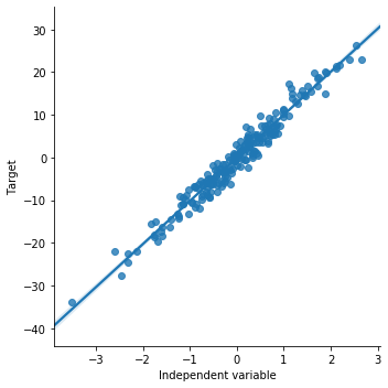
A scatter plot draws the feature on the horizontal axis and the target on the vertical axis. When linearity holds, the cloud of points should cluster tightly around a straight regression line. sns.lmplot() draws this scatter plot and fits a regression line in one call.
Start with the simulated data to see what a perfectly linear relationship looks like:
# order 1 indicates that we want seaborn to estimate a linear model (the line in the plot below) between x and y
sns.lmplot(x="x", y="y", data=toy_df, order=1)

plt.ylabel('Target')
plt.xlabel('Independent variable')
The scatter plot below shows points tightly aligned along the regression line — the ideal shape for a linear relationship:
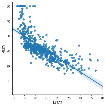
Now plot LSTAT (percentage of lower-status population) against MEDV from the Boston dataset:
sns.lmplot(x="LSTAT", y="MEDV", data=boston, order=1)The plot shows a clear downward trend: as LSTAT increases, house prices fall. The relationship is approximately linear, apart from a cluster of points at the low end of LSTAT:
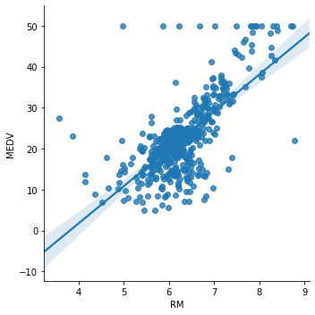
Next, plot RM (average number of rooms per dwelling) against MEDV:
sns.lmplot(x="RM", y="MEDV", data=boston, order=1)The linear trend is present but weaker — many data points deviate from the regression line, especially at low and high room counts:
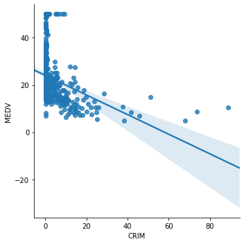
Now plot CRIM (per capita crime rate) against MEDV:
sns.lmplot(x="CRIM", y="MEDV", data=boston, order=1)The relationship is clearly non-linear. Nearly all data is packed near zero crime rates, and the regression line does not capture this pattern well:
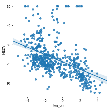
A log transformation compresses the long right tail of CRIM and can restore a linear relationship. Apply np.log() to CRIM and re-plot:
boston['log_crim'] = np.log(boston['CRIM'])

# plot the transformed CRIM variable vs MEDV
sns.lmplot(x="log_crim", y="MEDV", data=boston, order=1)
The transformed scatter plot shows a much more evenly distributed cloud of points around the regression line, confirming that the log transformation improved the linear fit:
Drop the temporary column before continuing:
# let's drop the added log transformed variable we don't need it for the rest of the demo

boston.drop(labels='log_crim', inplace=True, axis=1)
Residual Plots
A second way to check linearity is to look at the residuals — the differences between the model's predictions and the true target values.
The four-step process is:
- Fit a
LinearRegressionmodel using a single feature - Generate predictions on the training data
- Calculate the residual for each observation:
- Plot the residuals against the feature values and check that they scatter randomly around zero
When linearity holds, residuals should look like random noise centered at zero. A curved or funnel-shaped residual pattern signals a violated assumption.
Start with the simulated data. Fit a linear model, generate predictions, and compute residuals:
# SIMULATED DATA

# step 1: make a linear model
# call the linear model from sklearn
linreg = LinearRegression()

# fit the model
linreg.fit(toy_df['x'].to_frame(), toy_df['y'])

# step 2: obtain the predictions
# make the predictions
pred = linreg.predict(toy_df['x'].to_frame())

# step 3: calculate the residuals
error = toy_df['y'] - pred

# plot predicted vs real
plt.scatter(x=pred, y=toy_df['y'])
plt.xlabel('Predictions')
plt.ylabel('Real value')
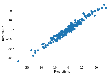
The predicted values align closely with the real target values, confirming a good linear fit on the simulated data:
Now plot the residuals against the independent variable x to verify that errors are randomly distributed around zero:
# step 4: observe the distribution of the errors

plt.scatter(y=error, x=toy_df['x'])
plt.ylabel('Residuals')
plt.xlabel('Independent variable x')
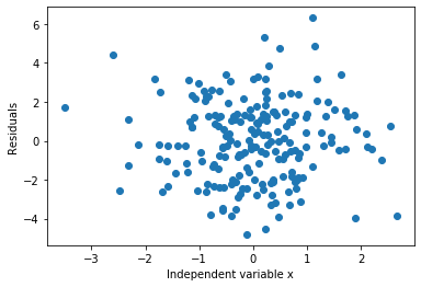
The residuals are evenly scattered above and below zero across all values of x — exactly what you want to see:
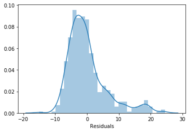
A histogram of those same residuals should show a Gaussian bell curve centered at zero. Plot it with sns.distplot():
sns.distplot(error, bins=30)
plt.xlabel('Residuals')
The residuals form a symmetric bell curve centered at zero, confirming the linear model assumption is fully satisfied on the simulated data:
Now repeat the same process for LSTAT from the Boston dataset. Fit the model, generate predictions, and plot them against the true MEDV values:
# step 1: call the linear model from sklearn
linreg = LinearRegression()

# fit the model
linreg.fit(boston['LSTAT'].to_frame(), boston['MEDV'])

# step 2: make the predictions
pred = linreg.predict(boston['LSTAT'].to_frame())

# step 3: calculate the residuals
error = boston['MEDV'] - pred

# plot predicted vs real
plt.scatter(x=pred, y=boston['MEDV'])
plt.xlabel('Predictions')
plt.ylabel('MEDV')
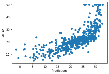
The model fits reasonably well in the middle range but consistently under-predicts the highest house prices — a sign that the linear relationship is imperfect:
Plot the residuals against LSTAT to see where the errors concentrate:
# step 4: observe the distribution of the errors

plt.scatter(y=error, x=boston['LSTAT'])
plt.ylabel('Residuals')
plt.xlabel('LSTAT')
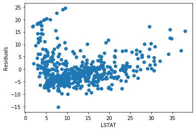
The residuals fan out at low and high values of LSTAT instead of staying flat around zero. This non-constant spread is called heteroscedasticity — a violation of the homoscedasticity assumption:
Now fit the model using log(LSTAT) instead and compare the predictions:
# step 1: call the linear model from sklearn
linreg = LinearRegression()

# fit the model
linreg.fit(np.log(boston['LSTAT']).to_frame(), boston['MEDV'])

# staep 2: make the predictions
pred = linreg.predict(np.log(boston['LSTAT']).to_frame())

# step 3: calculate the residuals
error = boston['MEDV'] - pred

# plot predicted vs real
plt.scatter(x=pred, y=boston['MEDV'])
plt.xlabel('Predictions')
plt.ylabel('MEDV')
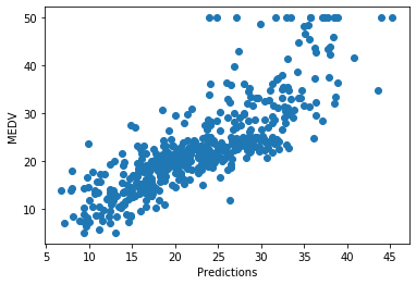
The predictions track the true values more evenly across the full price range after the transformation:
Plot the residuals after the transformation:
# step 4: observe the distribution of the errors

plt.scatter(y=error, x=boston['LSTAT'])
plt.ylabel('Residuals')
plt.xlabel('LSTAT')
The residuals are more centered around zero and spread more evenly across all LSTAT values compared to the untransformed model:
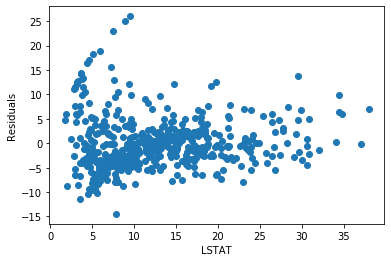
You can see how the log transformation improved linearity and reduced the error pattern. Try the same experiment on RM and CRIM to see whether transformation helps those features too.
Multicollinearity
Multicollinearity means that two or more input features are strongly correlated with each other. When this happens, the model cannot reliably separate the individual effect of each feature — coefficients become unstable and the model's interpretability breaks down.
You detect multicollinearity by computing a correlation matrix: a table that shows the pairwise correlation between every pair of features, where values near +1 or -1 indicate a strong relationship.
Compute the correlation matrix for the Boston features and display it as a heatmap — a color-coded grid where darker shades represent stronger correlations:
correlation_matrix = boston[features].corr().round(2)
figure = plt.figure(figsize=(12, 12))
# annot = True to print the correlation values inside the squares
sns.heatmap(data=correlation_matrix, annot=True)
Each cell in the heatmap shows the correlation between the two features labeling its row and column. Strong positive correlations appear in a warm dark color and strong negative correlations in a cool dark color:
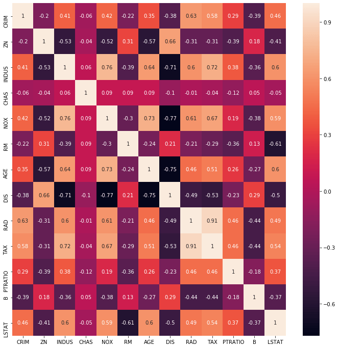
The heatmap reveals two pairs of highly correlated features. RAD (highway accessibility) and TAX (property tax rate) have a correlation of 0.91 — nearly perfectly correlated. NOX (nitric oxide concentration) and DIS (distance to employment centers) have a correlation of -0.71.
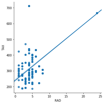
Plot the RAD–TAX pair in a scatter plot to see the collinearity visually:
sns.lmplot(x="RAD", y="TAX", data=boston, order=1)The points follow the regression line closely, confirming the strong linear relationship between highway accessibility and property taxes:
Now plot NOX vs DIS:
sns.lmplot(x="NOX", y="DIS", data=boston, order=1)The strong negative correlation between nitric oxide concentration and distance to employment centers is clearly visible — areas farther from job centers tend to have lower pollution:
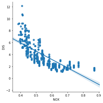
Both RAD–TAX and NOX–DIS violate the no-multicollinearity assumption. Before training a linear model, you would drop one feature from each correlated pair (or apply PCA to replace both with an uncorrelated component).
Normality
The normality assumption says that each input feature should follow a Gaussian distribution — the familiar symmetric bell curve. You check this with histograms and Q-Q plots (quantile–quantile plots).
Histograms
A histogram bins feature values and plots their frequency. A normally distributed feature produces a symmetric bell shape centered around the mean. Skewed or multi-modal shapes signal a violation.
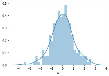
Plot the simulated variable x, which you know is normally distributed by construction:
sns.distplot(toy_df['x'], bins=30)The histogram shows the classic symmetric bell curve — your reference for what a normally distributed feature looks like:
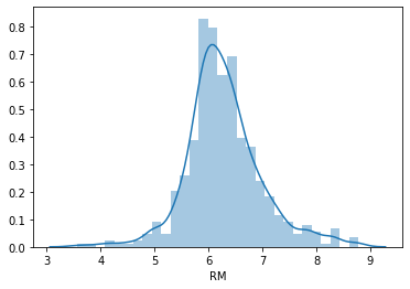
Now plot RM (average rooms per dwelling) from the Boston dataset:
sns.distplot(boston['RM'], bins=30)RM shows a roughly normal distribution centered around six rooms — it passes the normality check:
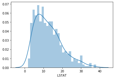
Plot LSTAT (percentage lower-status population):
sns.distplot(boston['LSTAT'], bins=30)LSTAT is visibly right-skewed — most values are low, but a long tail stretches toward higher values. This violates the normality assumption:
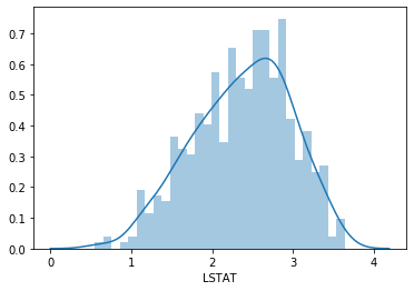
Apply a log transformation to LSTAT to compress the tail and compare:
# histogram of the log-transformed LSTAT for comparison
sns.distplot(np.log(boston['LSTAT']), bins=30)
After the log transformation, the distribution is less skewed and closer to a bell shape, though still not perfectly Gaussian:
Q-Q Plots
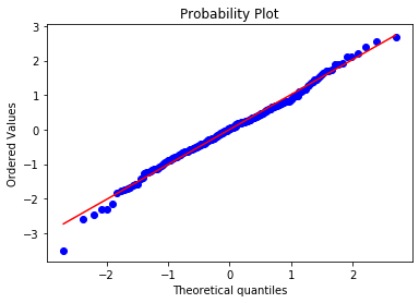
A Q-Q plot (quantile–quantile plot) is a more precise normality diagnostic. It plots the quantiles of your actual data (y-axis) against the theoretical quantiles of a perfect Gaussian distribution (x-axis). When the data is normally distributed, the points form a straight 45-degree line. Departures from that line reveal where the distribution diverges from normality.
Plot the Q-Q plot for the simulated variable x:
stats.probplot(toy_df['x'], dist="norm", plot=plt)
plt.show()
Every point lies on the 45-degree reference line — the ideal outcome for a normally distributed variable:
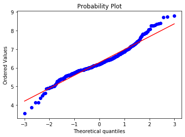
Now check RM:
stats.probplot(boston['RM'], dist="norm", plot=plt)
plt.show()
The center of the distribution follows the line well, but the tails deviate slightly — RM is close to normal but not perfect:
Check LSTAT:
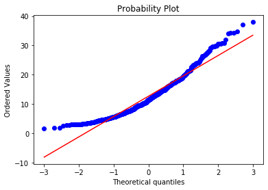
stats.probplot(boston['LSTAT'], dist="norm", plot=plt)
plt.show()
The points curve away from the reference line at both ends, confirming that LSTAT is not normally distributed:
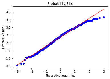
Apply the log transformation to LSTAT and re-plot:
# and now for the log transformed LSTAT
stats.probplot(np.log(boston['LSTAT']), dist="norm", plot=plt)
plt.show()
After the transformation, the points track the reference line much more closely across the full range of quantiles:
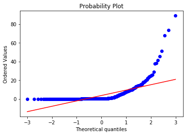
For comparison, check CRIM, which you already know has an extreme right skew:
stats.probplot(boston['CRIM'], dist="norm", plot=plt)
plt.show()
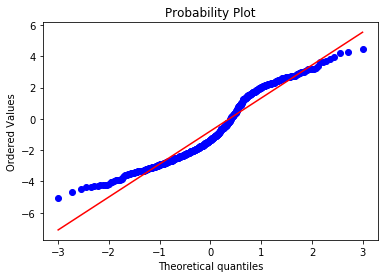
The Q-Q plot shows a severe upward curve at the high end — CRIM is extremely non-normal:
Apply the log transformation to CRIM:
stats.probplot(np.log(boston['CRIM']), dist="norm", plot=plt)
plt.show()
The transformation improves normality noticeably, though the distribution still deviates from the reference line — you might experiment with a Box-Cox or Yeo-Johnson transformation for a better result:
Homoscedasticity
Homoscedasticity — also called homogeneity of variance — means that the model's prediction errors have the same spread regardless of the feature value. When errors grow larger (or smaller) as the feature increases, the data is heteroscedastic, which makes regression coefficients less reliable.
To check homoscedasticity, you fit a model using several features together, compute the residuals on the test set, and plot those residuals against each feature. Ideally the residual cloud stays at the same width (same variance) across all feature values.
Baseline Model on Raw Features
Split the data into training (70%) and test (30%) sets, using RM, LSTAT, and CRIM as features:
X_train, X_test, y_train, y_test = train_test_split(
    boston[['RM', 'LSTAT', 'CRIM']],
    boston['MEDV'],
    test_size=0.3,
    random_state=0)

X_train.shape, X_test.shape, y_train.shape, y_test.shape((354, 3), (152, 3), (354,), (152,))Scale the features with StandardScaler, which converts each feature to zero mean and unit variance. The standardization formula is:
Where:
- — the standardized score (the scaled output)
- — the original raw feature value
- — the mean of the feature across the training set
- — the standard deviation of the feature across the training set
scaler = StandardScaler()
scaler.fit(X_train)StandardScaler(copy=True, with_mean=True, with_std=True)Fit the linear regression model on the scaled training data and evaluate its mean squared error on both sets:
# call the model
linreg = LinearRegression()

# train the model
linreg.fit(scaler.transform(X_train), y_train)

# make predictions on the train set and calculate the mean squared error
print('Train set')
pred = linreg.predict(scaler.transform(X_train))
print('Linear Regression mse: {}'.format(mean_squared_error(y_train, pred)))

# make predictions on the test set and calculate the mean squared error
print('Test set')
pred = linreg.predict(scaler.transform(X_test))
print('Linear Regression mse: {}'.format(mean_squared_error(y_test, pred)))
print()Train set
Linear Regression mse: 28.603232128198893
Test set
Linear Regression mse: 33.20006295308442The test MSE is 33.2 — your baseline to beat after applying transformations. Now compute the residuals and check for homoscedasticity. Plot residuals against LSTAT:
# calculate the residuals
error = y_test - pred

# plot the residuals vs LSTAT
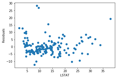
plt.scatter(x=X_test['LSTAT'], y=error)
plt.xlabel('LSTAT')
plt.ylabel('Residuals')
The residuals for LSTAT are reasonably spread around zero across most of the feature range:
Plot residuals against RM:
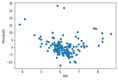
plt.scatter(x=X_test['RM'], y=error)
plt.xlabel('RM')
plt.ylabel('Residuals')
The residuals for RM are not homogeneous — low and high room counts produce larger errors than the middle range, indicating heteroscedasticity:
Plot residuals against CRIM:
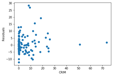
plt.scatter(x=X_test['CRIM'], y=error)
plt.xlabel('CRIM')
plt.ylabel('Residuals')Text(0, 0.5, 'Residuals')The residuals for CRIM are heavily skewed — most values cluster at low crime rates, leaving a very long right tail with few observations and large errors:
Now use the Yellowbrick ResidualsPlot visualizer for a consolidated view of model residuals. To install the library, run:
pip install yellowbrick
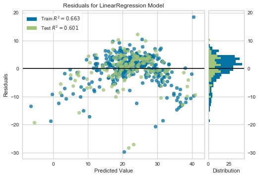
ResidualsPlot shows the residuals for both training and test data on one chart, with the residual distribution histogram on the right side:
from yellowbrick.regressor import ResidualsPlot

linreg = LinearRegression()
linreg.fit(scaler.transform(X_train), y_train)
visualizer = ResidualsPlot(linreg)

visualizer.fit(scaler.transform(X_train), y_train)  # Fit the training data to the model
visualizer.score(scaler.transform(X_test), y_test)  # Evaluate the model on the test data
visualizer.poof()
The residuals fan out at higher predicted values and are not centered around zero, confirming heteroscedasticity. The test R² is 0.60:
Improved Model on Log-Transformed Features
Apply a log transformation to all three features — LSTAT, CRIM, and RM — and rebuild the model:
# log transform the variables
boston['LSTAT'] = np.log(boston['LSTAT'])
boston['CRIM'] = np.log(boston['CRIM'])
boston['RM'] = np.log(boston['RM'])

# let's separate into training and testing set
X_train, X_test, y_train, y_test = train_test_split(
    boston[['RM', 'LSTAT', 'CRIM']],
    boston['MEDV'],
    test_size=0.3,
    random_state=0)

X_train.shape, X_test.shape, y_train.shape, y_test.shape((354, 3), (152, 3), (354,), (152,))Re-fit the scaler on the new transformed training data:
# let's scale the features
scaler = StandardScaler()
scaler.fit(X_train)StandardScaler(copy=True, with_mean=True, with_std=True)Fit the model on the transformed and scaled features and evaluate the MSE:
# building the model

# call the model
linreg = LinearRegression()

# fit the model
linreg.fit(scaler.transform(X_train), y_train)

# make predictions and calculate the mean squared error over the train set
print('Train set')
pred = linreg.predict(scaler.transform(X_train))
print('Linear Regression mse: {}'.format(mean_squared_error(y_train, pred)))

# make predictions and calculate the mean squared error over the test set
print('Test set')
pred = linreg.predict(scaler.transform(X_test))
print('Linear Regression mse: {}'.format(mean_squared_error(y_test, pred)))
print()Train set
Linear Regression mse: 24.36853232810096
Test set
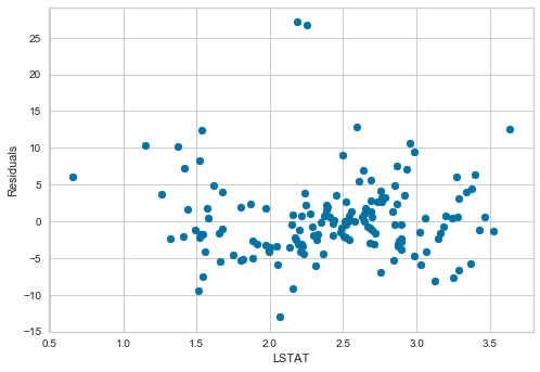
Linear Regression mse: 29.516553315892253The test MSE dropped from 33.2 to 29.5 — a clear improvement from the transformations alone. Now check whether the residuals are more homoscedastic. Plot residuals vs LSTAT:
# calculate the residuals
error = y_test - pred

# residuals plot vs LSTAT
plt.scatter(x=X_test['LSTAT'], y=error)
plt.xlabel('LSTAT')
plt.ylabel('Residuals')
After transformation, the residuals for LSTAT are centered around zero and spread evenly across the full range of feature values:
Plot residuals vs RM:
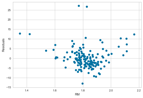
# residuals plot vs RM
plt.scatter(x=X_test['RM'], y=error)
plt.xlabel('RM')
plt.ylabel('Residuals')
The spread of the residuals is more uniform across the RM range compared to the baseline model:
Plot residuals vs CRIM:
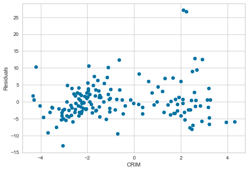
# residuals plot vs CRIM
plt.scatter(x=X_test['CRIM'], y=error)
plt.xlabel('CRIM')
plt.ylabel('Residuals')
The log transformation eliminated the extreme skew in CRIM's residuals — they are now spread across a much wider and more balanced range of values:
Run the Yellowbrick residuals plot on the transformed model for a final consolidated view:
linreg = LinearRegression()
linreg.fit(scaler.transform(X_train), y_train)
visualizer = ResidualsPlot(linreg)

visualizer.fit(scaler.transform(X_train), y_train)  # Fit the training data to the model
visualizer.score(scaler.transform(X_test), y_test)  # Evaluate the model on the test data
visualizer.poof()
The residuals are substantially more homogeneous after transformation. Comparing R² values: the transformed model achieves a test R² of 0.65, up from 0.60 for the baseline — a meaningful gain from feature engineering alone.
Conclusion
In this tutorial you validated all four linear model assumptions on the Boston housing dataset and demonstrated how log transformations address violations. Starting with raw features, the model achieved a test MSE of 33.2 and R² of 0.60. After applying log transformations to LSTAT, CRIM, and RM, the test MSE dropped to 29.5 and R² improved to 0.65 — without changing the model architecture at all.
Key takeaways:
- Scatter plots and residual plots reveal whether the linearity assumption holds for each feature. A curved or funnel-shaped residual pattern is a clear warning sign.
- Q-Q plots are more sensitive than histograms for detecting non-normality, especially in the tails of the distribution.
- A correlation above roughly 0.8 between two features signals multicollinearity — keep one and drop the other before training a linear model.
- Log transformation is the most practical first remedy for right-skewed features: it compresses the long tail, improves linearity, and often reduces heteroscedasticity simultaneously.
- Feature engineering at the assumption-checking stage — before any hyperparameter tuning — can produce measurable improvements in model performance.
Next steps:
- Read Feature Engineering: Handling Outliers to learn how extreme values affect these same assumption checks and how to treat them before modeling.
- Explore Feature Engineering: Variable Magnitude to understand how feature scaling choices interact with the assumptions covered here.
- Study Lasso and Ridge Regularisation for Feature Selection to see how regularization handles multicollinearity in practice when you cannot simply drop features.