
Linear regression is one of the oldest and most widely used predictive techniques in statistics and machine learning. At its core, it answers a simple question: given a set of measurable inputs, what continuous output value does the data suggest? Unlike classification, which predicts categories, regression predicts a number — for example, the selling price of a house.
In this tutorial you will build a regression pipeline on the Boston housing dataset. You will explore the data, select features by correlation, train a LinearRegression model with scikit-learn, and evaluate it using three standard metrics. You will also plot learning curves to understand how the model generalises as more training data is added.
Prerequisites: Python 3.x, scikit-learn, Pandas, NumPy, Matplotlib, Seaborn.
What is Regression?
Regression is a statistical method that attempts to determine the strength and character of the relationship between one dependent variable (the value you want to predict, usually written as ) and one or more independent variables (the inputs, written as ).
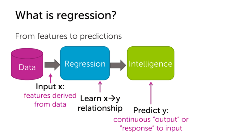
The diagram below shows the core idea: raw data goes into a regression model, which learns the relationship and produces a continuous prediction.
Where Regression Applies
Linear regression is used across many domains because it is fast to train, easy to interpret, and often gives a strong baseline. A few practical examples follow.
Stock price prediction uses historical prices and news events as input features to forecast future stock values.

Tweet popularity prediction estimates how many people will retweet a post based on the number of followers, hashtag popularity, and text features.

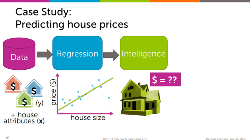
House price prediction uses property attributes such as number of rooms, distance to employment centres, and neighbourhood crime rate to estimate sale price — the exact task you will work through in this tutorial.
Simple and Multiple Linear Regression
Linear regression comes in two forms depending on how many input features you use.
Simple Linear Regression
Simple linear regression uses a single independent variable to predict the dependent variable. The relationship is described by a straight line:
Where:
- — the dependent variable (house price)
- — the intercept (baseline value when )
- — the coefficient for the independent variable
- — the independent variable (e.g. number of rooms)
- — the random error term
Multiple Linear Regression
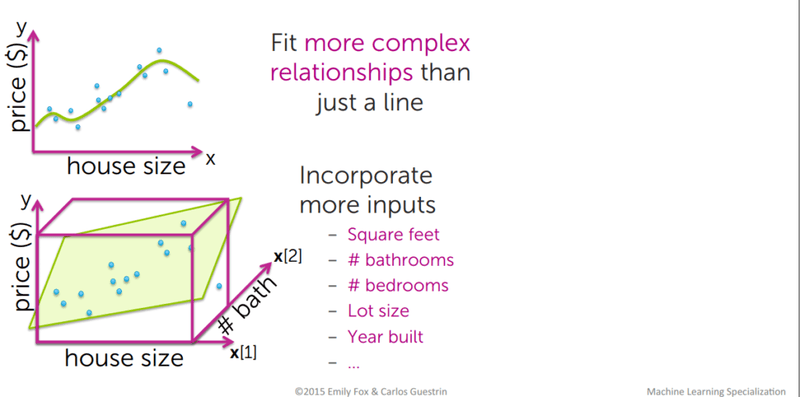
Multiple linear regression extends the formula to more than one independent variable, allowing the model to capture more complex patterns in the data. Instead of fitting a line in 2D space, you fit a hyperplane in higher-dimensional space. When you add too many features, you can also fit more complex polynomial relationships.
The diagram below illustrates how adding a second input dimension (e.g. number of bathrooms alongside house size) lifts the problem from a 2D line to a 3D plane fit.
Theory: Best-Fit Line, Cost Function, and Gradient Descent
The Best-Fit Line and Residuals
The best-fit line (also called the regression line) is the line for which the error between predicted values and observed values is minimised. These errors are called residuals — the vertical distances between each observed data point and the line.
The Cost Function
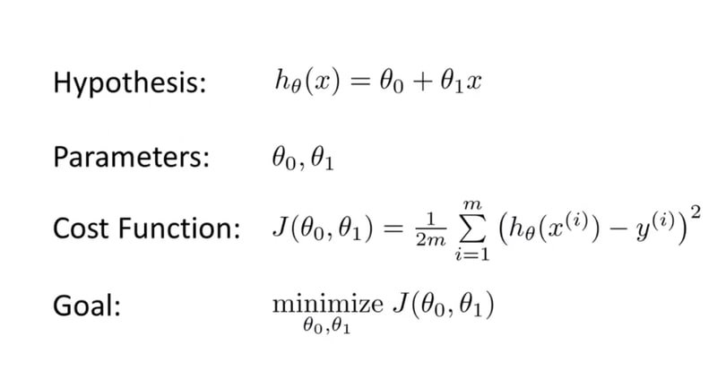
To find the best-fit line algorithmically, you minimise a cost function — a measure of how wrong your current parameter estimates are. The standard choice is Mean Squared Error (MSE), which penalises large errors more heavily than small ones.
The diagram below shows the hypothesis function, the MSE cost function , and the optimisation goal:
Gradient Descent
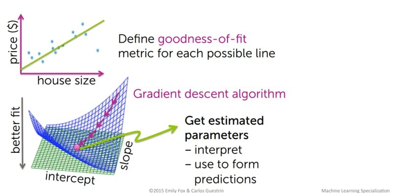
Gradient descent is the optimisation algorithm used to minimise the cost function. Starting from random parameter values for and , gradient descent iteratively takes steps in the direction of steepest descent on the cost surface until it reaches the minimum. The step size is controlled by the learning rate — too large and the algorithm overshoots; too small and training is very slow.
The diagram below shows both the goodness-of-fit metric being defined for each candidate line and the gradient descent surface being navigated to reach optimal parameters:
Bias-Variance Tradeoff
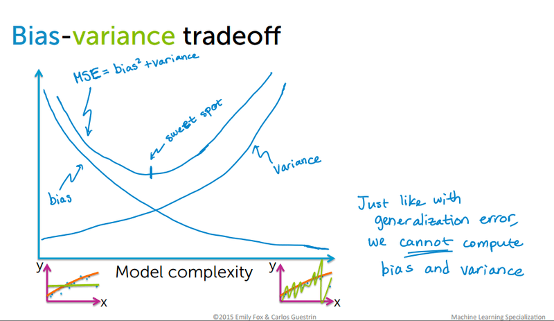
Every supervised model must balance two sources of error. Bias refers to simplifying assumptions a model makes to learn the target function — high bias produces underfitting. Variance refers to how sensitive the model is to fluctuations in the training data — high variance produces overfitting. The goal is to reach the sweet spot where both are low.
The diagram below shows the classic bias-variance tradeoff curve where MSE = bias² + variance, and the optimal model complexity sits at the "sweet spot":
Loading the Boston Dataset
Start by importing all libraries you will need for this tutorial. Keeping all imports in one block at the top makes dependencies immediately visible.
import numpy as np
import pandas as pd
import seaborn as sns
import matplotlib.pyplot as plt
from sklearn.datasets import load_boston
from sklearn.model_selection import train_test_split
from sklearn.linear_model import LinearRegression
from sklearn.metrics import mean_absolute_error, mean_squared_error
Load the dataset and inspect its structure:
boston = load_boston()
type(boston)
sklearn.utils.Bunch
boston.keys()dict_keys(['data', 'target', 'feature_names', 'DESCR', 'filename'])Print the full dataset description to understand what each feature represents:
print(boston.DESCR).. _boston_dataset:
Boston house prices dataset
---------------------------
**Data Set Characteristics:**
:Number of Instances: 506
:Number of Attributes: 13 numeric/categorical predictive. Median Value (attribute 14) is usually the target.
:Attribute Information (in order):
- CRIM per capita crime rate by town
- ZN proportion of residential land zoned for lots over 25,000 sq.ft.
- INDUS proportion of non-retail business acres per town
- CHAS Charles River dummy variable (= 1 if tract bounds river; 0 otherwise)
- NOX nitric oxides concentration (parts per 10 million)
- RM average number of rooms per dwelling
- AGE proportion of owner-occupied units built prior to 1940
- DIS weighted distances to five Boston employment centres
- RAD index of accessibility to radial highways
- TAX full-value property-tax rate per $10,000
- PTRATIO pupil-teacher ratio by town
- B 1000(Bk - 0.63)^2 where Bk is the proportion of blacks by town
- LSTAT % lower status of the population
- MEDV Median value of owner-occupied homes in $1000's
:Missing Attribute Values: None
:Creator: Harrison, D. and Rubinfeld, D.L.
This is a copy of UCI ML housing dataset.
https://archive.ics.uci.edu/ml/machine-learning-databases/housing/
This dataset was taken from the StatLib library which is maintained at Carnegie Mellon University.
The Boston house-price data of Harrison, D. and Rubinfeld, D.L. 'Hedonic
prices and the demand for clean air', J. Environ. Economics & Management,
vol.5, 81-102, 1978. Used in Belsley, Kuh & Welsch, 'Regression diagnostics
...', Wiley, 1980. N.B. Various transformations are used in the table on
pages 244-261 of the latter.
The Boston house-price data has been used in many machine learning papers that address regression
problems.Inspect the feature names and the first five target values (median house prices in thousands of dollars):
boston.feature_namesarray(['CRIM', 'ZN', 'INDUS', 'CHAS', 'NOX', 'RM', 'AGE', 'DIS', 'RAD',
'TAX', 'PTRATIO', 'B', 'LSTAT'], dtype='<U7')boston.target[: 5]array([24. , 21.6, 34.7, 33.4, 36.2])Inspect the raw array shape to confirm 506 samples and 13 features:
data = boston.data
type(data)
numpy.ndarray
data.shape(506, 13)Building the DataFrame
A DataFrame is a two-dimensional tabular data structure provided by Pandas. Converting the NumPy array into a DataFrame gives you labelled columns and makes exploration much easier.
data = pd.DataFrame(data = data, columns= boston.feature_names)
data.head()| CRIM | ZN | INDUS | CHAS | NOX | RM | AGE | DIS | RAD | TAX | PTRATIO | B | LSTAT | |
|---|---|---|---|---|---|---|---|---|---|---|---|---|---|
| 0 | 0.00632 | 18.0 | 2.31 | 0.0 | 0.538 | 6.575 | 65.2 | 4.0900 | 1.0 | 296.0 | 15.3 | 396.90 | 4.98 |
| 1 | 0.02731 | 0.0 | 7.07 | 0.0 | 0.469 | 6.421 | 78.9 | 4.9671 | 2.0 | 242.0 | 17.8 | 396.90 | 9.14 |
| 2 | 0.02729 | 0.0 | 7.07 | 0.0 | 0.469 | 7.185 | 61.1 | 4.9671 | 2.0 | 242.0 | 17.8 | 392.83 | 4.03 |
| 3 | 0.03237 | 0.0 | 2.18 | 0.0 | 0.458 | 6.998 | 45.8 | 6.0622 | 3.0 | 222.0 | 18.7 | 394.63 | 2.94 |
| 4 | 0.06905 | 0.0 | 2.18 | 0.0 | 0.458 | 7.147 | 54.2 | 6.0622 | 3.0 | 222.0 | 18.7 | 396.90 | 5.33 |
Add the target (house price) as a new column so all data lives in one place:
data['Price'] = boston.target
data.head()| CRIM | ZN | INDUS | CHAS | NOX | RM | AGE | DIS | RAD | TAX | PTRATIO | B | LSTAT | Price | |
|---|---|---|---|---|---|---|---|---|---|---|---|---|---|---|
| 0 | 0.00632 | 18.0 | 2.31 | 0.0 | 0.538 | 6.575 | 65.2 | 4.0900 | 1.0 | 296.0 | 15.3 | 396.90 | 4.98 | 24.0 |
| 1 | 0.02731 | 0.0 | 7.07 | 0.0 | 0.469 | 6.421 | 78.9 | 4.9671 | 2.0 | 242.0 | 17.8 | 396.90 | 9.14 | 21.6 |
| 2 | 0.02729 | 0.0 | 7.07 | 0.0 | 0.469 | 7.185 | 61.1 | 4.9671 | 2.0 | 242.0 | 17.8 | 392.83 | 4.03 | 34.7 |
| 3 | 0.03237 | 0.0 | 2.18 | 0.0 | 0.458 | 6.998 | 45.8 | 6.0622 | 3.0 | 222.0 | 18.7 | 394.63 | 2.94 | 33.4 |
| 4 | 0.06905 | 0.0 | 2.18 | 0.0 | 0.458 | 7.147 | 54.2 | 6.0622 | 3.0 | 222.0 | 18.7 | 396.90 | 5.33 | 36.2 |
Use describe() to get a statistical summary of every feature including count, mean, standard deviation, and percentiles:
data.describe()| CRIM | ZN | INDUS | CHAS | NOX | RM | AGE | DIS | RAD | TAX | PTRATIO | B | LSTAT | Price | |
|---|---|---|---|---|---|---|---|---|---|---|---|---|---|---|
| count | 506.000000 | 506.000000 | 506.000000 | 506.000000 | 506.000000 | 506.000000 | 506.000000 | 506.000000 | 506.000000 | 506.000000 | 506.000000 | 506.000000 | 506.000000 | 506.000000 |
| mean | 3.613524 | 11.363636 | 11.136779 | 0.069170 | 0.554695 | 6.284634 | 68.574901 | 3.795043 | 9.549407 | 408.237154 | 18.455534 | 356.674032 | 12.653063 | 22.532806 |
| std | 8.601545 | 23.322453 | 6.860353 | 0.253994 | 0.115878 | 0.702617 | 28.148861 | 2.105710 | 8.707259 | 168.537116 | 2.164946 | 91.294864 | 7.141062 | 9.197104 |
| min | 0.006320 | 0.000000 | 0.460000 | 0.000000 | 0.385000 | 3.561000 | 2.900000 | 1.129600 | 1.000000 | 187.000000 | 12.600000 | 0.320000 | 1.730000 | 5.000000 |
| 25% | 0.082045 | 0.000000 | 5.190000 | 0.000000 | 0.449000 | 5.885500 | 45.025000 | 2.100175 | 4.000000 | 279.000000 | 17.400000 | 375.377500 | 6.950000 | 17.025000 |
| 50% | 0.256510 | 0.000000 | 9.690000 | 0.000000 | 0.538000 | 6.208500 | 77.500000 | 3.207450 | 5.000000 | 330.000000 | 19.050000 | 391.440000 | 11.360000 | 21.200000 |
| 75% | 3.677083 | 12.500000 | 18.100000 | 0.000000 | 0.624000 | 6.623500 | 94.075000 | 5.188425 | 24.000000 | 666.000000 | 20.200000 | 396.225000 | 16.955000 | 25.000000 |
| max | 88.976200 | 100.000000 | 27.740000 | 1.000000 | 0.871000 | 8.780000 | 100.000000 | 12.126500 | 24.000000 | 711.000000 | 22.000000 | 396.900000 | 37.970000 | 50.000000 |
data.info() gives a concise structural summary — column types, non-null counts, and memory usage — useful for spotting missing values quickly:
data.info()RangeIndex: 506 entries, 0 to 505
Data columns (total 14 columns):
# Column Non-Null Count Dtype
--- ------ -------------- -----
0 CRIM 506 non-null float64
1 ZN 506 non-null float64
2 INDUS 506 non-null float64
3 CHAS 506 non-null float64
4 NOX 506 non-null float64
5 RM 506 non-null float64
6 AGE 506 non-null float64
7 DIS 506 non-null float64
8 RAD 506 non-null float64
9 TAX 506 non-null float64
10 PTRATIO 506 non-null float64
11 B 506 non-null float64
12 LSTAT 506 non-null float64
13 Price 506 non-null float64
dtypes: float64(14)
memory usage: 55.5 KBThe dataset has no missing values, which you can confirm explicitly:
data.isnull().sum()CRIM 0
ZN 0
INDUS 0
CHAS 0
NOX 0
RM 0
AGE 0
DIS 0
RAD 0
TAX 0
PTRATIO 0
B 0
LSTAT 0
Price 0
dtype: int64Exploratory Data Analysis
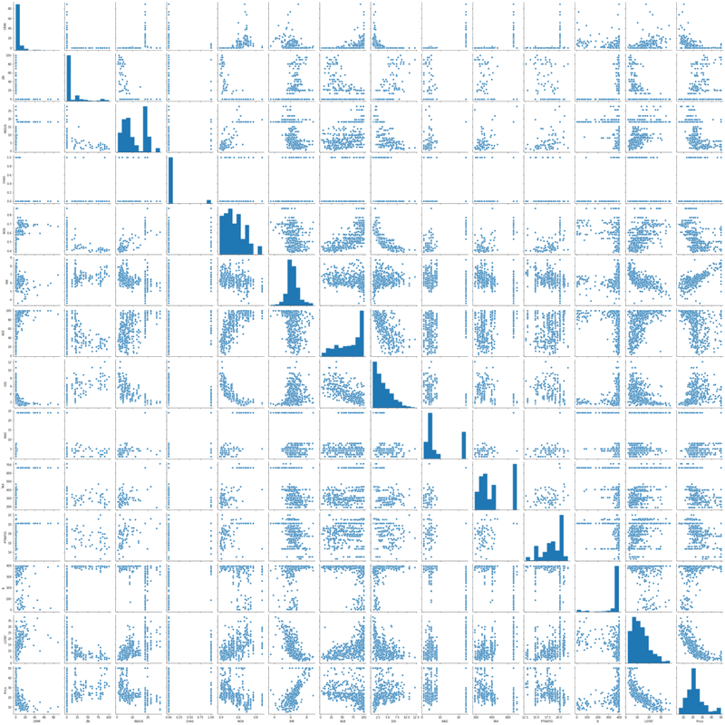
Before selecting features, you should understand how they relate to each other and to the target. A scatterplot matrix (pairplot) lets you see all pairwise relationships and identify obvious linear correlations at a glance.
sns.pairplot(data)
plt.show()
The pairplot below shows every feature plotted against every other feature. Diagonal cells show the marginal distribution of each variable:
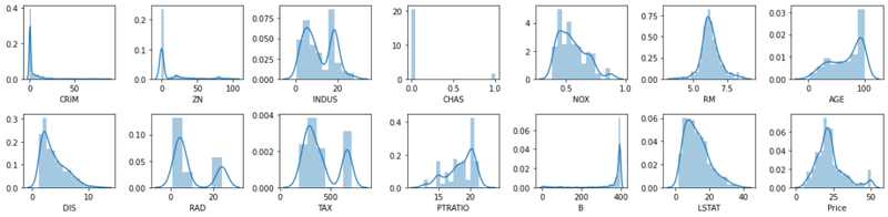
You can also inspect the marginal distribution of each individual feature with distribution plots to spot skew and outliers:
rows = 2
cols = 7
fig, ax = plt.subplots(nrows= rows, ncols= cols, figsize = (16,4))
col = data.columns
index = 0
for i in range(rows):
    for j in range(cols):
        sns.distplot(data[col[index]], ax = ax[i][j])
        index = index + 1
plt.tight_layout()
plt.show()
The grid of distribution plots below shows the density of each feature — several are heavily right-skewed (e.g. CRIM, ZN), while RM and Price are roughly bell-shaped:
Correlation Matrix
A correlation matrix quantifies the pairwise linear relationships between all variables using Pearson's r — a coefficient that ranges from −1 (perfect negative correlation) to +1 (perfect positive correlation). You will use this matrix to select which features to feed into the model.
corrmat = data.corr()
corrmat| CRIM | ZN | INDUS | CHAS | NOX | RM | AGE | DIS | RAD | TAX | PTRATIO | B | LSTAT | Price | |
|---|---|---|---|---|---|---|---|---|---|---|---|---|---|---|
| CRIM | 1.000000 | -0.200469 | 0.406583 | -0.055892 | 0.420972 | -0.219247 | 0.352734 | -0.379670 | 0.625505 | 0.582764 | 0.289946 | -0.385064 | 0.455621 | -0.388305 |
| ZN | -0.200469 | 1.000000 | -0.533828 | -0.042697 | -0.516604 | 0.311991 | -0.569537 | 0.664408 | -0.311948 | -0.314563 | -0.391679 | 0.175520 | -0.412995 | 0.360445 |
| INDUS | 0.406583 | -0.533828 | 1.000000 | 0.062938 | 0.763651 | -0.391676 | 0.644779 | -0.708027 | 0.595129 | 0.720760 | 0.383248 | -0.356977 | 0.603800 | -0.483725 |
| CHAS | -0.055892 | -0.042697 | 0.062938 | 1.000000 | 0.091203 | 0.091251 | 0.086518 | -0.099176 | -0.007368 | -0.035587 | -0.121515 | 0.048788 | -0.053929 | 0.175260 |
| NOX | 0.420972 | -0.516604 | 0.763651 | 0.091203 | 1.000000 | -0.302188 | 0.731470 | -0.769230 | 0.611441 | 0.668023 | 0.188933 | -0.380051 | 0.590879 | -0.427321 |
| RM | -0.219247 | 0.311991 | -0.391676 | 0.091251 | -0.302188 | 1.000000 | -0.240265 | 0.205246 | -0.209847 | -0.292048 | -0.355501 | 0.128069 | -0.613808 | 0.695360 |
| AGE | 0.352734 | -0.569537 | 0.644779 | 0.086518 | 0.731470 | -0.240265 | 1.000000 | -0.747881 | 0.456022 | 0.506456 | 0.261515 | -0.273534 | 0.602339 | -0.376955 |
| DIS | -0.379670 | 0.664408 | -0.708027 | -0.099176 | -0.769230 | 0.205246 | -0.747881 | 1.000000 | -0.494588 | -0.534432 | -0.232471 | 0.291512 | -0.496996 | 0.249929 |
| RAD | 0.625505 | -0.311948 | 0.595129 | -0.007368 | 0.611441 | -0.209847 | 0.456022 | -0.494588 | 1.000000 | 0.910228 | 0.464741 | -0.444413 | 0.488676 | -0.381626 |
| TAX | 0.582764 | -0.314563 | 0.720760 | -0.035587 | 0.668023 | -0.292048 | 0.506456 | -0.534432 | 0.910228 | 1.000000 | 0.460853 | -0.441808 | 0.543993 | -0.468536 |
| PTRATIO | 0.289946 | -0.391679 | 0.383248 | -0.121515 | 0.188933 | -0.355501 | 0.261515 | -0.232471 | 0.464741 | 0.460853 | 1.000000 | -0.177383 | 0.374044 | -0.507787 |
| B | -0.385064 | 0.175520 | -0.356977 | 0.048788 | -0.380051 | 0.128069 | -0.273534 | 0.291512 | -0.444413 | -0.441808 | -0.177383 | 1.000000 | -0.366087 | 0.333461 |
| LSTAT | 0.455621 | -0.412995 | 0.603800 | -0.053929 | 0.590879 | -0.613808 | 0.602339 | -0.496996 | 0.488676 | 0.543993 | 0.374044 | -0.366087 | 1.000000 | -0.737663 |
| Price | -0.388305 | 0.360445 | -0.483725 | 0.175260 | -0.427321 | 0.695360 | -0.376955 | 0.249929 | -0.381626 | -0.468536 | -0.507787 | 0.333461 | -0.737663 | 1.000000 |
A heatmap makes it much easier to spot high-correlation pairs visually. Warm colours indicate positive correlation and cool colours indicate negative correlation. Run the block below to render the annotated heatmap:
fig, ax = plt.subplots(figsize = (18, 10))
sns.heatmap(corrmat, annot = True, annot_kws={'size': 12})
plt.show()
The output heatmap shows the full Pearson correlation matrix for all 14 features. Notice that RM (average number of rooms) has the strongest positive correlation with Price (0.70) and LSTAT (lower-status population percentage) has the strongest negative correlation (−0.74).
Feature Selection by Correlation Threshold
Rather than using all 13 features, you will select only those with an absolute Pearson correlation above a chosen threshold against the target price. The helper function below returns a DataFrame of features that pass the threshold:
corrmat.index.valuesarray(['CRIM', 'ZN', 'INDUS', 'CHAS', 'NOX', 'RM', 'AGE', 'DIS', 'RAD',
'TAX', 'PTRATIO', 'B', 'LSTAT', 'Price'], dtype=object)def getCorrelatedFeature(corrdata, threshold):
feature = []
value = []
for i, index in enumerate(corrdata.index):
if abs(corrdata[index])> threshold:
feature.append(index)
value.append(corrdata[index])
df = pd.DataFrame(data = value, index = feature, columns=['Corr Value'])
return dfApply the function at a threshold of 0.50 to find features with a moderate-to-strong relationship with Price:
threshold = 0.50
corr_value = getCorrelatedFeature(corrmat['Price'], threshold)
corr_value| Corr Value | |
|---|---|
| RM | 0.695360 |
| PTRATIO | -0.507787 |
| LSTAT | -0.737663 |
| Price | 1.000000 |
Three features pass the 0.50 threshold: RM (positive), PTRATIO (negative), and LSTAT (negative). Retrieve their names as an array:
corr_value.index.valuesarray(['RM', 'PTRATIO', 'LSTAT', 'Price'], dtype=object)Subset the DataFrame to these correlated features and inspect the first few rows:
correlated_data = data[corr_value.index]
correlated_data.head()| RM | PTRATIO | LSTAT | Price | |
|---|---|---|---|---|
| 0 | 6.575 | 15.3 | 4.98 | 24.0 |
| 1 | 6.421 | 17.8 | 9.14 | 21.6 |
| 2 | 7.185 | 17.8 | 4.03 | 34.7 |
| 3 | 6.998 | 18.7 | 2.94 | 33.4 |
| 4 | 7.147 | 18.7 | 5.33 | 36.2 |
Plot the pairwise relationships within this reduced feature set to confirm the linear trends are visible:
sns.pairplot(correlated_data)
plt.tight_layout()
Training and Evaluating the Model
With the features selected, split the data into training (80 %) and test (20 %) sets. Shuffling the data when splitting removes any ordering bias in the dataset:
X = correlated_data.drop(labels=['Price'], axis = 1)
y = correlated_data['Price']
X.head()| RM | PTRATIO | LSTAT | |
|---|---|---|---|
| 0 | 6.575 | 15.3 | 4.98 |
| 1 | 6.421 | 17.8 | 9.14 |
| 2 | 7.185 | 17.8 | 4.03 |
| 3 | 6.998 | 18.7 | 2.94 |
| 4 | 7.147 | 18.7 | 5.33 |
X_train, X_test, y_train, y_test = train_test_split(X, y, test_size = 0.2, random_state = 0)
X_train.shape, X_test.shape((404, 3), (102, 3))You have 404 samples for training and 102 for testing. Now fit the model and generate predictions on the test set:
model = LinearRegression()
model.fit(X_train, y_train)
LinearRegression()
y_predict = model.predict(X_test)
df = pd.DataFrame(data = [y_predict, y_test])
df.T| 0 | 1 | |
|---|---|---|
| 0 | 27.609031 | 22.6 |
| 1 | 22.099034 | 50.0 |
| 2 | 26.529255 | 23.0 |
| 3 | 12.507986 | 8.3 |
| 4 | 22.254879 | 21.2 |
| ... | ... | ... |
| 97 | 28.271228 | 24.7 |
| 98 | 18.467419 | 14.1 |
| 99 | 18.558070 | 18.7 |
| 100 | 24.681964 | 28.1 |
| 101 | 20.826879 | 19.8 |
102 rows × 2 columns
Regression Evaluation Metrics
Good regression models require a quantitative measure of prediction quality. Three metrics are widely used, each with a different sensitivity to large errors.
Mean Absolute Error (MAE) is the average of the absolute differences between predictions and actuals — easy to interpret because it is in the same units as the target:
Mean Squared Error (MSE) squares each error before averaging, so large errors are penalised much more heavily than small ones:
Root Mean Squared Error (RMSE) takes the square root of MSE so the metric is back in the same units as the target, making it more interpretable:
In practice, MAE is easiest to interpret as the average error, MSE punishes large mistakes more, and RMSE gives you a single number in the units of your target variable. All three are loss functions — you want to minimise them.
The R² Score
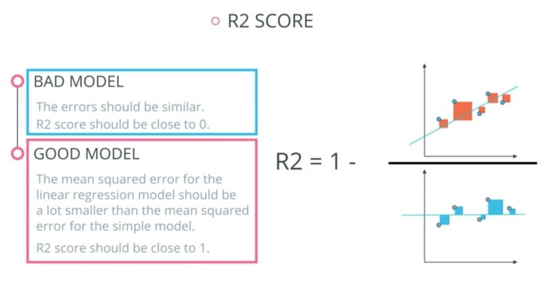
The coefficient of determination, , measures how much of the variance in the target the model explains. It is defined as:
Where:
- — total sum of squares (variance of the actual values)
- — residual sum of squares (variance unexplained by the model)
- ranges from 0 (model explains nothing) to 1 (model explains everything); a negative value means the model is worse than predicting the mean
The diagram below illustrates the difference between a bad model (R² near 0) and a good model (R² near 1):
Now compute all three metrics for the first model:
from sklearn.metrics import r2_scorecorrelated_data.columnsIndex(['RM', 'PTRATIO', 'LSTAT', 'Price'], dtype='object')score = r2_score(y_test, y_predict)
mae = mean_absolute_error(y_test, y_predict)
mse = mean_squared_error(y_test, y_predict)
print('r2_score: ', score)
print('mae: ', mae)
print('mse: ', mse)r2_score: 0.48816420156925056
mae: 4.404434993909258
mse: 41.67799012221684An R² of 0.49 means the three-feature model explains about half the variance in house prices. You will now experiment with different correlation thresholds to see whether adding or removing features improves this.
Feature Selection Experiments
The helper function below records metrics for each experiment so you can compare all threshold configurations in one table:
total_features = []
total_features_name = []
selected_correlation_value = []
r2_scores = []
mae_value = []
mse_value = []def performance_metrics(features, th, y_true, y_pred):
score = r2_score(y_true, y_pred)
mae = mean_absolute_error(y_true, y_pred)
mse = mean_squared_error(y_true, y_pred)
total_features.append(len(features)-1)
total_features_name.append(str(features))
selected_correlation_value.append(th)
r2_scores.append(score)
mae_value.append(mae)
mse_value.append(mse)
metrics_dataframe = pd.DataFrame(data= [total_features_name, total_features, selected_correlation_value, r2_scores, mae_value, mse_value],
index = ['features name', '#feature', 'corr_value', 'r2_score', 'MAE', 'MSE'])
return metrics_dataframe.TRecord the baseline result (threshold = 0.50, three features):
performance_metrics(correlated_data.columns.values, threshold, y_test, y_predict)| features name | #feature | corr_value | r2_score | MAE | MSE | |
|---|---|---|---|---|---|---|
| 0 | ['RM' 'PTRATIO' 'LSTAT' 'Price'] | 3 | 0.5 | 0.488164 | 4.40443 | 41.678 |
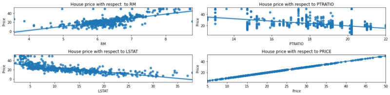
The following scatter plots show the linear relationship between each selected feature and house price, with regression lines fitted:
rows = 2
cols = 2
fig, ax = plt.subplots(nrows=rows, ncols=cols, figsize = (16, 4))
ax[0, 0].set_title("House price with respect  to RM")
ax[0, 1].set_title("House price with respect to PTRATIO")
ax[1, 0].set_title("House price with respect to LSTAT")
ax[1, 1].set_title("House price with respect to PRICE")
col = correlated_data.columns
index = 0

for i in range(rows):
    for j in range(cols):
        sns.regplot(x = correlated_data[col[index]], y = correlated_data['Price'], ax = ax[i][j])
        index = index + 1
fig.tight_layout()
The four-panel plot below shows regression lines for each of the three selected features against Price, confirming positive correlation for RM and negative correlations for PTRATIO and LSTAT:
The helper function below retrains the model from scratch for any given correlated feature subset, making it easy to compare different threshold configurations:
corrmat['Price']CRIM -0.388305
ZN 0.360445
INDUS -0.483725
CHAS 0.175260
NOX -0.427321
RM 0.695360
AGE -0.376955
DIS 0.249929
RAD -0.381626
TAX -0.468536
PTRATIO -0.507787
B 0.333461
LSTAT -0.737663
Price 1.000000
Name: Price, dtype: float64def get_y_predict(corr_data):
X = corr_data.drop(labels = ['Price'], axis = 1)
y = corr_data['Price']
X_train, X_test, y_train, y_test = train_test_split(X, y, test_size = 0.2, random_state = 0)
model = LinearRegression()
model.fit(X_train, y_train)
y_predict = model.predict(X_test)
return y_predictThreshold 0.60 — RM and LSTAT only: Tightening the threshold drops PTRATIO and keeps only the two most correlated features:
threshold = 0.60
corr_value = getCorrelatedFeature(corrmat['Price'], threshold)
corr_value| Corr Value | |
|---|---|
| RM | 0.695360 |
| LSTAT | -0.737663 |
| Price | 1.000000 |
correlated_data = data[corr_value.index]
correlated_data.head()| RM | LSTAT | Price | |
|---|---|---|---|
| 0 | 6.575 | 4.98 | 24.0 |
| 1 | 6.421 | 9.14 | 21.6 |
| 2 | 7.185 | 4.03 | 34.7 |
| 3 | 6.998 | 2.94 | 33.4 |
| 4 | 7.147 | 5.33 | 36.2 |
y_predict = get_y_predict(correlated_data)
performance_metrics(correlated_data.columns.values, threshold, y_test, y_predict)| features name | #feature | corr_value | r2_score | MAE | MSE | |
|---|---|---|---|---|---|---|
| 0 | ['RM' 'PTRATIO' 'LSTAT' 'Price'] | 3 | 0.5 | 0.488164 | 4.40443 | 41.678 |
| 1 | ['RM' 'LSTAT' 'Price'] | 2 | 0.6 | 0.540908 | 4.14244 | 37.3831 |
Dropping PTRATIO and keeping only RM and LSTAT improves R² from 0.49 to 0.54 — fewer but more informative features can outperform a larger set.
Threshold 0.70 — LSTAT only: Raising the threshold further leaves just LSTAT:
corrmat['Price']CRIM -0.388305
ZN 0.360445
INDUS -0.483725
CHAS 0.175260
NOX -0.427321
RM 0.695360
AGE -0.376955
DIS 0.249929
RAD -0.381626
TAX -0.468536
PTRATIO -0.507787
B 0.333461
LSTAT -0.737663
Price 1.000000
Name: Price, dtype: float64threshold = 0.70
corr_value = getCorrelatedFeature(corrmat['Price'], threshold)
corr_value| Corr Value | |
|---|---|
| LSTAT | -0.737663 |
| Price | 1.000000 |
correlated_data = data[corr_value.index]
correlated_data.head()| LSTAT | Price | |
|---|---|---|
| 0 | 4.98 | 24.0 |
| 1 | 9.14 | 21.6 |
| 2 | 4.03 | 34.7 |
| 3 | 2.94 | 33.4 |
| 4 | 5.33 | 36.2 |
y_predict = get_y_predict(correlated_data)
performance_metrics(correlated_data.columns.values, threshold, y_test, y_predict)| features name | #feature | corr_value | r2_score | MAE | MSE | |
|---|---|---|---|---|---|---|
| 0 | ['RM' 'PTRATIO' 'LSTAT' 'Price'] | 3 | 0.5 | 0.488164 | 4.40443 | 41.678 |
| 1 | ['RM' 'LSTAT' 'Price'] | 2 | 0.6 | 0.540908 | 4.14244 | 37.3831 |
| 2 | ['LSTAT' 'Price'] | 1 | 0.7 | 0.430957 | 4.86401 | 46.3363 |
Using LSTAT alone drops R² back to 0.43, confirming that the combination of RM and LSTAT at threshold 0.60 was the sweet spot. Try RM alone as a further comparison:
correlated_data = data[['RM', 'Price']]
correlated_data.head()| RM | Price | |
|---|---|---|
| 0 | 6.575 | 24.0 |
| 1 | 6.421 | 21.6 |
| 2 | 7.185 | 34.7 |
| 3 | 6.998 | 33.4 |
| 4 | 7.147 | 36.2 |
y_predict = get_y_predict(correlated_data)
performance_metrics(correlated_data.columns.values, threshold, y_test, y_predict)| features name | #feature | corr_value | r2_score | MAE | MSE | |
|---|---|---|---|---|---|---|
| 0 | ['RM' 'PTRATIO' 'LSTAT' 'Price'] | 3 | 0.5 | 0.488164 | 4.40443 | 41.678 |
| 1 | ['RM' 'LSTAT' 'Price'] | 2 | 0.6 | 0.540908 | 4.14244 | 37.3831 |
| 2 | ['LSTAT' 'Price'] | 1 | 0.7 | 0.430957 | 4.86401 | 46.3363 |
| 3 | ['RM' 'Price'] | 1 | 0.7 | 0.423944 | 4.32474 | 46.9074 |
Threshold 0.40 — six features: Lowering the threshold to 0.40 brings in more features (INDUS, NOX, RM, TAX, PTRATIO, LSTAT):
threshold = 0.40
corr_value = getCorrelatedFeature(corrmat['Price'], threshold)
corr_value| Corr Value | |
|---|---|
| INDUS | -0.483725 |
| NOX | -0.427321 |
| RM | 0.695360 |
| TAX | -0.468536 |
| PTRATIO | -0.507787 |
| LSTAT | -0.737663 |
| Price | 1.000000 |
correlated_data = data[corr_value.index]
correlated_data.head()| INDUS | NOX | RM | TAX | PTRATIO | LSTAT | Price | |
|---|---|---|---|---|---|---|---|
| 0 | 2.31 | 0.538 | 6.575 | 296.0 | 15.3 | 4.98 | 24.0 |
| 1 | 7.07 | 0.469 | 6.421 | 242.0 | 17.8 | 9.14 | 21.6 |
| 2 | 7.07 | 0.469 | 7.185 | 242.0 | 17.8 | 4.03 | 34.7 |
| 3 | 2.18 | 0.458 | 6.998 | 222.0 | 18.7 | 2.94 | 33.4 |
| 4 | 2.18 | 0.458 | 7.147 | 222.0 | 18.7 | 5.33 | 36.2 |
y_predict = get_y_predict(correlated_data)
performance_metrics(correlated_data.columns.values, threshold, y_test, y_predict)| features name | #feature | corr_value | r2_score | MAE | MSE | |
|---|---|---|---|---|---|---|
| 0 | ['RM' 'PTRATIO' 'LSTAT' 'Price'] | 3 | 0.5 | 0.488164 | 4.40443 | 41.678 |
| 1 | ['RM' 'LSTAT' 'Price'] | 2 | 0.6 | 0.540908 | 4.14244 | 37.3831 |
| 2 | ['LSTAT' 'Price'] | 1 | 0.7 | 0.430957 | 4.86401 | 46.3363 |
| 3 | ['RM' 'Price'] | 1 | 0.7 | 0.423944 | 4.32474 | 46.9074 |
| 4 | ['INDUS' 'NOX' 'RM' 'TAX' 'PTRATIO' 'LSTAT' 'P... | 6 | 0.4 | 0.476203 | 4.3945 | 42.6519 |
Adding weakly correlated features at threshold 0.40 does not improve over the two-feature model, which confirms that feature quality matters more than feature quantity for linear regression.
Normalisation and Standardisation
When features have very different scales (e.g. TAX ranges into the hundreds while NOX is between 0 and 1), models that rely on distances or gradient-based updates can be affected. Standardisation rescales each feature to have zero mean and unit variance (Gaussian distribution):
Normalisation rescales samples to have unit norm and is particularly useful when using kernel-based similarity measures. Scikit-learn provides several ready-made scalers:
| Name | Sklearn_class |
|---|---|
| Standard scaler | Standard scaler |
| MinMaxScaler | MinMax Scaler |
| MaxAbs Scaler | MaxAbs Scaler |
| Robust scaler | Robust scaler |
| Quantile Transformer_Normal | Quantile Transformer(output_distribution ='normal') |
| Quantile Transformer_Uniform | Quantile Transformer(output_distribution = 'uniform') |
| PowerTransformer-Yeo-Johnson | PowerTransformer(method = 'yeo-johnson') |
| Normalizer | Normalizer |
The LinearRegression estimator in scikit-learn accepts a normalize parameter that applies feature-wise standardisation before fitting. Try it and observe whether the R² changes:
model = LinearRegression(normalize=True)
model.fit(X_train, y_train)
LinearRegression(normalize=True)
y_predict = model.predict(X_test)
r2_score(y_test, y_predict)0.48816420156925067The R² is essentially identical, which is expected for ordinary least squares — linear regression coefficients adjust to scale, so normalisation does not change the fit quality here.
Plotting Learning Curves
Learning curves show how model performance changes as you add more training data. They help you diagnose two common problems: if training and validation scores are both low you have underfitting (high bias); if the training score is high but the validation score is low you have overfitting (high variance).
Import the cross-validation utilities needed:
from sklearn.model_selection import learning_curve, ShuffleSplitDefine a reusable function that plots both the training score and the cross-validation score as a function of training set size:
def plot_learning_curve(estimator, title, X, y, ylim=None, cv=None, n_jobs=None, train_sizes=np.linspace(.1, 1.0, 10)):

    plt.figure()
    plt.title(title)
    plt.xlabel("Training examples")
    plt.ylabel("Score")

    train_sizes, train_scores, test_scores = learning_curve(
        estimator, X, y, cv=cv, n_jobs=n_jobs, train_sizes=train_sizes)

    train_scores_mean = np.mean(train_scores, axis=1)
    train_scores_std = np.std(train_scores, axis=1)
    test_scores_mean = np.mean(test_scores, axis=1)
    test_scores_std = np.std(test_scores, axis=1)

    plt.grid()

    plt.fill_between(train_sizes, train_scores_mean - train_scores_std,
                     train_scores_mean + train_scores_std, alpha=0.1,
                     color="r")
    plt.fill_between(train_sizes, test_scores_mean - test_scores_std,
                     test_scores_mean + test_scores_std, alpha=0.1, color="g")

    plt.plot(train_sizes, train_scores_mean, 'o-', color="r",
             label="Training score")
    plt.plot(train_sizes, test_scores_mean, 'o-', color="g",
             label="Cross-validation score")

    plt.legend(loc="best")
    return plt

X = correlated_data.drop(labels = ['Price'], axis = 1)
y = correlated_data['Price']

title = "Learning Curves (Linear Regression) " + str(X.columns.values)

cv = ShuffleSplit(n_splits=100, test_size=0.2, random_state=0)

estimator = LinearRegression()
plot_learning_curve(estimator, title, X, y, ylim=(0.7, 1.01), cv=cv, n_jobs=-1)
plt.show()
Conclusion
In this tutorial you trained a linear regression model on the Boston housing dataset. You explored the data with pairplots and distribution plots, selected features using Pearson correlation thresholds, and compared five different feature configurations. The two-feature model using RM and LSTAT (threshold 0.60) achieved the best R² of 0.54 and MAE of 4.14, outperforming both more restrictive and more relaxed feature sets. You also verified that feature normalisation has no effect on ordinary least squares fit quality, and built reusable learning-curve tooling to diagnose bias and variance.
Key takeaways:
- Linear regression fits a line (or hyperplane) by minimising the mean squared error between predictions and actual values using gradient descent.
- Feature selection by Pearson correlation is a fast and interpretable way to identify which inputs are worth including — but always validate empirically.
- R² measures how much target variance your model explains; MAE and RMSE measure average prediction error in interpretable units.
- More features do not always improve regression — weakly correlated features can add noise rather than signal.
- Learning curves reveal whether your model is underfitting or overfitting and guide decisions about adding more data or regularisation.
Next steps:
- Read Logistic Regression with Python to see how the linear model is adapted for binary classification problems.
- Explore Random Forest Regressor to see how an ensemble of trees can capture non-linear relationships that linear regression misses.
- Experiment with all 13 Boston features (threshold = 0.0) and add Ridge or Lasso regularisation to compare against the correlation-filtered models built here.