
Datasets in the real world often have dozens — or hundreds — of features. Training a model on all of them can be slow, and many features are correlated, meaning they carry overlapping information. Principal Component Analysis (PCA) solves both problems at once: it transforms your original features into a smaller set of new variables called principal components, each of which captures as much of the remaining variance in the data as possible.
Think of it like finding the best angle to photograph a 3-D object so that the 2-D photo still shows as much detail as possible. PCA finds that "best angle" mathematically — and it does so without throwing away information arbitrarily.
In this tutorial you will apply PCA to the Breast Cancer Wisconsin dataset (30 numeric features, 569 samples) using scikit-learn. You will reduce the feature space from 30 dimensions to 2, visualize the result as a scatter plot, and use a scree plot to understand how variance is spread across components.
Prerequisites: Python 3.x, scikit-learn, Pandas, NumPy, Matplotlib, Seaborn.
What Is PCA?
PCA is a statistical technique that converts a set of possibly correlated variables into a new set of linearly uncorrelated variables called principal components. Each component is an axis in the transformed space; the first component points in the direction of greatest variance, the second points in the direction of the next greatest variance (and is perpendicular to the first), and so on.
The diagram below shows the intuition: on the left, the raw correlated data with the two eigenvectors (principal directions) overlaid; on the right, the same data after rotation so the axes align with those principal directions.
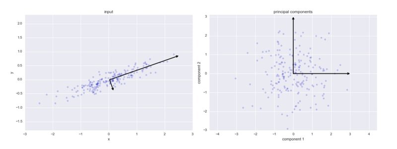
Principal Components
Each principal component describes one independent direction of variation in your data:
- Principal Component 1 — the axis that spans the most variation in the dataset.
- Principal Component 2 — the axis that spans the second most variation, perpendicular to PC1.
- Principal Component 3 — the axis that spans the third most variation, perpendicular to PC1 and PC2, and so on.
Because the components are ordered by the amount of variance they explain, you can discard the later components (which carry little information) and retain only the top — that is the essence of dimensionality reduction.
When to Use PCA
PCA is a good choice when you need to:
- Visualize high-dimensional data in 2-D or 3-D.
- Remove multicollinearity before fitting a linear model.
- Speed up a machine-learning algorithm by reducing the number of input features.
- Explore the inter-relationships between variables in a dataset.
How PCA Works Step by Step
Here is the complete process at a conceptual level:
- Standardize the data so every feature has zero mean and unit variance.
- Compute the covariance matrix to measure how features vary together.
- Calculate eigenvectors and eigenvalues of the covariance matrix. Each eigenvector is a principal component direction; the corresponding eigenvalue tells you how much variance that component captures.
- Choose components — keep only the top eigenvectors (the ones with the largest eigenvalues).
- Project the data onto the selected eigenvectors to produce the lower-dimensional representation.
The covariance between two features and is:
Where:
- — number of samples
- — value of feature for sample
- — mean of feature
The eigenvectors of this covariance matrix give the principal component directions; the eigenvalues give the variance along each direction.
In practice, scikit-learn handles all of this internally via Singular Value Decomposition (SVD), so you only need to call PCA() and fit_transform().
Implementation
Setting Up Imports
Start by importing every library you will need for this tutorial:
import pandas as pd
import numpy as np
import  seaborn as sns
import matplotlib.pyplot as pltfrom sklearn import datasets, metrics
from sklearn.model_selection import train_test_splitLoading the Breast Cancer Dataset
Load the dataset directly from scikit-learn's built-in collection:
cancer = datasets.load_breast_cancer()Print the full description to understand what each of the 30 features represents:
print(cancer.DESCR).. _breast_cancer_dataset:
Breast cancer wisconsin (diagnostic) dataset
--------------------------------------------
**Data Set Characteristics:**
:Number of Instances: 569
:Number of Attributes: 30 numeric, predictive attributes and the class
:Attribute Information:
- radius (mean of distances from center to points on the perimeter)
- texture (standard deviation of gray-scale values)
- perimeter
- area
- smoothness (local variation in radius lengths)
- compactness (perimeter^2 / area - 1.0)
- concavity (severity of concave portions of the contour)
- concave points (number of concave portions of the contour)
- symmetry
- fractal dimension ("coastline approximation" - 1)
The mean, standard error, and "worst" or largest (mean of the three
worst/largest values) of these features were computed for each image,
resulting in 30 features. For instance, field 0 is Mean Radius, field
10 is Radius SE, field 20 is Worst Radius.
- class:
- WDBC-Malignant
- WDBC-Benign
:Summary Statistics:
===================================== ====== ======
Min Max
===================================== ====== ======
radius (mean): 6.981 28.11
texture (mean): 9.71 39.28
perimeter (mean): 43.79 188.5
area (mean): 143.5 2501.0
smoothness (mean): 0.053 0.163
compactness (mean): 0.019 0.345
concavity (mean): 0.0 0.427
concave points (mean): 0.0 0.201
symmetry (mean): 0.106 0.304
fractal dimension (mean): 0.05 0.097
radius (standard error): 0.112 2.873
texture (standard error): 0.36 4.885
perimeter (standard error): 0.757 21.98
area (standard error): 6.802 542.2
smoothness (standard error): 0.002 0.031
compactness (standard error): 0.002 0.135
concavity (standard error): 0.0 0.396
concave points (standard error): 0.0 0.053
symmetry (standard error): 0.008 0.079
fractal dimension (standard error): 0.001 0.03
radius (worst): 7.93 36.04
texture (worst): 12.02 49.54
perimeter (worst): 50.41 251.2
area (worst): 185.2 4254.0
smoothness (worst): 0.071 0.223
compactness (worst): 0.027 1.058
concavity (worst): 0.0 1.252
concave points (worst): 0.0 0.291
symmetry (worst): 0.156 0.664
fractal dimension (worst): 0.055 0.208
===================================== ====== ======
:Missing Attribute Values: None
:Class Distribution: 212 - Malignant, 357 - Benign
:Creator: Dr. William H. Wolberg, W. Nick Street, Olvi L. Mangasarian
:Donor: Nick Street
:Date: November, 1995
This is a copy of UCI ML Breast Cancer Wisconsin (Diagnostic) datasets.
https://goo.gl/U2Uwz2
Features are computed from a digitized image of a fine needle
aspirate (FNA) of a breast mass. They describe
characteristics of the cell nuclei present in the image.
Separating plane described above was obtained using
Multisurface Method-Tree (MSM-T) [K. P. Bennett, "Decision Tree
Construction Via Linear Programming." Proceedings of the 4th
Midwest Artificial Intelligence and Cognitive Science Society,
pp. 97-101, 1992], a classification method which uses linear
programming to construct a decision tree. Relevant features
were selected using an exhaustive search in the space of 1-4
features and 1-3 separating planes.
The actual linear program used to obtain the separating plane
in the 3-dimensional space is that described in:
[K. P. Bennett and O. L. Mangasarian: "Robust Linear
Programming Discrimination of Two Linearly Inseparable Sets",
Optimization Methods and Software 1, 1992, 23-34].
This database is also available through the UW CS ftp server:
ftp ftp.cs.wisc.edu
cd math-prog/cpo-dataset/machine-learn/WDBC/The dataset contains 569 samples and 30 features. Wrap it in a DataFrame to inspect the feature values:
df = pd.DataFrame(cancer.data, columns=cancer.feature_names)
df.head()| mean radius | mean texture | mean perimeter | mean area | mean smoothness | mean compactness | mean concavity | mean concave points | mean symmetry | mean fractal dimension | ... | worst radius | worst texture | worst perimeter | worst area | worst smoothness | worst compactness | worst concavity | worst concave points | worst symmetry | worst fractal dimension | |
|---|---|---|---|---|---|---|---|---|---|---|---|---|---|---|---|---|---|---|---|---|---|
| 0 | 17.99 | 10.38 | 122.80 | 1001.0 | 0.11840 | 0.27760 | 0.3001 | 0.14710 | 0.2419 | 0.07871 | ... | 25.38 | 17.33 | 184.60 | 2019.0 | 0.1622 | 0.6656 | 0.7119 | 0.2654 | 0.4601 | 0.11890 |
| 1 | 20.57 | 17.77 | 132.90 | 1326.0 | 0.08474 | 0.07864 | 0.0869 | 0.07017 | 0.1812 | 0.05667 | ... | 24.99 | 23.41 | 158.80 | 1956.0 | 0.1238 | 0.1866 | 0.2416 | 0.1860 | 0.2750 | 0.08902 |
| 2 | 19.69 | 21.25 | 130.00 | 1203.0 | 0.10960 | 0.15990 | 0.1974 | 0.12790 | 0.2069 | 0.05999 | ... | 23.57 | 25.53 | 152.50 | 1709.0 | 0.1444 | 0.4245 | 0.4504 | 0.2430 | 0.3613 | 0.08758 |
| 3 | 11.42 | 20.38 | 77.58 | 386.1 | 0.14250 | 0.28390 | 0.2414 | 0.10520 | 0.2597 | 0.09744 | ... | 14.91 | 26.50 | 98.87 | 567.7 | 0.2098 | 0.8663 | 0.6869 | 0.2575 | 0.6638 | 0.17300 |
| 4 | 20.29 | 14.34 | 135.10 | 1297.0 | 0.10030 | 0.13280 | 0.1980 | 0.10430 | 0.1809 | 0.05883 | ... | 22.54 | 16.67 | 152.20 | 1575.0 | 0.1374 | 0.2050 | 0.4000 | 0.1625 | 0.2364 | 0.07678 |
5 rows × 30 columns
Notice that the feature scales vary wildly — some values are in the tens (mean radius), others in the hundreds (mean area), and others are fractions (mean smoothness). PCA is sensitive to scale, so you must standardize before fitting.
Standardizing the Features
Standardization — also called z-score normalization — subtracts the mean and divides by the standard deviation for each feature, placing every variable on the same scale:
Where:
- — original feature value
- — mean of the feature across all samples
- — standard deviation of the feature across all samples
Import StandardScaler and apply it to the full feature matrix:
from sklearn.preprocessing import StandardScalerscaler = StandardScaler()
X_scaled = scaler.fit_transform(df)
X_scaled[: 2array([[ 1.09706398e+00, -2.07333501e+00, 1.26993369e+00,
9.84374905e-01, 1.56846633e+00, 3.28351467e+00,
2.65287398e+00, 2.53247522e+00, 2.21751501e+00,
2.25574689e+00, 2.48973393e+00, -5.65265059e-01,
2.83303087e+00, 2.48757756e+00, -2.14001647e-01,
1.31686157e+00, 7.24026158e-01, 6.60819941e-01,
1.14875667e+00, 9.07083081e-01, 1.88668963e+00,
-1.35929347e+00, 2.30360062e+00, 2.00123749e+00,
1.30768627e+00, 2.61666502e+00, 2.10952635e+00,
2.29607613e+00, 2.75062224e+00, 1.93701461e+00],
[ 1.82982061e+00, -3.53632408e-01, 1.68595471e+00,
1.90870825e+00, -8.26962447e-01, -4.87071673e-01,
-2.38458552e-02, 5.48144156e-01, 1.39236330e-03,
-8.68652457e-01, 4.99254601e-01, -8.76243603e-01,
2.63326966e-01, 7.42401948e-01, -6.05350847e-01,
-6.92926270e-01, -4.40780058e-01, 2.60162067e-01,
-8.05450380e-01, -9.94437403e-02, 1.80592744e+00,
-3.69203222e-01, 1.53512599e+00, 1.89048899e+00,
-3.75611957e-01, -4.30444219e-01, -1.46748968e-01,
1.08708430e+00, -2.43889668e-01, 2.81189987e-01]])Every value is now a z-score — most fall between -3 and +3 regardless of the original unit of measurement.
Applying PCA
The PCA() Class
Scikit-learn's PCA uses Singular Value Decomposition (SVD) internally to find the principal component directions.
The key parameters are:
n_components— how many components to keep. Pass an integer (e.g.2) to keep exactly that many, or a float between 0 and 1 (e.g.0.95) to keep enough components to explain that fraction of variance.random_state— an integer seed for reproducible results when a randomized SVD solver is used.explained_variance_ratio_— after fitting, this attribute holds the proportion of variance explained by each selected component.fit_transform()— fits the model and projects the data in one step.inverse_transform()— maps the compressed data back into the original feature space.
Reducing to 2 Components
Import PCA and fit it on the standardized data, requesting 2 components so you can visualize the result on a 2-D scatter plot:
from sklearn.decomposition import PCApca = PCA(n_components=2, random_state=42)
pca.fit(X_scaled)
PCA(n_components=2, random_state=42)Now project the 30-dimensional data into the 2-D principal component space:
X_pca = pca.transform(X_scaled)Check the shape to confirm the dimensionality reduction worked:
X_scaled.shape, X_pca.shape((569, 30), (569, 2))The original 30 features have been compressed into just 2 principal components while preserving as much variance as the first two components can capture.
Visualizing the Two Classes in 2-D
Plot each sample using its two principal component scores, coloring points by their tumour class (malignant or benign):
plt.figure(figsize=(12,8))
plt.scatter(X_pca[:, 0], X_pca[:, 1], c = cancer.target, cmap = 'viridis')
plt.xlabel('First Principal Component')
plt.ylabel('Second Principal Component')
plt.title('Scatter plot for Second principal component and First principal component')
plt.show()
The scatter plot below shows the 569 breast-cancer samples projected onto PC1 (x-axis) and PC2 (y-axis), colored by class label:
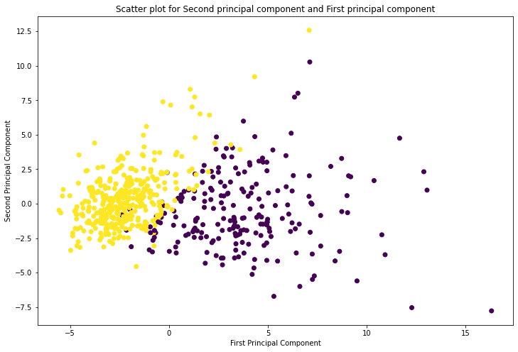
The two classes separate reasonably well along the first principal component alone, confirming that PC1 captures the most discriminative structure in the data. The cluster on the left (yellow) corresponds to benign cases; the cluster on the right (purple) corresponds to malignant cases.
Explained Variance Ratio
Check exactly how much variance each component accounts for:
pca.explained_variance_ratio_array([0.44272026, 0.18971182])PC1 explains 44.3 % of the total variance and PC2 explains 19.0 %, giving a combined coverage of about 63.3 % with only 2 dimensions — a significant compression of the original 30.
Scree Plot: Variance Across All Components
To decide how many components to keep in a real project, refit PCA with more components and plot the explained variance as a bar chart (a scree plot):
pca = PCA(n_components=20, random_state=42)
X_pca = pca.fit_transform(X_scaled)
variance = pca.explained_variance_ratio_
plt.ylabel('Variance')
plt.xlabel('Principal components')
plt.title('Bar graph for variances of the componets ')
plt.bar(x = range(1, len(variance)+1), height=variance, width=0.7)
plt.show()
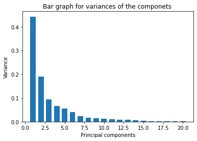
The scree plot below shows the explained variance for each of the 20 components:
Inspect the variance values directly:
variancearray([0.44272026, 0.18971182, 0.09393163, 0.06602135, 0.05495768, 0.04024522, 0.02250734, 0.01588724, 0.01389649, 0.01168978, 0.00979719, 0.00870538, 0.00804525, 0.00523366, 0.00313783, 0.00266209, 0.00197997, 0.00175396, 0.00164925, 0.00103865])The scree plot shows the classic "elbow" shape: the first two components capture the bulk of the variance, and subsequent components contribute progressively less. In practice you would choose at the elbow point — often the first 5–7 components capture 80–90 % of the total variance, which is sufficient for most downstream tasks.
Conclusion
In this tutorial you applied PCA to the 30-feature Breast Cancer Wisconsin dataset. After standardizing the features with StandardScaler, you used scikit-learn's PCA class to compress 30 dimensions into 2 principal components and confirmed the result with both a scatter plot and a scree plot. PC1 alone accounts for 44 % of the variance, and the first two components together cover 63 % — enough to reveal a clear visual separation between the malignant and benign tumour classes.
Key takeaways:
- Always standardize features before applying PCA; otherwise features with large numeric ranges dominate the principal components.
explained_variance_ratio_tells you exactly how much information each component retains — use it to choose the right number of components.- The scree plot's "elbow" is your guide: keep components up to the point where adding another gives diminishing returns.
- PCA produces uncorrelated components, which makes downstream linear models more stable and faster to fit.
- The transformed data loses its original feature names — PCA is best used for visualization or as a preprocessing step, not when feature interpretability is critical.
Next steps:
- Explore Dimensionality Reduction with LDA and PCA to compare PCA with Linear Discriminant Analysis, which uses class labels to find the most discriminative projection.
- Read Feature Selection with Filtering Methods to learn how to remove redundant features before applying PCA, keeping only the most informative variables.
- Apply PCA as a preprocessing step before training a Random Forest Classifier and compare accuracy against training on the raw 30 features.