
When embarking on exploratory data analysis, your first task is identifying what types of data you are working with. Different statistical variables require entirely different preprocessing, visualization, and modeling strategies. Misidentifying a variable type can lead to inappropriate charts, broken models, or lost information.
A variable is any characteristic, quantity, or number that can be measured or counted. In programming and statistics, they are named variables because their values vary across different observations.
In this tutorial, you will explore the four major types of variables: numerical, categorical, date-time, and mixed variables. You will use two real-world finance datasets containing customer IDs, loan amounts, interest rates, and employment categories to learn how to identify, inspect, and visualize each data type using histograms and bar charts.
Prerequisites: Python 3.x, Pandas, NumPy, Matplotlib.
What Is a Variable?
A variable is any characteristic, number, or quantity that can be measured or counted. They are called 'variables' because the value they take may vary, and it usually does. In programming, a variable is a value that can change, depending on conditions or on information passed to the program.
The following are examples of variables:
- Age (21, 35, 62, ...)
- Gender (male, female)
- Income (GBP 20000, GBP 35000, GBP 45000, ...)
- House price (GBP 350000, GBP 570000, ...)
- Country of birth (China, Russia, Costa Rica, ...)
- Eye colour (brown, green, blue, ...)
- Vehicle make (Ford, Volkswagen, ...)
Most variables in a data set can be classified into one of four major types:
- Numerical variables
- Categorical variables
- Date-Time Variables
- Mixed Variables
Numeric Variables
The values of a numerical variable are numbers.
They can be further classified into:
- Discrete variables
- Continuous variables
Discrete Variable
In a discrete variable, the values are whole numbers (counts). For example, the number of items bought by a customer in a supermarket is discrete. The customer can buy 1, 25, or 50 items, but not 3.7 items. It is always a round number.
The following are examples of discrete variables:
- Number of active bank accounts of a borrower (1, 4, 7, ...)
- Number of pets in the family
- Number of children in the family
Continuous Variable
A variable that may contain any value within a range is continuous. For example, the total amount paid by a customer in a supermarket is continuous. The customer can pay, GBP 20.5, GBP 13.10, GBP 83.20 and so on.
Other examples of continuous variables are:
- House price (in principle, it can take any value) (GBP 350000, 57000, 100000, ...)
- Time spent surfing a website (3.4 seconds, 5.10 seconds, ...)
- Total debt as percentage of total income in the last month (0.2, 0.001, 0, 0.75, ...)
Demo Dataset
In this demo, we will use a toy data set which simulates data from a peer-to-peer finance company to inspect numerical and categorical variables.
customer_id: Unique ID for each customerdisbursed_amount: loan amount given to the borrowerinterest: interest rateincome: annual incomenumber_open_accounts: open accounts (more on this later)number_credit_lines_12: accounts opened in the last 12 monthstarget: loan status(paid or being repaid = 1, defaulted = 0)loan_purpose: intended use of the loanmarket: the risk market assigned to the borrower (based in their financial situation)householder: whether the borrower owns or rents their propertydate_issued: date the loan was issueddate_last_payment: date of last payment towards repyaing the loan
Setup
Before loading and analyzing the dataset, import the standard data processing and plotting libraries:
import pandas as pd
import numpy as np
import matplotlib.pyplot as plt
Load the peer-to-peer lending CSV file directly from the repository into a Pandas DataFrame:
data = pd.read_csv('https://raw.githubusercontent.com/laxmimerit/feature-engineering-for-machine-learning-dataset/master/loan.csv')
data.head()| customer_id | disbursed_amount | interest | market | employment | time_employed | householder | income | date_issued | target | loan_purpose | number_open_accounts | date_last_payment | number_credit_lines_12 | |
|---|---|---|---|---|---|---|---|---|---|---|---|---|---|---|
| 0 | 0 | 23201.5 | 15.4840 | C | Teacher | <=5 years | RENT | 84600.0 | 2013-06-11 | 0 | Debt consolidation | 4.0 | 2016-01-14 | NaN |
| 1 | 1 | 7425.0 | 11.2032 | B | Accountant | <=5 years | OWNER | 102000.0 | 2014-05-08 | 0 | Car purchase | 13.0 | 2016-01-25 | NaN |
| 2 | 2 | 11150.0 | 8.5100 | A | Statistician | <=5 years | RENT | 69840.0 | 2013-10-26 | 0 | Debt consolidation | 8.0 | 2014-09-26 | NaN |
| 3 | 3 | 7600.0 | 5.8656 | A | Other | <=5 years | RENT | 100386.0 | 2015-08-20 | 0 | Debt consolidation | 20.0 | 2016-01-26 | NaN |
| 4 | 4 | 31960.0 | 18.7392 | E | Bus driver | >5 years | RENT | 95040.0 | 2014-07-22 | 0 | Debt consolidation | 14.0 | 2016-01-11 | NaN |
Continuous Variables
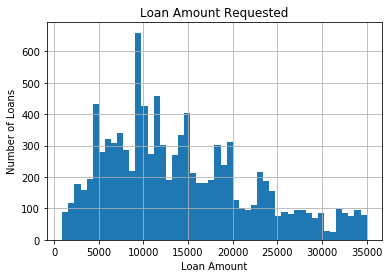
Let's look at the values of the variable disbursed_amount. It is the amount of money requested by the borrower. This variable is continuous and can take any principal value.
Check all the unique values present in the column:
data['disbursed_amount'].unique()array([23201.5 , 7425. , 11150. , ..., 6279. , 12894.75, 25584. ])To construct a histogram from a continuous variable, you first split the data range into equal-width intervals called bins. The histogram below plots the distribution of requested loan amounts across 50 bins:
fig = data['disbursed_amount'].hist(bins=50)

# title and axis labels
fig.set_title('Loan Amount Requested')
fig.set_xlabel('Loan Amount')
fig.set_ylabel('Number of Loans')
The resulting plot shows a continuous distribution of values across the entire range with no gaps between adjacent bars:
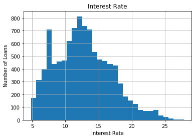
Similarly, the interest column contains the continuous interest rates charged to the borrowers:
data['interest'].unique()array([15.484 , 11.2032, 8.51 , ..., 12.9195, 11.2332, 11.0019])Plot the interest rates using 30 histogram bins:
fig = data['interest'].hist(bins=30)
fig.set_title('Interest Rate')
fig.set_xlabel('Interest Rate')
fig.set_ylabel('Number of Loans')
The interest rates also vary continuously, showing a skewed distribution without gaps:
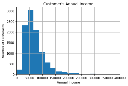
Now, let's explore the income declared by the customers, that is, how much they earn yearly. This variable is also continuous.
Check the unique values of annual income declared by borrowers:
data['income'].unique()array([ 84600. , 102000. , 69840. , ..., 228420. , 133950. ,
55941.84])Plot the income distribution using 100 bins, limiting the x-axis to $400,000 for better readability:
fig = data['income'].hist(bins=100)

# For better visualisation, only specific range is displayed on the x-axis
fig.set_xlim(0, 400000)

# title and axis labels
fig.set_title("Customer's Annual Income")
fig.set_xlabel('Annual Income')
fig.set_ylabel('Number of Customers')
Most borrowers report annual incomes between 70,000, with a long right tail of higher earners:
Discrete Variables
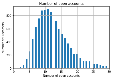
Next, inspect the number of open credit lines in the borrower's credit file (number_open_accounts). Because a customer can only open integer numbers of accounts, this is a discrete variable:
data['number_open_accounts'].unique()array([ 4., 13., 8., 20., 14., 5., 9., 18., 16., 17., 12., 15., 6.,
10., 11., 7., 21., 19., 26., 2., 22., 27., 23., 25., 24., 28.,
3., 30., 41., 32., 33., 31., 29., 37., 49., 34., 35., 38., 1.,
36., 42., 47., 40., 44., 43.])Construct a histogram of open credit accounts using 100 bins and limiting the range to 30:
# let's plot a histogram to get familiar with the distribution of the variable

fig = data['number_open_accounts'].hist(bins=100)

# for better visualisation, only specific range in the x-axis is displayed
fig.set_xlim(0, 30)

# title and axis labels
fig.set_title('Number of open accounts')
fig.set_xlabel('Number of open accounts')
fig.set_ylabel('Number of Customers')
Unlike continuous distributions, the discrete nature of accounts results in a plot with visible gaps between distinct integer bars:
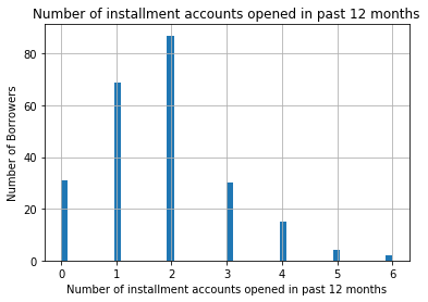
Similarly, inspect the number of installment accounts opened in the past 12 months (number_credit_lines_12):
# let's inspect the variable values

data['number_credit_lines_12'].unique()array([nan, 2., 4., 1., 0., 3., 5., 6.])Plot the number of installment accounts using 50 histogram bins:
# let's make a histogram to get familiar with the distribution of the variable

fig = data['number_credit_lines_12'].hist(bins=50)

# title and axis labels
fig.set_title('Number of installment accounts opened in past 12 months')
fig.set_xlabel('Number of installment accounts opened in past 12 months')
fig.set_ylabel('Number of Borrowers')
The plot clearly shows gaps representing integer gaps, with most customers having zero to two accounts:
Binary Variables
A binary variable is a special case of discrete variables that can only take two values, such as 0 or 1. Inspect the target column, which indicates whether a loan defaulted (0) or was repaid (1):
data['target'].unique()array([0, 1], dtype=int64)Plot the distribution of the binary target variable:
# let's make a histogram, although histograms for binary variables do not make a lot of sense

fig = data['target'].hist()

#only specific range in the x-axis is displayed
fig.set_xlim(0, 2)

# title and axis labels
fig.set_title('Defaulted accounts')
fig.set_xlabel('Defaulted')
fig.set_ylabel('Number of Loans')
The histogram shows two bars corresponding to the binary classes 0 and 1:

Categorical Variables
A categorical variable is a variable that can take on one of a limited, and usually fixed, number of possible values. The values of a categorical variable are selected from a group of categories, also called labels. Examples are gender (male or female) and marital status (never married, married, divorced or widowed).
Other examples of categorical variables include:
- Intended use of loan (debt-consolidation, car purchase, wedding expenses, ...)
- Mobile network provider (Vodafone, Orange, ...)
- Postcode
Categorical variables can be further categorised into:
- Ordinal Variables
- Nominal variables
Ordinal Variable
Ordinal variables are categorical variable in which the categories can be meaningfully ordered.
For example:
- Student's grade in an exam (A, B, C or Fail).
- Days of the week, where Monday = 1 and Sunday = 7.
- Educational level, with the categories Elementary school, High school, College graduate and PhD ranked from 1 to 4.
Nominal Variable
For nominal variables, there isn't an intrinsic order in the labels. For example, country of birth, with values Argentina, England, Germany, etc., is nominal.
Other examples of nominal variables include:
- Car colour (blue, grey, silver, ...)
- Vehicle make (Citroen, Peugeot, ...)
- City (Manchester, London, Chester, ...)
There is nothing that indicates an intrinsic order of the labels, and in principle, they are all equal.
Note:-
Sometimes categorical variables are coded as numbers when the data are recorded (e.g. gender may be coded as 0 for males and 1 for females). The variable is still categorical, despite the use of numbers.
In a similar way, individuals in a survey may be coded with a number that uniquely identifies them (maybe to avoid storing personal information for confidentiality). This number is really a label, and the variable is categorical. The number has no meaning other than making it possible to uniquely identify the observation (in this case the interviewed subject).
Ideally, when we work with a dataset in a business scenario, the data will come with a dictionary that indicates if the numbers in the variables are to be considered as categories or if they are numerical. And if the numbers are categories, the dictionary would explain what each value in the variable represents.
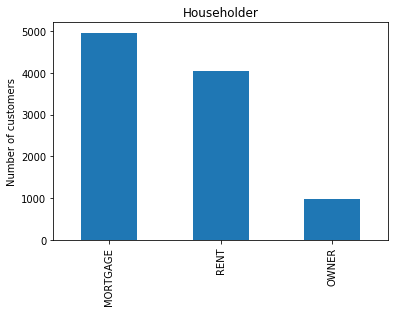
Check the unique categories in the householder column, which indicates home ownership status:
data['householder'].unique()array(['RENT', 'OWNER', 'MORTGAGE'], dtype=object)Count the number of customers in each home ownership category and generate a bar plot:
fig = data['householder'].value_counts().plot.bar()
fig.set_title('Householder')
fig.set_ylabel('Number of customers')Text(0, 0.5, 'Number of customers')The bar plot displays customer frequencies across Rent, Owner, and Mortgage categories:
You can verify the exact counts for each category using the value_counts() method:
data['householder'].value_counts()MORTGAGE 4957
RENT 4055
OWNER 988
Name: householder, dtype: int64Check the unique values of loan_purpose, another nominal variable representing how the borrower intends to use the funds:
data['loan_purpose'].unique()array(['Debt consolidation', 'Car purchase', 'Other', 'Home improvements',
'Moving home', 'Health', 'Holidays', 'Wedding'], dtype=object)Create a bar plot showing the counts of loans by their purpose:
fig = data['loan_purpose'].value_counts().plot.bar()
fig.set_title('Loan Purpose')
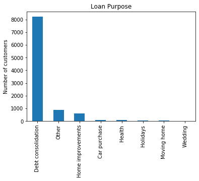
fig.set_ylabel('Number of customers')Text(0, 0.5, 'Number of customers')The bar plot shows that debt consolidation is by far the most common loan purpose:
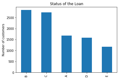
Now examine the market variable, which represents the risk rating band. This is an ordinal variable because risk bands have a logical progression:
data['market'].unique()array(['C', 'B', 'A', 'E', 'D'], dtype=object)Plot the distribution of borrowers across different risk markets:
fig = data['market'].value_counts().plot.bar()
fig.set_title('Status of the Loan')
fig.set_ylabel('Number of customers')Text(0, 0.5, 'Number of customers')The bar plot displays customer frequencies across risk categories A through E:
Finally, inspect the first five values of customer_id. Although these are numbers, they serve as unique identifiers (labels) and are functionally categorical:
data['customer_id'].head()0 0
1 1
2 2
3 3
4 4
Name: customer_id, dtype: int64Count the number of unique customer IDs:
len(data['customer_id'].unique())10000Date and Time Variables
A special type of categorical variable are those that instead of taking traditional labels, like color (blue, red), or city (London, Manchester), take dates and / or time as values. For example, date of birth ('29-08-1987', '12-01-2012'), or date of application ('2016-Dec', '2013-March').
Datetime variables can contain dates only, time only, or date and time.
We don't usually work with a datetime variable in their raw format because:
- Date variables contain a huge number of different categories
- We can extract much more information from datetime variables by preprocessing them correctly
In addition, often, date variables will contain dates that were not present in the dataset used to train the machine learning model. In fact, date variables will usually contains dates from the future, respect to the dates in the training dataset. Therefore, the machine learning model will not know what to do with them, because it never saw them while being trained.
Pandas initially reads dates as strings (object type):
data[['date_issued', 'date_last_payment']].dtypesdate_issued object
date_last_payment object
dtype: objectConvert the raw string columns into datetime objects using to_datetime():
data['date_issued_dt'] = pd.to_datetime(data['date_issued'])
data['date_last_payment_dt'] = pd.to_datetime(data['date_last_payment'])
data[['date_issued', 'date_issued_dt', 'date_last_payment', 'date_last_payment_dt']].head()| date_issued | date_issued_dt | date_last_payment | date_last_payment_dt | |
|---|---|---|---|---|
| 0 | 2013-06-11 | 2013-06-11 | 2016-01-14 | 2016-01-14 |
| 1 | 2014-05-08 | 2014-05-08 | 2016-01-25 | 2016-01-25 |
| 2 | 2013-10-26 | 2013-10-26 | 2014-09-26 | 2014-09-26 |
| 3 | 2015-08-20 | 2015-08-20 | 2016-01-26 | 2016-01-26 |
| 4 | 2014-07-22 | 2014-07-22 | 2016-01-11 | 2016-01-11 |
Verify that the columns have been cast to the datetime type:
data[['date_issued_dt', 'date_last_payment_dt']].dtypesdate_issued_dt datetime64[ns]
date_last_payment_dt datetime64[ns]
dtype: objectExtract the month and year from the parsed datetime columns:
data['month'] = data['date_issued_dt'].dt.month
data['year'] = data['date_issued_dt'].dt.year
Calculate the sum of disbursed amounts grouped by year, month, and risk market, and plot the trends over time:
fig = data.groupby(['year','month', 'market'])['disbursed_amount'].sum().unstack().plot(
    figsize=(14, 8), linewidth=2)

fig.set_title('Disbursed amount in time')
fig.set_ylabel('Disbursed Amount')
The time-series plot shows lending amounts growing over time, driven by grades B and C:
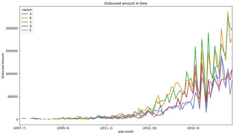
This toy finance company seems to have increased the amount of money lent from 2012 onwards. The tendency indicates that they continue to grow. In addition, we can see that their major business comes from lending money to C and B grades.
A grades are the lower risk borrowers, borrowers that most likely will be able to repay their loans, as they are typically in a better financial situation. Borrowers within this grade are charged lower interest rates.
D and E grades represent the riskier borrowers. Usually borrowers in somewhat tighter financial situations, or for whom there is not sufficient financial history to make a reliable credit assessment. They are typically charged higher rates, as the business, and therefore the investors, take a higher risk when lending them money.
Mixed Variables
Mixed variables are those which values contain both numbers and labels.
Variables can be mixed for a variety of reasons. For example, when credit agencies gather and store financial information of users, usually, the values of the variables they store are numbers. However, in some cases the credit agencies cannot retrieve information for a certain user for different reasons. What Credit Agencies do in these situations is to code each different reason due to which they failed to retrieve information with a different code or 'label'. While doing so they generate mixed type variables. These variables contain numbers when the value could be retrieved, or labels otherwise.
As an example, think of the variable number_of_open_accounts. It can take any number, representing the number of different financial accounts of the borrower. Sometimes, information may not be available for a certain borrower, for a variety of reasons. Each reason will be coded by a different letter, for example: 'A': couldn't identify the person, 'B': no relevant data, 'C': person seems not to have any open account.
Another example of mixed type variables, is for example the variable missed_payment_status. This variable indicates, whether a borrower has missed a (any) payment in their financial item. For example, if the borrower has a credit card, this variable indicates whether they missed a monthly payment on it. Therefore, this variable can take values of 0, 1, 2, 3 meaning that the customer has missed 0-3 payments in their account. And it can also take the value D, if the customer defaulted on that account. Typically, once the customer has missed 3 payments, the lender declares the item defaulted (D), that is why this variable takes numerical values 0-3 and then D.
Mixed Variables Dataset
The dataset used to study Mixed Variables contains 2 columns id and open_il_24m. id is the unique key for each borrower and open_il_24m is the number of installment accounts opened in past 24 months by that borrower. Installment accounts are those that, at the moment of acquiring them, there is a set period and amount of repayments agreed between the lender and borrower. An example of this is a car loan, or a student loan. The borrowers know that they are going to pay a fixed amount over a fixed period.
We will begin by reading the dataset into a dataframe.
data = pd.read_csv('https://raw.githubusercontent.com/laxmimerit/feature-engineering-for-machine-learning-dataset/master/sample_s2.csv')
data.head()| id | open_il_24m | |
|---|---|---|
| 0 | 1077501 | C |
| 1 | 1077430 | A |
| 2 | 1077175 | A |
| 3 | 1076863 | A |
| 4 | 1075358 | A |
Check the size of the dataset:
data.shape(887379, 2)Fictitious meaning of the different letters / codes in the variable open_il_24m are:
- 'A': couldn't identify the person
- 'B': no relevant data
- 'C': person seems not to have any account open
Examine the unique values present in the column:
data.open_il_24m.unique()array(['C', 'A', 'B', '0.0', '1.0', '2.0', '4.0', '3.0', '6.0', '5.0',
'9.0', '7.0', '8.0', '13.0', '10.0', '19.0', '11.0', '12.0',
'14.0', '15.0'], dtype=object)Display the frequency of each unique mixed value:
data.open_il_24m.value_counts()A 500548
C 300000
B 65459
1.0 6436
0.0 5481
2.0 4448
3.0 2468
4.0 1249
5.0 606
6.0 309
7.0 163
8.0 81
9.0 47
10.0 28
11.0 23
12.0 17
13.0 7
14.0 6
15.0 2
19.0 1
Name: open_il_24m, dtype: int64Generate a bar plot of frequencies for the mixed variable values:
fig = data.open_il_24m.value_counts().plot.bar()
fig.set_title('Number of installment accounts open')
fig.set_ylabel('Number of borrowers')
The resulting bar plot displays both the alphanumeric codes (A, B, C) and the numeric strings:
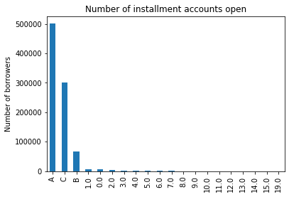
This is how a mixed variable looks like!
Summary
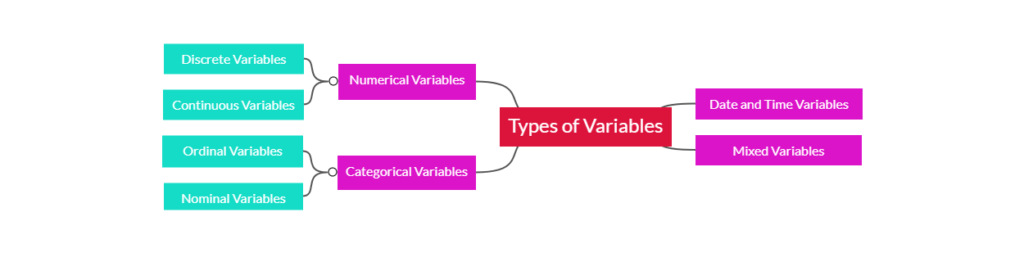
The diagram below provides a visual mindmap summarizing how numerical, categorical, date-time, and mixed variables are structured:
Conclusion
In this tutorial, you examined the four main categories of data variables: numerical (discrete and continuous), categorical (nominal and ordinal), date-time, and mixed variables. Using real-world finance datasets, you loaded, cleaned, parsed, and visualized columns using Matplotlib histograms and bar plots to understand data structures.
Key takeaways:
- Numerical Variables: Numeric data can be continuous (values vary smoothly over a range, like income) or discrete (values represent distinct integer counts, like number of open accounts).
- Categorical Variables: Categories can be nominal (having no inherent order, like loan purpose) or ordinal (having a logical sequence, like risk grade bands).
- Date-Time Variables: String representation of dates must be parsed into proper datetime formats (
datetime64[ns]) before you can perform time-series aggregation or trend analysis. - Mixed Variables: Columns containing both numerical measurements and categorical reason labels (like credit status codes) must be identified and preprocessed carefully before modeling.
Next steps:
- Get a complete hands-on introduction to data structures with Pandas Crash Course to master loading, filtering, and mutating data tables.
- Learn how to visualize relationships between variables directly from DataFrames in Data Visualization with Pandas.
- Master plotting basics with Matplotlib Crash Course to style and customize your plots.